BLACK AND WHITE
by Vick "Virgil the Doom Poet" Bobkov
The ol' Virge got his start back in the year 2000 during the source port boom before having a fairly active 2001. His main claim to fame is probably contributing a level to 2002: A Doom Odyssey but there was also that one time where he "punched up" some of the levels for Plutonia 2 back when Sam Woodman ran the show and one of them made it into the final product after some tender love and care from Thomas van der Velden. Black and White, a MAP01 replacement for Doom II, was his first release but it didn't find its way to the /idgames archives. It would have gone down with Geocities had a kind soul not scraped it from the cold bosom of the internet. BW is apparently vanilla-compatible but I've been informed that the markers for its two flats need to be fixed.
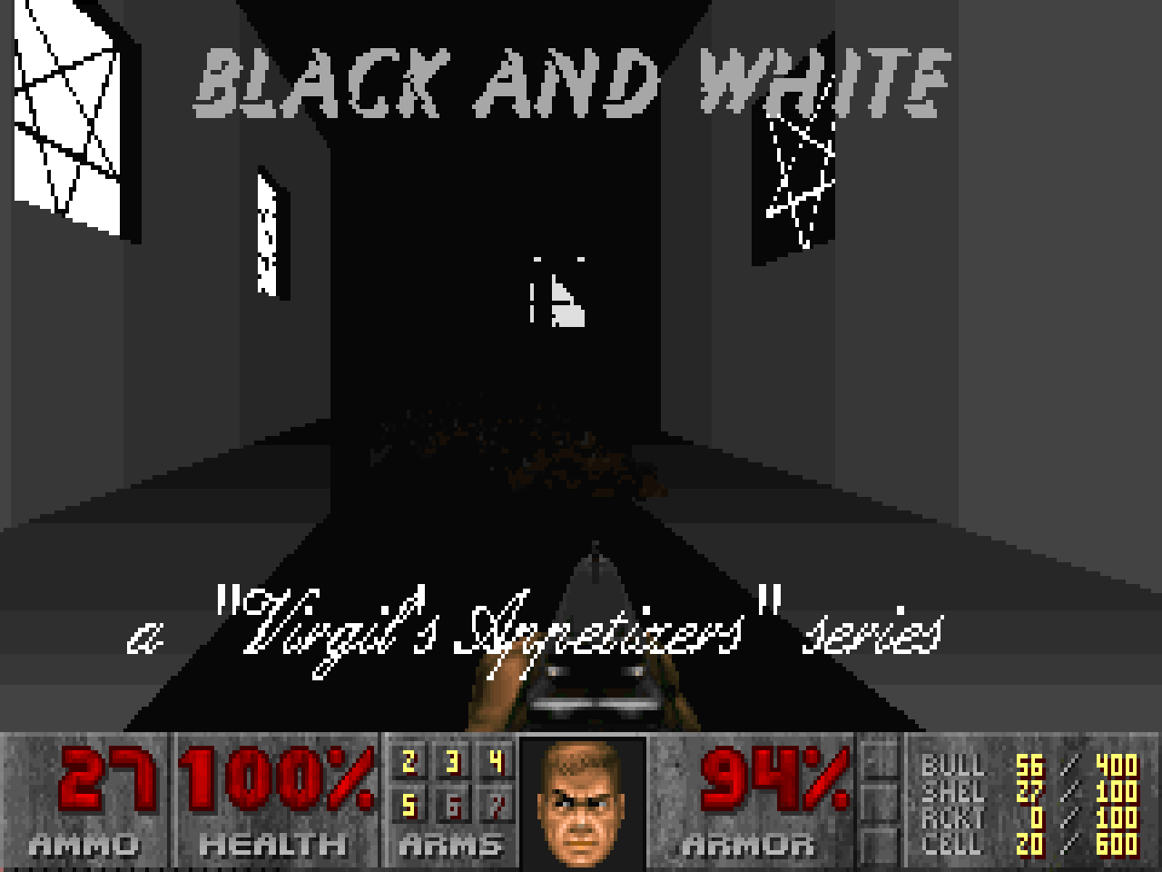
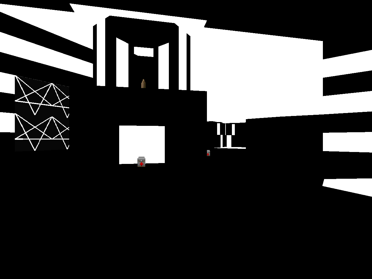
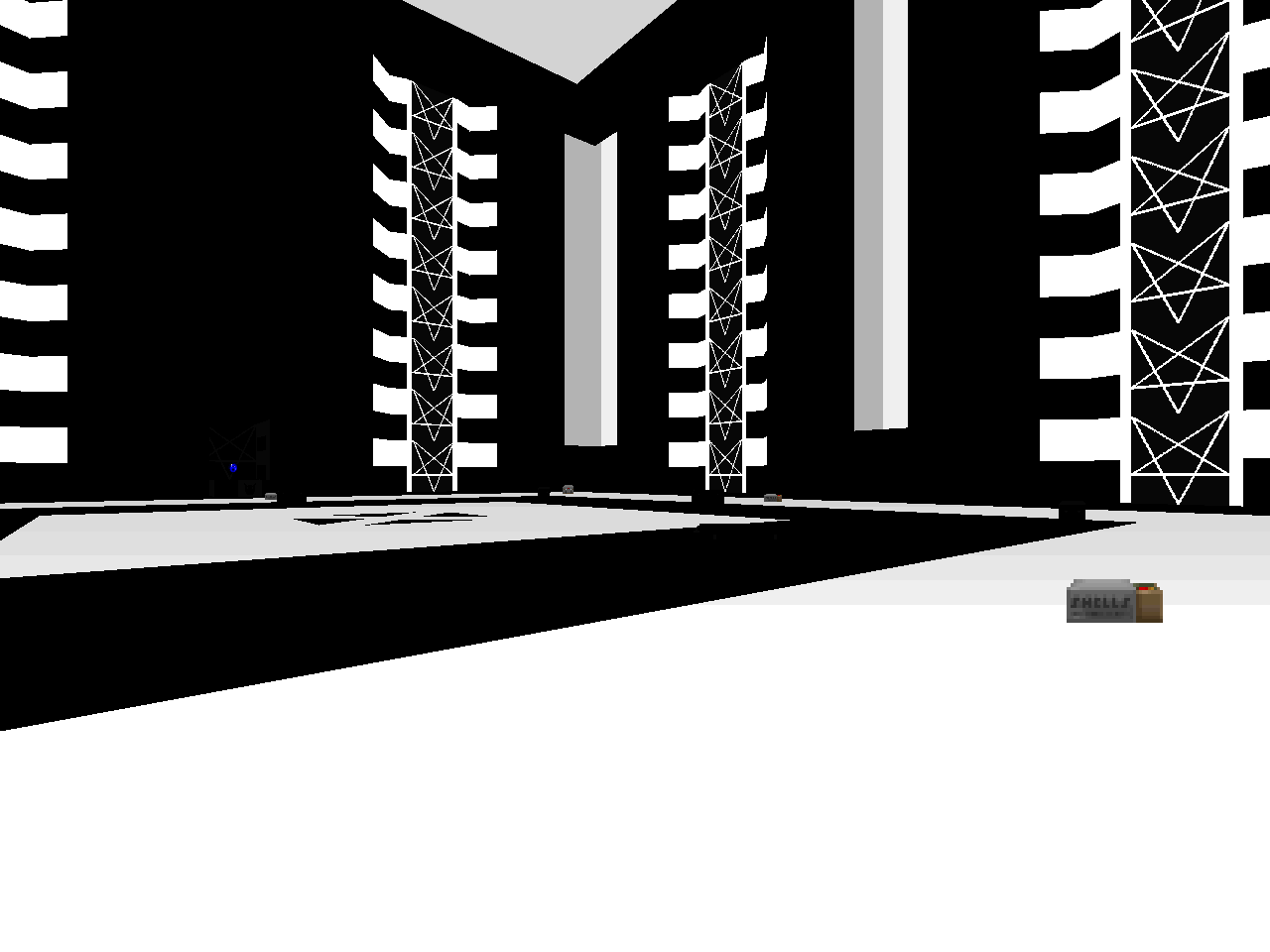
This level is themed around two colors and I would be surprised if you could not guess which ones. It's not horrible but Vick doesn't do a whole lot with the theme, appearing to rest his laurels on the pure novelty of the visuals. The opening room has the most interesting architecture out of the whole thing but its checkered-like pattern is not seen again until the end of the map where it's sort of used for a pair of arenas for "Dead Simple" monsters that are far too large for their contents. The western leg introduces a support beam-like midtexture and then the author goes oh so crazy with a deconstructed corridor where said midtexture appears to be placed at random alongside irregular chunks of geometry.
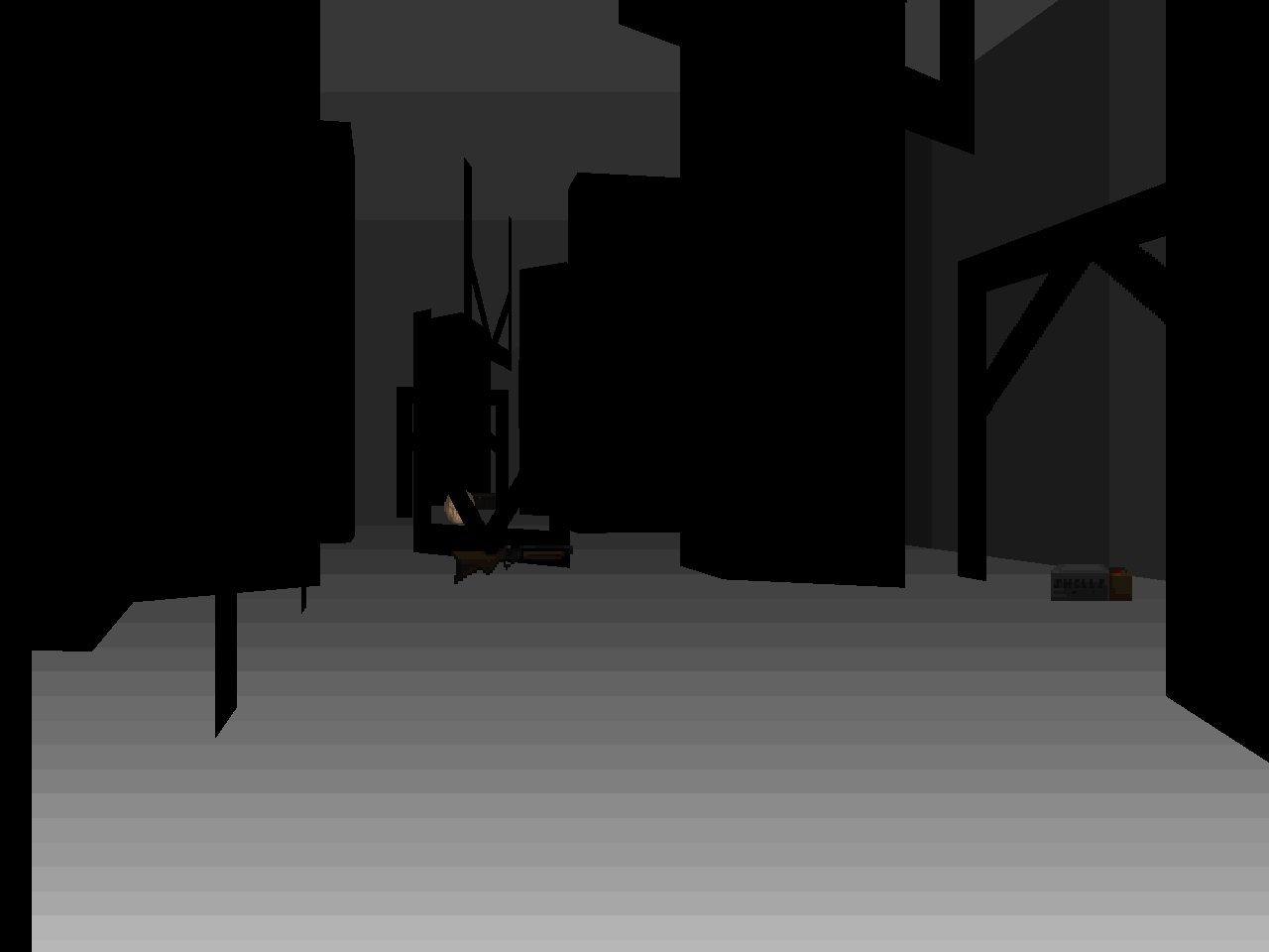
The disorienting effect of a monochrome setting isn't fully felt at first but you will be hating it when you go spelunking in the eastern cavern. Vick's blobs of matter dispersed through the hallway have unusual shapes and when combined with an inability to perceive their true depth in addition to that of the tunnel walls makes dodging the rockets of three combined Cyberdemons a tricky proposition. My initial inclination was to drag them further into the tunnel where you can use them to take down a Spiderdemon and then tie them up in a slaughter that's sort of tricky due to the shape of the room. Unless you're really fortunate, though, you'll still have to take all three down with the combat shotgun / rocket launcher, and provoking infighting between them and the crowd at the east end is less than straightforward.
Combat is an absolute grind. I don't like Virgil's hordes of monsters because they don't evoke the terror of Doom, just dogged determination. The cacodemons in the western leg kind of work because while the floaters are hard to see the passage itself is fundamentally open and the rocket launcher is a fresh, powerful weapon. The east is a complete derail, though. Between the mancubus and arachnotron arenas the manc one is much better if only because the fatsos in the periphery force you to move. I like the finale, though. It gives you a BFG and way too many cells to beat back an over-zealous boss spawner until the exit becomes available and the effect with the silent crusher wall is neat.
I can't think of many reasons to recommend BW. Certainly not the music. Vick assures the reader that his supplied soundtrack is on par with Memento Mori, which is either the biggest slam I've ever heard on Mark Klem or a statement born out of a mixture of naivete and hubris. It's not as cacophonous as Dark Castle's MAP02, but I can't make the same positive comparison. As grindy as it is, I can't even suggest that you try a lower difficulty because Virgil did not implement them. The best thing you can do is play on ITYTD and take advantage of half damage and double ammo. I'm pretty sure that Cyberdemon trio will still suck, though. I've seen great black and white maps in recent years, like "Vibetech" from Skulldash. You don't have to go digging through BW to look for inspiration or for that matter fun but if you do you had best be prepared for the long haul.

SIDE BY SIDE ON MY PIANO KEYBOARD
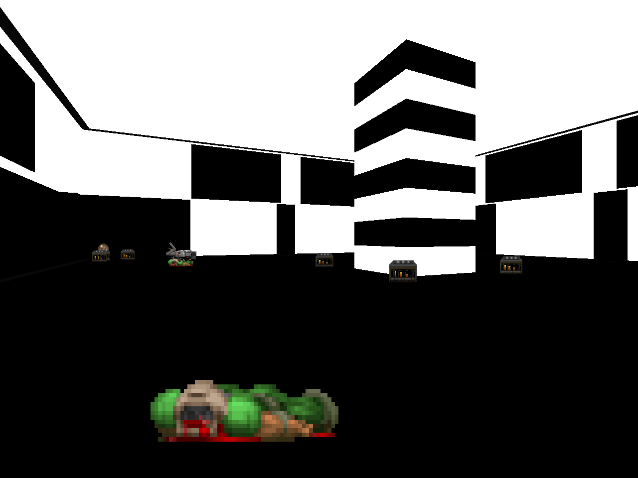
Those are some striking screenshots, at the very least.
ReplyDeleteHey, I'm just thinking if this wouldn't be a bad move if I would take those textures from wad. It would be sad to see them wasted. Of course, with credits and such.
ReplyDeleteThis wad is a refreshing change of pace
ReplyDelete