Memfis was known for his love of classic megaWADs but this rarely reflects in the particulars of his level design. His typically less-hardcore monster density is counterbalanced by exacting ammo balance and his layouts display modern sensibilities on how to make levels feel interconnected and fun to move around in. I never took the opportunity to pursue a direct comparison but REQUIMEM made it easy to do so. This two-level set was initially released in 2011 but didn't make it to the archives until 2014 during the great Memfis dump. It's actually the first two levels of Requiem, remade, and thus requires its .WAD for the reused resources. The tested port was PrBoom-Plus using -complevel 2 so it ought to work okay in modern limit-removing .EXEs.
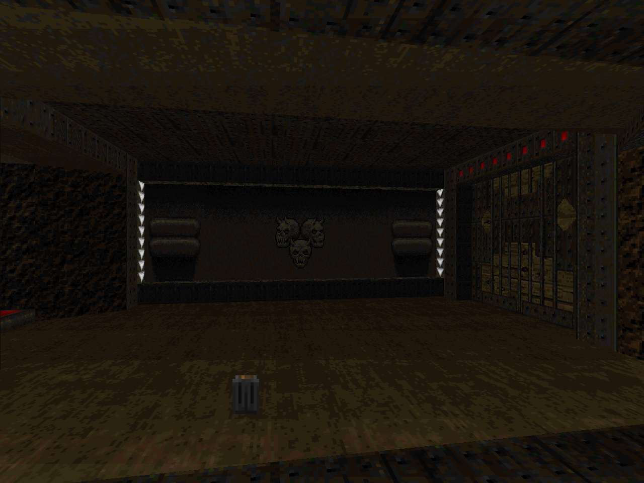
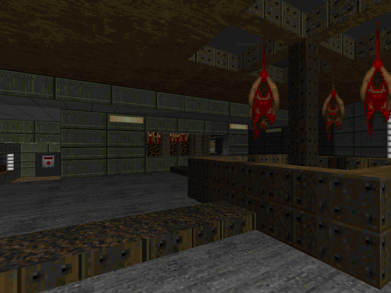
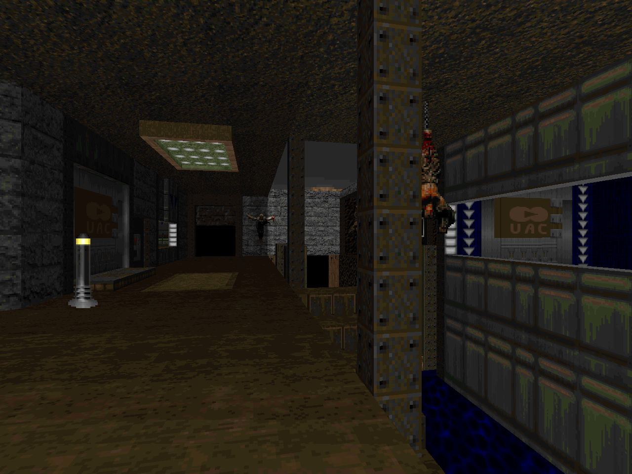
I haven't touched Requiem since 2011 so I had to refresh my view of the originals, which are "The Gateway" by Orin Flaharty and "Sacrificium" by Anthony Czerwonka / Florian Helmberger. I believe that these are two of the shortest maps of the set, not counting Adam Windsor's Demonfear-cum-bailout submissions. The comparison revealed vast changes in each level's configuration while retaining many of the base elements. You still get a lot of MAP01's texture combinations, for instance, but most of the interlinking hallways were removed in favor of putting the different areas in direct contact with each other. MAP02's changes feel more extensive, largely as a function of where Memfis decided to shift the detail.
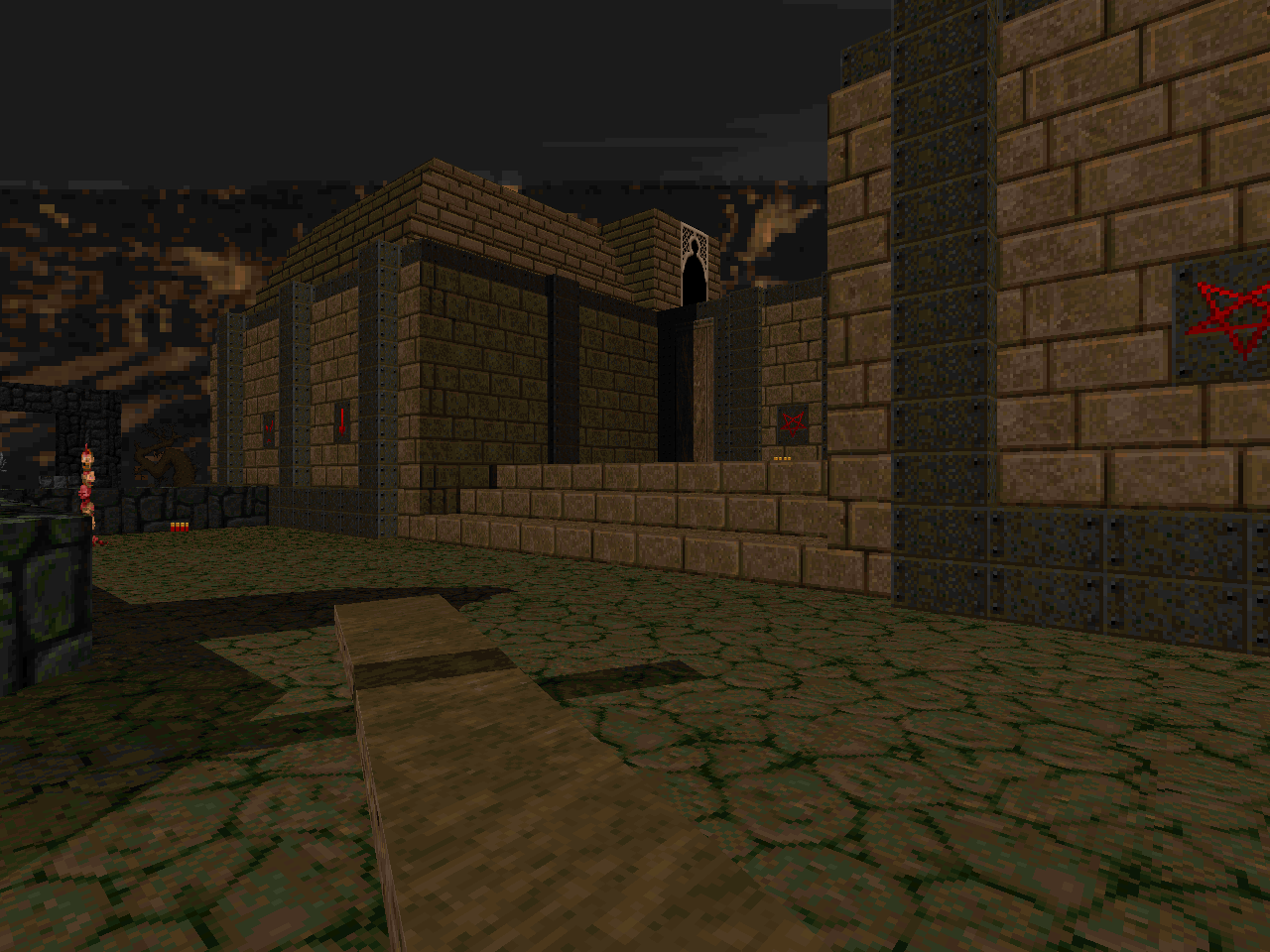
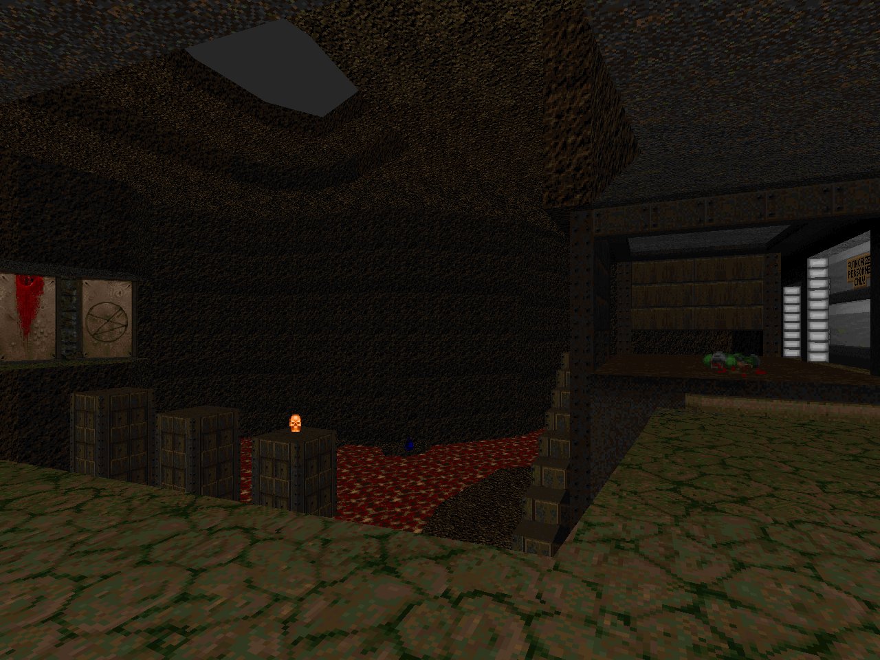
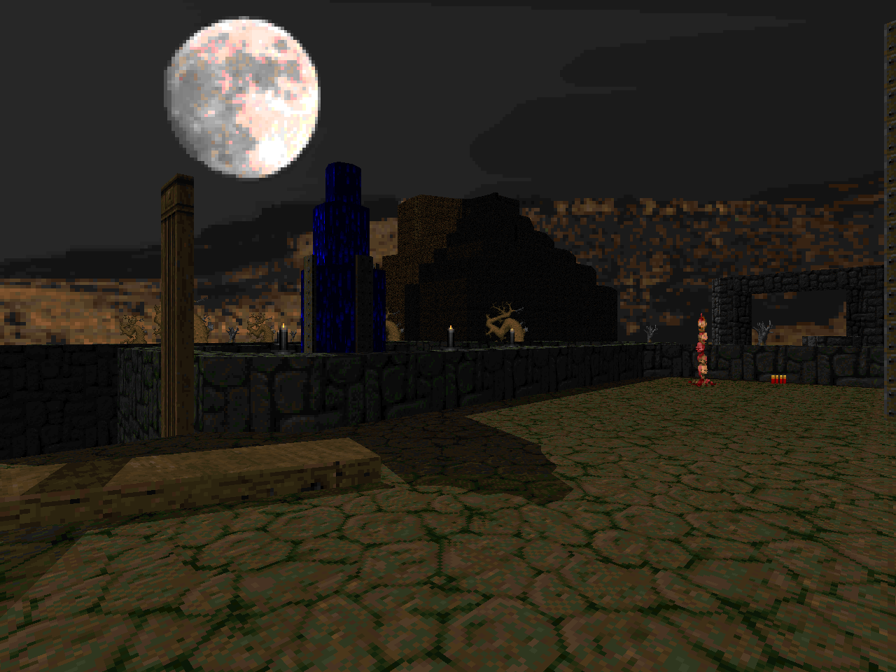
Both MAP01 and MAP02 have at least one significant addition of height variation where none previously existed. This takes the form of a trench running through the main play area of the first level. For the second, Memfis moved the iconic Stonehenge-type structure off the playable space and supplanted it with a descent into an admittedly cool-looking water park. The general idea seems to be to play up its strong scenic focus by adding a large mountain in the distance (which ties the starting area to the outdoor segment via a pair of slat windows). He also eliminates the utilitarian function of the building, making it an impressive setpiece that you play outside of instead of starting inside it.
The combat changes make these more meaty levels than the originals. Part of this is Memfis's predilection toward hyper-tuned thing placement that reward you for conserving ammo through pistol use in the early game. The strategy applies just as much to picking off wounded enemies as it does to chipping away at zombies. Neither of the Requiem levels are quite so punishing, "The Gateway" being the least of the two. "Sacrificium" comes the closest for including a pain elemental but you have to weigh this against the REJECT table black magic at the monument. Memfis affords you no such break and even gives you two meatballs to chew on. Not at the same time, of course. It's interesting to see how he took the level's initially claustrophobic encounters and then used the pain elemental to spin the open areas into the most dangerous.
This was a cute experiment and I'm glad to see that the author tackles a few other remakes in his early days. I am intrigued to see how he reconfigures them in order to suit his particular style. It's also just nice to see the textures of these classic megaWADs get some more use. If you found Requiem to be a bit too stuffy then this might just be the take that you've been waiting for.

REQUIMEM
by "Memfis"
TUNNELS OF LOVE
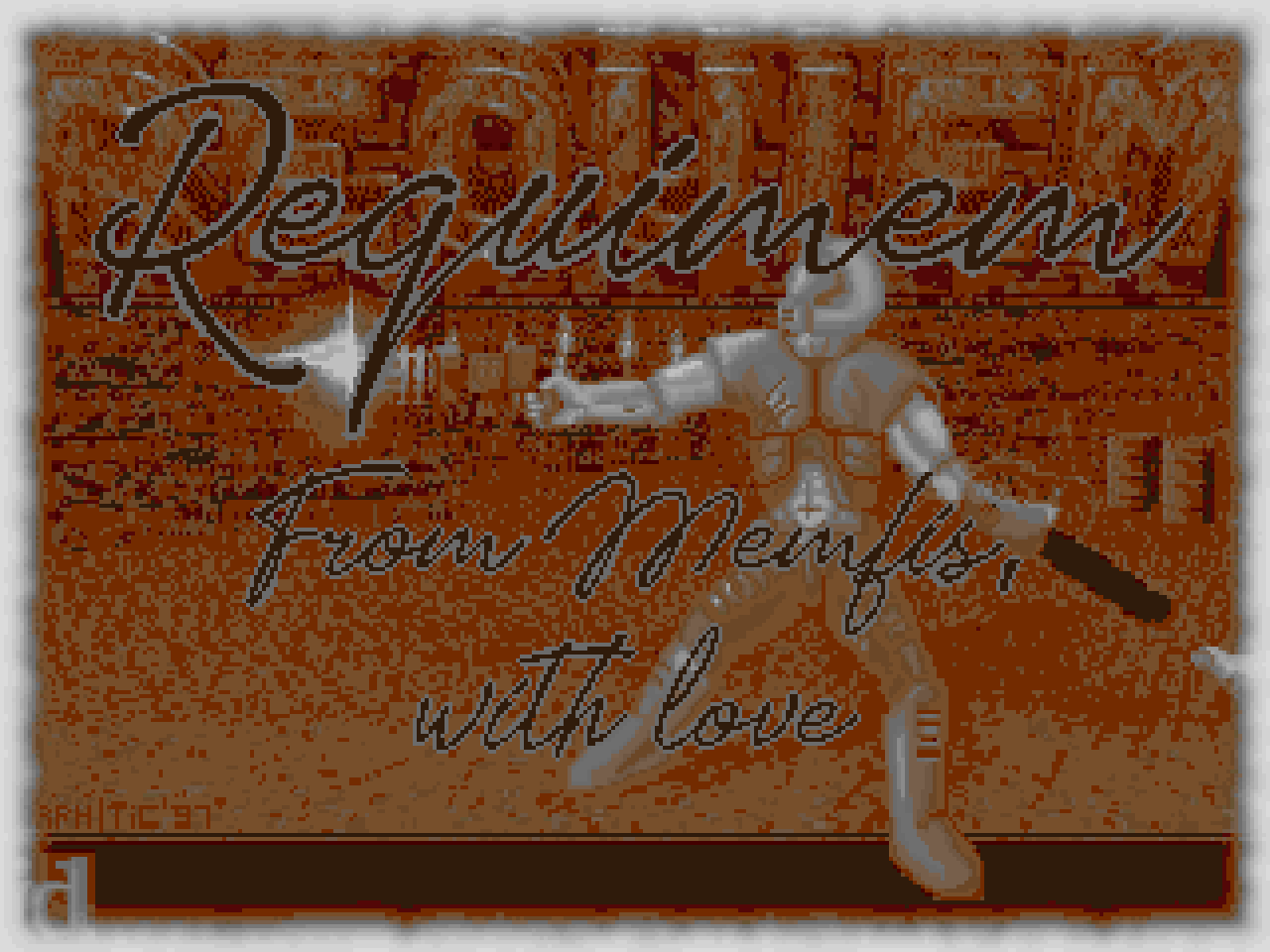
Weird, /idgames copy doesn't have a titlepic.
ReplyDeleteToo bad it's only 2 maps. Just like Eternal's tributes only typically cover a few maps (was especially disappointing with Reternal).
I have a lot of fake titlepics floating around the site. The one coming up for RELIVEX2 is just as fake.
DeleteTreacherous.
Deleteif you ever load up a wad and my review titlepic isn't there then I almost certainly made it for the review.
Delete