ZEUS
by Stephen Renton
by Stephen Renton
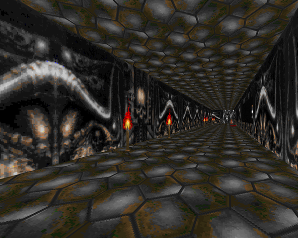
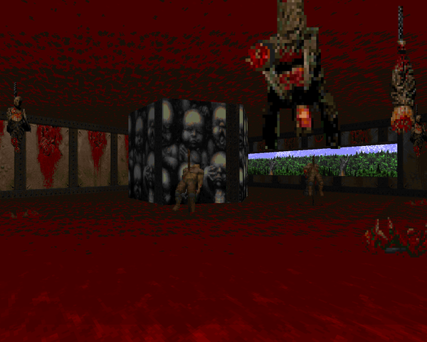
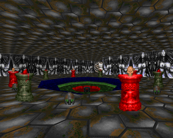
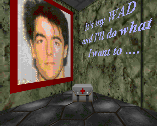
Zeus is a single map for the original Doom, replacing E2M5. It's pretty short, clocking in at 69 monsters. Renton ascribes the project to his high-resolution scanner. Clearly he was replicating the artwork of H.R. Giger, whose bio-mechanical imagery dominates the level's new wall graphics, the sole exception being a forest landscape that significantly clashes with the room it's used in. Honestly, very little of the graphics actually fit. The skull texture that marks most of the map's doors stands out in a sea of wallpapered nightmares, like the paper clip woman (Illuminatus I) or the labial archways in the outdoor area or bare-breasted witches (Witches' Dance). Thank goodness Renton spared us from Landscape XX.
While I'm fascinated by Giger's surreal artwork, and note its undoubted influence on Doom's art direction, whether directly or indirectly (through Alien and Aliens), it doesn't work well when used in this fashion. I think his pieces can make great centerpieces, as evidenced in another 1994 WAD (INVADE2), but very little of this stuff tiles well at all. I must admit, I'm tickled pink by the idea of a Doom project that features textures in Giger's style (where Doom's puts much more emphasis on blood). Hopefully it would avoid the shortcomings of the Darkseed adventure games.
So, pushing all the aesthetic concerns aside (the textures barely propping up what's otherwise a pretty boring layout), I'd say that the gameplay is a little difficult, considering how hard you're likely to get slammed by hitscanners. Still, considering all the resources available to you (like the plasma rifle secret), it's not tough at all, and bits like the demon corner are wholly ineffectual for whatever reason. There's an inescapable trap if you should go for the BFG, but it hardly registers in a level as short as this. I don't think I could pick out a standout encounter, except for perhaps the baby pillar room.
Throw on an annoying sound effects pack and you've got your bog standard '94 map. It's got some of that wild-eyed innocence that makes these works so charming, and the Giger textures help to give it some flair, but neither ultimately escalate ZEUS beyond its uninteresting gameplay. There are better '94 maps you could play, but if you want a fast romp with some brand new artwork (or just have a Giger fetish), you might do well to give Zeus a try.


ZEUS EX MACHINA


Annoying sound effects pack? That's the only mention given to the affront to our ears? "Steven. Steven. Steven." It's hard to take this map seriously because it looks and sounds like a fething disgrace - I even made a Youtube video about it. I appreciate what the mapper was trying to do, and this was the early days of Doom, but I would say there is little to no value in this map and it is hardly something the mapper is likely to be proud of.
ReplyDelete-MajorRawne
Renton had a decent enough idea but Giger's work doesn't lend itself to wallpapering and the sounds, as you mentioned, are horrible. I played this back in the day alongside Yak World and, well, Yak World holds up way better.
Delete