Perhaps the most infamous of all unauthorized
Doom products,
Laura Beyer's Doom was sold for $20 and featured nine maps, replacing the first episode (with an install process that modified the
Doom IWAD), and coming with three "bonus" levels. I really don't know how much Beyer was actually involved in this work. She's listed as the "Boss (she made us do it!)" and the destination for game orders, but Mike "Laura's BOY TOY" Helm is the Head Programmer with Kody Zander and Darryl Dewald listed as the actual level designers. Certainly someone was responsible for the new graphics and sounds, a few of the latter I recognize as appearing in
Eternal Doom (and many other WADs of the time). As to how the team assembled, it looks like almost everyone was (and still is) stationed in Creston, Canada, so I assume they were friends.

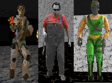
Most of the new graphics and sounds are pretty bad, including the enemy replacements. Actually, the regular zombiman death is pretty good, but the baron, which appears to be a photographed action figure, is pretty painful, though the first time I got the call and response with his wake up and death noises I admit I smirked. Just a little. The textures aren't all awful, but the solid black with tiling brown squiggles blows, and while the well-known in-game advertisements aren't nearly as pervasive as in the demo level (here E1M9), I'd still rather not see them. Actually, with a few notable exceptions, texturing in the entire series is terrible. Granted, it's '94, but still.
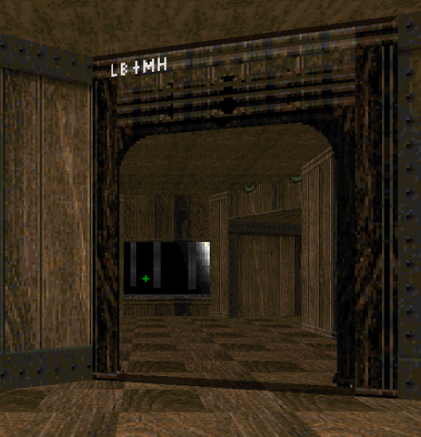
There are some neat stabs at special effects here and there, like demons falling in through the ceiling or several instances of the "crystal sector" effect put to good use. Most of the gameplay is pretty boring, though, dispatching spaced out segments of monsters that probably can't even see you because of what I can only assume is a bum reject table. If you lob rockets, you don't even wake them up half the time. Furthering this boredom are some big design flaws, like long, slow elevators, mazes, and stale architecture. E1M7 is perhaps my favorite level but even it is weighed down by reusing its greatest aspect ad nauseum.
If you want a mapset that encapsulates some of the worst trends of '94 mapping,
Laura Beyer's Doom is a fine choice. I think it deserves most of its reputation, though some of the comments directed toward Beyer herself are mind-boggling. There are some moments that might be worth seeing (inspired I'm sure by contemporary releases, especially
Doomsday of UAC), but I think you can safely pass this one by unless you're historically curious.
LAURA BEYER'S DOOM
by Kody Zander and Darryl Dewald
| E1M1 |
|---|
| Three large, outdoor areas making use of the garish custom textures. The key to exploration resides in the enormous columns, inside of which are powerups, teleporters and triggers to map features. You're rarely in danger; the author has scattered soulspheres, combat armor and ammo practically everywhere, and there's some kind of reject table screw-up that prevents the map's token Cyberdemon from getting a shot at you. While it's slathered in '94, I think the light bridge secret is pretty cool as long as you're comfortable ignoring the giant invisible wall that marks its presence. Putting the blue key in a "secret" though is beyond the pale. | 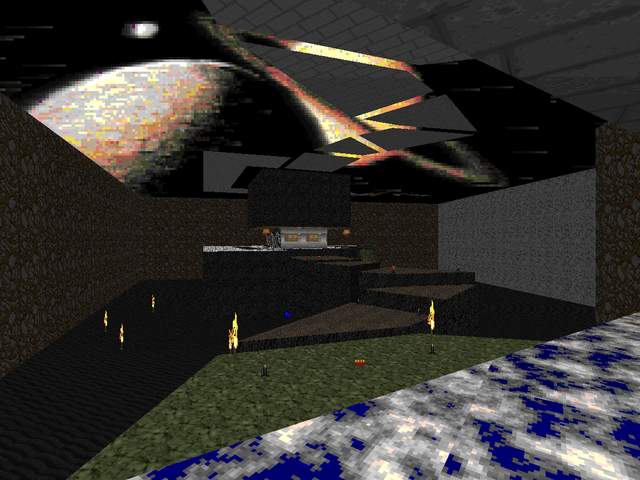 |
| E1M2 |
|---|
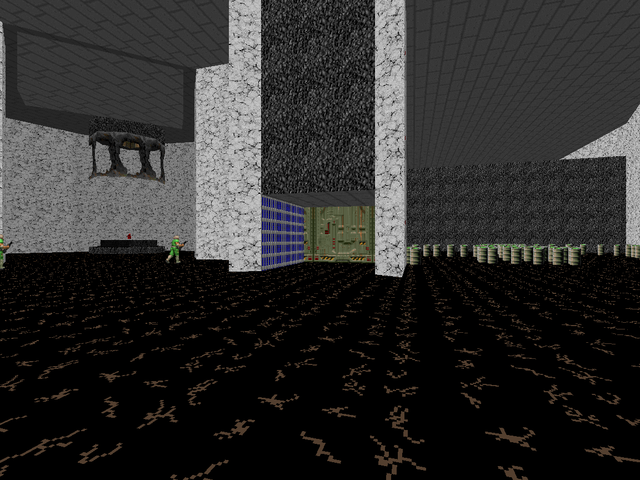 | Ugly as sin huge cavern. The smaller sections with the arch graphic are almost passable but the huge white walls are an eyesore. Again, the puzzles are a bit obtuse. The yellow key has a goofy domino sequence and an invisible wall you're supposed to squeeze past. Also a Cyberdemon who is completely non-threatening, never mind the two soulspheres in the cavern with him. The only inspired part is a bit where you see demons "fall" in from the ceiling, but the speed of the lift coupled with the fact that you can see them far ahead of time robs the effect of efficacy. |
| E1M3 |
|---|
| More garish underground caverns, but things are a tad bit better. For one, the central teleporter shows some slightly interesting level design, though the lift room is downright annoying. Conversely, the rocket launcher area is more vibrant. It's a slow stair spiral, but the flaming tiles damage you, and coupled with pressure from the baron replacements (and a few other things) you have to plot your movements a little more carefully. There's also a bizarre annex featuring a wall graphic featuring (I assume) Laura herself. I'm seeing... a little improvement? | 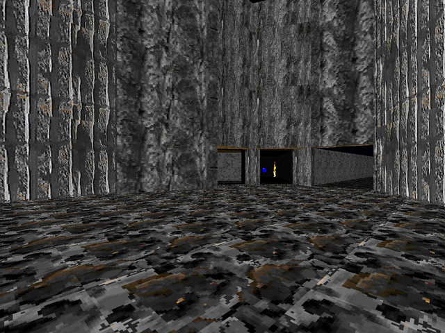 |
| E1M9 |
|---|
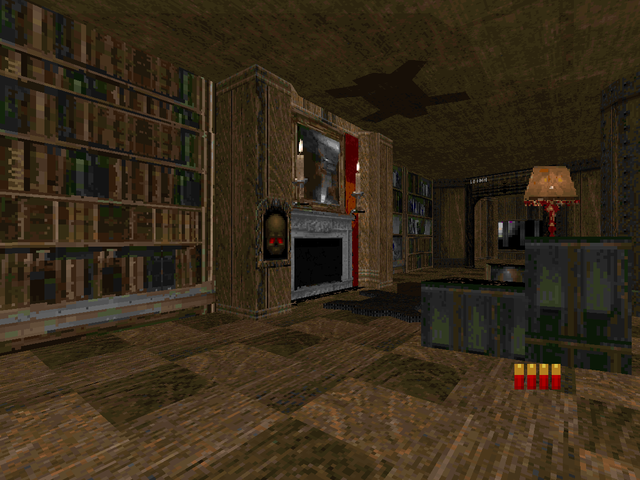 | This is the infamous demo level. It's a haunted house with some of the best mapping yet, though considering what's gone before, it's not much to get excited about. Actually, I'll be honest. Stuff like the fireplace you can activate (and fur rug) and the billiards table is pretty cool. There's also a garden / Pac-Man maze that's...totally optional I think? And a very confusing bit with three barons that appear to float in the air because of a rising floor. Actually, it's one of the most successful special effects in the episode yet. It suffers due to the obnoxious advertising near the beginning (though the literal pop-up near the end is genius, if just as annoying). |
| E1M4 |
|---|
| Starts out in a mansion-esque section and descends into uninteresting mazey gameplay. The lifts leading to the bedroom are annoying, along with the climb to the red key, which has three tiers of slowly rising winding staircases with hardly any enemies to show for it. Funnily enough, the main attraction is the northeastern maze, which actually pulls off "menacing" with the effective footfall sound effect. Once you've cleared out most of the enemies, you'll get progressively jumpier looking for the final few. Throwing one in the walls that gets crushed later on in the level would have been delicious. | 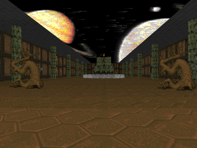 |
| E1M5 |
|---|
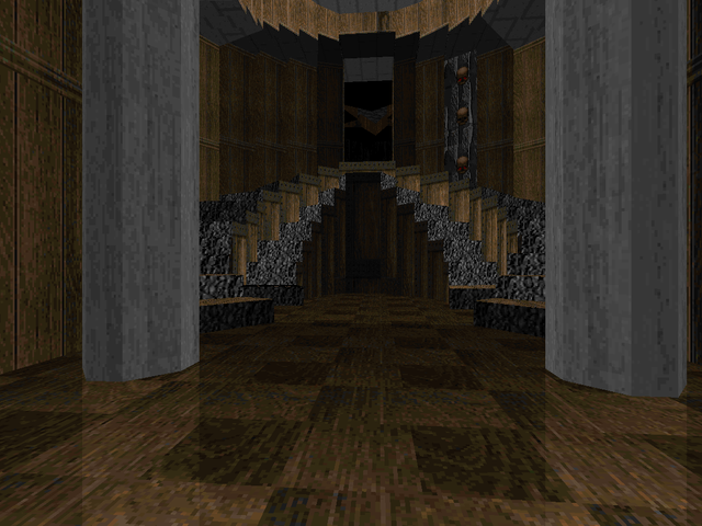 | Another abstract map featuring curious, semi-realistic areas like the miniature houses in the northern area or the jail section to the southwest. Action is par for the course, being mostly uninteresting save areas like the jail where some monsters wake up before you see them, or the primitive special effects displayed in the Satanic cathedral and those "teleporter" pads past the blue key door. That opening foyer might look a bit better if it weren't so garishly textured. |
| E1M6 |
|---|
| Some shameful level design here. You can cut this in two halves, the upper area which loosely resembles some kind of habitable quarters for the hordes of zombimen, and the mines. It just hits a lot of bad notes. You have to take the world's longest elevator to get to the red key in the mines and ride it back up to fight through other areas of the main map, eventually snagging the blue key, which grants access to the exit all the way back down the world's longest elevator. Unless you don't scout out the ammo room, you won't be hurting for health and armor (though you'll have to snag a shotgun from an enemy). Just boring boring boring. | 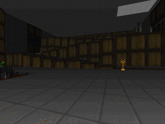 |
| E1M7 |
|---|
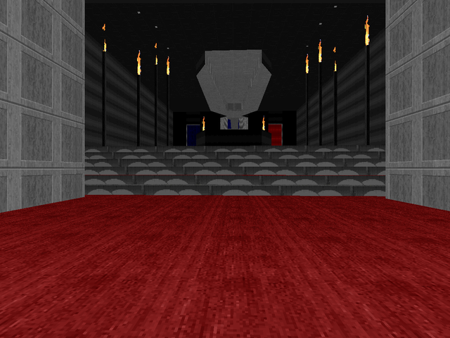 | A short map but contains some of the most interesting ideas in the WAD. The opening visual is quite striking (I mean, compared to the last seven maps) and there's a maze built out of crystal sectors a la Doomsday of UAC. Afterward you'll be doing a lot of running through ruined tunnels, the fidelity of which is actually pretty good, with splotches of toxic runoff eating through the bottom of the walls. The only unforgivable section requires you to navigate several elevators full of nukage before finding safe ground. If you've got less than, say, 60% health when you start, you're probably boned. The end puts the player on a runway with a spaceship. I wonder how much Lim's map influenced this? |
| E1M8 |
|---|
| A very large, weird map. It's kind of crawling around on a spaceship, given that you visit a barracks, several ship hangars, lots of air ducts, and a cargo hold. There are some rudimentary stabs at scripted explosions via barrels and crushers. I guess the ship may be self-destructing? Anyway, it's a pretty confusing map with lots to explore (and not a lot of real action). Crawling through air ducts isn't very fun, but you get some respite with two teleporter jaunts to other sections to grab the blue and yellow keys before finding the escape ship, which has a neat viewscreen moment. That blast door to the west actually looks kind of cool. | 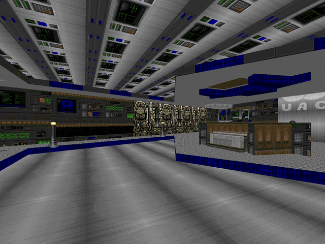 |
If you couldn't get enough after finishing the main episode, there are three
BONUS wads included in the package, each one replacing E1M1. They largely teach new appreciation for the preceding levels as the authors plunge to new depths of level design.
| BONUS1 |
|---|
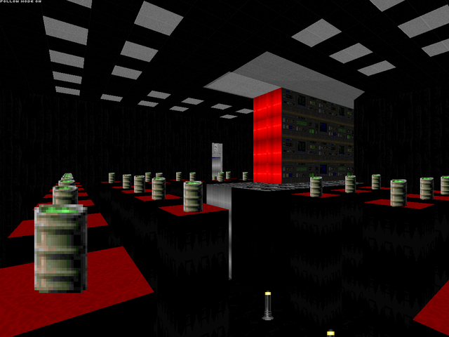 | A nonstop pain train full of puzzles you can only hope to not screw up. The opening pillar run sets the stage where several platforms you run across lower into the ground. One of them teleports you to a permanent cell. Then there's a barrel obstacle course where two pressure plates cause the entire room to crush you, not to mention the platform troll section to the southwest which teleports you back to a crusher gauntlet with collapsing floors you ran not once but twice already. The docks housing the yellow (and blue) keys are the only things in this map worth looking at, which has nothing but hatred for the player. |
| BONUS2 |
|---|
| This caverns-oriented map has several things wrong with it. Two of them are the large outdoor areas, which have large, central circular platforms that are actually slow elevators. Even worse, to leave each area you'll have to access slow lift corridors to the north and south that dip down even further than the main elevators. Why'd it have to be lifts? All things considered, the twisty rock maze to the south isn't nearly as frustrating. Of the things I'd say they got right, there's a neat waterfall effect hiding the yellow key, and a few chances to go rock climbing, and some cool stuff with the boat docks. The lifts just drag this level down, though. | 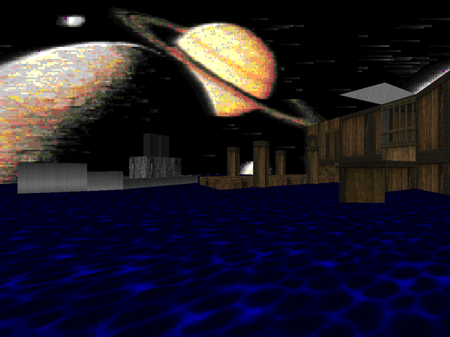 |
| BONUS3 |
|---|
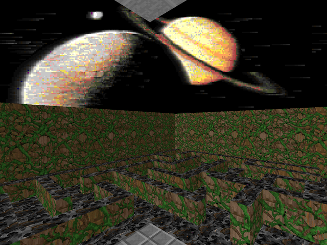 | This map consists of eight functionally identical clusters of four (sometimes three) outdoor areas that are hedge mazes sprinkled with imps and shotgun guys. Many of the hedge layouts are unsurprisingly copy and pasted with minor (if any) alterations. The presence of warp rooms to the northeast and southwest don't do much to alleviate the pain that is exploring this level. I'm not even sure what's required to open up the exit hallway, located between the red and yellow key doors. The important thing is that you shouldn't play this map. Just don't do it. |
TWITCH 'N' SHILL


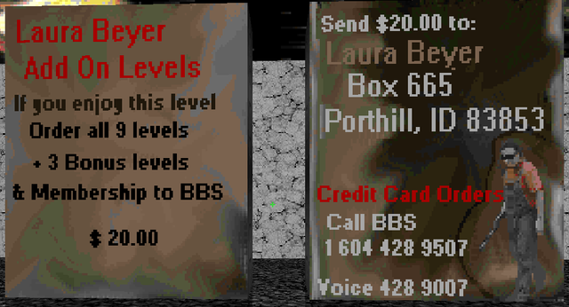
Probably the worst Doom related game ever sold for money - and not even with an official license at that.
ReplyDeleteyeah but as a historical footnote it's hilarious
DeleteYea, what a WAD of crap! The Mod DB "modern" version of LBDoom actually puts bonus levels into E2/E3/E4 M1's
DeleteAbsolute tripe. I can't believe they actually sold this trash level pack for money. Totally worthless except for being a history piece.
ReplyDeletehistory piece is right, but it has its own (very limited) appeal
DeleteI remember finding and downloading lblev2 (E1M2) back in 2003 out of curiosity, blissfully aware of the controversies surrounding it. I remember being unimpressed by the map but not finding it absolutely terrible, about 3 or 4/10.
ReplyDeleteIronically, the main reason why I was intrigued was because it appeared that this Laura Beyer was a prominent female mapper (the relative lack of prominent female gamers has always been a bugbear of mine) who even had her own level creator, albeit one that people generally found impossible to run. I say ironically, because as you say, it's doubtful if she had much involvement in the actual mapping (and the same might also apply to the level editor). Also, judging by the text files, an Episode 2 was planned, but didn't happen.
I'm pleased someone got a hold of the full product and uploaded it for posterity, even though it's not very good. Apparently GreyGhost at Doomworld saw it on EBay back in November 2010, so someone, somewhere, has probably bought it at some stage. I can see that there were many attempts at creative and innovative stuff (especially by 1994 standards) but most were somewhat badly implemented (even by 1994 standards). I agree with the controversies though- the attempt to sell these maps was out of order.
The pictures seem to be missing. Good review otherwise. I tried to play the bonus levels, but I quit around the second one - they don't even seem to be beatable! Truly awful.
ReplyDeleteI am in the process of backfilling screenshots since the great Imgur breach at the end of 2016 and LBDOOM isn't too far away so that everyone can marvel at its graphical genius.
DeleteThis sounds iteresting...almost. Where can I buy it?
ReplyDeleteYou can't anymore! But Andy Olivera is the patron saint of rescuing obscure stuff and made a copy from a package that he got off eBay. It's available on his Doom site http://visionsofdoom.us/
DeleteBeing someone with an interest in most things "so bad it's good", and now knowing about the existence of this masterpiece, I can say with certainty that I'd honestly and legitimately purchase this add-on if it were still possible. If, by any chance, someone could track down the original creators and possibly convince them to continue the project, maybe they could complete a full total conversion? Maybe they would have better success selling a more complete product.
ReplyDeleteAfter 25 years I am mostly interested in hearing what they have to say about how LBDOOM came to be. It's obvious that Laura herself had the marketing focus but it would be cool to hear about the level of everyone's involvement.
DeleteHello, I am curious where you got Creston, BC from as the order form mentions Porthill, ID.
ReplyDeleteCreston is a result from Google namesearch... I think more than one person with that name had online records associated with Creston. Regardless, the phone number's 604 area code on the "digital" order form is for British Columbia, though interestingly enough not Creston. IDK about the dynamics of internet access at the time the WAD was made to say anything but based on the fact that Porthill is a tiny, smallest of small towns I would hazard that it was just the location of a PO Box for all of your sweet, sweet American US dollars. It would have only been a 15 minute drive for anyone living in Creston, though I don't know how casual--or not--border crossings would have been at the time.
Deleteerr, more than one person from the team
Delete