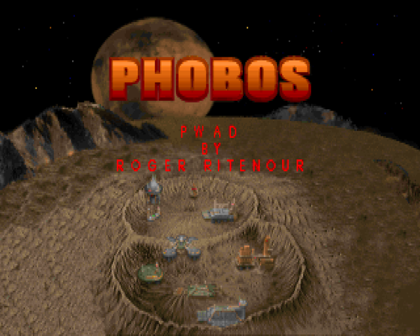
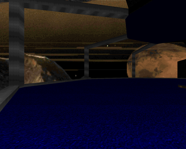
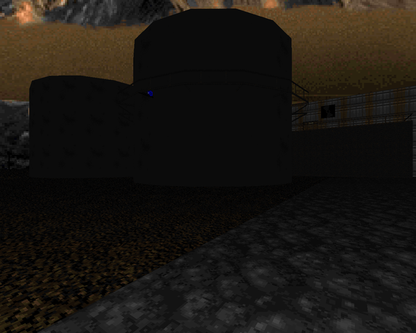
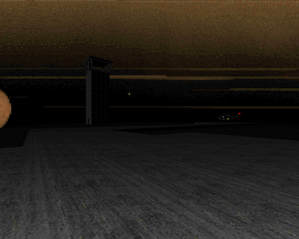
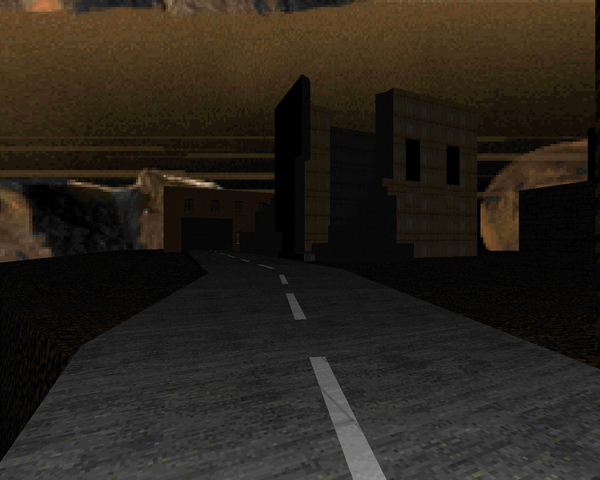
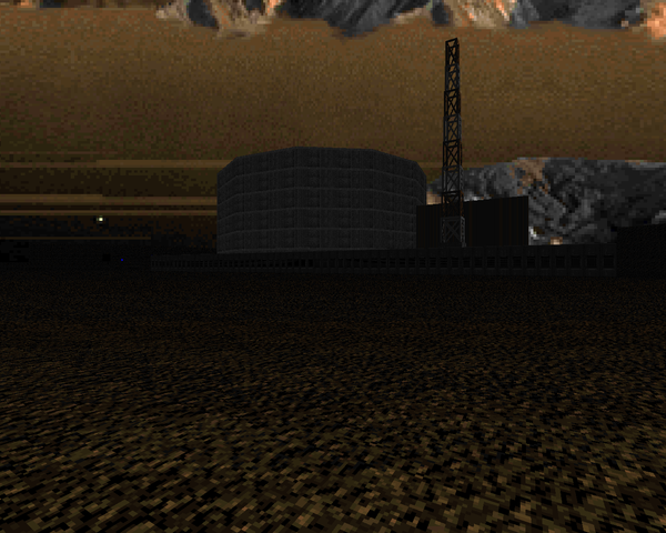
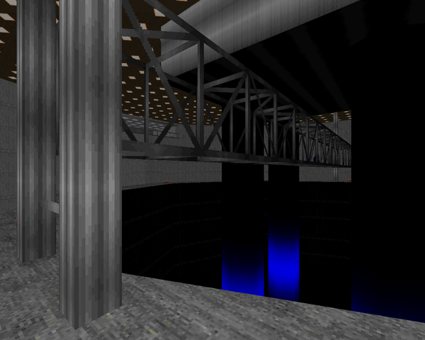
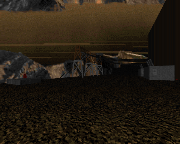
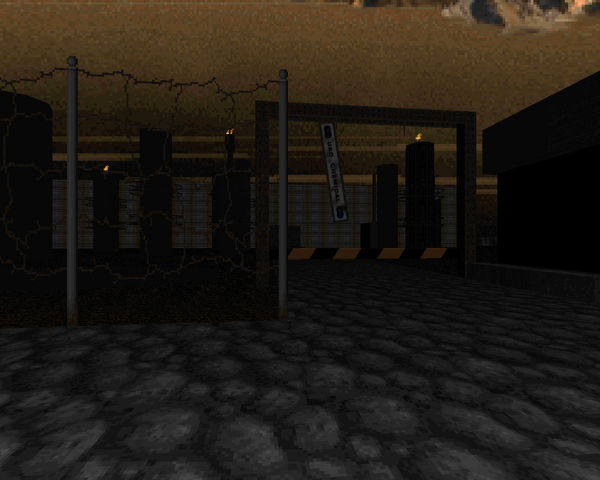
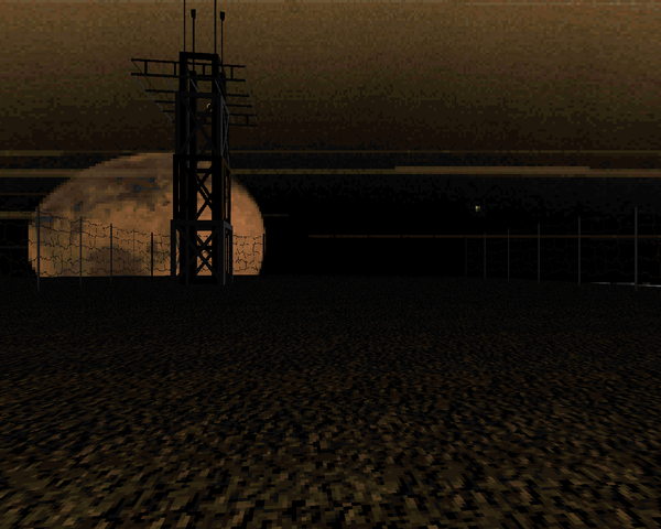
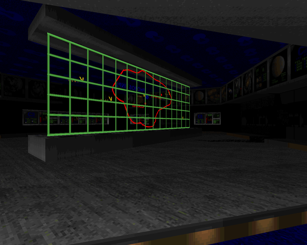
Roger Ritenour’s Phobos is a four-map minisode for Doom II that reuses the implicit story of the first four maps of the original's "Knee Deep in the Dead". The player arrives at the research facility on Phobos, fighting through the hanger, the nuclear plant, toxin refinery, and then Command and Control, where the demons undoubtedly struck first. However, rather than reinventing the wheel with another Episode One style mapset, Ritenour worked to make each location as realistic as possible. He does a pretty good job. Where Earth had some gorgeous surf and sand, and maybe a glass elevator, Phobos is filled to the brim with specialized textures and ingenious special effects that help to develop the character of each level.
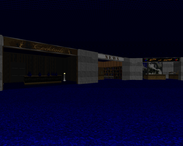
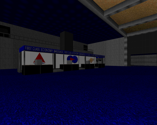
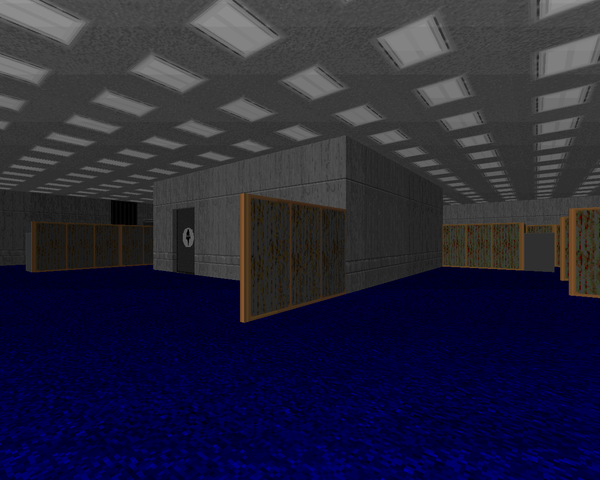
The amount of care poured into the levels is staggering. Check out those tiny faucets in the bathrooms, or the construction of virtually every chair. There are a lot of textures created specifically for signage, most notably in the nuclear plant and Phobos space port. Where Earth sought to pour the level geometry into rugged naturalism, Ritenour’s chief concern here is invoking the artifice of humanity. That’s not to say that PHOBOS is devoid of the caverns that virtually defined his earlier episode. The rocky landscape of Mars’s moon is apparent everywhere, with the first three maps housing small tunnels as secrets and the fourth with a cavern complex that dwarfs the actual "Command and Control".
The combat bears Ritenour’s indelible stamp, with fixed battles dwarfed by monsters that teleport, awake, on a semi-random basis into different spots in the level. Sometimes it works, and facing a horde of demons that’s looking for you as opposed to diligently waiting for your arrival is a nice change of pace. Other times you see arachnotrons and mancubuses crammed into places they don’t really fit. "Command and Control" has the same problem the subterranean portions of Earth had, where it’s too dark to see anything and your first warning of an adjacent commando is your rapidly depleting health. It’s certainly challenging, but the best method of circumventing the “challenge” slows the action to a crawl as you fumble around in the darkness.
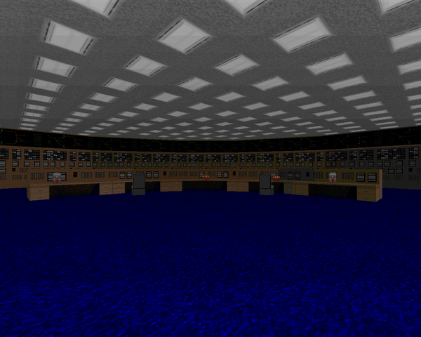
That said, I do enjoy the layouts and the exploration involved in each map. In spite of the drive toward "realism", they lack the kind of stale architecture found in hyper-realistic levels. Ritenour takes pains to establish a specific purpose for each room rather than a mess of nearly identical small areas. An office complex is reduced to a single mess of cubicles, the walls upon which you can nonetheless climb; the nuclear plant control room is greatly simplified, with only one console row that again does not impede player movement; about the worst example would be the nearly identical turbines in the nuke plant or the paired men / women bathrooms, but these are few and far between.
I prefer Phobos to Ritenour's Earth. It leaves a greater impression, from the very beginning, with Holst's "Mars". The maps are more distinctive and, though I have to agree that some of the tricks of Earth are quite breathtaking, I find the craftsmanship of Phobos to be superior. I would have liked to see Ritenour tackle the rest of "Knee Deep in the Dead", but he evidently ran out of interest by MAP04. I'd recommend a playthrough, though don't go in expecting anything close to the experience of the original Doom. The encounters are an acquired taste and if you're a stickler for the less representative composition of typical levels, you may want to sit this one out.


PHOBOS
by Roger Ritenour
by Roger Ritenour
WELCOME HOME, MARINE
This post is part of a series on
Doomworld's Top 10 WADs of 1998
Doomworld's Top 10 WADs of 1998
| Gothic DM 2 | Cyberdreams |
| Phobos | Earth |
| Venom | Tantrum 2 |
| DICKIE10 | Run Buddy |
| ODESSA14 | Crestfallen |


A very neat mapset for sure. I can't help but feel that it inspired some of Eternal's work (namely his remake of Map10 in Remain1.wad). The visual effects blew my mind the first time I tried this, and I still run through every now and again to keep it fresh on the brain.
ReplyDeletehvorfor kan jeg ikke downloade filen til mig selv så jeg kan overføre spillet til mit USB
ReplyDeletedet er mærkeligt. Pcen er nok ikke kraftig nok til det. hilsen benjamin
The full mapset is Pleides or something, Phobos is around the middle.
ReplyDeleteMore like Ritenour mashed Phobos and the original Pleiades together with some new material and added a bunch of ZDoom bells and whistles
Delete