VENOM
by Ola Björling
by Ola Björling
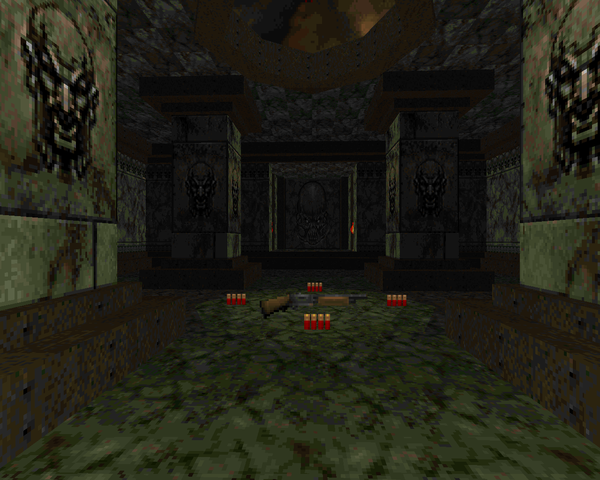
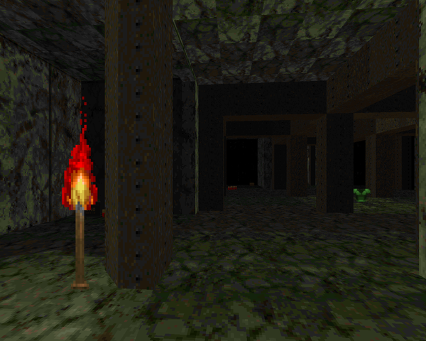
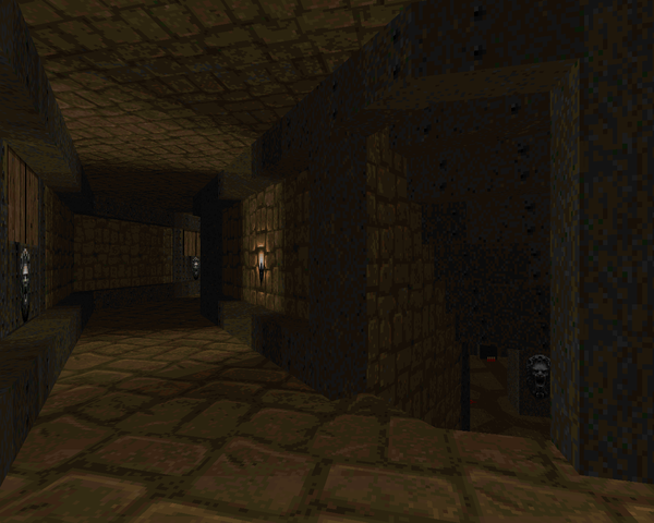
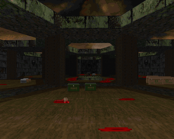
Before Ola released Tantrum 2, a remastering of his original Tantrum, he put out Venom, another MAP01 replacement for Doom II. The biggest noticeable difference between Tantrum (2) and Venom is that Tantrum is predominantly brown with a few green marble areas, whereas Venom is the opposite – mostly green marble with a few brown / tan brick sections. Otherwise, what you have contains much the same combat, if a bit toned down. As usual, Ola has no included storyline. Venom is just a celebration of the aesthetic pioneered in Thy Flesh Consumed.
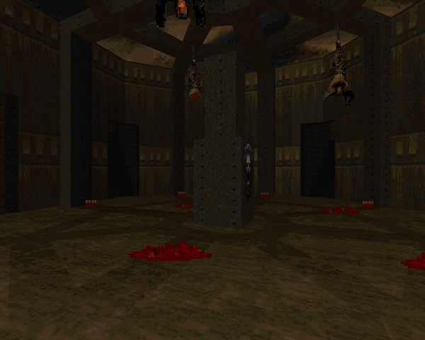
If the map has any real failing, it's that it's very linear, where Tantrum 2 had multiple ways you could approach certain areas. It's not a big issue unless you're into exploring. If you just want to run a Doom II obstacle course, then Ola has you covered. You start out in a marble-columned room and open up one of the map's four wings, fight your way to the end, then flip a switch that opens up a path in another one of the cardinal directions. The north wing is the longest and most intricate, while the end section is just a honeycomb of rooms you open in a clockwise direction until the center chamber, which houses the exit, is revealed.
As I said before, Venom plays like a less-abusive Tantrum 2. Certainly, Ola dumps you into a few dicey situations (one of which I'll say is pretty unfair to the player), but you usually have an out when dealing with the demonic hordes, like the invulnerability tucked into a corner of the northern murder pit. Other moments like the hell knight corps on the return or the chaingunner wave in the eastern wheel reward patience and attention to detail. The encounter I dare call unfair is the penultimate room. It's not so bad if you rush into the blind drop, but if you make the mistake of creeping up to the edge and waking up the baddies in front of you, there's a good chance you'll get squashed.
Venom is every bit as gorgeous as Tantrum 2. Lighting and detailing are phenomenal, as is typically the case with Ola. Just check out the torches in the hell knight corners or the entire eastern wheel room. The brown metal support texture pervades the map, but it's a nice contrast to the green marble, and doesn't feel at all obtrusive. The whole map is just incredibly well done, architecture and all. If nothing else, it's worth loading the map up with no monsters just to walk around and admire the care Björling has put into this marvel.
You should really play Venom. It's an attractive vanilla Doom II map with plenty of action to satisfy veterans. Björling once again outdoes himself; it's plain to see why it was chosen as one of Doomworld's Top 10 WADs of 1998. While it's not as fun in terms of exploration, it's still a great experience. I wish Ola had been as prolific an author as his contemporaries, like Malcolm Sailor, because he cooks up some great stuff. In any event, download Venom, run it in the source port of your choice, and have a blast. It's worth it.


...OR IS IT CARNAGE?
This post is part of a series on
Doomworld's Top 10 WADs of 1998
Doomworld's Top 10 WADs of 1998
| Gothic DM 2 | Cyberdreams |
| Phobos | Earth |
| Venom | Tantrum 2 |
| DICKIE10 | Run Buddy |
| ODESSA14 | Crestfallen |
I love your 'selection menus' for top ten wads for 1994-1998 and 2011 (and like I said in Planisphere 2, almost all of 2012, it just lacks a menu). Good way to organize. :)
ReplyDeleteI think at some point it should be a goal to get 1999-2010 fully covered as well, but of course I mean a long term goal. :)