Zones of Fear, released in 2012, is a
Boom-compatible megaWAD from the Czech Doom community, a followup to the "first" Czech community project,
Quake World, which shares many of the same authors. The Czech community has an unusual character, at least, from my limited understanding. On the one hand, the classic Pavel Hodek, who WADified one of the stories of the
Galaxia sci-fi serial comic. On the other, a handful of authors who love the
Hell Revealed style of gameplay, authoring
Kama Sutra and contributing to
Plutonia 2 (with
Kama Sutra 2 and more delights waiting in the wings).
Zones of Fear bridges this gap with something of a working man's megaWAD.
ZOF has no given story; the authors didn't play around with the text strings, so what you have is a varied collection from six different people, with three of them doing the majority of the ground work (enekli33, jaeden and Damned). As a whole, they tend to look quite nice, especially Damned's work, who manages to transform even Wolfenstein 3D's tired textures into something gorgeous. They're not exactly steeped in special effects, excepting a few 3D bridges here and there (or some great uses of transparencies), but I feel comfortable saying that Zones of Fear is easy on the eyes (if a little bright at times).
There are some problems, however. I initially balked at Zones after looking ahead at the sizes of the later maps. MAP30, the grand finale, clocks in at 2500+ monsters. That's a lot of monsters. That's not an issue in and of itself, but when you end up with a lot of repetitive architecture and fights, you start to roll your eyes at the padded-out monster count. I guess there's adventure in an epic battle (or several hundred of them), but I'd like to see what these guys can do if they put their heads together and play around in a somewhat smaller sandbox. Some maps have an interesting enough flow, but are just too big. I like the idea of "The City Run", for instance, but it drags on for too long and clearing the same packs of enemies over and over again doesn't make time go by any faster.
It's interesting to see exactly just how distinct the authors' styles are from each other. Damned is probably my favorite, with gorgeous layouts that remind me of something Dutch Devil might do, except more symmetric and not as inspiring in the encounter department. He also appears to stick to original Doom tracks for his levels. Enekeli33 could maybe stand to shrink the sizes of his levels a little, as they're really big and often feel empty compared to the monster density. His music choices are classic tracks of contemporary games, like Heretic, Hexen, and Duke3D. Jaeden's levels have the most sprawl (appropriately also being responsible for MAP30) and supplies a host of MIDIs of American nu-metal and similar things. The others I don't have the best picture of but are definitely imaginative in their own ways.
I think the authors are an incredibly promising group of talent, in spite of some of the disagreements I may voice about their design choices, and look forward to seeing what they can do in the future. Personally, I think they could stand to reign in some of that uninhibited enthusiasm for huge levels and avoid the kind of repetition in encounter design I'm seeing here, and maybe make things just a bit more player friendly. In the end, though it may be tiring at times, Zones of Fear is not a bad mapset; it can be pretty cool at times. It just exhibits a few qualities that are likely to annoy your average player (more so speedrunners). You ought to at least give it a try.


ZONES OF FEAR
by assorted authors
| Blood | MAP01 |
|---|
| by enkeli33 |
|---|
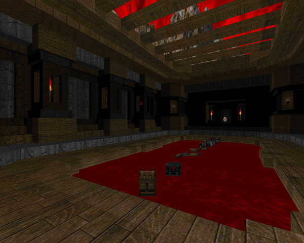
| Medium-size Hellish fortress on an island in a sea of blood. Blood is a pretty important motif, as one might expect from the title. It's a pretty slow-paced map; you'll be dispatching many of its ~140 monsters (largely zombimen and imps) with the pistol, the shotgun being relegated to cacodemon duty. The keep itself looks nice enough, featuring some clean, attractive architecture, let down by spartan detailing, which makes the large rooms look quite barren. Standout encounter is the yellow key room, where the floor caves into the blood, after which you're forced to deal with several waves of aerial opponents on restricted platforms. | 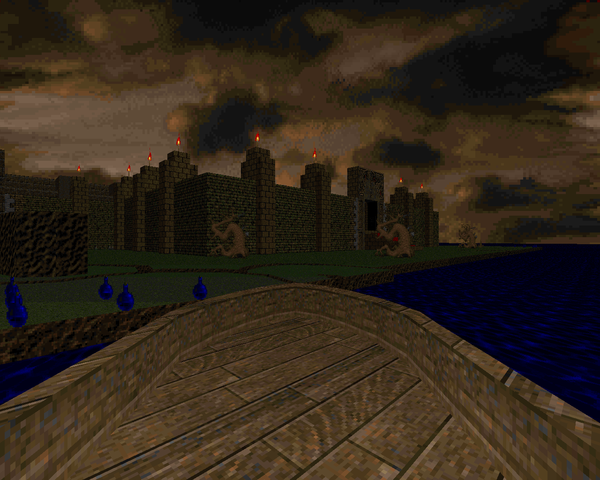 |
| MAP02 | Grim |
|---|
| by enkeli33 |
|---|
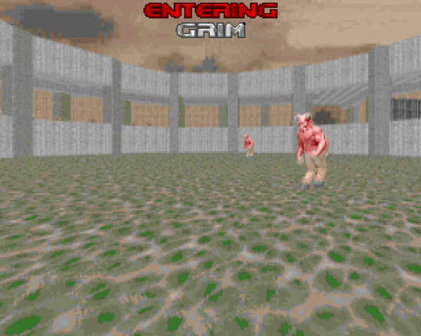
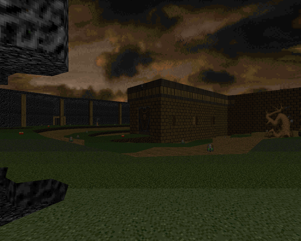 | Opens with a few large, barren yards but things pick up when you drop into the underground tunnel, with a horde of demons to shotgun down, followed by some cacodemons (and a pain elemental) before you pick up a handy SSG. It ends with an outdoor Hellish section that's not too tough, though a certain guardian might surprise you on the return trip. The action is a step up, thanks to the introduction of the SSG (and later the chaingun), but you're still mowing down hordes of low-tier enemies. The middle section (the demon rushdown followed by the cacos) is my standout sequence of the map, a nice series of encounters that put some pressure on the player. |
| City Centre | MAP03 |
|---|
| by Vasek "Damned" Havranek |
|---|
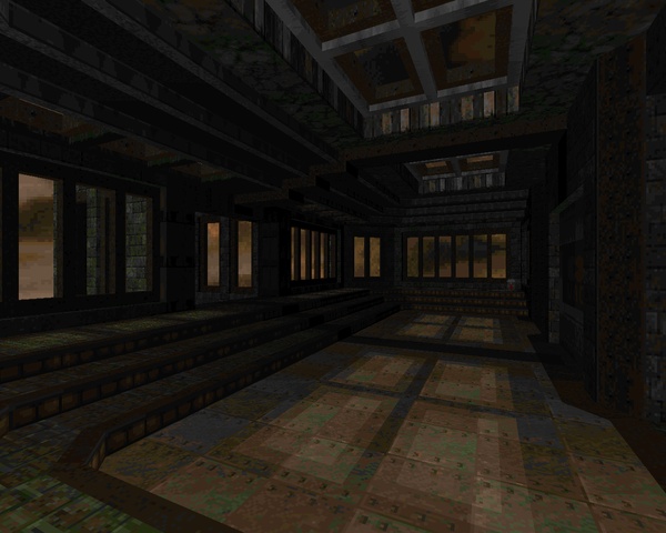
| This is a nice, clean techbase map that is nonetheless weighed down by the overwhelming symmetry of the central compound. Damned does a little bit to keep things fresh, like that blue key door annex, but running and clearing the mirrored hallways and red key door rooms makes the opening quite boring, imp ambush notwithstanding. Once you get outside, things perk up, with a mass of demons and spectres to kill, followed by the army waiting for you on the other side of the gate. I like the look of the black glass buildings on the exit walk, and the mancubus is a decent closer. |  |
| MAP04 | Naziland |
|---|
| by enkeli33 |
|---|
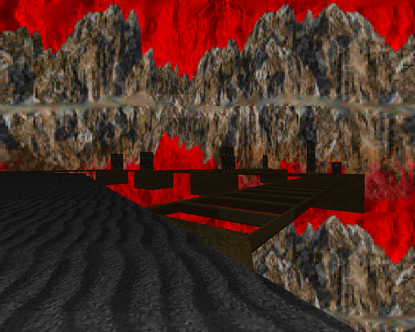
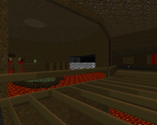 | The monster count initially intimidated me, but it's mostly trash monsters, including enough SS Nazis to make The Twilight Zone blush (most of them dispatched from a vast barrel trap). It's a huge level that actually feels empty at times, featuring a lot of underground caverns and several small fortifications. Starting out at the beginning, you can conquer the map's wings in any direction you so choose, victory resulting in a teleport to one of the three key pedestals at the end, part of a three-cog ground mural (actually pretty cool). The action is pretty tepid, the best fight being a revenant ambush at the megasphere, but the scenery's cool. I like the southern wing with the enormous bridges over blood. |
| Only Genuine Can Pass | MAP05 |
|---|
| by Vasek "Damned" Havranek |
|---|
| Phenomenal techbase that looks like something Dutch Devil might have made, what with all the carefully designed base components. It's got a few instances where you repeat identical encounters on left / right sides, but overall, I love it. The opening is rough, fighting hell knights, imps, and spectres in a tight space with a revenant coming to ruin your day once you grab some more ammo. It rarely lets up, with the finale serving as a cool series of battles. The sectioned-off cells are a good hook (wasted on identical monster compositions) but when followed up by that swarm of revenants, you'll be hopping and bopping. Looks great, plays pretty good. Dig that exit. | 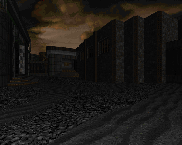 |
| MAP06 | UAC Warehouse |
|---|
| by jaeden |
|---|
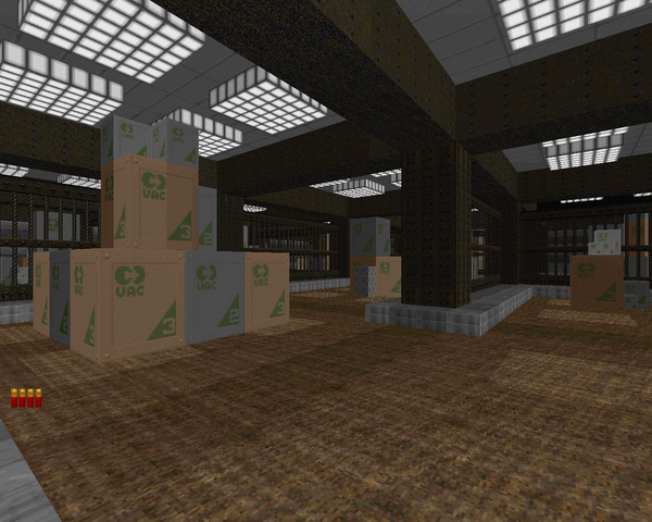 | A simple, pretty basic warehouse level from jaeden. There are some claustrophobic fights in the first half, followed by the larger stores shootout, which has you exposed to enemy fire (though light) on several sides, but with lots of cover. A few big annoyances... The air ducts battle at the end is not compelling unless you haven't figured out how to fight in tight spaces (in which case you'll be annoyed) and the blue tunnel section is baffling, with nothing to show but an annoying plasma rifle secret that can trap you inside. It looks okay, though. |
| Green Temple | MAP07 |
|---|
| by enkeli33 |
|---|
| This (obviously) marble temple is simple but pleasing. The encounters are too spread out, though. Most of your action will come from the wheel room (where cacodemons peek over the walls to ruin your day) and the finale, a "Dead Simple"-style arena fight that doesn't change things much. Some more monsters running around that enormous columned hallway would go a long way toward livening up the WAD, or maybe a cool encounter in the bloody hallway, one of the standout segments of the level. At the very least, it has a good Cyberdemon reveal. |  |
| MAP08 | Searching on Holy Ground |
|---|
| by des_arthes |
|---|
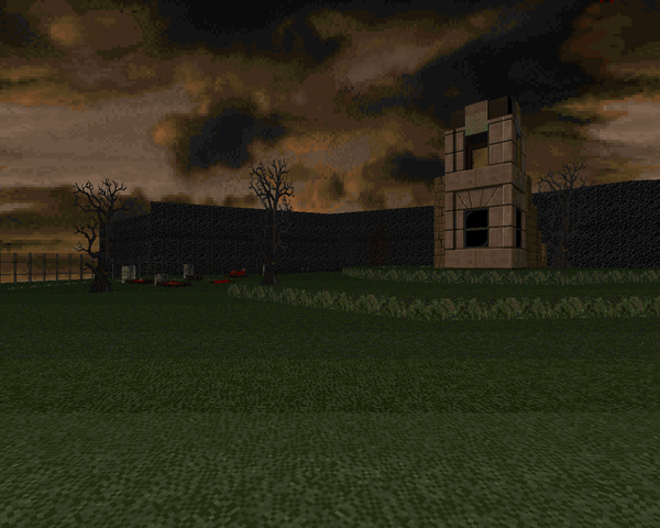 | A simple level based around a tiny, shelled-out cathedral. des_arthes makes some okay fights by cramming monsters into the opening area but segments like that arch-vile / revenant in the closet are a little too nasty. The graveyard, though, is fair game (my favorite encounter). Once you grab the red key the lights go out and a host of monsters silently arrives to cut you down. With all the hitscanners mixed in, you can't just circle strafe without a care. Once you get beyond the red key door, things calm down, with the biggest surprise waiting in the exit room. Decent little level. |
| Cathedral of Unending Dark | MAP09 |
|---|
| by jaeden |
|---|
| This is a large, marble cathedral (drawing perhaps some inspiration from Hell Revealed's "Temple of Fear") that has a level of detail on par with the earlier MAP05. While jaeden makes unusually good use out of the DOORTRAK textures, this level is weighed down by repetitive monster fights as many of the enemy packs have identical compositions, like the four mobs on the stairs or the interstitial hordes in the L-junctions. The fights are at their best when you hit the end of each leg. Though the walking dead to the west aren't memorable, the set piece is a nice breather, and the slaughter-ish section to the east is the clear standout fight, where progressively nastier hordes of monsters are ushered into a room designed for rocket and BFG combat. What jaeden manages best, I think, is the progressive darkening of the level's northeastern wing as you head deeper and deeper. | 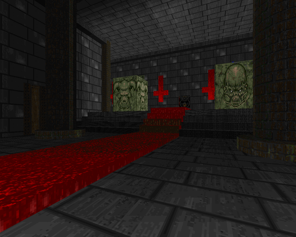 |
| MAP10 | Test of Patience |
|---|
| by enkeli33 |
|---|
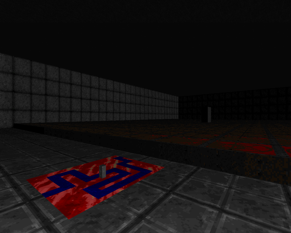 | This is a small, simple puzzle map. Well, it's more like a puzzle gauntlet, reminding me of Whitemare's "Ice Riff" (though far less refined). You have your safe space / crusher hallway, your hair-thin winding catwalk, your pedestal climbing acrobatics, and a few teleport mazes. The first one is easy to figure out; the second is the one that will be your true test of patience. Once you're on the other side it's some eye-rolling treadmilling before your showdown with two arch-viles. Don't worry – you have plenty of cover. |
| Caves of Agony | MAP11 |
|---|
| by jaeden |
|---|
| Borrows the look of "Circle of Death", especially for the large, opening area. Most of your fighting will be vs. imps in the outdoor, walkway sections. That doesn't make it any easier as the imps are spread out and you'll have to dodge fireballs from several potential directions. Couple that with some nasty traps, like the spectre ambush at the rocket launcher or the yellow key guardian, and you have a caustic cocktail. The most memorable encounter is the caged baron area that precedes the red key grab, as it's not exactly a picnic. Unfortunately, hitting eight close switches to open up access to the door is nowhere near endearing. | 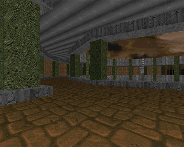 |
| MAP12 | Hexagon Castle |
|---|
| by klofkac and enkeli33 |
|---|
 | Interesting semi puzzle-map based around a hexagonal fortress and the outlying caves. You get a few pretty important clues which honestly should render the rest of the map to auto-pilot. The combat isn't that interesting, nor are the little side-puzzles. The major exception is at the heart of the keep, where stepping into the main chamber releases two HUGE hordes of revenants with an arch-vile in between. It's tough time ducking and weaving those rockets when you're hanging up on those interstitial bookcases. I like the hook of the clock which comes back in the ending, though. |
| An Unknown Hour | MAP13 |
|---|
| by Vasek "Damned" Havranek |
|---|
| Another very attractive grey and concrete techbase from damned. Like his other works, some of the level's beauty is marred by mirrored monster composition. Fortunately, the the layout leaves less identical packs lying in wait and more identical packs attacking from two directions – much more preferable. It's not as hard as MAP05, though you may find yourself doing some tricky rocket launching due to demons and spectres running around. The trickiest bits are the lost soul / pain elemental ambush after grabbing the red key and the return to the starting area. There's a mancubus assault on your position followed by a series of tricky firefights that ends with you rushing back to the beginning to stop two arch-viles from resurrecting the army you just slew. Pretty fun level. | 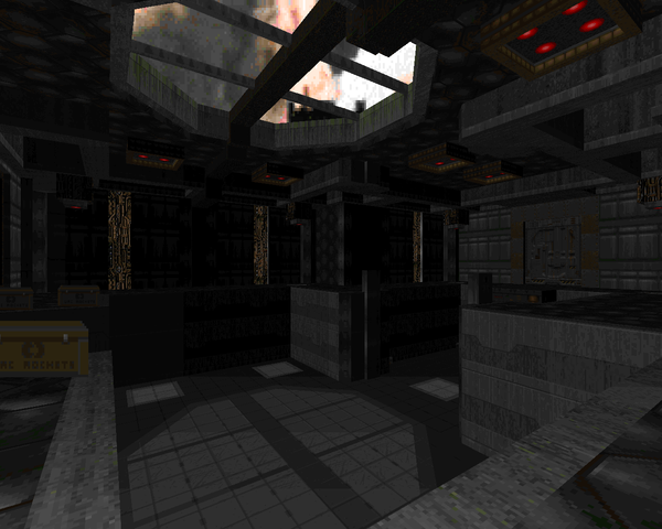 |
| MAP14 | Rusted Tower |
|---|
| by enkeli33 |
|---|
 | This very large fantasy-style level has some good aspects. I like exploring the rusted tower from which the level gets its namesake and enkeli throws in a few great fights, like the maze that abruptly appears behind you which he throws a few arch-viles into, or that swarm of cacodemons in the southwestern portion. However, it could stand to undergo some revisions. Running into the same hell knight / cacodemon encounter every time you return to the throne room is really boring and the finale is even worse, featuring twelve ranks of monsters lowered one by one into the east, west and north – three sets of troopers, three sets of sergeants, three of commandos, and three of imps. You could almost cut the northwestern section of the level out entirely. |
| The City Run | MAP15 |
|---|
| by jaeden |
|---|
| This city block looks good enough but after you battle the tenth identical horde of monsters out in the streets you're forced through your eyes will have about rolled out of your head. That's not to mention moments that must have slipped by playtesters, like the absurd teleporter trap gauntlet right beyond the red key door. The first group of monsters is decent enough, but throw in the hell knight / pain elemental pack followed by BARONS AND ARCH-VILES with efficient teleporters and no real estate and you're in for it. You have to budget your cell ammo so as to be fully stocked both for the hell knight and baron waves and even then hope things go your way, because monsters are teleporting in all around you. The enormous caged / teleporter crawl near the end is almost a breather as you have room to move and stir up some infighting. Basically, avoid. | 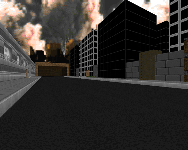 |
| MAP31 | Rivalside |
|---|
| by jaeden |
|---|
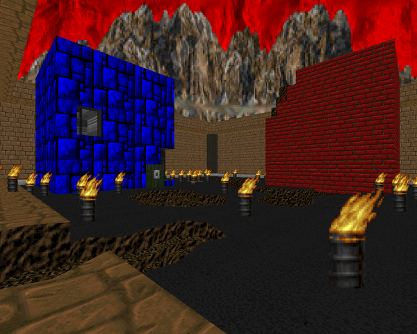 | This immensely silly level centers around a turf / gang war between SS Nazis and the Doom II zombies. Each one has a fort and jailed enemies you'll have to clear out and somewhere in between is the level's actual challenge – a gauntlet of tougher monsters released by cells into a small room that you'll have to fend off, closing with a Cyberdemon. Killing the opposing armies isn't exactly novel but it's a nice change of pace. |
| An Inglorious Basterd | MAP32 |
|---|
| by Vasek "Damned" Havranek |
|---|
| Damned puts together a very attractive base in his particular style using the Wolf3D textures. It's loaded with SS Nazis, with a few excursions to Doom's other monsters, but the presence of the troopers plus the proportional lack of health turns this into a corridor shooter. Use cover wisely and snipe the monsters when you can or you'll lose a war of attrition. The few incursions by demons are pretty riotous, like the wave of revenants you have to take down with a chaingun (harrowing!) or the pair of arch-viles you'll hope you have the BFG for, not to mention the three Cyberdemon salute at the level's end. The most annoying part of this level is trying to hit the Nazi snipers that autoaim can't touch, mainly in the fortress courtyard. | 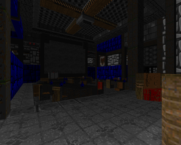 |
| MAP16 | The Mayhem |
|---|
| by enkeli33 |
|---|
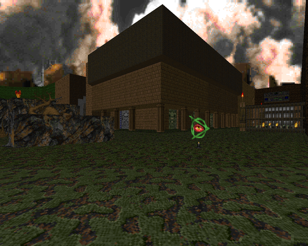 | "The Mayhem" is all about spectacle. You jump off the side of the bridge that isn't explicitly flagged as being dangerous, run into a non-toxic channel, and then dodge multitudes of imp fireballs while you clear out the courtyard. From there it's off to a huge platforming section where you jump from giant column to giant column, downward to where the key cards and skull keys are hidden away. I'm not too particularly enthused with this part as it's tough to see where you're jumping, though warp pads in the muck will port you to specific platforms if you miss. My favorite section is that concrete columned area to the south, which gives the hallway an unusual texture. |
| Circle | MAP17 |
|---|
| by enkeli33 |
|---|
| Enkeli pushes out another monster of a level, this one an enormous underground network of sewers and caverns. While it's aesthetically pleasing and has some cool areas, like the outdoor spillage to the west or the main base chamber, there is far too much strolling through identical areas fighting indistinguishable monster formations, like the curved piping full of mancubuses / arachnotrons or the outer circuit of the southern fortress, with packs of commandos and imps in the outer chambers. The northern area isn't that much better, the only solace being the flooded crate room, which has curiously boxed-in barons, I'm guessing to keep them from standing underneath the entryway. | 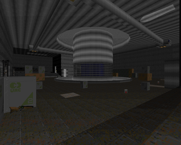 |
| MAP18 | Godless |
|---|
| by enkeli33 |
|---|
 | Oh, cool, a short level. It's on some kind of an island with a wooden fortress built into it. After emerging from the start, you fight your way through the wilderness to the main entrenchment, with an underwhelming showdown in the blood pit (cool look though) and a frenzy of spectres ambushing you. There are some arachnotrons stomping around outside the map bounds, but they're not much of a threat. Those twin pairs of hell knights at the beginning had me worried, but the rest of the map is pleasantly varied. |
| Gate That Leads to Hell | MAP19 |
|---|
| by enkeli33 |
|---|
| If the monster count intimidates you, don't let it. This is a pretty straightforward slaughtermap with an adequate weapon loadout once you make your way up that first rocky staircase. Enkeli teleports you to three different places, each one exponentially smaller than the last, only because the first is a huge, winding canyon in Hell where he attempts to surprise you with teleport waves consisting mostly of imps and demons. With all the ammo laying around, he could stand to throw some revenants in there and make the player sweat. The other memorable section is a looping climb on the edge of a crater where packs of cacodemons are revealed at certain intervals, so for maximum fun, you should just sprint all the way up to save BFG ammo. For a slaughter, it's pretty chill. (And that blinking T is hilarious.) |  |
| MAP20 | The Rift |
|---|
| by jaeden |
|---|
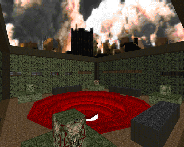 | It's a huge fusion of temple and techbase with a lot of outdoor sections. On the one hand, the rift itself is a cool reveal and easily the least annoying part of the map, with the potential to get a cloud of cacodemons to infight the four Cyberdemons or get some cross-fighting going on between the barons surrounding them. I also like the platform room ringed by imps that requires some deft handling. On the other hand, there are some big design decisions I strongly dislike. That long chasm to the southwest has enemies at the top that can't hit you that well but take forever to kill. I despise that network of identical rooms to the west, ten chambers, eight of which have a mancubus in one corner, a baron in the opposite, a handful of imps, and a computer mainframe that you have to carefully skirt around. There's a silent crusher, albeit near the beginning. It's less annoying than MAP15, at least. |
| Peace | MAP21 |
|---|
| by enkeli33 |
|---|
| Enkeli offers up a low key slaughtermap rendered in beige brick. It's actually kind of fun as most of the difficulty comes not from the heavier monsters spread around the level but the hordes of imps (and some pinkies), a true measure of demon wrangling. If you don't like the SSG, you might want to sit this one out, as you'll use it a lot to neutralize the 350+ enemies, though you can certainly grab the rocket launcher (and BFG) for taking down tougher targets. Action mainly involves clearing the larger areas to get all six keys so you can flip the switch that raises the bars to the exit. That conveyor tier to the south was a nice little gimmick, while that southeastern imp ambush room is entirely underwhelming. | 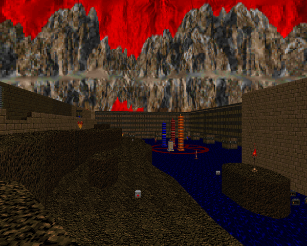 |
| MAP22 | Undersite |
|---|
| by jaeden |
|---|
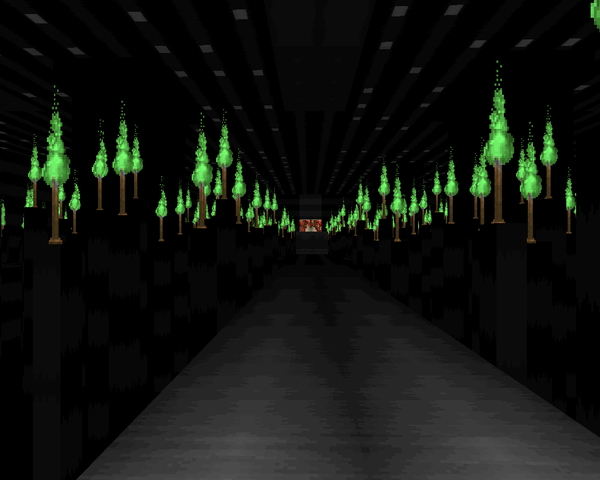 | Okay, this is a pretty cool map. It's got a lot of themes rolled into a complex, rough and tumble level with some great visuals, chiefly that green torch arachnotron room. "Undersite" has a load of challenging combat scenarios including a few Cyberdemons so I'd keep a save handy if I were you. There's the initial foray to the northern region, that pillar climb with the Cybie and hell knights in the center, and the finale, an imp assault worthy of "Knockout" where any spare cells will be put to good use. The only fight that really falls flat to me is the room just south of the start, which has four chambers packed full of imps that are revealed one at a time as you flip the switches in the alcoves. Just let them all loose at once or pack some nastier beasts in the others. Still, very fun. |
| The Conquest | MAP23 |
|---|
| by enkeli33 |
|---|
| Enkeli claims inspiration from Alien Vendetta's MAP31, which I haven't played, but judging from a quick read, he's themed each of the three wings you will be visiting after a certain color. There's blue, green, and red. The red area is short and sweet, with a neat cryptic teleporter pad as a set piece. The blue wing has the lion's share of the cool fights, with a spectre ambush in dark blue water that will earn the ire of some (especially if you didn't grab the hidden BFG). The green marble area I'm not so fond of, mainly because of the looping paths to the northeast that pad out the monster count with hordes of imps and varieties of zombimen that don't add much excitement. The blood cistern and giant jaw (well, the IOS one too) were very cool, though. | 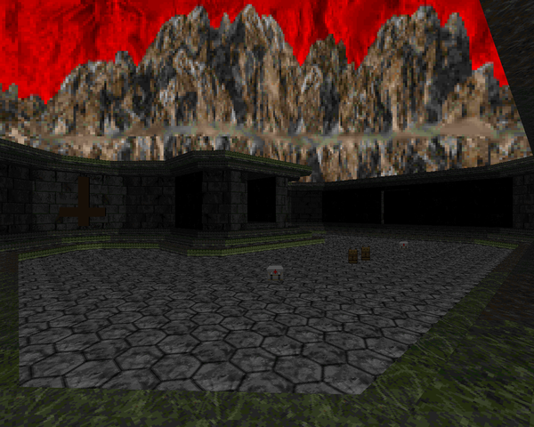 |
| MAP24 | The Riddle |
|---|
| by jaeden |
|---|
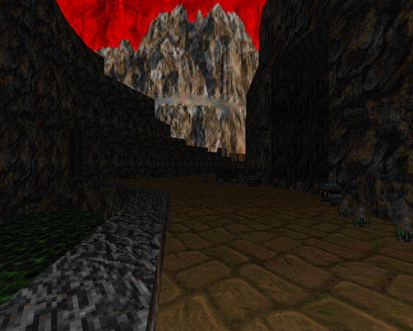 | This level is entirely too large for its own good. It's a huge, rocky and mostly outdoors. It's based around a wheel-shaped hub with four branches out to four enormous arenas, either featuring a Cyberdemon as its centerpiece or three masterminds in the case of the other. There's something to be said for the visuals of these battlegrounds, but they are too spacious and very much a pain to deal with, not to mention having to go back through the level after finding all six keys and hitting the switch on the side of every key door. There are three for each quarter and have (mostly) stale monster packs inside. Jaeden also uses the same trappy gimmick twice – traversing a spiral tunnel in a dark space with spectres in your way. Really, condense the most annoying parts of this level down (like the cacodemon / mancubus bridge zone which takes far too long to corral) and you'd have a pretty well-muscled fighting machine. As it stands, I'm bored. |
| The Oblivion | MAP25 |
|---|
| by enkeli33 |
|---|
| Wow, that's a lot of monsters!...or not. "Oblivion" has a very cool look with the gray stone arches and rows of columns. At its heart, it's a very simple slaughter map. There are a ton of powerups and a ton of ammo, but the only time you'll be at any real danger is during the first wave, which has a bunch of hitscanners. After that you can just circle strafe around the teleporting monster packs only pausing to dart into the next lowered teleporter, which will release increasingly threatening waves of monsters. I think the only times I used the BFG were at the beginning, thinning out the baron / hell knight horde to get to the next platform, and mopping up the cacodemons at the end. The final wave is...not that impressive. Still, it's pretty fun. |  |
| MAP26 | Tower of Blood |
|---|
| by jaeden |
|---|
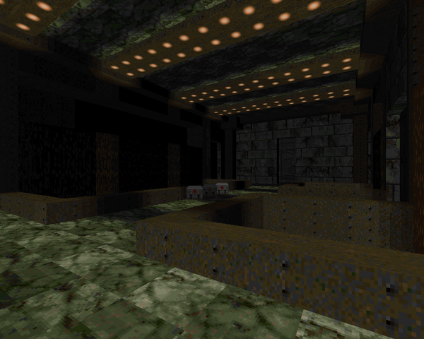 | Jaeden made a gorgeous marble and blood level but the gameplay is awful. The opening isn't too bad but hotfooting while being hailed by fireballs from mancubuses and then barons is unforgivable and that pain elemental clusterfuck right on the other side of the baron alley isn't much better. Throw in a criminal amount of backtracking made even more confusing as the tower is a faux-3D assemblage of floors connected by teleporters (a la Black Tower) and you have one sexy but frustrating death trap. That slaughter floor (the northeast section on the automap) is almost babytown frolics compared to the unfair combat situations. |
| Deeper and Deeper | MAP27 |
|---|
| by enkeli33 |
|---|
| This is a surprisingly light level. Sure, it's big and it's got over 300 monsters, but it reminds me of TNT's style, i.e. tons of lower tier monsters from zombies to imps with some nice bits of architecture (like the baron / hell knight teleport ambush room). The gimmick is that you are heading deeper and deeper, until you are 500 something (meters?) below the earth's surface. It's mostly caverns interspersed with techbase segments. I couldn't really tell you a standout fight, though that first cave assault where cacodemons backed by an arch-vile boil out of the walls is one of the strongest moments. Pretty fun, if very linear. I like the goofy crate secret. | 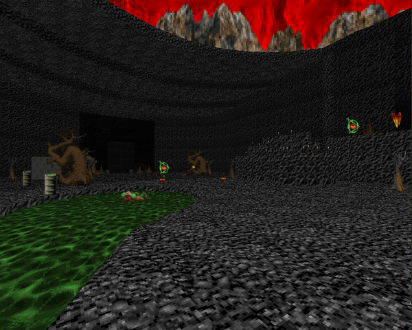 |
| MAP28 | The Fallen |
|---|
| by Pavel "pipicz" Tvrzník |
|---|
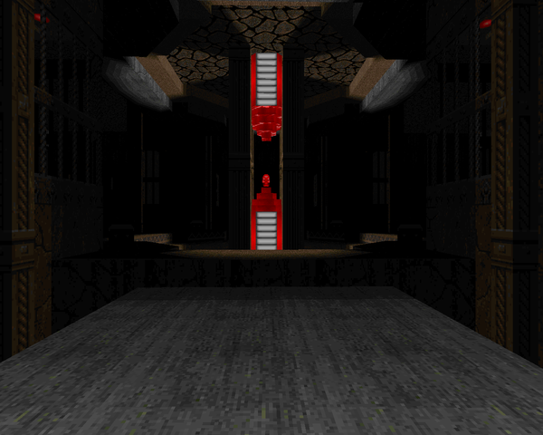 | Pipicz releases a monster of a level that cites a number of influences in the vein of "The Living End", most important to him being Anders Johnsen's "Dark Dome" from Alien Vendetta. The biggest concession is that the bloody floor doesn't damage you. Keep moving and fighting your way to ammo stores. Turret monsters have been interred on virtually every wall, alternating pockets of revenants and hell knights. If there is any complaint, it's that this dark and gorgeous map is absolutely bilaterally symmetric. Everything you do on one side of the map is mirrored on the other. On the positive side, that means once you suffer through one ambush, you're prepared for the second! Knowing the secret alcoves (especially the commando entrenchments) is a must. It's kind of fun, but grueling, so beware. |
| Rotten | MAP29 |
|---|
| by enkeli33 |
|---|
| Enkeli finishes out the regular set with a large, mostly castle-style level that's normal combat punctuated with the occasional slaughter. The architecture is maybe a little bigger than it should be, but I'm actually pretty pleased by the stuff he put in to fill the giant hallways out. The only places that feel barren are the caged area in the lake of blood to the west (an enormous hell knight / baron BFG blast) and the mancubus / arachnotron room just north of the main hall. It's not that tough unless you're careless, as you're practically handed the BFG and tons of ammo on a silver platter. The trickiest it might get are the revealed ranks of monsters in the finale or the dual Cyberdemons guarding the yellow key door. A nice way to lead in to the end. | 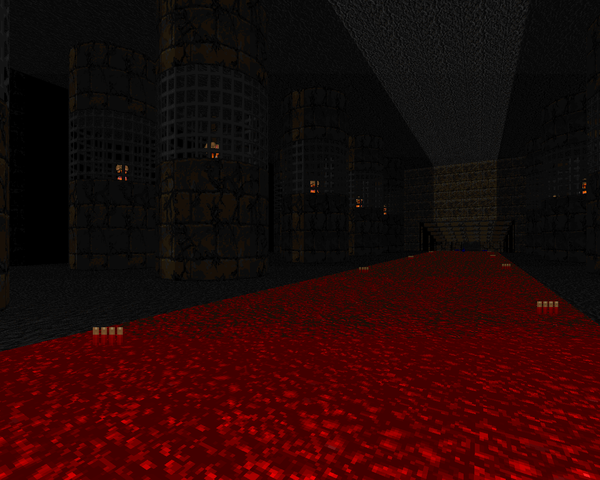 |
| The Doomcore | MAP30 |
|---|
| by jaeden |
|---|
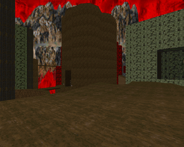 | With roughly twice the monster count of "The Oblivion", MAP30 is an experience all its own. It's an enormous gauntlet, and some aspects of the architecture and layout are very neat (like the way the route through the level criss-crosses and you head back through collected key doors), but there are several major points which really drag it down. First, as seen in "The Rift", there are plenty of monsters parked on ledges that you'll never be able to effectively kill and which will rain unseen death upon you. Second, there is a three dimensional maze echoing his fascination with air ducts, except practically every cube of space is occupied by a lost soul. Very boring. Finally, the boss shooter that ends it, where you have to run three puzzle-style gauntlets before you can raise the column to get at the head. An extra megasphere or two would really help get the player to the final confrontation. Standout encounter? Like I could ever really pick with a draw pool this huge. Fans of Deus Vult-style epics may want to give this madness a shot. |
KDE DOMOV MŮJ?




Thanks for you review :) Plenty of people told me the maps are too big. And I promised all of 'em my future maps will be smaller ;) (enkeli33)
ReplyDeleteJust finished playing this, and decided to browse the review of it. I have a lot to say, so essay post coming up =P.
ReplyDeleteNice review as usual, and it pretty much mirrors how I feel about the maps, a lot of neat ideas, but way too much repetition and padding. I liked Damned's maps, though I sometimes feel as though the maps were made by a very sophisticated map generator due to the symmetry and copied detailing throughout the rooms (I know this is a weird and personal complaint, but I still really enjoyed them.)
Despite their length, I think I liked all of Enkeli's maps, and his style was pretty well-defined (medium-to-large map with medieval resources containing groups of same-type monsters). The difficulty in his maps also seemed to be a little more tame compared to the others, so they felt like breathers in between brutal beat-downs. I'm glad that he is going to try making smaller maps, as it may encourage more creative monster placement. Its something I should probably do with my own maps as well actually :P.
To be honest the maps that dragged on the longest to me were not any of Enkeli's maps, but jaeden's map 25 and 30, in which I ran and skipped past most of the encounters if possible. Something interesting I noted about jaeden's style is that it starts out pretty unrefined and basic early on in the megawad (map06 being an example of what I mean), but that with each map, his style seems to improve quite a bit (take any of his hell maps for example). I think my favorite map of his (and my favorite map from the wad in fact), would be map 26. It was pretty atmospheric, and I liked the notion it gave of navigating a tower (despite some of the confusion it entailed). I am glad he provided crushers for the pitch-black closet monsters.
Now for the outliers. Map 8 was a short but quaint little doomy-realism map, with a graveyard segment that caught me off-guard and murdered my face. I liked map 12's simple puzzles. Map 28 felt like the token stone + blood monster-fest map that is found later episodes of every hell revealed style wad. I enjoyed it, but I had to think of a strategy to beat it.
In short, it was a pretty hit-or-miss megawad, but it was enjoyable for the most part. I look forward to any more stuff put out by the Czech crew, and I think the feedback on this wad is helpful to them. =)
Yeah, jaeden was "most improved", too bad all that energy went into developing repetitive monster levels. BTW, did you mean jaeden's MAP24? MAP25 is a pretty short slaughter from enkeli that has a ton of gray. I also agree that damned's detail borders on the fetishistic, as is the case with the HeDRoX series. He makes interesting fights, at least, which is something that seems to escape El Rodo.
DeleteOops, yes, I meant map 24 =P.
DeleteThanks Kassman. ;) My maps looks like from generator, because I mostly don't have idea, what I really want to build.
DeleteJaenden improved a lot during the work on this megawad, but he also became megalomaniacal.
I am quite surprised you liked his map 26. The first version he submitted was hard and annoying. I decided to make some changes in the map like adding the crushers in the dark area and lot of elevators and teleports from acid pits.