PHOCAS ISLAND
by Chris "Chopkinsca" Hopkins
by Chris "Chopkinsca" Hopkins
Chris Hopkins was something of a Doom community fixture in the mid-2000s, though he's still around. While he's most famous for Phocas Island 2, his crown jewel had to come from somewhere. To wit, Phocas Island. Released in 2004, it's a very large single level for ZDoom, occupying the MAP01 slot. The plot is pretty simple, considering that it's a location-driven story. And, well, it's not much of a story! You're shipwrecked on an island, which you quickly find out is populated by demons and their ilk. Are you prepared to clean the island out in your attempt to find a possible means of escape?
Phocas Island is a very large level, and it should be played on HMP unless you're rocking some kind of crazy mod. Hopkins says that only the best Doomers should bother with UV, but the thing placement is a cruel joke which I quit after grabbing the red key due to monster density paired with three or four arch-viles at key choke points with you limited to basically the shotgun. I'm sure that there's a way to best the cyclone of horrors, but I'm guessing that it's very slow and beyond my patience. HMP is infinitely more manageable, though the level's pace makes it one big shotgun (and, later, combat shotgun) grind down a very pretty corridor.
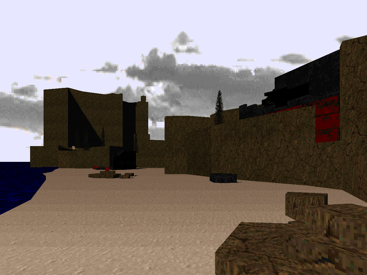
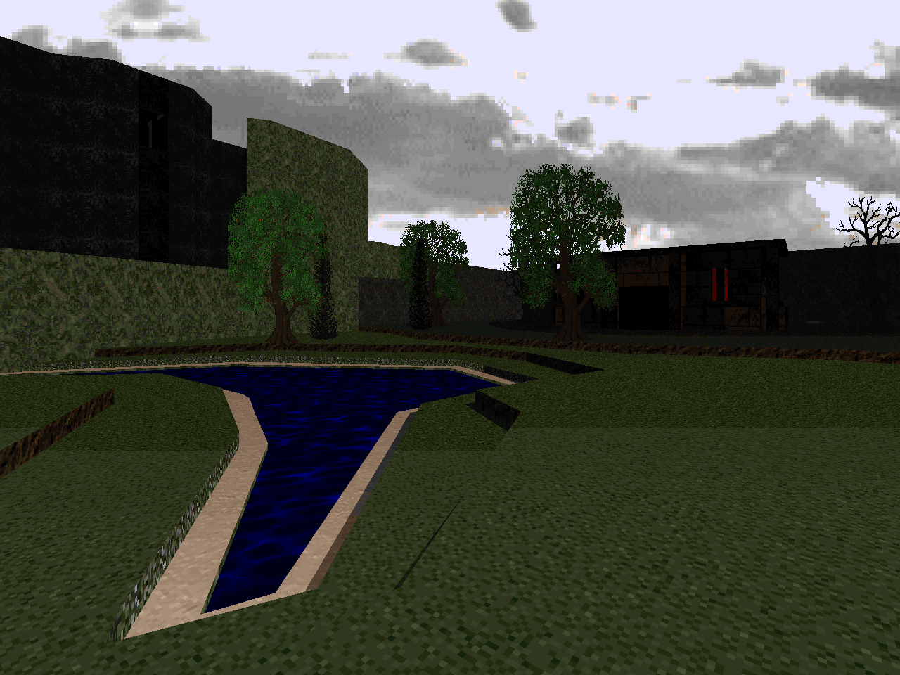
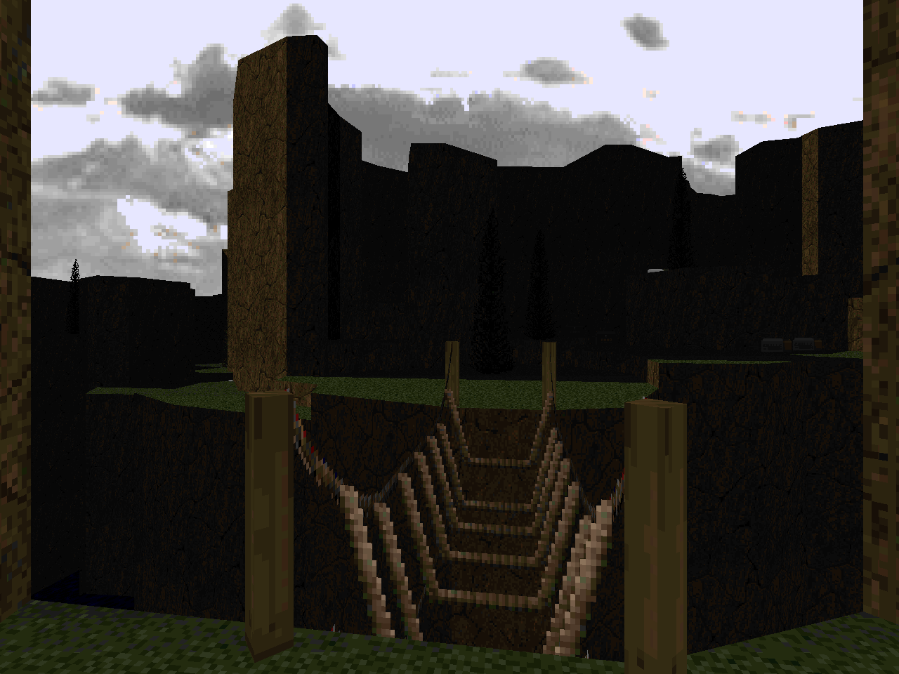
The main draws of PHOCAS aren't the encounters. This PWAD is all about setting and atmosphere, and it delivers in spades. Hopkins uses slopes in a great way to make a naturalistic environment complete with wreckage scars and while it's kind of awkward slip-sliding down them in bits like the tunnel segment that dominates the level's opening portion, it's a refreshing change from the meticulously flat topographic oceans that Doom's landscapes are born of. I also love how they're used in the temple section. Hopkins is very good at using slopes in basic but fundamental ways to improve the character of the mapset while avoiding the trap of over-detailing.
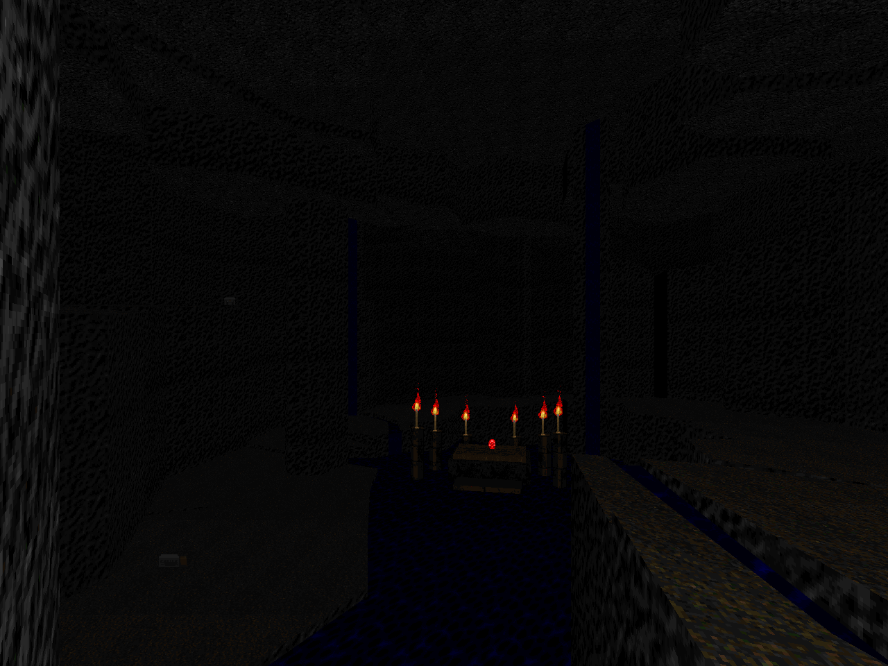
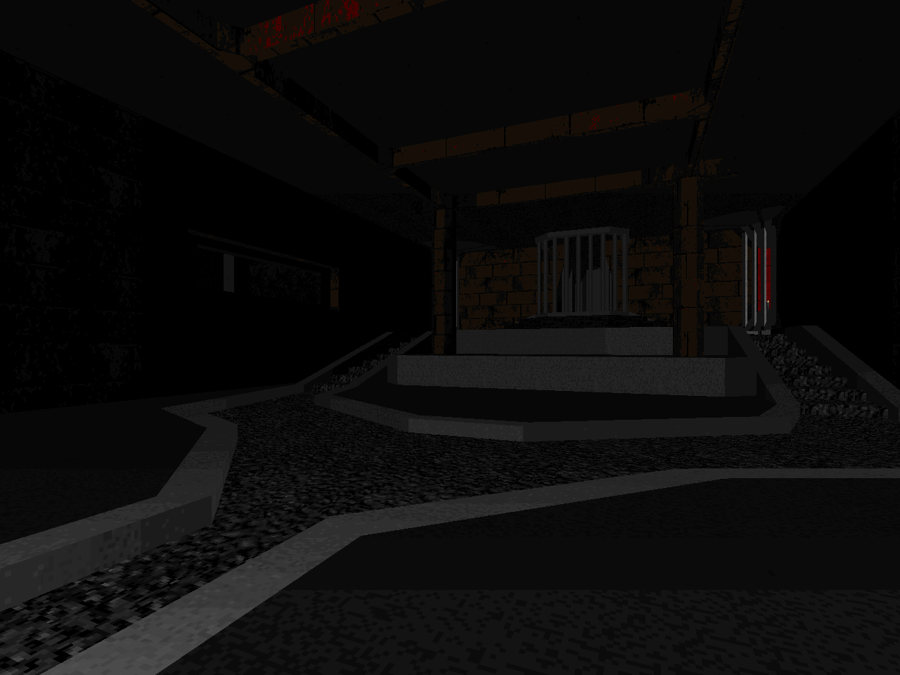
Another important element of this level - the shading. Chopkinsca has spent a lot of time shadowcasting to create stark but beautiful scenes cast by the light of a setting sun. At least, I'm assuming that Doomguy's west is cardinal west. It's easy to overlook but very gorgeous, again in a simple but fundamental way. The interior spaces are understandably much darker but contrast in lighting is everywhere and a big part of Phocas Island's appeal. I also love the music choices (keyed to specific areas), pulling from Duke3D and Squaresoft. Some people may find "Plasma" overdone, but it did a great job setting the mood, and while I'm not as up on identifying my Square tracks as some people, the picks from Secret of Mana are very smart.
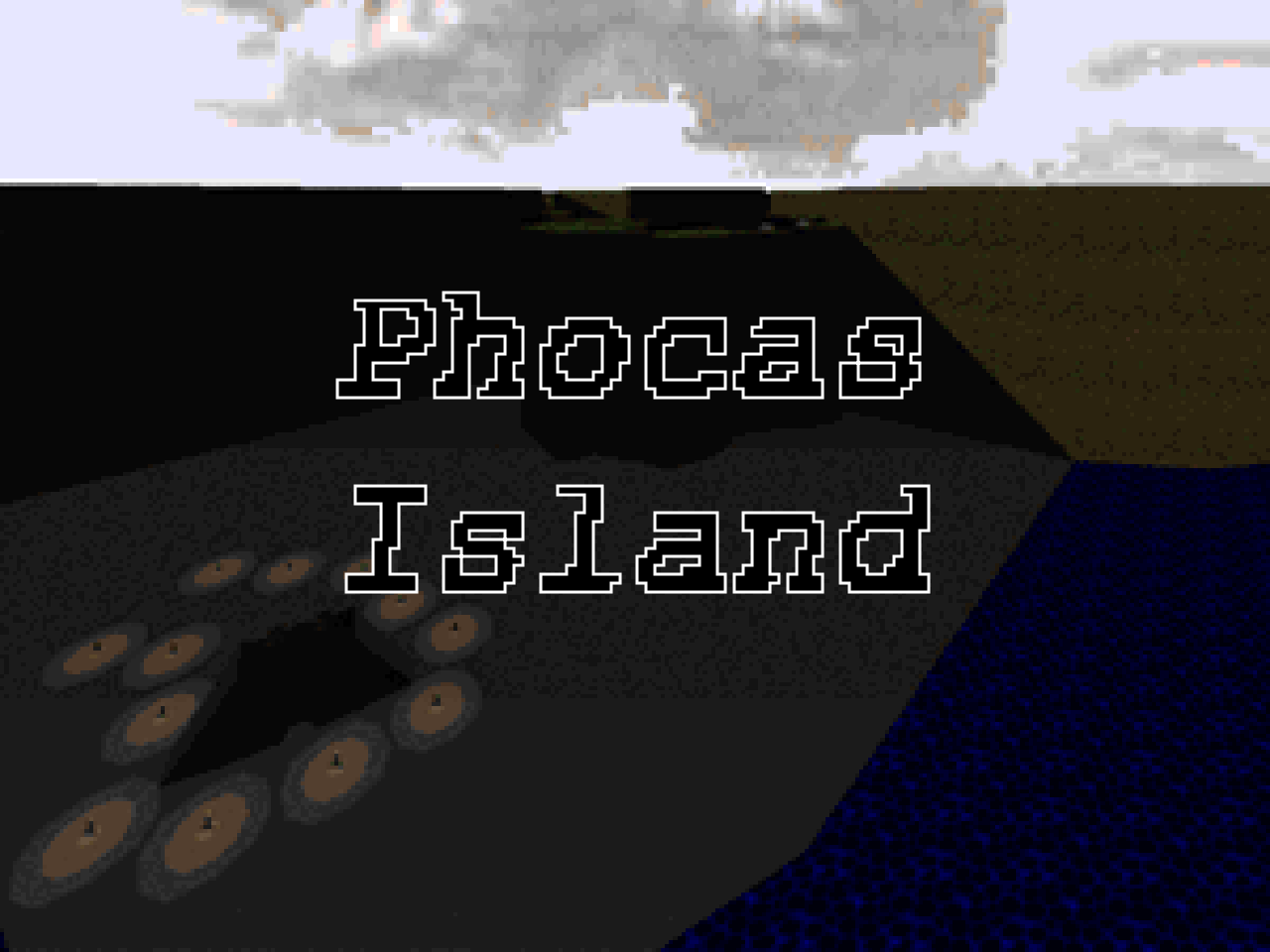
Hopkins does a pretty good job making the secrets feel more out of the box than usual. At least, from what I'm used to. I think you have to rocket jump into that hutch overlooking the starting beach. Well, that's what I did. There's also that ominous shrine from the titlepic, which resists all methods of approach beyond simply bounding over the beach and into the ocean, though I only figured that out after slaying the rest of the monsters without the aid of the secret plasma rifle. C'est la Doom! The early rocket launcher secret is appreciated, and if it had any more rockets stashed away it might be a viable way to complete the red key fight on UV. There are also tons of goodies hidden under water, though it's dark as fuck down there.
Yes, I absolutely suggest playing Phocas Island, even if you'll only deign to experience it as a tourist. The amount of work put into building atmosphere warrants an investigation, and if the sequel is anything like it, I'll be doubly impressed. Just, uh, play it light with that difficulty slider, eh?


NO DOOM WAD IS AN ISLAND
No comments:
Post a Comment