Way Too Many Dead Guys is Urthar's first release, a seven-map episode for
Doom II published in 2015 that targets limit-removing ports... and, the author recommends, something that also disables infinite actor height. Personally, I only ran into a couple of problems with cacodemons biting the top of my head. While this PWAD isn't on the archives yet, it's pretty much finished, and it's definitely worth a play. Urthar shows a lot of craftsmanship and a style that is very much his own in terms of architecture and what he decides to fill his architecture with.
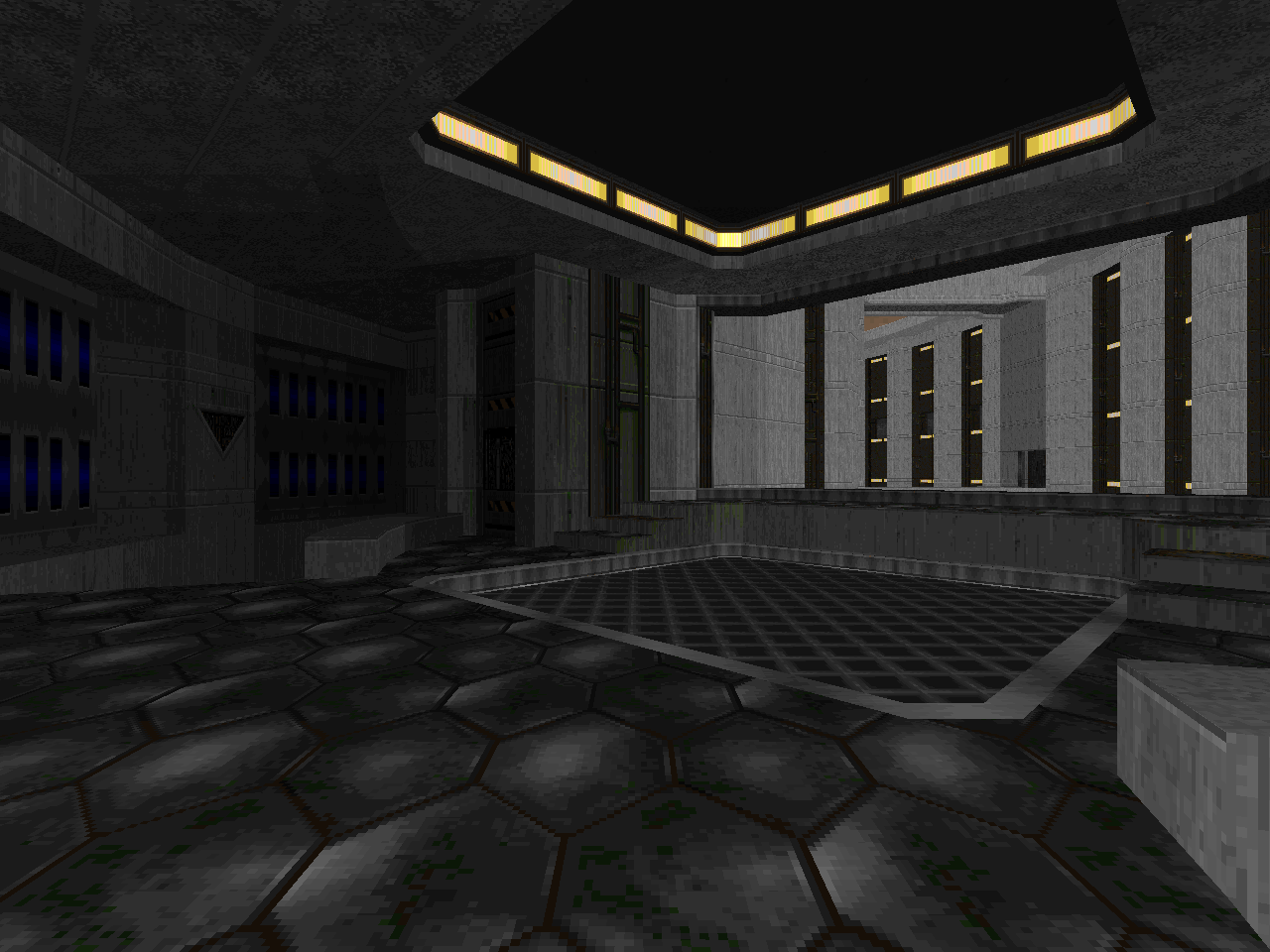
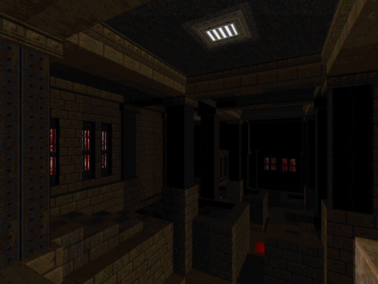
WTMDG does not have a written story; as of this writing, it doesn't even have a .TXT. There's an implied narrative, though, that takes the player through the bowels of some monolithic UAC outpost in search of the source. Per usual, this heavily involves the station aqueducts, sewage, and nukage channels. When you finally make your way through, you'll find that Hell's outpost isn't any more hospitable, passing through a glorified torture cage before the marble palace that lies beneath. The entire journey is wrought from enormous, monolithic architecture that leaves an impression of great depth, as though you're only battling through a tiny fraction of what must be a massive complex. This effect is at its greatest in "Contact" and "Descent", which shows something in the Star Wars scale of Imperial construction. It's refreshing to see this applied in the context of a techbase, since the usual size of UAC tech tends toward something more squat.
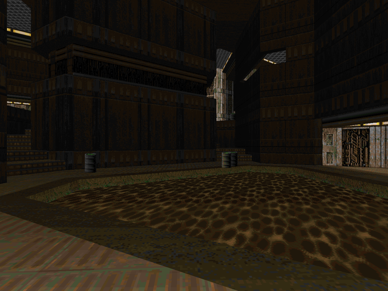
Urthar also has a uniquely geometric sense that grounds his designs as I imagine an engineer would. Take the circular sense of MAP01, or the triangular (isogonal) hexagons in MAP02, or all the half-realized octagons of MAP03, then back to hexagons and triangles in MAP04, not to mention the pentagons of MAP07. It's all there, but it's developed in such a fashion that it never becomes stale, looking beautiful on both the automap and in person. In direct contrast, Hell proper has nothing to do with the curvilinear slice offered in MAP04. It's overwhelmingly orthogonal, interesting when juxtaposed with the more interesting shapes that dominate the rest of Way Too Many Dead Guys. An unconscious commentary on the Hell of rectangles in Doom level architecture? Or is Hell just playing it straight, for once?
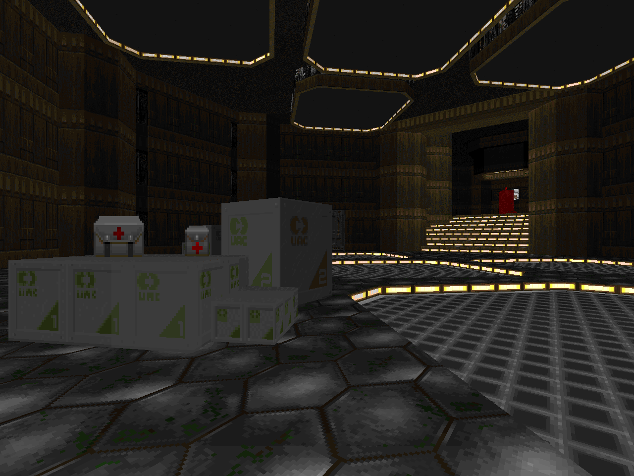
While much of WTMDG is built from mastodonic masonry, Urthar leaves the player acutely aware of the space involved rather than fill the areas up with demon flesh. There are only a few instances where you're flooded with monsters, the largest being an enormous teleport ambush in MAP04 - the only one of its kind. The only other encounter that really comes to mind is a two-pronged assault in MAP06 that's still mostly built from demons and imps. Much of the time, you're on the catwalks that surround the pits around which these structures are built, trading potshots with monsters that are just as grounded as you are. MAP05 takes this concept to its logical end, with the main crossroads built from tiered gangways, your only sources of opposition corralled into cubby-holes built into the outer wall. The resulting atmosphere imposes on the player from sheer architecture alone.
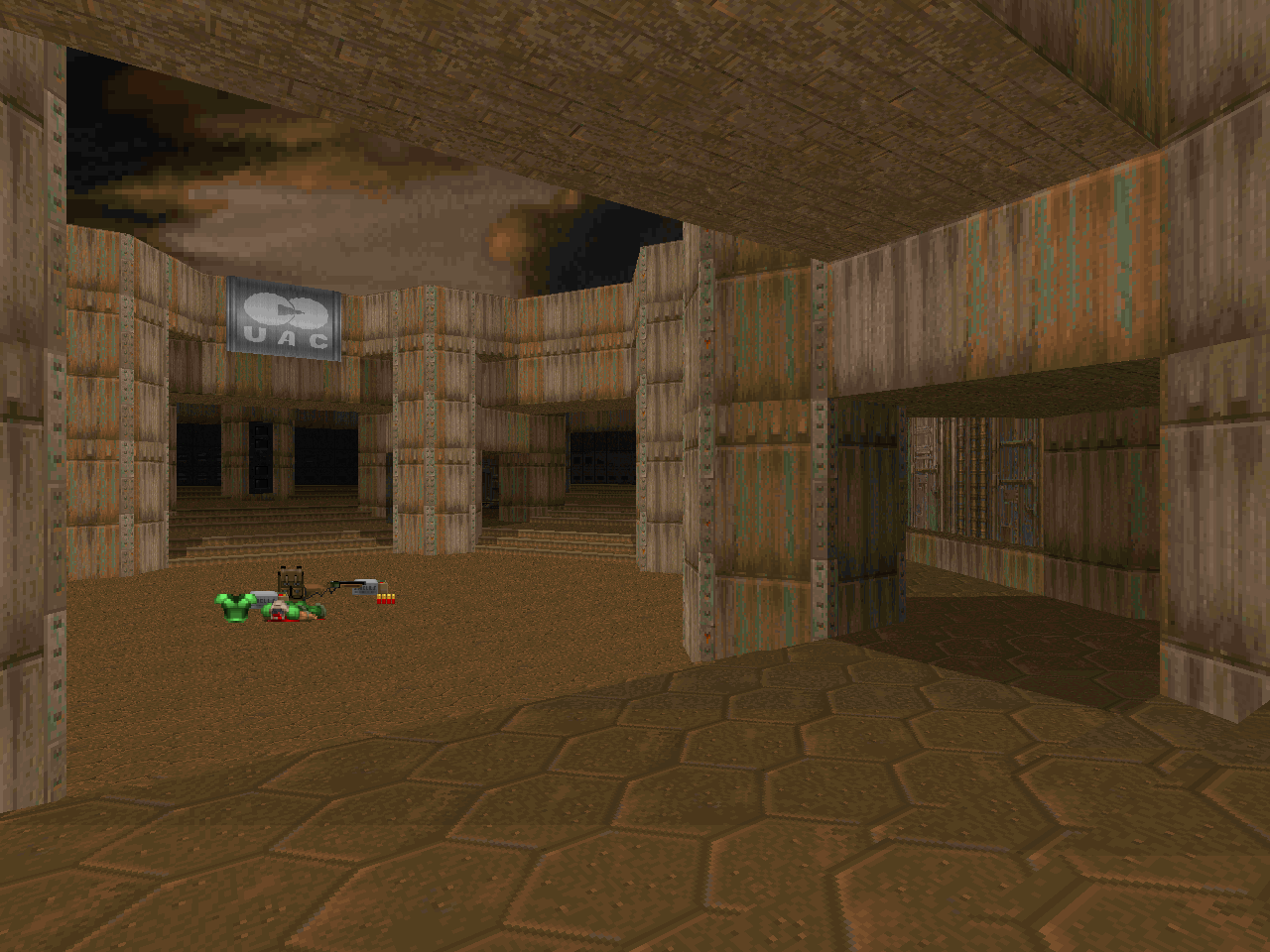
Geometry isn't the only thing dividing the first four levels from the second two. MAP05 marks the beginning of set piece encounters as the dominant force, with some pretty dastardly setups. At least, they feel cruel when compared to all the stuff that has gone before. MAP06 combines the two for a few relaxed-pace areas contrasted against a couple of locked-in encounters that will put your contortionist skills to the test... as much as I would expect from this style, anyway. It's an interesting change of pace and speaks pretty well of what other tricks the author might have up his sleeve.
And, really, that's one of the best aspects of Way Too Many Dead Guys. Urthar has a distinctive style, and we've only seen seven-ish levels of it. What other delights await in the future? Only time will tell. Until then, enjoy these precious polygons.

WAY TOO MANY DEAD GUYS
by "Urthar"
| Contact | MAP01 |
|---|
| A pretty cool intro and I assume a sign of things to come. Urthar uses a clean and attractive architectural motif to create a true sense of place, like this could really be part of some enormous facility. You could describe it as "just" a sluice between two hallways split by a couple of bridges, but the sense of scale is so much more. The combat is very light fare, made almost entirely of zombies and imps with a few instances of demons and some revenants toward the end. Lots of space to move around in. I love the touch where the zombie "closes" the red key door; a great opening hook. | 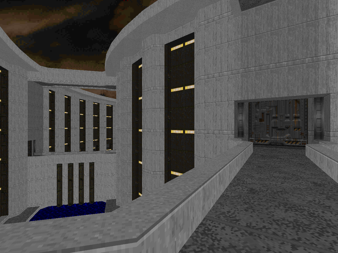 |
| MAP02 | Descent |
|---|
 | Triangles and hexagons... Is this "Dead Simple"? It's a pretty interesting deconstruction of the "Underhalls" aesthetic, emphasizing two main tiers of play. There are the aquatic pits that you might fall into and have to kill a spectre or two, and there are the hallways of piping that surround them. Almost all of the action happens in the latter, and has you dealing with the usual suspects, plus the occasional mancubus. The trickiest bit for me was the little ledge you're expected to crawl along while all those nasty monsters are clamoring for some cheap shots. Actually, it's not that hard but it sort of SEEMS scary. The labyrinthine layout makes for a nice brain teaser. The ending elevator fight is a good finisher. |
| Breach | MAP03 |
|---|
| Into the depths of the complex, where you can start to see the signs of the sickness. "Breach" is dominated by a large canal of nukage in the level's center, the site of a showdown with stationed arachnotrons that command a certain degree of respect as you blitz around with the rocket launcher. The off-areas are composed of the networks of hallways and staircases that appear to be staples of Urthar's works, but they're delightfully arranged and lead to some cool areas, like the big mobilization area to the north which comes with a cool mancubus / arch-vile team that starts to mow through the squadrons of zombies on the platform with you. I was pretty sure that there would be some sort of big fight at the red key platform, but the author is more than content to just let the suspense build, which it does, right until the very end. |  |
| MAP04 | Hive |
|---|
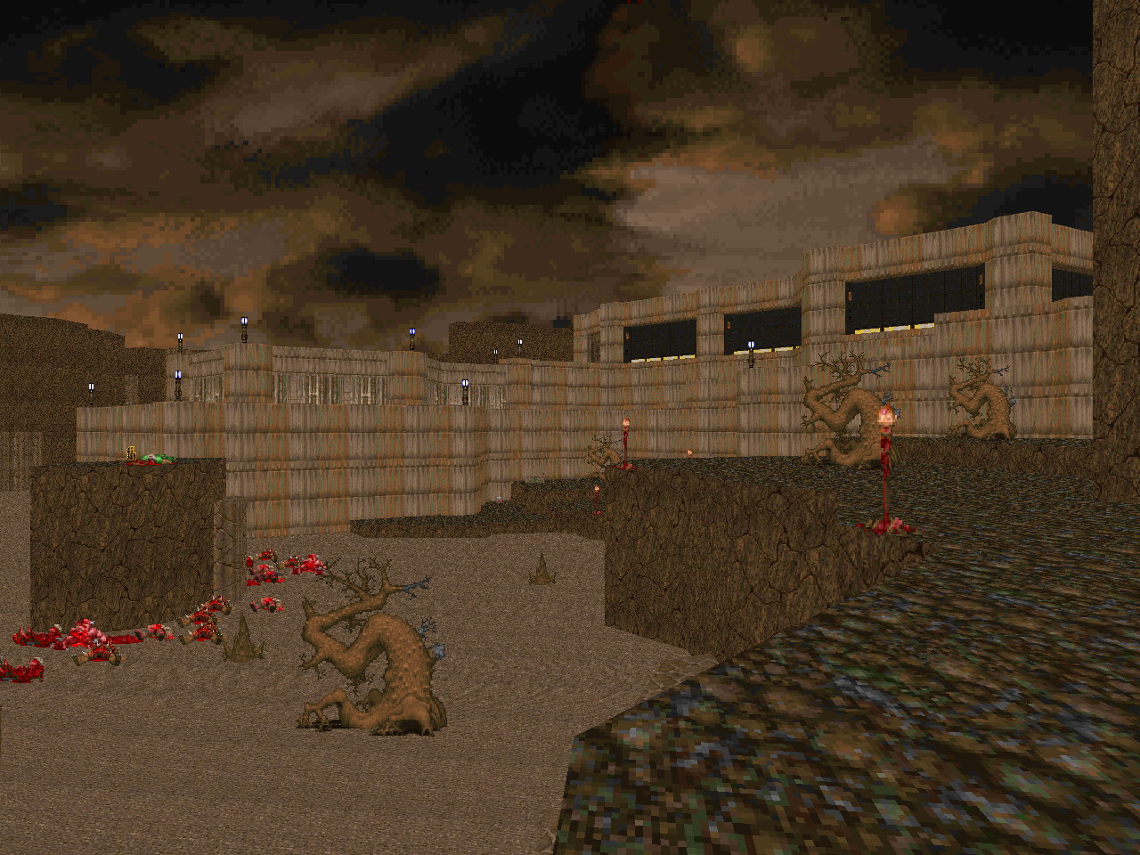 | Out of the depths of the base and into some daylight... albeit in the badlands of wherever you are. The core of "Hive" is a honeycomb of hexagonal rooms and areas networked by appropriate hallways. To the northwest, a guard tower overlooking a desolate scene, the site of an enormous teleport ambush that you'll want the rocket launcher for. To the east, an underground nukage dump guarded by a Cyberdemon. I believe that the blue key is entirely optional, but it's the only way to snag the plasma rifle, which lets you grease Cybie and save all those rockets for the yellow key fight, which is heavy on monsters and has a handful of pain elementals augmenting it from a completely different direction. The yellow door locks the southern area, an organic compound that guards the red key that's big on spectres, cacodemons, and barons. The initial chaos when you drop in is pretty good. Also, there are three chambers in the main area that house a bunch of baddies that will open up to ensure that you've got some sort of surprise waiting while you're backtracking. Nothing too nasty, just something to keep you busy. |
| Cage | MAP05 |
|---|
| "Cage" takes Urthar's style of quasi-fractal iteration and flips the action in the opposite direction. It's one twisted torture chamber of restricted player movement, hammered in by the initial room - a series of criss-crossing catwalks sectioning off lava pits, divided by height, and surrounded by imps in alcoves. There's something of the aura of "Tricks and Traps", but with the consistent aesthetic theme of metal bars and skin as wallpaper. One of the early troublesome encounters pits the player against a pair of Hell knights backed by an arch-vile in a room whose central platform is a crusher surrounded by lava, and that's after having slain a wave of demons and imps on your limited real estate. The arch-vile comes as a bit of a shock, and there are plenty more to follow. I really like the teleporting vile battle to the southwest, which forces you to be on both the defensive and offensive as you clear out the imps on the ground in preparation for dealing with the sorcerer, and the matryoshka-style elevators to the northwest make for another bout of intriguing chaos. The crusher / cage red key room may seem among the nastiest to clear, especially after the imps are revealed, but there's a "secret" near the end that dumps you back in with some light amp goggles so that it's not quite as annoying if going for max kills. Also, cool trick at the end with the chatty marble face! | 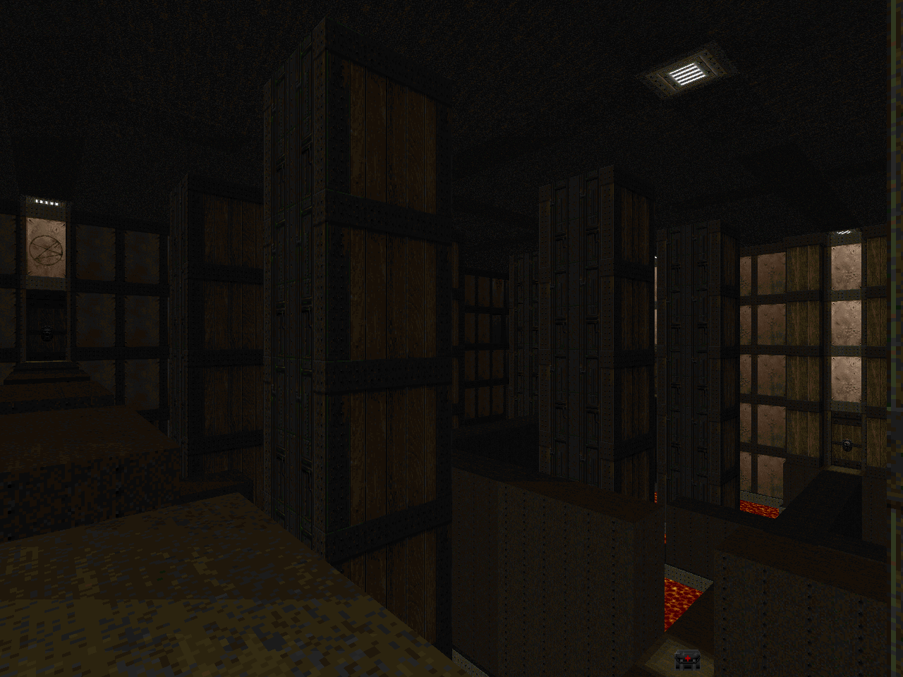 |
| MAP06 | Ruin |
|---|
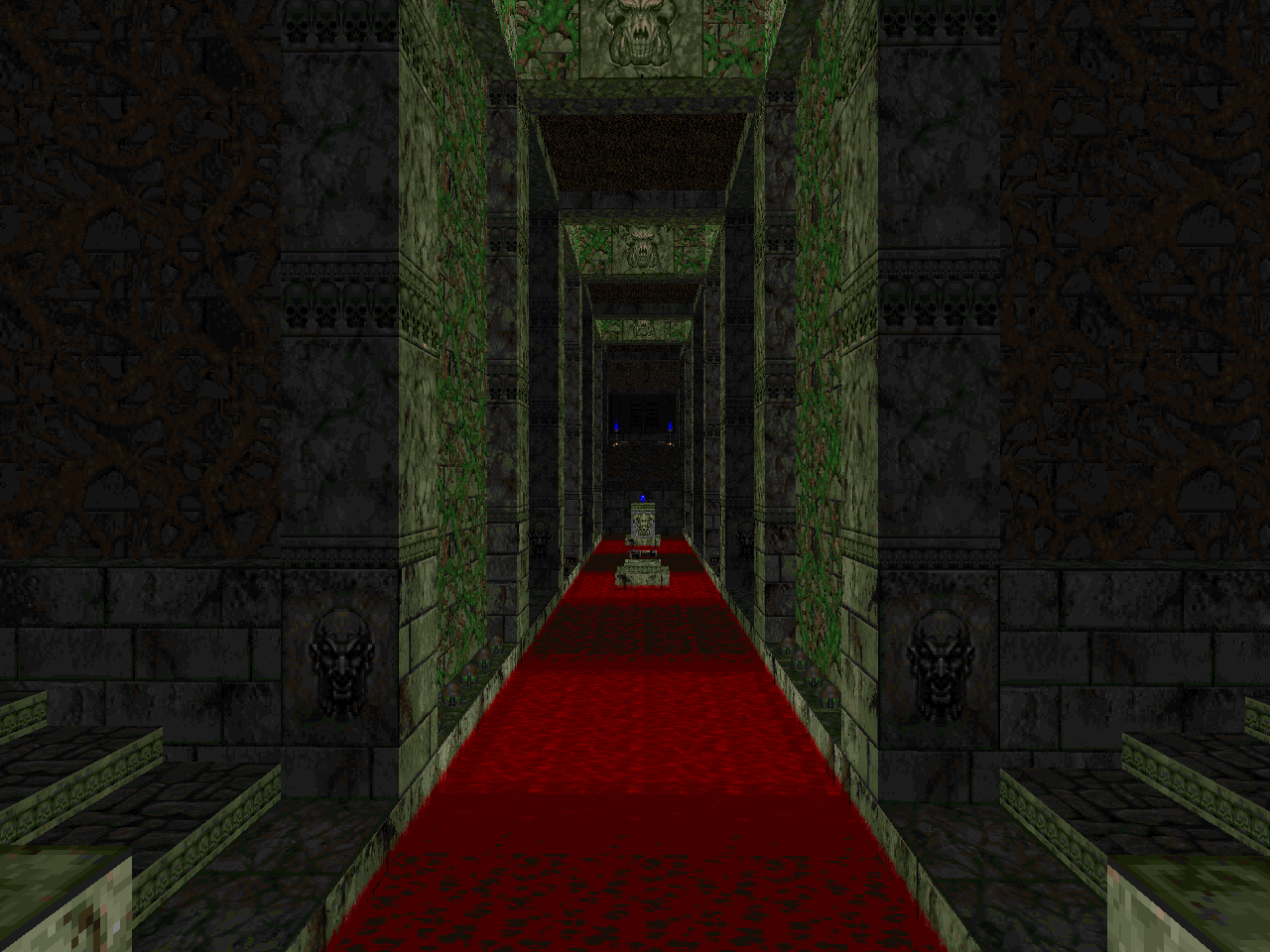 | More of Urthar's orthogonal style, plus a healthy dose of the oppression doled out in the previous level. The invul sphere is a big help, but without any knowledge, you won't be making the most of it. The western path, which is a pretty straightforward decision, leads to the main portion of the level: a pair of dueling marble staircases that run up and down, counter to each other, along a long, sluice of blood. It's liberally staffed with zombies and mancubuses and a few clutches of cacodemons... but nothing worth stressing over. The southern path drops you into a bout of arachnophobia, with a Spiderdemon on the opposite end and a bunch of arachnotrons around the perimeter. It's actually not that bad, since there's enough cover for careful players to dodge enemy fire until all of the baddies have been rooted out. The northern leg has a bigger variety of monsters released in two hordes - imps, demons, and two Hell knight / arch-vile trios - which you're made to fend off with the plasma rifle. However you choose to use your invul is up to you. All roads lead to the finale, a big open-air slaughter that's mostly low-tier enemies plus a cloud of cacos, but the zombies are actually semi-threatening due to attrition. I think the biggest shock is in the exit room, when you suddenly unleash four arch-viles, one of which will probably teleport to a place you just cleared out. With all the verticality, it's kind of fun to puzzle out, and the secrets surrounding the yellow key are worth discovering. |
| Siege | MAP07 |
|---|
| A true blue finale, and unlike pretty much all the other levels, apart from the iteration on the number 5. It's a giant crater with a central lake of lava that has a big fuckoff tower coming out of it. The tower is guarded by five Cyberdemons plus a lower ring of commandos, and the outer perimeter is covered by a bunch of Spiderdemons, and there are a bunch of lost souls that will crawl out of the crater during all the fighting. Phase one is pretty simple - grab the blur sphere and get the Cyberdemons and Spiderdemons infighting with minimal damage to yourself. Phase two, mop up the losers and hit the switches the Cybs were guarding, which will open up the central chamber. Then... victory! | 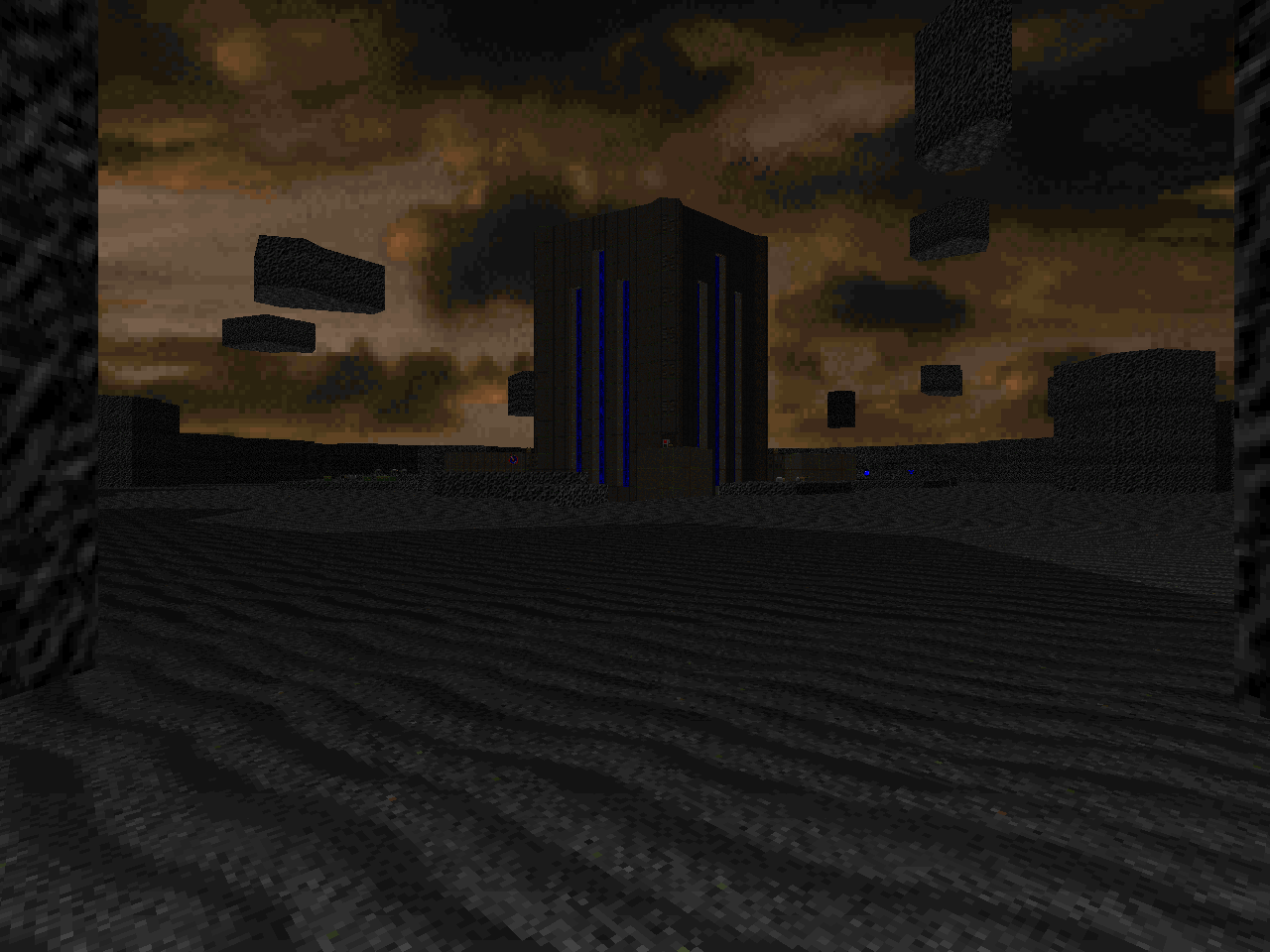 |
TWO TOO MANY?






So - did you enjoy the gameplay in this wad, after all the talk you make about the aesthetic?
ReplyDeleteI did not sing the praises of this pwad's combat because it is not its strongest point, but I remarked upon the bits I thought of as memorable.
ReplyDeleteI never said I thought it was the high point of the wad (and I don't), but I would like to know if you found it an enjoyable ride regardless.
DeleteBTW on the 'Itinerary', the latest update still says it's Breach.
Also - since the page has been rather dead lately, I put another suggestion or two up on the 'road map' page. The main one not already in the list is an E1 style sort of DTWID like Doom I episode by Dolman, which like some of my other suggestions, is overlooked because it didn't get to /idgames: https://www.doomworld.com/vb/wads-mods/71986-dtwid-my-version-of-episode-one-of-doom/
Ol' No Name is also still pending in the 'it didn't get to /idgames so it's easy to overlook' category. I won't concern myself with reminders over what's on /idgames, those would be hard to miss (of course).
if i do not specifically state otherwise, you can assume that gameplay was enjoyable, if unremarkable, because unenjoyable gameplay - to me - would be remarkable
DeleteAre you still even updating the 2015 road map page? Jared's Doom (Dolman's E1 DTWID episode) is well worth looking at, not even listed on there: https://www.doomworld.com/vb/wads-mods/71986-dtwid-my-version-of-episode-one-of-doom/
Deletebrandon, it's time to back off, because i don't have the time to deal with you micromanaging my hobby
DeleteWhat a similarity :)
ReplyDeletehttp://xbox360media.ign.com/xbox360/image/article/900/900446/mirrors-edge-20080820034741550_640w.jpg
that is probably where the pic I used came from! I was looking for some kind of vast underground architecture and those catwalks / stairs / ladders on the pillars seemed to fit the bill. still haven't played Mirror's Edge. looks like I should. too many games, too many pwads.
DeleteI liked the methodic level design on this one! Cage freaked me out like all getout.
ReplyDeletecage's oppressive atmosphere, nasty traps, and complex tiered labyrinth make for a very meaty experience
Delete