CH RETRO
by Christian Hansen
To the uninitiated, it may look as though Chris was indulging his Ultimate tooth prior to his work on 2002: A Doom Odyssey. His painstakingly arranged back catalog tells a different story, however. At the very least, Hansen had built no less than four levels for Paul's pet project before even starting his Retro Episode. While the final product saw release in 2002, the same year as 2002ADO and similar critical darling Rip It, Tear It, Smash It, it originally started as a single level before being incorporated as RETROEPS's E1M6 as "Primary Base". There's a slight parallel to The Classic Episode but CH_RETRO's development was far less publicly measured. This initial offering is an E1M1 replacement for the original Doom.
The level, as with the finished product, eschews any semblance of a plot. It is intended to be Romero fanservice in order to momentarily relieve players of their debilitating addiction to Knee Deep in the Dead-style techbase levels. And how! The end result feels like a mix of Romero's architecture and Tom Hall's more labyrinthine layouts. I was surprised to find myself stuck a few times when trying to figure out where I needed to go in order to progress but this was the result of picking one of two paths and then wandering so far that I forgot where the fork in the road was. The quickest route to the exit doesn't involve covering a lot of ground but it's very dangerous.
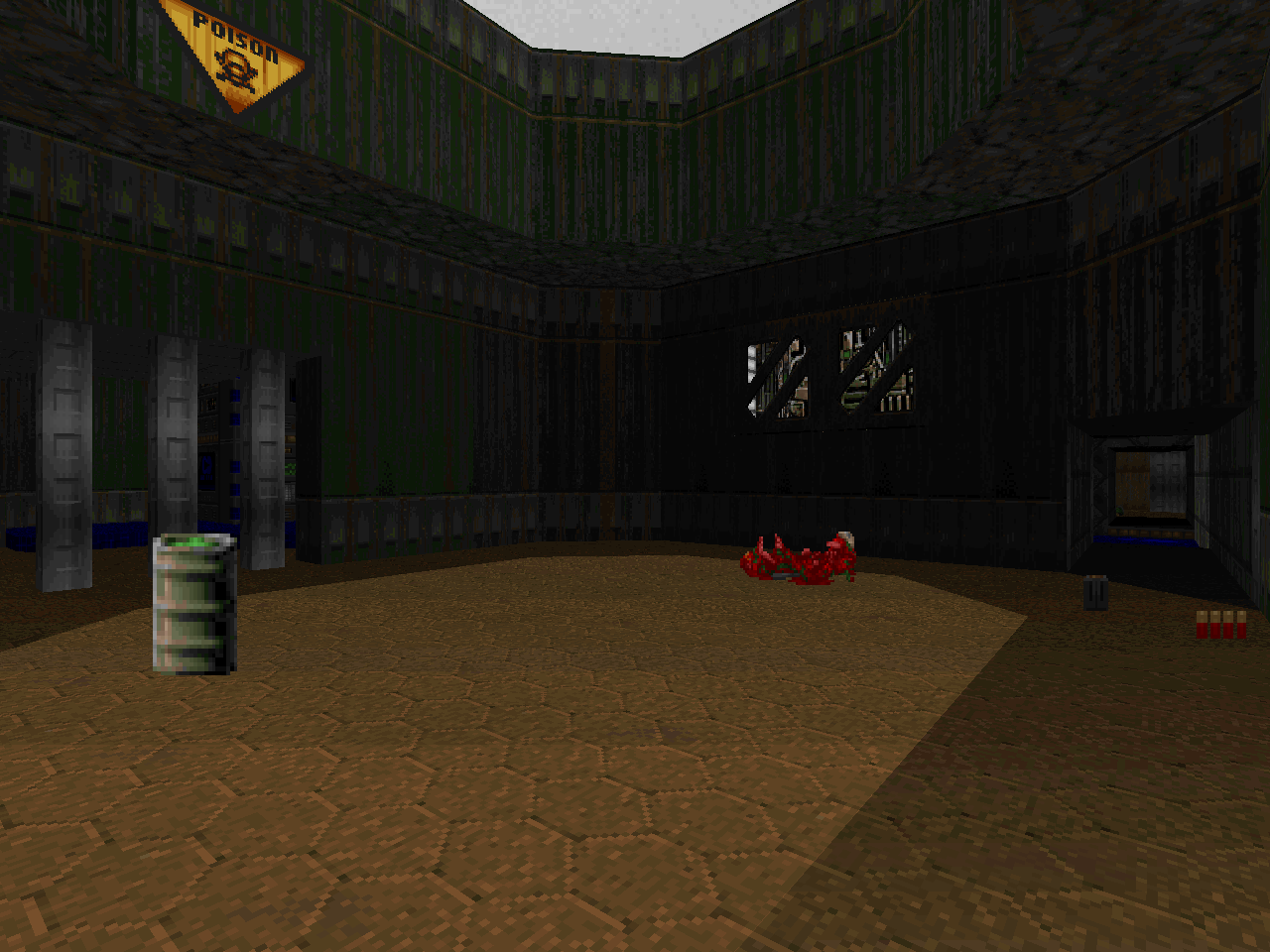
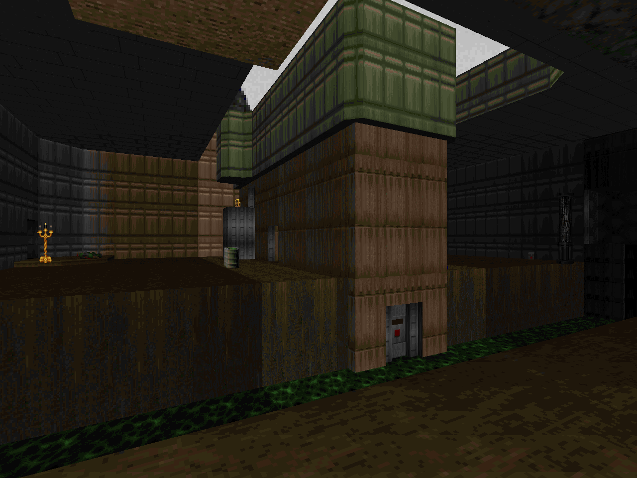
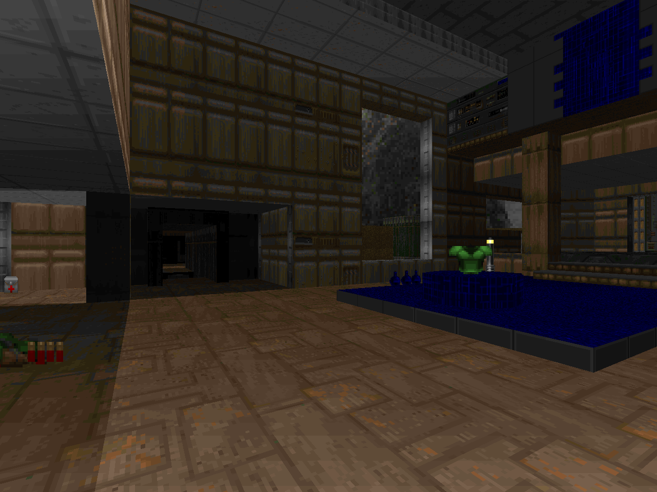
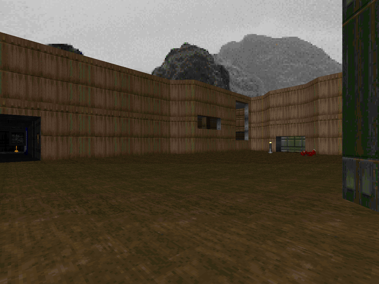
The threat comes from an overabundance of hitscanners. While this isn't anything new compared to the monster makeup of the first episode, I feel it to be more devious in how these encounters are arranged. I know that Romero had his fair share of thirty-second lock-in fights but the teleporter ambush in the southwestern yard isn't thematically consistent with KDitD because most of its enemies warp in. Forgetting the secret "Military Base", of course. The lock in element comes from having to take the elevator up but I suppose that it does give you several avenues of escape as dangerous as they may be. Explorers may find goodies like a green armor and a soul sphere to soften the sting.
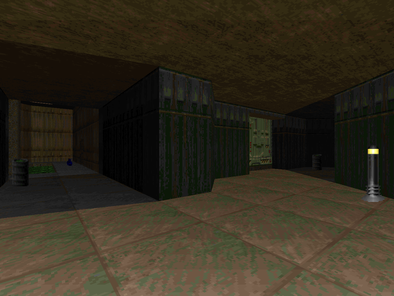
One of Hansen's biggest successes is his use of lighting. It's an understated element in detailing and is the exact touch needed in order to make the appearance of vanilla maps pop. Some of the lightcasting done goes beyond the sort of thing that I would expect to see in John's levels - specifically, a couple of fixtures in the southeast corners of the green armor room and exit hallway - but Chris's adherence or lack thereof to a format does not in and of itself augment my amusement. Most of the lighting is defined by the architecture's own linedefs but a few lamps here and there give the author an excuse to throw a few rays down the corpse-laden corridors.
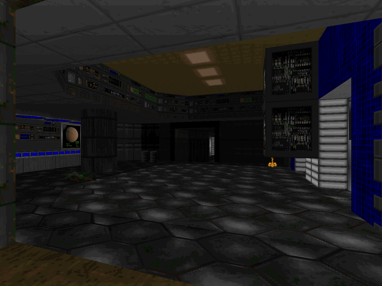
Episode One scholars may note a selection of original Doom homages. Myself, I see the computer elevator room from "Command Control"; "Hangar"'s penultimate chamber but with the dynamic light inverted so that it illuminates the area behind the midtexture walls; and the cutout ceiling / irregular hallway from "Toxin Refinery", admittedly an E1 staple in the collective conscience of the community. What more can you find? For some reason the scrolling tech apertures were giving me a "Pandemonium" vibe but I was way off the mark there. It's still a really weird detail to find in a Knee Deep in the Dead-style level. I like it!
Given what I see here, I'm looking forward to witnessing where Chris goes with the RETROEPS. That's an entire episode of horsing around within vanilla Doom's limitations and developing his craft. Certainly, many find the E1M6 version of this map to be the definitive release, if only because they are unaware of its proof-of-concept beginning. It will be interesting to see what tweaks are made between now and 2002.


NEWRETROWAVE
No comments:
Post a Comment