HALL OF THE MOUNTAIN KING
by John "Spooky" Bye
Bye's early authorial career showed that he was willing to work with some crazy ideas. CyberDoom portrayed a virtual world whose structures represented hyperlinked websites in cyberspace. Gardens of Delight dialed back on the madness as a fairly mundane chateau / castle kind of thing. Hall of the Mountain King went even further, taking the promising static light work of GARDENSD and cranking it up at the expense of any semblance of interesting architecture. It differs from his earliest material in that it's actually an E1M1 replacement for the original Doom but it still hails from 1996.
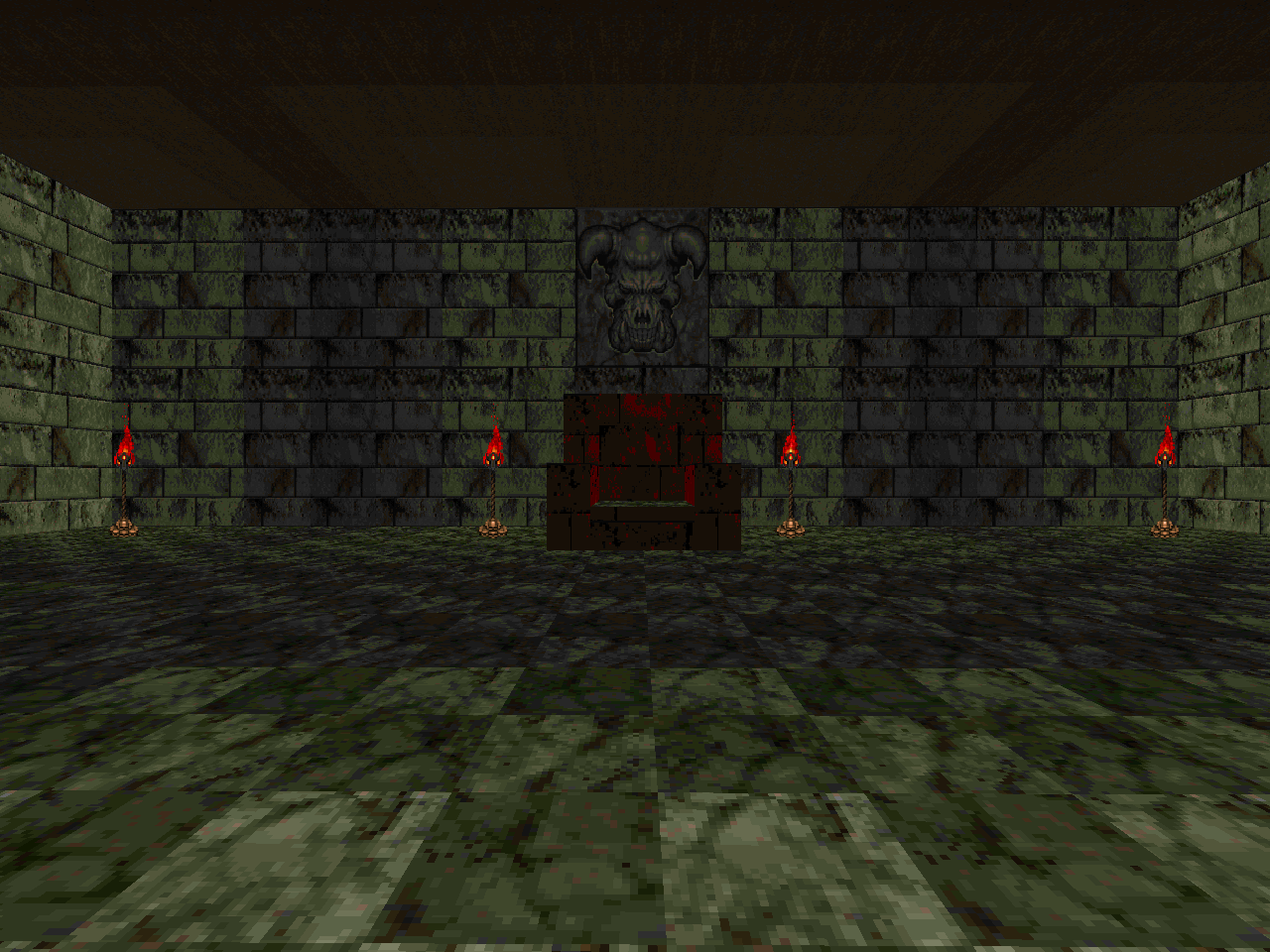
The high points of HALLMONT are actually based on a segment from J.R.R. Tolkien's The Hobbit, specifically the chapters "Over Hill and Under Hill" and "Riddles in the Dark". I doubt whether I would have guessed it without reading the .TXT but you never know. It's basically you sneaking around the Goblin King's underground fortress except by sneak I mean blasting imps and former humans with the shotgun. Bye has a synopsis of all the important areas which includes a reference to JJTOWN, a PWAD with no formal or even apparent release. Given the context of his "inspiration" I am guessing that it became MAP10 of Cygnus IV.
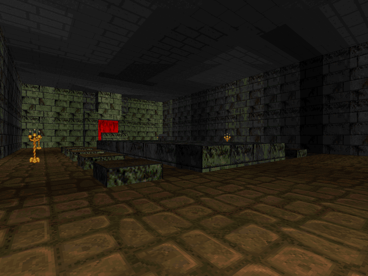
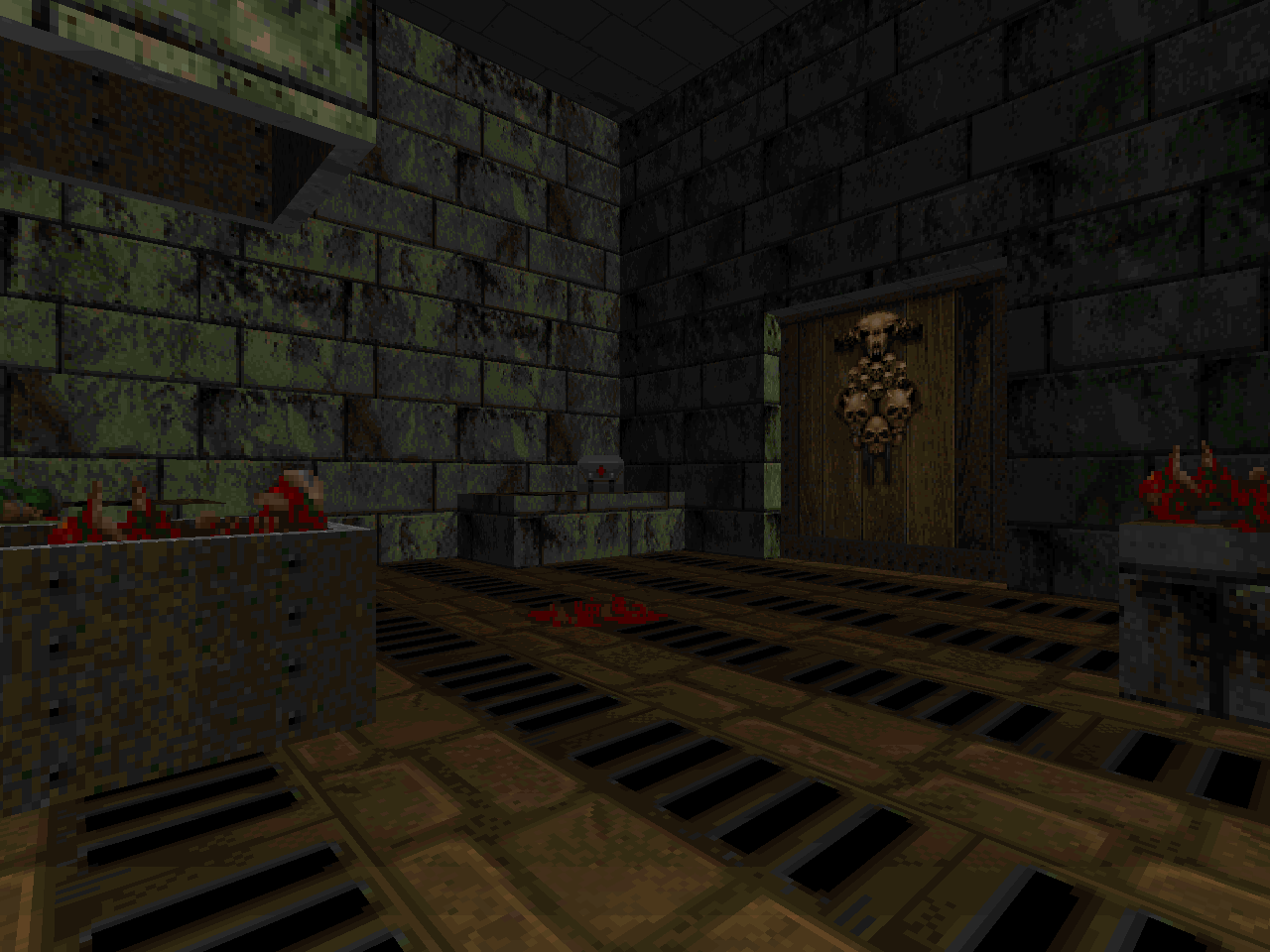
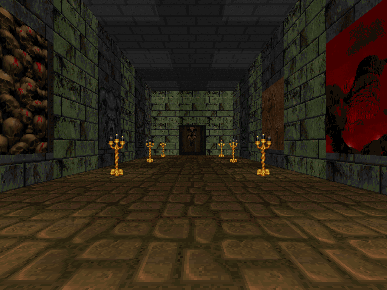
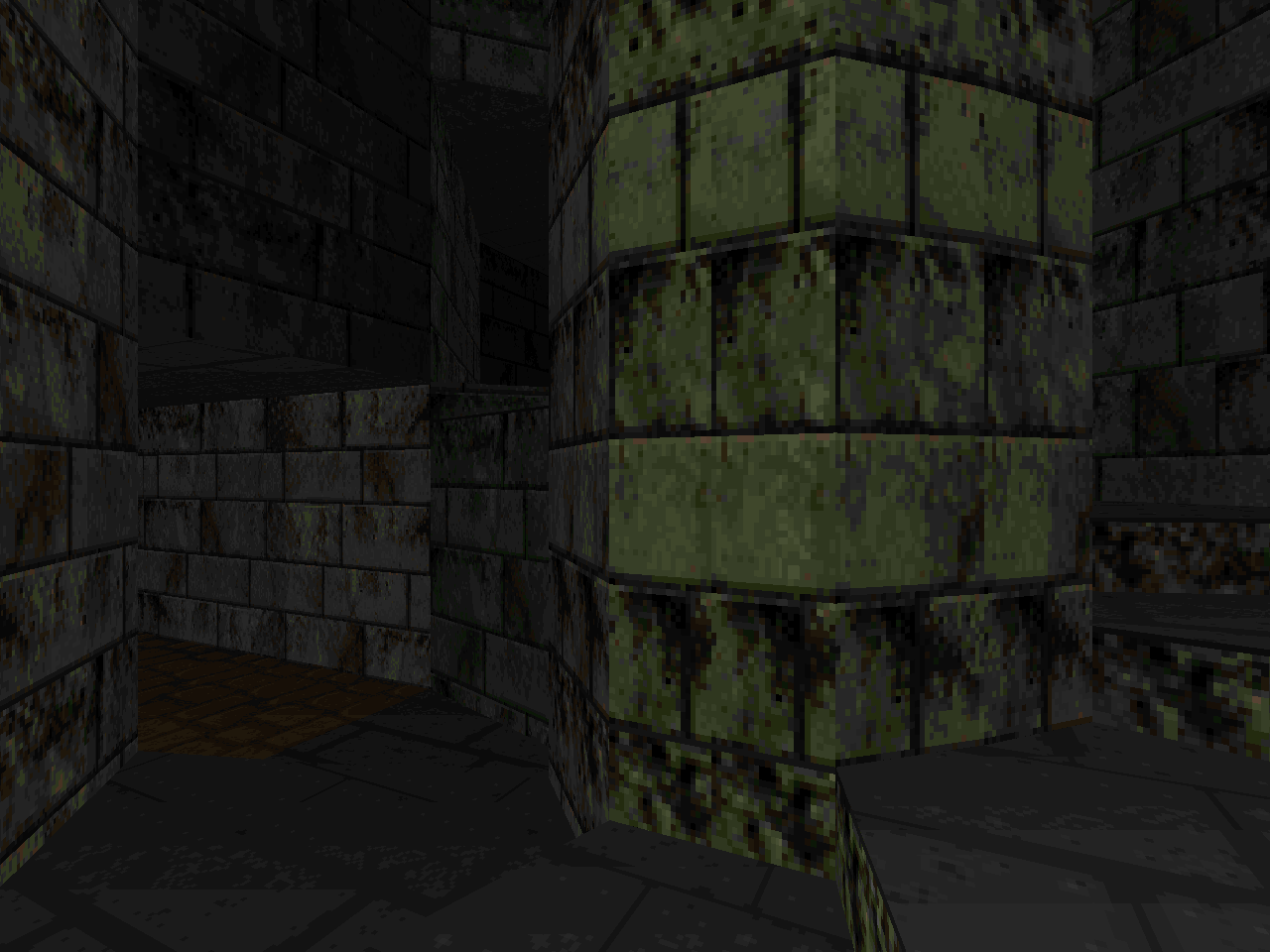
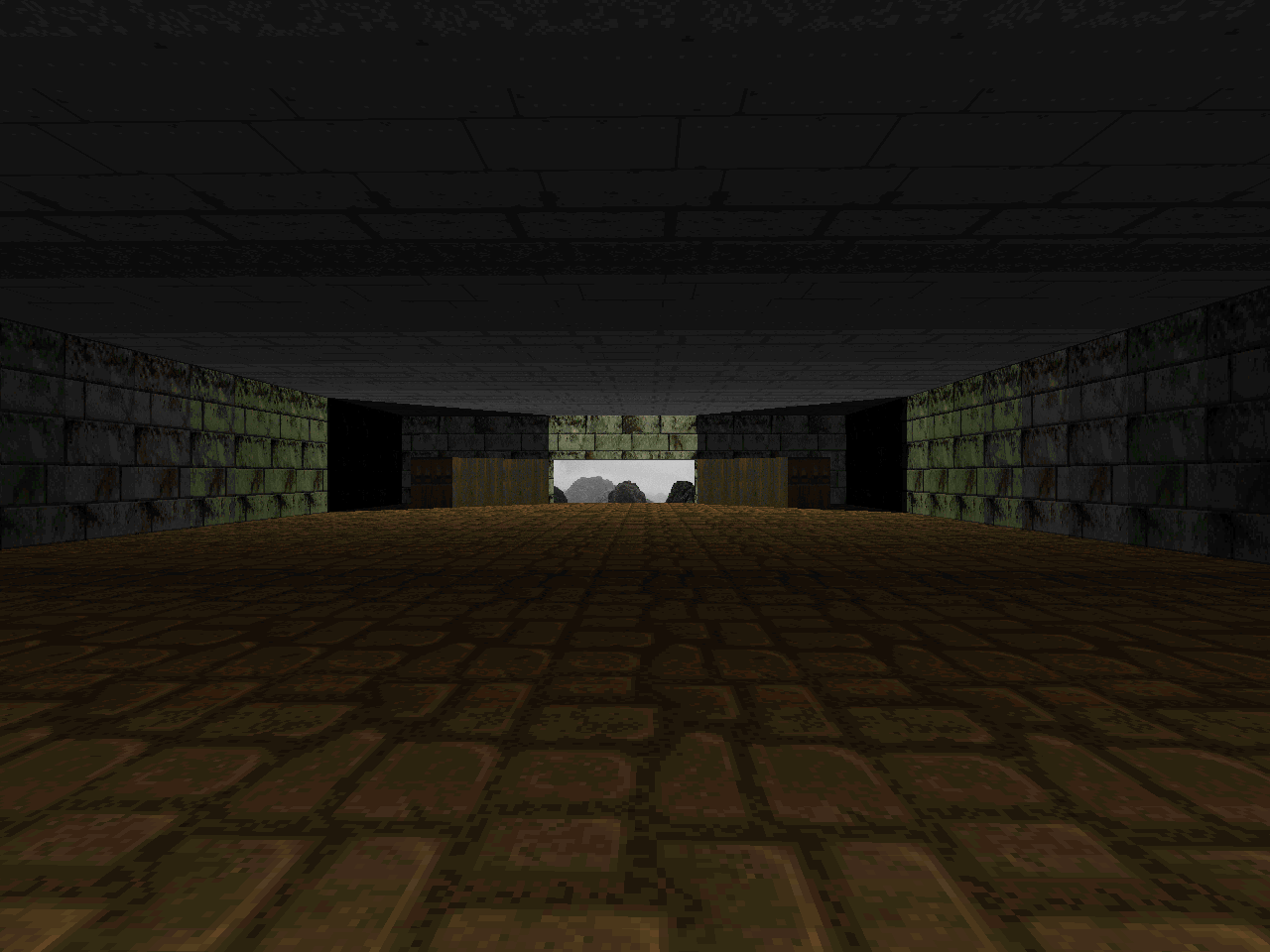
Hall of the Mountain King mainly exists as an experiment for Bye to focus almost solely on lighting gradients. The actual layout and architecture are incredibly bland, consisting of either hallways with regular alcoves or large, rectangular chambers. The linedef allowance was spent on smoothing the fadeout from torches and candles. Except, uh, the halos are just as rectilinear. The effect is still pretty neat and works as a decent tech demo. Authors circa 1996 were more concerned with casting light and shadows a la John Anderson than this sort of fetishistic focus on fade. It wasn't until the advent of limit-removing source ports that this sort of detail became economical.
I wouldn't characterize it as quintessentially Bye, either. He was just as cognizant of the limitations of lighting detail in sector design and it shows in his later works. His contributions to The Darknening E1 are more realistic in the shape of the lights that they cast rather than the depth of difference between bright and dark. Granted, he was still doing tacky squared-off auras in the following levels. This includes Magnum Opus and Park, the latter becoming the first map of Cygnus IV. It even extends into some of his levels from The Talosian Incident. I can't say whether I noticed the idiosyncrasy until just now. I guess I never spent much time looking at the light patterns before, you know, he practically rubbed them in my face.
The combat is still characteristically John's, Bye which I mean that you must face a scant 39 monsters over a large area. A good portion of them are concentrated at the exit, too. The lack of distractions gives you some time to enjoy the wonderful, uh, architecture. It would be cool if HALLMONT had a stronger atmosphere to drink in but square light halos is literally all it has. It doesn't help that it uses the default "At Doom's Gate" for background music. The author thankfully went on to exercise his authority and pen tracks with a more ambient feel for his later releases. This might give the spectre / Gollum event a better impact.
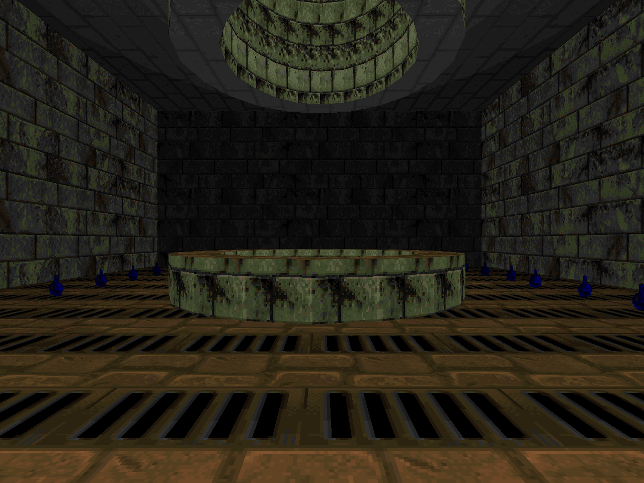
The coolest part of Hall of the Mountain King to me is the exit sequence. This is mainly because Bye uses some sector engineering so that you can take the same pair of spiral staircases twice to even higher heights. The spectre / partial invisibility thing is kind of DoomCute but it would be hard to know without being aware of the context. This is also why the hidden switch behind the Goblin King's throne is such a pain in the ass. You might have an inkling of its location if you knew that this was based on The Hobbit but you'd probably need to read the .TXT to be able to make the comparison. The document further removes any ambiguity by spelling out the location of the unmarked button.
HALLMONT may interest Tolkien lovers but it's mostly for PWAD historians. Its focus on gradient lighting cripples any architectural appeal and the square sector halos look chunky. Its monotonous marble is mostly interesting as an example of how people were trying to push vanilla Doom's limitations back in 1996.


DRAW A LINE,
MAP THAT WORLD
No comments:
Post a Comment