Doom Center was an important fixture of the community during the post-source port boom. It was something of a media hub in its promotion of PWADs and their authors. It eventually deactivated with the death of its host but some of its staff went on to join Doomworld. Snapshots of the site were thankfully preserved via archive.org but most of its content and enthusiasm have not figured into its legacy. I only know of Doom Center's existence because it hosted a map-making contest during a week that celebrated the shareware episode in 2001. John Romero himself judged the submissions; the winner received an autographed copy of the Ultimate Doom.
The event had a list of specific guidelines, some of which were followed more stringently than others:
- The authors had a two-week window in which they could create the level - no modifications!
- It was expected to be in the style of Knee Deep in the Dead in terms of architecture, themes, textures, etc.
- It was restricted to stock Doom IWAD resources, preferably but not exclusively KDITD assets
- The submission had to be Boom-compatible
- It had to occupy slot E1M1
- No limitation on MIDI music with encouragement to stick to E1 tracks
Sixteen folks officially answered the call and Romero ranked four of them. The winner - Jeffrey Crenshaw - was a dark horse who does not appear to have made any other levels. Supposing that he wasn't under an otherwise anonymous handle, of course. The remaining authors include future Doomworld legends Fredrik Johansson (Vrack 2b); Rex Claussen (The Darkest Hour, Simply Phobos); and Esa Repo (Suspended in Dusk, Back to Basics). Other notable fixtures are Doug Merrill (DooMed Speed Demos Archive); Simon Broadhead (CCHEST and CCHEST2); Tobias Munch (Visions of Eternity, which - by way of this - I learned started back in 2001); Bob Larkin (Doom Wad Station); and Simon Judd (SLADE3).
It's interesting to see such a broad variety of ideas exhibited as far as what folks thought would win this particular contest. Opulent was unable to finish his level within the allotted time which explains its bizarre presentation. And, uh, the fact that a crucial switch is broken. Riddle's entry has the same sort of vibe. It looks on its face like a decent homage to "Computer Station" but its errors include an untextured monster closet door and another demon deployment device that's bafflingly bereft of monsters. Lasmanowicz's outing is passable if rectilinear and full of wide, open spaces. Its Achilles heel, like Merril's map, is a switch which should have had a repeatable action. Larkin's level feels more like a wildass 1994 mini-adventure with some of its setpieces. Deathbringer takes things back to the same era but toward the realistic end of the spectrum with an underwhelming air traffic control tower.
Rellik's "CEN2D" is a decent, different take on the Phobos style and even employs Romero's horseshoe design principle. Except, uh, the space that you're maneuvering around is your ultimate goal. Broadhead's "KDITD_SB" is simple and super orthogonal. Its biggest issue is a large labyrinth constructed of a 6 x 6 grid of small cells, each one carpeted by nukage. Buck's "OXYGEN" is small but okay though it doesn't have much to offer beside a neat remake of "Hangar"'s computer room. I liked Judd's "PWF"; it's built around a sentinel Cyberdemon who stands watch in the central chamber. An unfortunate oversight with yet another switch, however, prevents the player from accessing the rocket launcher.
Crenshaw's winning level has some of the hallmarks of Romero's E1 design. Its central area is symmetric, calling to mind "Phobos Lab" but more "Central Processing". It's also densely populated and features big monster closets for a proper bloodbath. Its main setpiece is a clever sequence that drains the contents of a vat out into an exterior trench. Tobias's map is far more authentic in its organic ambushes, even if it draws heavily on "Nuclear Plant"'s computer maze. It also makes the shotgun guys feel incredibly lethal, one ambush in particular. Rex's INVICTUS is one of my favorites. The way in which you have to explore the level in order to raise the bridge feels more like Sandy Petersen's design than Romero, though. It also has a long, toxic leg that is preferably conquered with an officially-but-not-quite-secret enviro suit.
Tobias probably did the best job of simulating the sometimes organic pacing of John's encounter design. Trent, though, has the absolute best setpiece fight. The "Phobos Anomaly" finish lets you pound rockets into a mass of demonflesh while forcing you to be wary of sneaky spectres lest you suffer the consequences. The teleporter-navigated battle around the central catwalk is way more dangerous but not quite as fun due to the perfect storm of monsters above and at your level plus a damage floor. It also looks pretty cool but it's probably a bit too cramped to stand in as something from E1.
Espi would go on to expand his LAITOS and release it as a single level in the following year. It's an outstanding adventure and shows off a lot of design principles that were important to him and, later on, the community in general. It's an intricate network of irregularly shaped hallways and rooms, many of which are interconnected with a multitude of windows. The way that height variation has been incorporated seems as though its placement were optimally calculated. Espi's painstaking texture work is more subtle, here, because he opts to use upper and lower wall cheats. The green stains on concrete don't stand out as much as a recessed surface might so the overall effect looks a tad monochromatic. It's a great adventure, though, and I can plainly see his architecture style a la Suspended in Dusk exhibited here.
Fredrik was reportedly unable to utilize the entire two weeks but he still managed to produce a fantastic, E1-style outing. If anything holds it back from "feeling" like Romero then it's Johansson's economy of design. He has the central, symmetric holding but the side areas are built flush against it rather than sprawling away toward the edges of the playable space. It's a real treat to explore, though, and even has some nested secrets to decipher if you want to step foot in every area that you can look into. The sewer side-section has more of a Tom Hall / E2 flavor but this is reductive id-is-the-root-of-all-inspiration thinking.
Crenshaw's level isn't my personal fave but I can see why John picked it over the ones that I fancied. I would have gone with Fredrik's based purely on the elusive Phobos feel. The layout is elegant and its architecture attractive. Its efficient use of space runs counter to Romero's characteristic sprawl, though. Trent kicked the most ass but the majority of its playing space is a bit cramped and his level's use of teleporters is a bit wild for E1. Tobias may have played it a bit too safe. I did however enjoy the way in which he combined some of John's design decisions in a new way to elevate a typical KDITD experience.
Espi had one of the coolest entries but it's too consciously his to make it in a contest being judged by adhering to the Romero / Hall style. Claussen delivered for me in terms of making a level whose progression was slightly cryptic. Assembling a path to the exit would go on to be used in levels like "Limbo" but it's probably too much if you're limited to the elements of the shareware episode. Crenshaw played it relatively safe in terms of his layout and combat. It still has a cinematic !WOW! factor, though, by way of its draining vat and horde of monsters locked behind the western door. It's identifiably E1 while offering a cool twist or two.
The collection itself is unsurprisingly a mixed bag. It was open to the public and had a time limit of two weeks. Folks like Team Rocket blasted off a rock solid megaWAD in a single day but this contest was back in 2001. The original Doom Builder hadn't even been developed yet let alone whatever quality of life tools that came with future iterations. DTWiD received enough material to make something like four separate megaWADs and then picked and polished their cream of the crop. It would be more appropriate to examine, say, any similarities to the entirety of the 10 Sectors submissions.
The process unfortunately resulted in instances of botched content, which rigorous playtesting would have quashed. It has some pretty cool levels that you won't find elsewhere. Well, you might see a few if you go diving through back catalogues. Not Fredrik Johansson's badass WAD, though. If you consider yourself a fan of E1-style levels then you ought to play his map - found in E1M4 - at the very least.


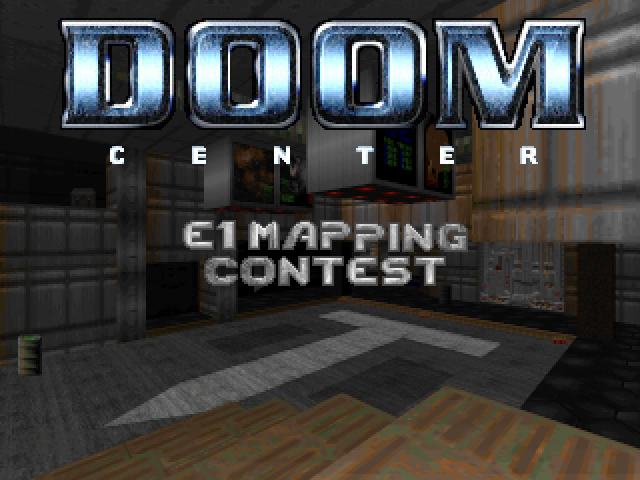
DOOM CENTER E1
MAPPING CONTEST
by various authors
MAPPING CONTEST
by various authors
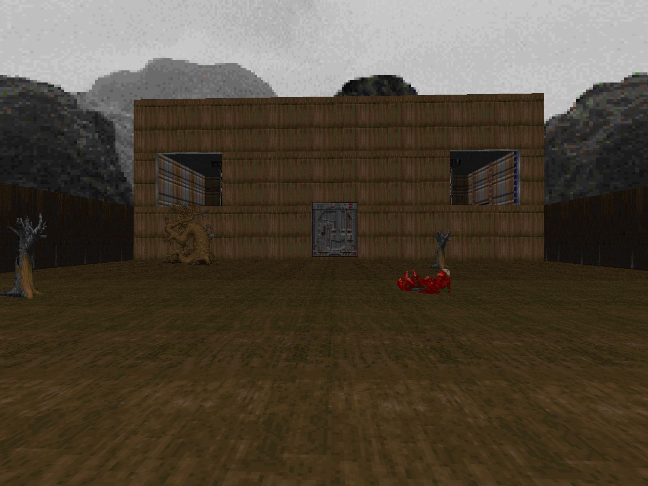
| CEN2D.WAD | E1M1 |
|---|---|
| by Jim "Rellik" McDougald | |
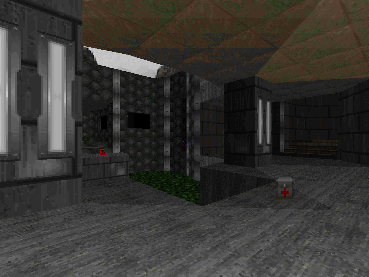
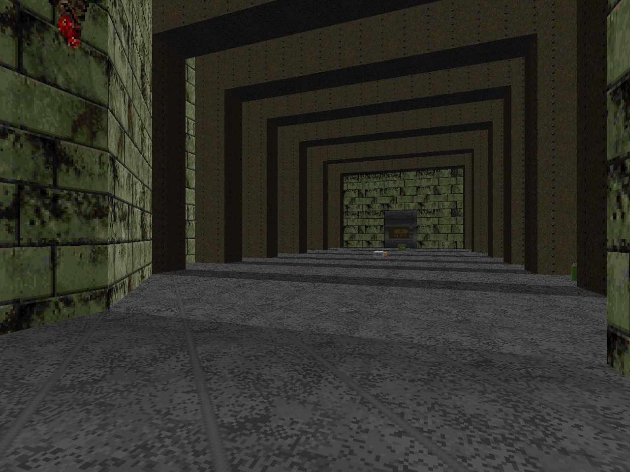
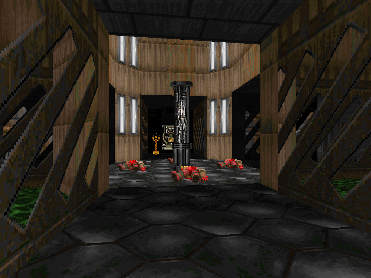
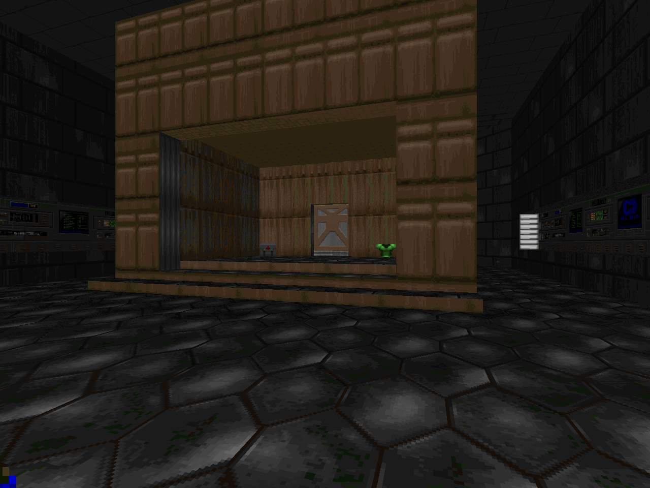
| Based around a central courtyard. You can see and shoot into it but can't enter until you get the blue key. It's a cute level and has some pretty convincing sector props like the computer stacks sporting tech columns. I also enjoyed the tiered staircase room that steps down to the red key shrine. Action is mostly shotgun and chaingun versus all the registered normies. The lost soul reveal has a nice look since they stand out against the pulsing light in the beige panel room. The rest of the action is ho-hum. I'm glad that the author gives you a bunch of rockets to slay the end-of-level Baron squad, though. The very early first cacodemon might give you pause. |  |
| E1M2 | CONTEST.WAD |
|---|---|
| by Robert Lasmanowicz | |
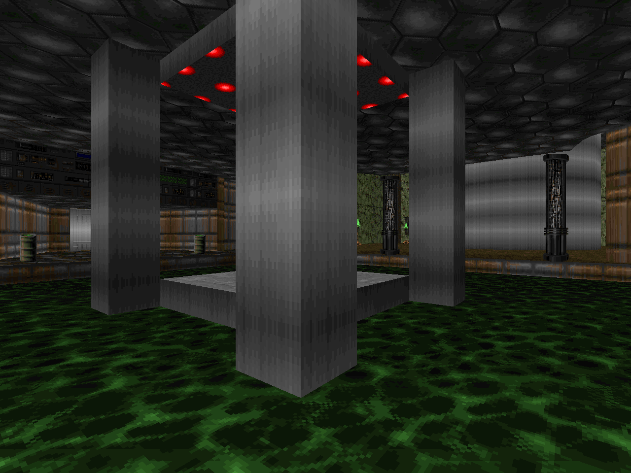
 | This is a chunky and rectilinear map, sporting in excess of 300 enemies. I like that there are bunches of monster closets to introduce swarms - in addition to teleporter ambushes - but it's dominated by airy spaces. The southeast wing has one of the best bits, a maze where shooting prompts an invasion. It also has the map's weirded moment with a row of six pillars, each sporting a replenishing monster. There are a couple of huge outdoor yards that try to be climactic but the visuals are sorely lacking. They're basically big squares ringed by garage doors. Robert tries out some hardcore switch-fu in the west to northern area but one of the first buttons is not a repeatable action. As a result the level cannot be completed. It's too bad because the sector machinery and teleporter-fu for the blue key is kind of interesting. |
| DNG19.WAD | E1M3 |
|---|---|
| by Doug "Opulent" Merrill | |
| A network of empty marble corridors with a few interesting rooms. It looks more like a deathmatch level since it only sports thirteen monsters, none of them stronger than a demon. I gave this map the benefit of the doubt for far too long. It's actually broken junk. The switch that lowers the platform to the inner sanctum is in the same alcove and must be accessed from the lower floor. It's a minor quibble when compared to the switch behind the blue key barrier, though. The gargoyle head isn't tied to anything so it can't raise the walkway to the exit. The red bars and flooded yellow door are red herrings that do not contribute to the progression. |  |
| E1M9 | OXYGEN.WAD |
|---|---|
| by Jordan "Oxygen" Buck | |
 | Cramped but cute. Buck sort of understands interesting room shapes even if one of them is a clear homage to the computer chamber in "Hangar". The layout is really tight, though, and most of the rooms end up looking fairly plain. Combat is easy a la shareware. You're swimming in shells. The trickiest thing you might have to do is kill the three imps in the inaccessible outdoor yard to the southeast. |
| FRED-E1.WAD | E1M4 |
|---|---|
| by Fredrik Johansson (3rd Place) | |
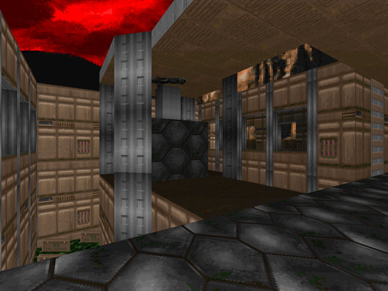
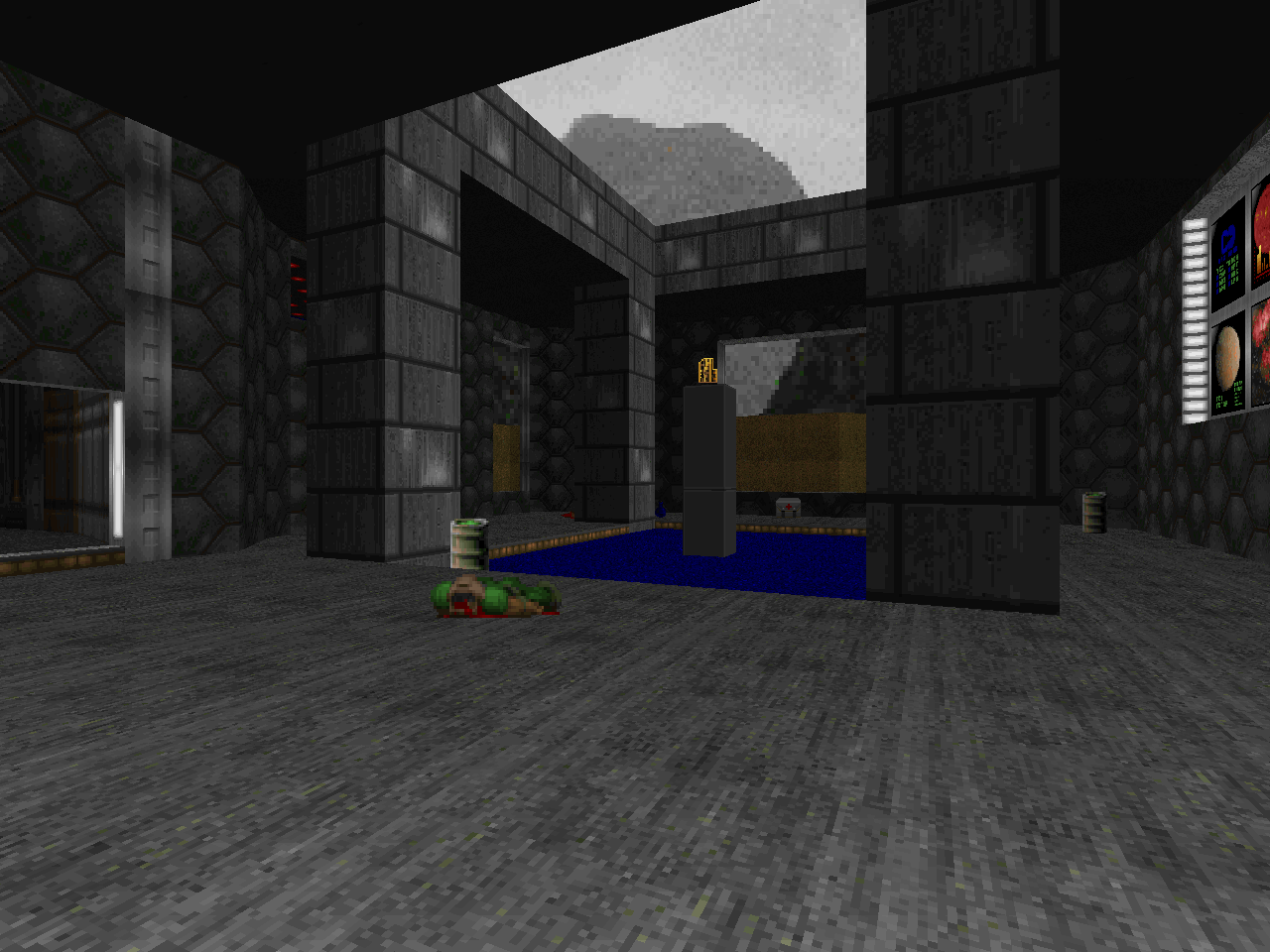
| This is a damn fine E1 level. If you had slapped it into KDITD then it would have fit right in. The opening is super heavy on zombies and health isn't exactly carpeting the floor so attrition is a real concern. It's exciting as Phobos can be, though, and has a wealth of initially inaccessible areas to compel you to explore. I especially enjoyed the nested secrets that lead up to the tech tunnel basement / chainsaw pillar lowering. E1 doesn't exactly lend itself to pitched fights but the blue key battle comes the closest and feels like a classic closet setup. The central architecture and immediate eastern annex look super sharp, particularly the opening facade across the nukage moat. | 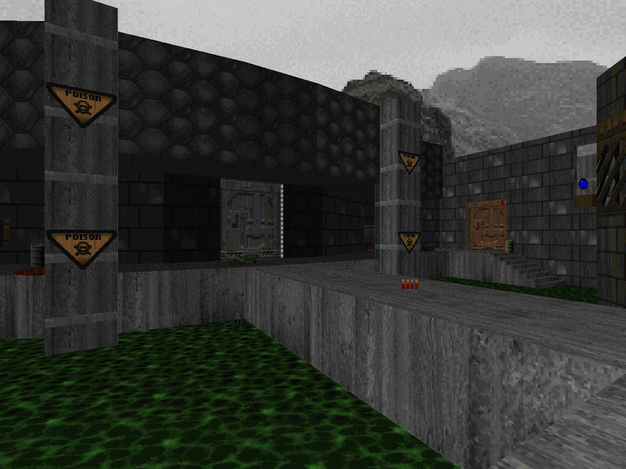 |
| E1M5 | HR_E1ENTRY.WAD |
|---|---|
| by Harvey Riddle | |
 | It starts out looking like a credible if simple imitation of "Computer Station" but fails to stick the landing due to a lack of polish. The author hits a lot of the right notes. The lighting complements the simple geometry by looking moody and offering some moments of contrast. He also added in a handfuln of monster closets that open elsewhere when you reach certain milestones. The effort falls off toward the end, though, probably as Harvey butted up against the contest deadline. There is a blatant untextured wall in the northern hallway and the trap that opens when you grab the blue key is completely empty. I'm not one to harp on things like texture alignment but the shaky wheels fall off the wagon once you hit the exit room. Interesting note to speed runners: you can skip the blue key since the zombies can open its associated door from the back. |
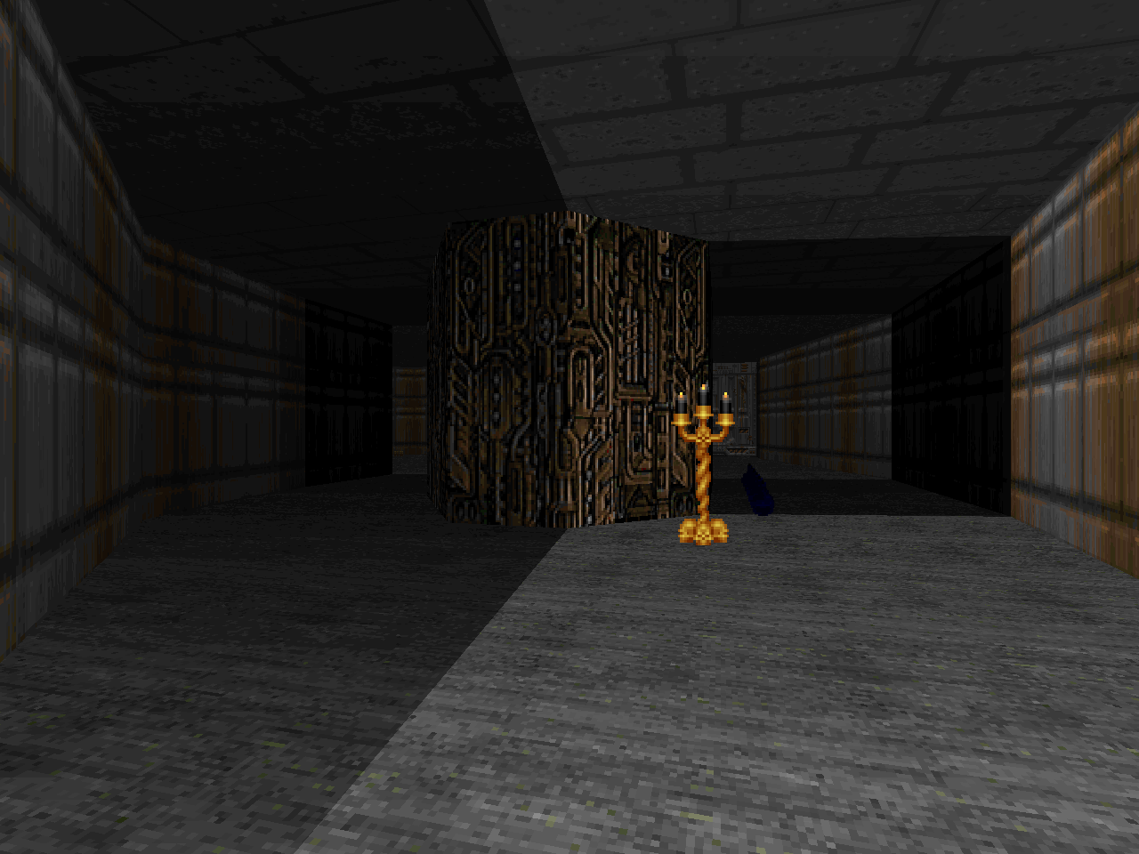
| INVICTUS.WAD | E1M6 |
|---|---|
| by Rex Claussen | |
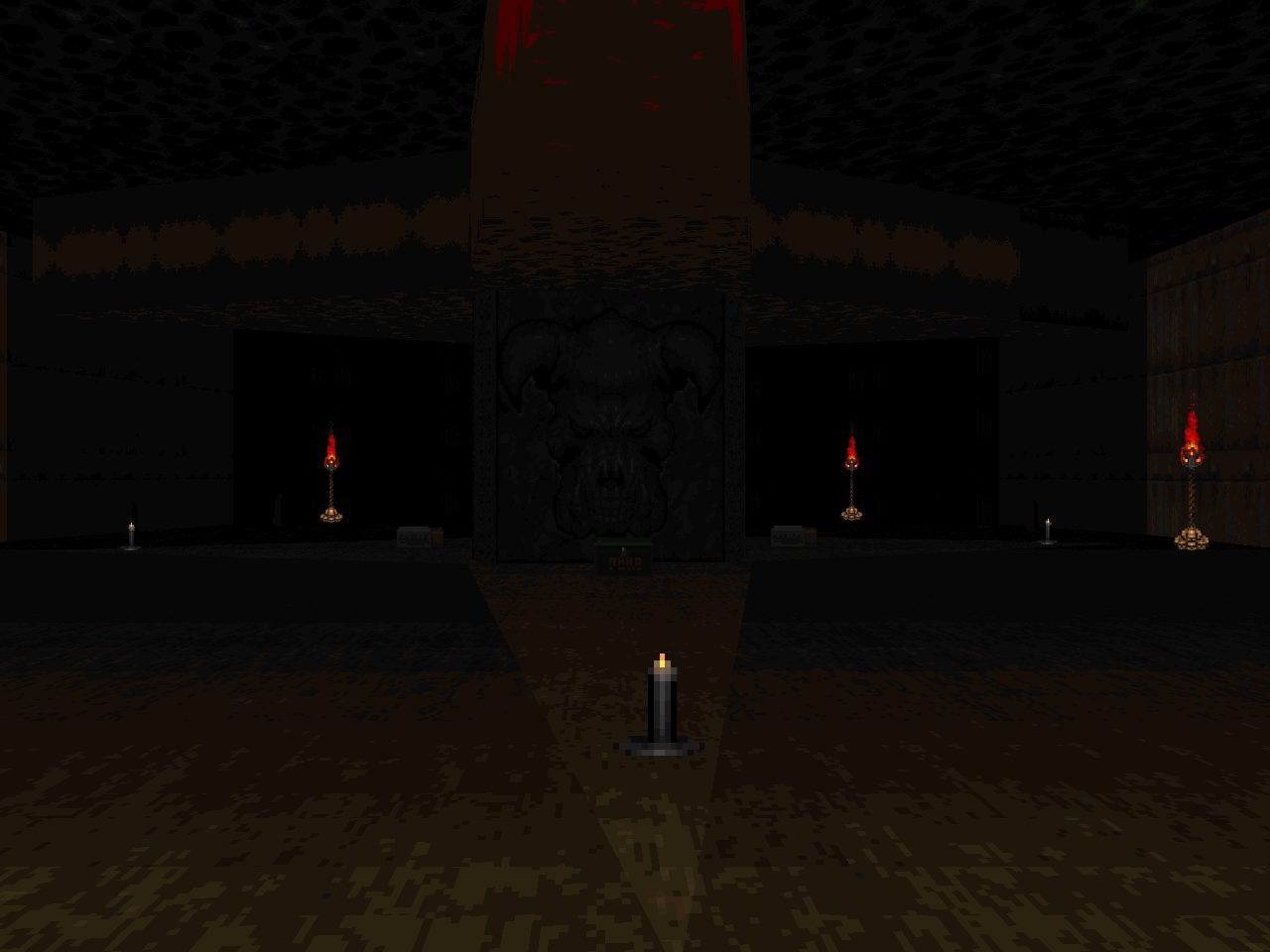
| Later released individually in 2002. This is another really cool level that sort of channels "Computer Station" energy but does its own distinct thing. Even if this includes aping the opening central structure from "Nucelar Plant". All is forgiven when you start digging into the layout. Rex has a ton of interesting architecture and I for once don't recognize it as being copy and pasted from one of his previous releases. The goal is to raise a bridge to the tower in the outdoor area. This will require you to explore the three different pathways branching off the start. Health and ammo are actually pretty tight, making this one of the most demanding balance-wise thus far. The chainsaw and especially berserk fist are very helpful; just be careful when using them vs. the myriad spectres. Great stuff. | 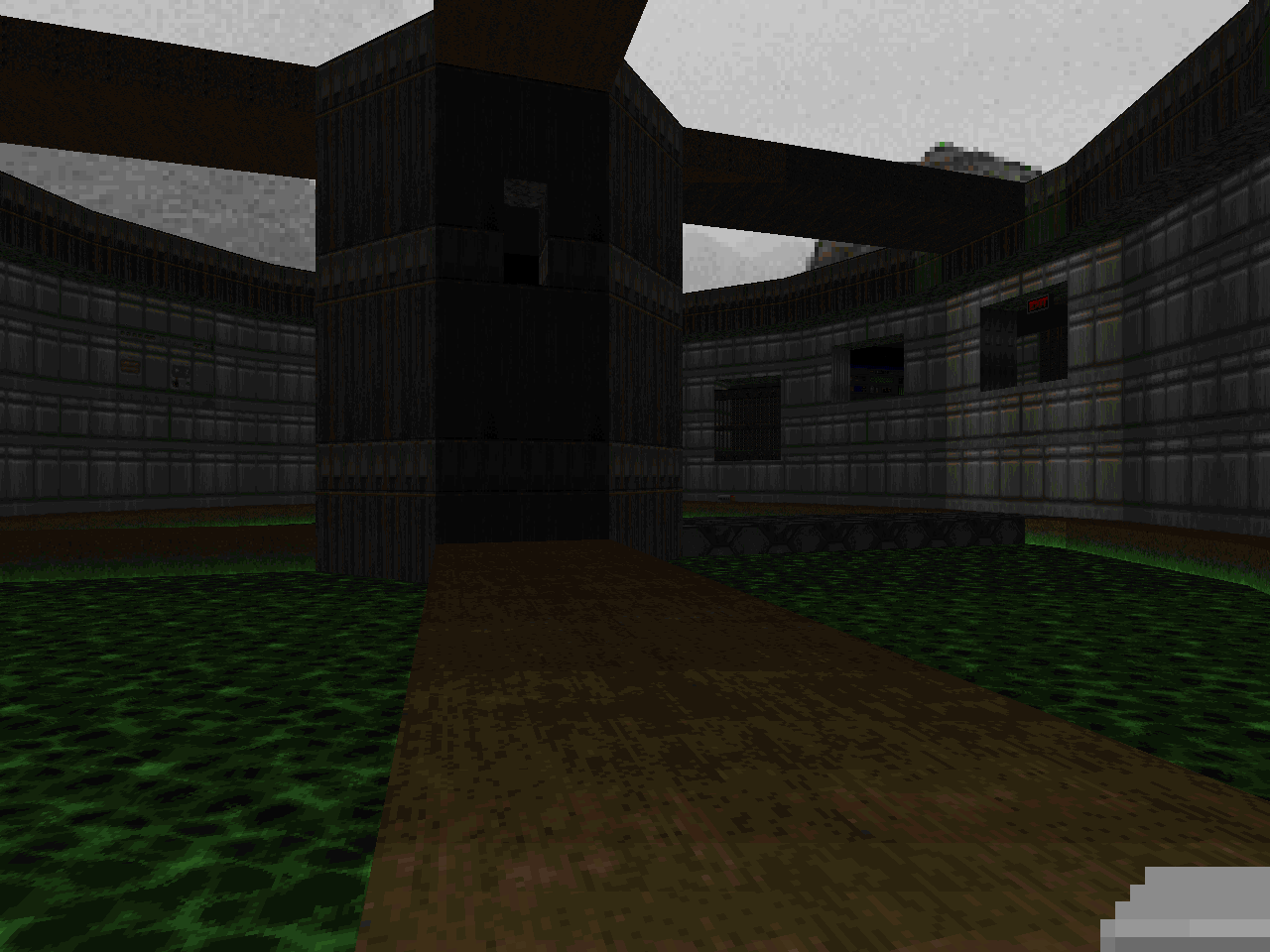 |
| E1M7 | KDITD_SB.WAD |
|---|---|
| by Simon "Volteface" Broadhead | |
 | Super orthogonal and simple. The flat building facade doesn't leave a great first impression and it's borne out through the underwhelming layout. A large portion of the map is dedicated to a thirty-five cell grid of chambers that makes up a nukage attrition maze. The western walkway feels like a clumsy stab at evoking the design of "Computer Station". The lock-in fights at the yellow key are okay, I guess. |
| LAITOS.WAD | E1M8 |
|---|---|
| by Esa "Espi" Repo | |
| Significantly expanded upon and independently released in 2002. The layout and architecture are rock solid. It's simply but beautifully built as far as detailing goes and features oodles of connecting windows to peer into future locations. I can see the style that would be refined for Suspended In Dusk, especially in areas like the northeastern trench. Espi also shows a dedication toward height variation through copious staircases and upper windows from which enemies attack. Health is given fairly freely but the ammo balance may feel a bit tight at first. It pays to be precise with your pistol shots. Incredibly elegant. | 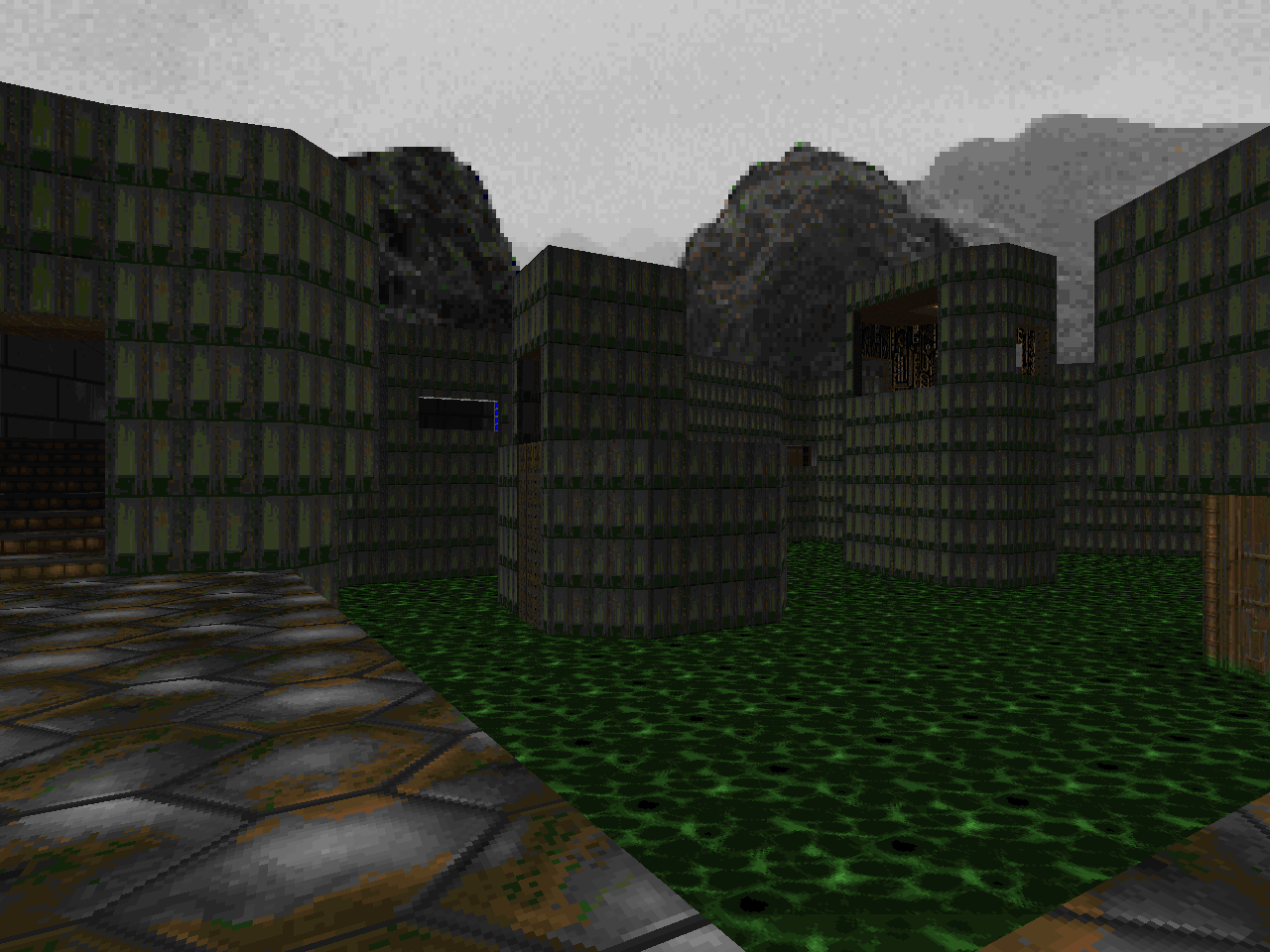 |
EPISODE TWO
| E2M1 | PWF.WAD |
|---|---|
| by Simon "Slayer" Judd | |
 | It's a cute level where the Cyberdemon serves as a tower defender in the cramped central room. Most of the difficulty is a result of this awkward setup. There's also a huge teleporter ambush for the finale but you won't be able to fully clear either without the freakin' rocket launcher. And its pedestal button isn't set up properly so the weapon itself won't lower all the way to the ground. Such malarkey! Judd uses dead-end backtracking in a few places to open barriers so progression can be a bit confusing. The toxic tunnels to the east look pretty cool. |
| TOBIAS_M.WAD | E2M2 |
|---|---|
| by Tobias Münch (4th Place) | |
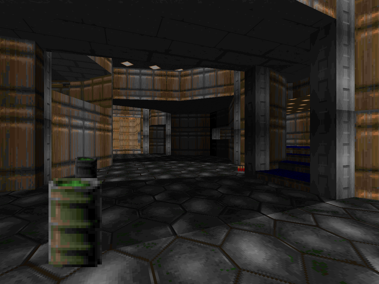
| The opening cramped hallway and immediate dump into an E1M2-ish strobe maze is an inauspicious beginning. It works, though. The author has an excellent sense on how to use monster closets for both organic ambushes and simple surprises. This shines best of all in the aforementioned stacks. He also uses it for a lethal ambush where you're liable to be Swiss-cheesed by shotgunners at super speed. Architecture and height variation are pleasant if a bit underwhelming. The central room between the yellow and red key doors is the main exception. The combat is classic shotgun vs. E1 enemies (no barons) with Tobias exerting a bit more control over where you pick the shotty up. Expect to use your pistol a bit. | 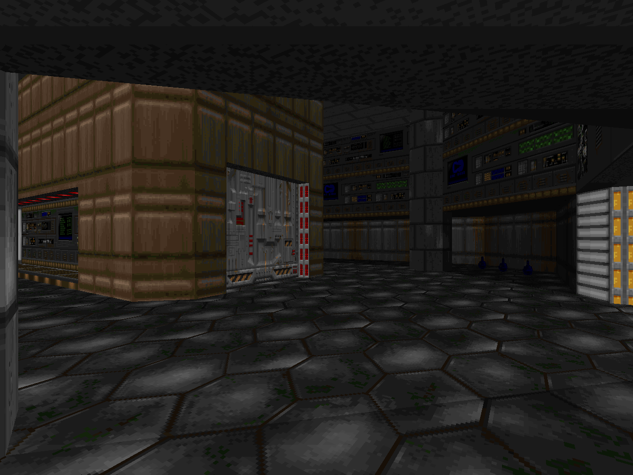 |
| E2M3 | TOBLOOD.WAD |
|---|---|
| by Bob "brad_tilf" Larkin | |
 | Uh, okay. This is a very short level with a slightly tricky layout due to some timed triggers. It feels like a '94 map, albeit one which sports a couple of admittedly cool setpiece areas. I appreciate the big silver canister that's west of the starting area and the way it opens. The expansive marble and metal hall to the exit is nice, too. Not so much the outdoor street bit, though. |
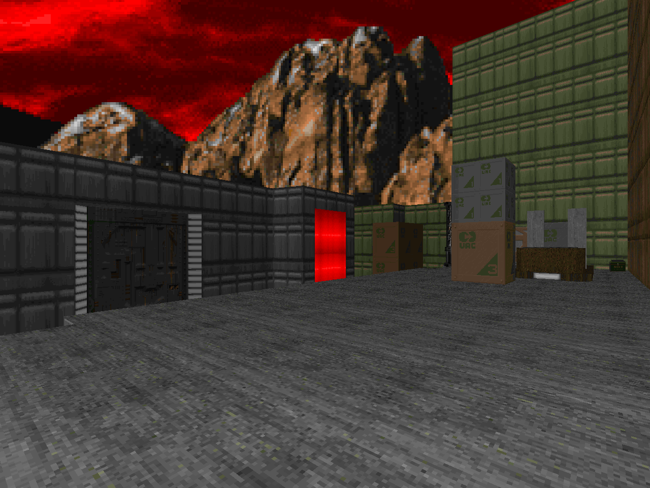
| TRAFFICCONTROL.WAD | E2M4 |
|---|---|
| by Michael "Deathbringer" Martin | |
| It's colored in Phobos but is more of a location-based theme level. Something like an air traffic control station. The layout is really rectilinear and boxy but it's not awful. Unless you can't choke down the super-long hallway with a pack of demons and spectres at the other end. Like the previous level it gives me a 1994 vibe but more on the humdrum / realistic side of things. Not just because of the command tower but also the forklift and the sewer tunnel you have to investigate. The northernmost building facade looks pretty cool, at least. | 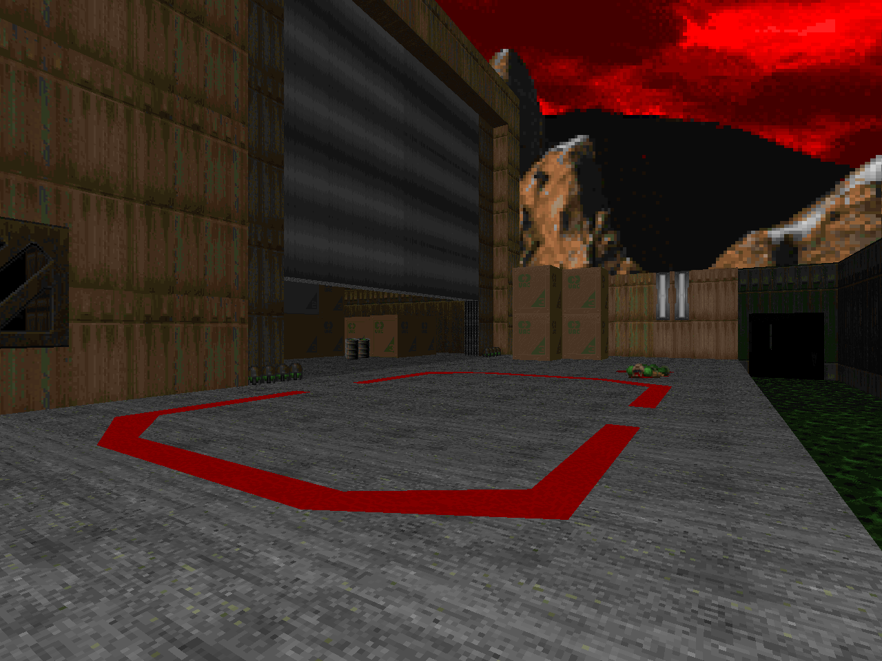 |
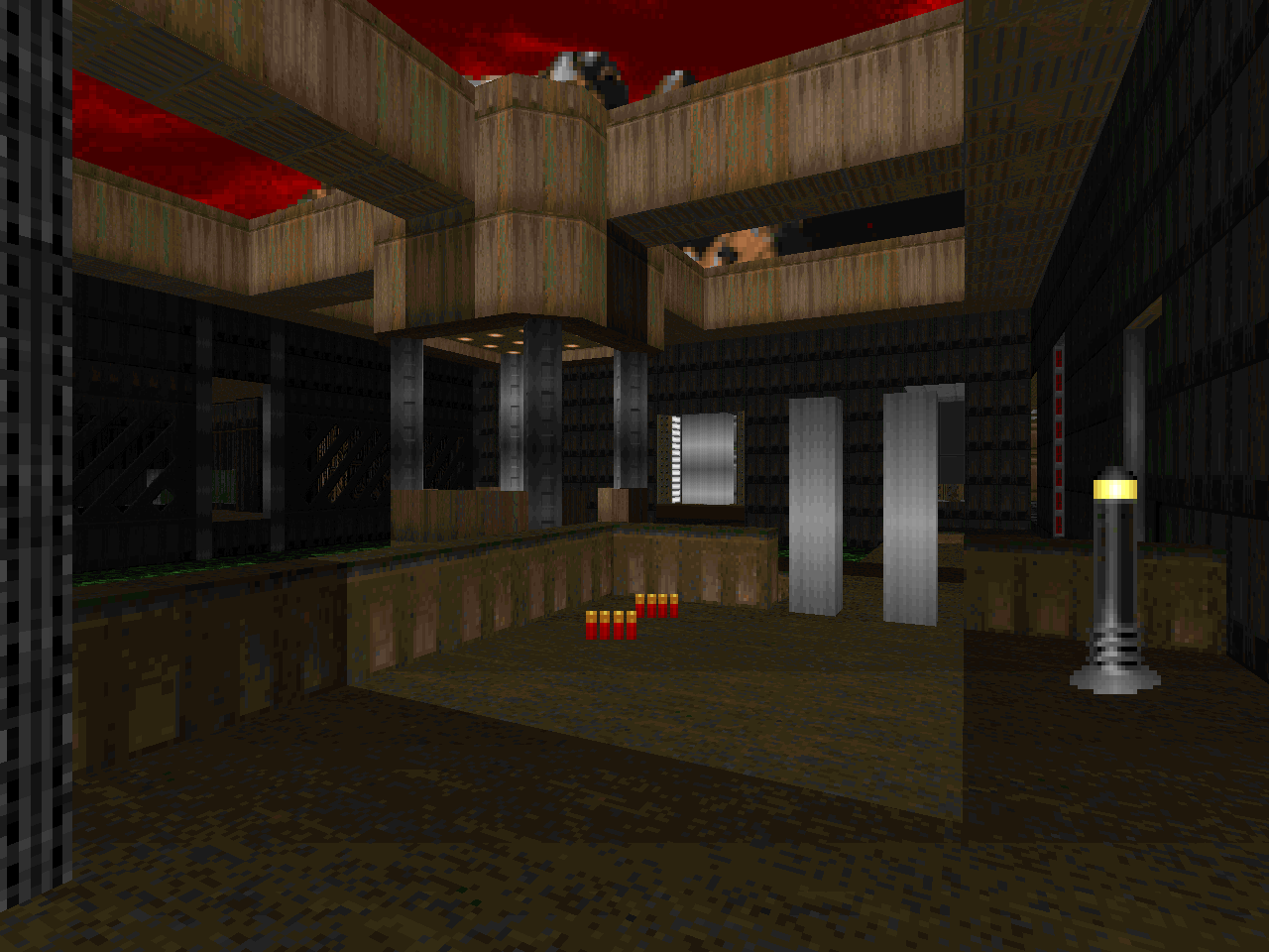
| E2M5 | WALLD1E1.WAD |
|---|---|
| by Jeffrey Crenshaw (1st Place) | |
 | The central symmetry and branching weirdness feels like a definite echo of E1. The starting area is slightly reminiscent of "Computer Station" but it goes its own way after a bit. Crenshaw definitely gets the super-sized KDITD bodycount and all of his monster closets are crammed full. The most memorable sequence of this map for me involves the toxic vat with the blue key. When you finally get inside it drains down, filling the trench to the immediate east. Crenshaw also does a lot of lightcasting, even for the little baby crates, to create strong contrasts between the bright and the darkness. It's a small, fun level and padded out through hordes of Hellspawn. |
| JXT-E1M1.WAD | E2M6 |
|---|---|
| by Jay "Jayextee" Trent (2nd Place) | |
| A tight level with a "Phobos Anomaly" finish. The design of the installation is pretty cool. I like how the author eventually lands you in the central structure where you can open up the side paths to the main switches. There are a couple of rough spots, though, the nastiest in my mind being the fight in the toxic pits. The damage floors combine with the monsters on the ground and the imps on the catwalk for a disorienting and dangerous experience. I prefer the pacing of the finale. It's a great rocket-launcher battle. It's a long time, however, before the walls come tumbling down. | 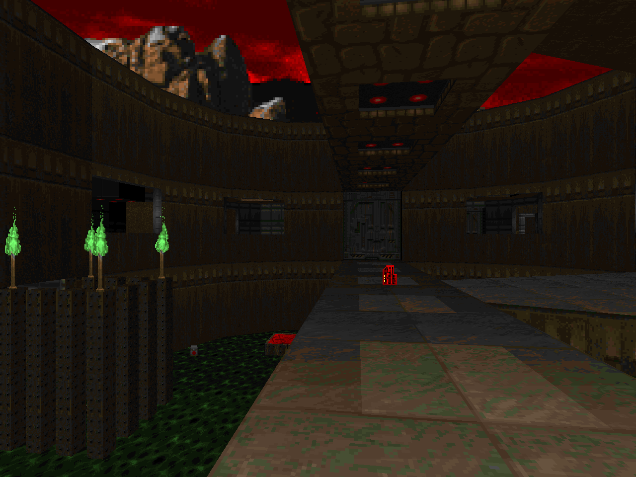 |
THE WINNER TAKES IT ALL
Hey, it's my second-most famous contribution to the Doom community! Looking back, I don't know what I was thinking, making a "realistic" level. Aside from using the E1 texture set I basically just did what I wanted. I should set myself the same time limit and criteria and see what I can come up with, these days.
ReplyDelete-Deathbringer