Way back when in the year 2000, while the rest of us were fighting off Y2K, Doomworld hosted a contest. The goal was to create a Boom map using no more than ten sectors. The idea has more merit than one might think at first, as - to quote
DoomWiki - "[a] sector does not have to be a single polygon. For instance, two squares can be separate and non-contiguous, but still be part of the same sector." What this meant for
10 Sectors was a ton of maps that had a bunch of "sectors" that only had ten different combinations of ceiling and floor flat, height, light, tag, and type. A whopping
146 entries were submitted, and the cream of the crop were selected and deposited into this, the
10 Sectors megaWAD.
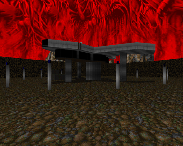
The quality of the final product is pretty divergent. Compare the first five levels to pretty much any one of the last ten maps and then ponder what the other 114 submissions were like (or just see for yourself, in either 10 Sectors 2 or the collection of five megaWADs the judges used to pick through the entries). They're all very playable for the most part, but it's clear that the kind of Boom wizardry witnessed in parts of this megaWAD were the exception rather than the rule. The one thing you can expect to see throughout much of this mapset is a flat plane of action. Getting players to the kind of varying heights they're used to with a scant ten sectors is tricky business. Some of these guys, to their credit, manage to pull it off without it feeling binary.
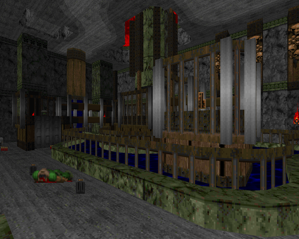
Speaking of wizardry, one of the ways authors get around the ten sector limitation without things feeling static is by the rather ingenious use of linedef runs that reconfigure the level geometry on a grand scale. You will rarely see any of this happening yourself because the contestants are careful to gate you off from returning to the previous sections once they've been manipulated, but it's easy to see when it fucks up, which if you run through Paul Schmitz's MAP11, you might. When it works, though, it's a fantastic cheat, enabling spectacles like Chrozoron's "Under the Horizon".
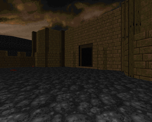
10 Sectors is not necessarily hard, but many of the later maps are ballbusters that should appeal to any player looking for a challenge, except perhaps Niggel's MAP16, which on UV has woefully inadequate ammo stores for the task laid out before you. GeminI's level is built more like an obstacle course, where the puzzle is composed of monsters, as is also the case with Gonzalo's "Frenzy", which carries echoes of his contributions to
Cyberdreams. "Crunch!" is more of a typical puzzle level, though the combat is still designed to throw you off balance. Then, of course, there's the wild and weird (but cool) stuff like Aardappel's "Hexagon", which carries an aesthetic unique enough for an honorable mention.
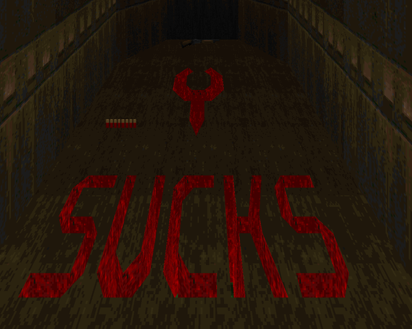
It's amazing what you can get away with using 10 Sectors. Parts of this megaWAD do impress, and if nothing else, it's a pretty solid collection of Doom II maps to gun your way through. If you're not one to be wowed by the technical accomplishments of some crafty authors, though, you may want to stick to something more traditional. At least, something with way more sector combinations. At the very least, give it a shot - that last run of levels is pretty freakin' great.


10 SECTORS
by assorted authors
| Kukloppe | MAP01 |
|---|
| by Tobias "Quido666" Forsberg |
|---|
| Simple yet ornate brick and mortar level with a lot of hitscanners. The only time you're really threatened is by the commando pit guarding the exit switch. It's really short but looks very nice, like it would be cool as part of a larger map. | 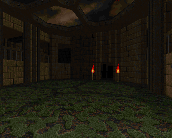 |
| MAP02 | Hangar |
|---|
| by Øystein Langhelle |
|---|
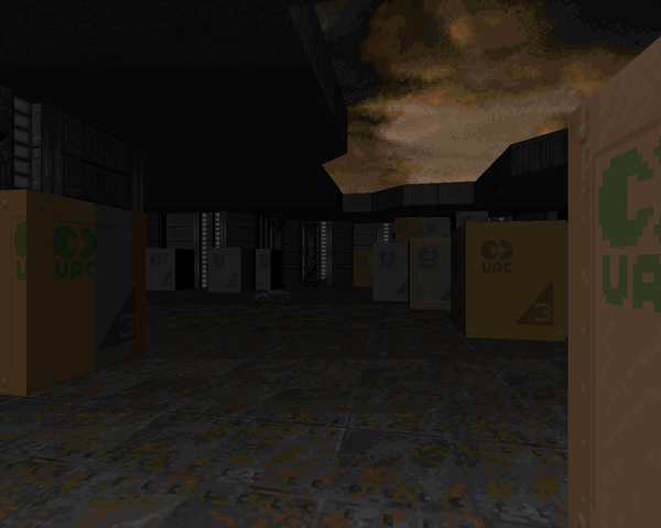 | A slightly more robust map in a crate base format. Langhelle makes things more nuanced with all the places a monster can hide, though the arachnotrons and mancubuses make some of the hold points a bit of a grind. You'll probably want to save those rockets for the few revenants. The berserk pack at the onset is a nice resource to spare. |
| Astral Deformity | MAP03 |
|---|
| by Kristian Aro |
|---|
| Aro's brick and mortar level feels like an outtake from Demonfear, looking boxy and feeling brutal. Once you start shooting you won't have an opportunity to stop for a good bit. The combat shotgun is a nice upgrade for the claustrophobic gameplay that dominates the level. The only thing that sucks is the rocket launcher ledge with the revenants, which is a pretty awkward fight. Fun stuff. | 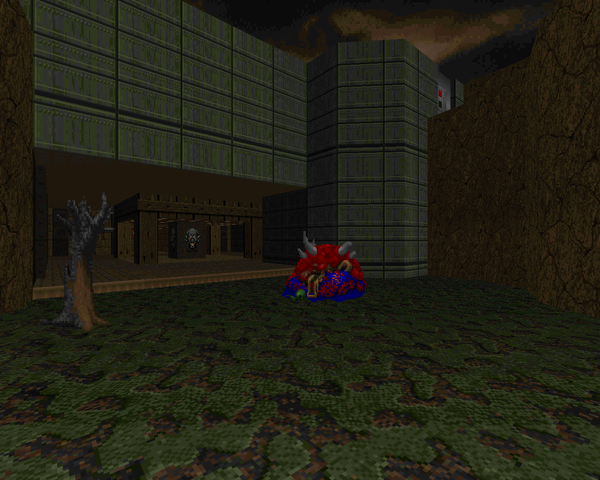 |
| MAP04 | 60 Feet Under |
|---|
| by "Cephaler" |
|---|
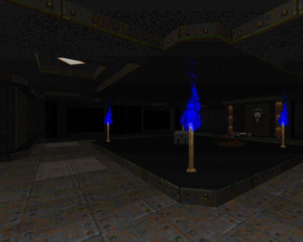 | A simple nest of twisting dark metal tunnels designed around congestion and monster closets. It's decent enough, with color-coded switches lowering gates to their associated areas. Most of the ambushes are nothing special but the arch-vile / spectre fight is almost always an affair to remember. Don't forget that you picked up a plasma rifle somewhere on the way. |
| Into the Fray | MAP05 |
|---|
| by "Cephaler" |
|---|
| A short romp through a largely outdoor brick and mortar style area. The main hook is a dangerous trek through a gated walkway where you don't have enough firepower to stay and chat, so you've gotta push on through and explore the rest of the area before you can make things safe. Once you grab the combat shotgun it's pretty much over, though that final room of mancubuses and cacodemons might give you some pause. | 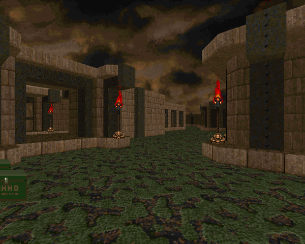 |
| MAP06 | Pain Manor |
|---|
| by Arno Ansems |
|---|
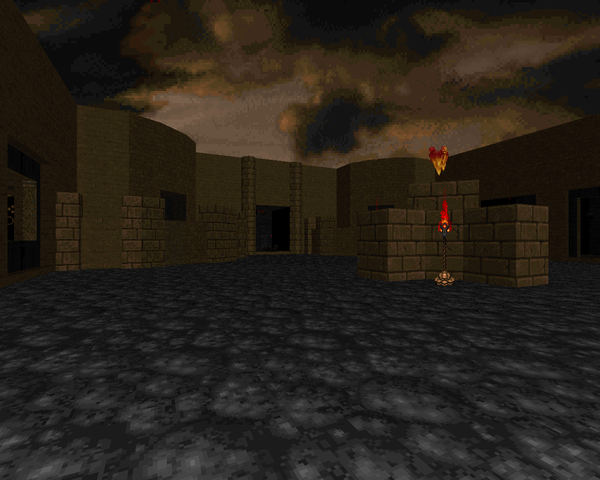 | Arno tackles the contest with a more traditional map layout. "Manor" is about as long as an average map with a little exploration and a lot of monsters to kill. It even has a showdown in a big outdoor courtyard with tons of cacodemons and a pair of arch-viles. If you're so distracted, you might not find time to grab the rocket launcher until it's all said and done with. This is a very cool level and feels almost too advanced for the competition what with all the sector furniture. |
| Death Valley Fortress | MAP07 |
|---|
| by Kurt Kesler |
|---|
| KBOOM13, perhaps? This is a big outdoor map plus base with a bunch of hard-hitting monsters. Kurt sets the pace by dumping most of your gear at your feet which you'll need for killing off the mancubus / Hell knight snipers and clearing the biggest building of its revenants and arch-viles. There is a Cyberdemon, and all the scrub on the ground make it a very deadly duel since you're liable to get hung up on shit. The final sprint is pretty much hold down the fire button with the plasma rifle and try not to eat a revenant rocket or arch-vile blast. Fun and hectic. | 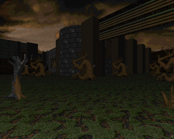 |
| MAP08 | Frenzy |
|---|
| by Gonzalo Perez de la Ossa |
|---|
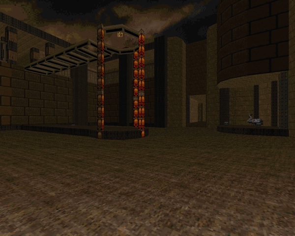 | Better known as one half of Presage, the duo behind Cyberdreams. This level begins and ends with Cyberdemon telefrags but the in-between is a lot of monsters to be killed. The arrangements aren't that tricky at first but the yellow key courtyard requires a lot of fancy footwork to start and surviving after you've grabbed the key and woken the arch-vile is a bit of a bear. The final fight is perhaps more dickish than any of the ones from Cyberdreams due to the proximity at which you have to skirt the blue skull Cyb. I had to slam him with a combat shotgun painstun and then run over the corner of his ledge to the telefrag. |
| UAC Base | MAP09 |
|---|
| by "kinkajoy" |
|---|
| A blue and silver UAC installation with a couple of blinking tech tunnels to run through. Most of the doors in this level are triggered elevators, which gives it an unusual feel as you careen between the two different tiers of gameplay. The more unusual segments feature teleporters to jump between sections and a baron in a cage that you have to take a torturous path around, not that it matters once you off a few imps and turn your combat shotgun at him. Standout fight - the mess of zombies on the elevator corner pads right after the demons and spectres in the dark. | 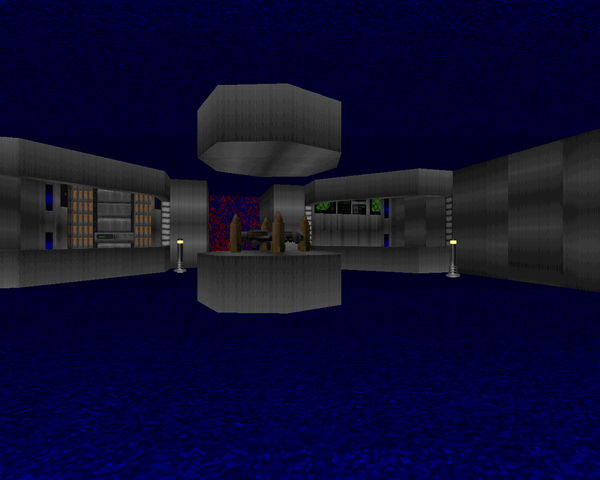 |
| MAP10 | Tension |
|---|
| by Mike "Cyb" Watson |
|---|
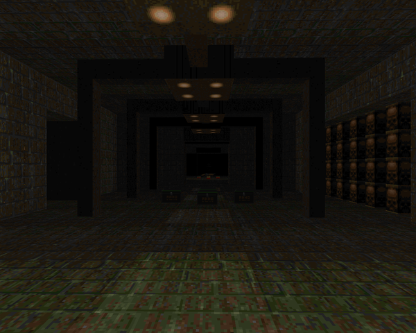 | Cyb crashes the party with this dingy, sewer-tile map that manages to look pretty good, regardless. The berserk pack at the beginning is a red herring - unless you want to Tyson these bastards, anyway. "Tension" has a lot of claustrophobic combat but most of it can be held off at convenient chokepoints. The three exceptions are 1) the big cacodemon room if you don't max out your bullets before starting a fight 2) the pain elemental room if you miss out on that sweet secret shell stash and 3) the Cyberdemon, but if you're a quick hand with the BFG you can probably wall bump his ass. Cool level. |
| Decade-ence | MAP11 |
|---|
| by Paul Schmitz |
|---|
| Schmitz of Artifact fame gives us this interesting fusion of wood, metal and marble. Difficulty slowly escalates as you gather the weapons until you reach the outdoor section, where a crossfire of bullets and fireballs threatens to chip away at your health. You'll need as much of it as you can keep for the final area, an impressive-looking catwalk surrounding two giant vats, the perimeter guarded by all sorts of nasties. Finding the blue keycard isn't bad; the red and yellow ones are part of a simple timed switch puzzle. The Cyberdemon showdown will put your SSG through its paces. Note - when you step into the elevator, make sure you run back and forth through the car a good bit, or you'll get stuck when you move forward. | 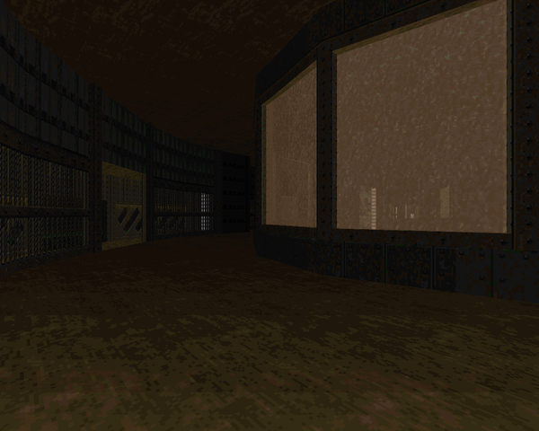 |
| MAP12 | A Place of Warship |
|---|
| by Kurt Kesler |
|---|
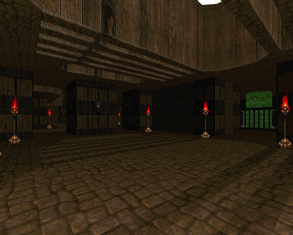 | This wood and mortar level feels too small for a Kesler map, but all the hallmarks are there. Tons of hitscanners, tons of hardbodies, and tons of ammo with which to blast them to smithereens. The opening is probably the most dangerous part of the level as monsters are hiding behind all those pillars (and, as you'll see, within), and your ever-shifting focus may let one of them sneak up on you. Hitting the yellow key means upgrading to the rocket launcher, which should usher you through the rest of the level with the exception of a Cyberdemon, who's a tricky fight with your limited real estate. |
| Summercore | MAP13 |
|---|
| by Jonathan Rimmer |
|---|
| Rimmer makes a pretty cool outdoor level that weaves into some kind of a base before showing off with a faux-3D bridge, one that you saw at the start of the level. Early action is all about the shotgun but the daring will turn this into a combat shotgun party with a quick grab from between the two fatsos. Chewing through all those Hell knights and barons makes things drag a bit, but there are only about sixty enemies, so it's over before you know it... supposing you don't repeatedly die to one of many high-HP encounters. | 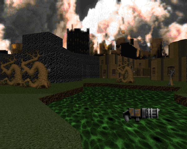 |
| MAP14 | Lift Tension |
|---|
| by Jonathan "Teppic" Dowland |
|---|
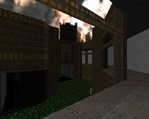 | An orthogonal nukage facility that's really tight on ammo. Don't miss too many shots or you'll be SOL when it's time to kill the big bads. Even though it's green, Dowland is kind enough to abstain from damage floors. You still have shit to fight down in the trenches but some ammo management and sprinting around for rockets should make everything go alright. The revenant room is a bit tricky with everything that's running around when you first get in; be on the lookout for a surplus of shells. |
| Computer Complex | MAP15 |
|---|
| by Paul Berlin |
|---|
| Berlin makes the most of his ten sectors by building a massive green techbase complex filled with monsters numbering in excess of three hundred. It's loaded with hitscanners and a few nasty ambushes that you'll do well to survive, particularly that high-HP pack that guards the blue key or the finale, which is an exercise in tunneling, crowd control, and not getting smoked by an arch-vile. The only thing holding it back is the sector limitation because the layout is pretty flat, but that means actually having to care about hitscanners from far away, because every window is a portal to pain. | 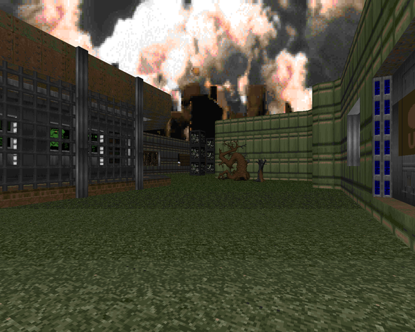 |
| MAP31 | Marle - The Horrible Bitchgoddess |
|---|
| by Kevin Nadolski |
|---|
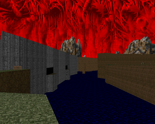 | "Marle" is a straight up canyon crawl with everything that entails, plus the added threat of falling into the toxic water at the bottom, which you cannot crawl out of. Expect to be ducking fireballs all the time and watching out for hitscanners plinking away from the other side of the map as you advance toward your objective. There are a couple of mini-labyrinths that are a little more fun to explore, since you're not under constant pressure. The secret exit is kind of clever, though obvious if you happen to glance back once you've passed the switch. |
| Hexagon | MAP32 |
|---|
| by Wouter "Aardappel" van Oortmerssen |
|---|
| Aardappel gives us this bizarre construction, built entirely out of hexagons with the mysterious WadC. The opening is a little rough because you're low on ammo and protection and there are a lot of avenues for monsters to approach, but once you finish the initial clear, it's all about slowly pushing forward and killing what may come. Grabbing the SSG made it a little more fun for me because there's way too much ammo for irresponsible use to be an issue, and truth be told once you get things under control you're not hurting for health, either. The visuals are quite striking, though, due to the hexagonal tiles. |  |
| MAP16 | Tech Base: Sector 10 |
|---|
| by Michael "Risen" Niggel |
|---|
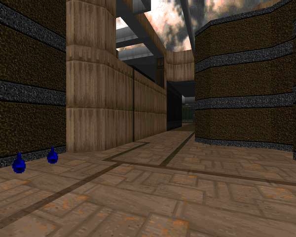 | This level looks really cool but is a complete and total pain in the ass to play when going in blind. Ammo is at a premium, a fact initially made evident with the big cacodemon swarm in the outdoor area and then hammered home in the second half, partially with that arch-vile trio but more the room with the four monster pens, all of which are loaded down with tons of HP and only returning two rockets. Don't bother trying to kill 'em all on UV. Or, really, just dial it down to HMP so you can breathe a little easier. It's a shame, 'cause the actual inner workings of the staircase puzzles are pretty cool. |
| Lord of the Flies | MAP17 |
|---|
| by Kristian "Ebola" Käll |
|---|
| A tricky, ornate marble map. The opening is an odd bit since the SSG and its ammo are down in the toxic blood pit and you'll quickly wake up some invaders. Once you hit the eastern, outdoor area, you're fine, since it's loaded down with shells and bullets. Just take your time with the imp galleries and knock out the arch-viles and presto! you're ready for the big bad, who can be dealt with (albeit a tad slowly) with some back and forth strafing. The faux-3D bridges, including the rising one at the finale, are Hell of cool. | 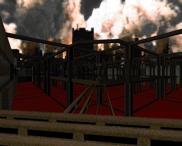 |
| MAP18 | Quick and Dirty |
|---|
| by Anthony "Swedish Fish" Soto |
|---|
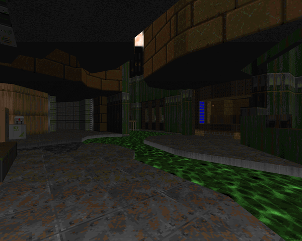 | "Quick" is length and connectivity and "Dirty" is the toxic lake in which this outpost resides. It's a fun blastathon with a bunch of imps mucking around in the doldrums. About the only point of challenge will be the outdoor area because of the snipers and the indoor crossfire in the crate area since there are a couple of walls of hitscanners you'll have to punch through. Cool stuff! Shame it's so short. |
| Nukage Town | MAP19 |
|---|
| by Sami Mäki-Mantila |
|---|
| Another short, fun map. The concept is similar - some kind of complex surrounded by a body of nukage - but the execution differs on some key points. There is an enormous cacodemon / pain elemental ambush lying in wait as you walk out toward the exit, which is kind of but not really guarded by some barons and demons. I like the reuse of the entrance pit sectors for a re-entry to the caged room you could see across from the starting area. | 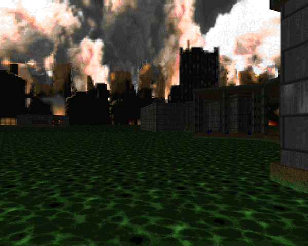 |
| MAP20 | Ganymede Outpost |
|---|
| by Boris "Tarin" Iwanski |
|---|
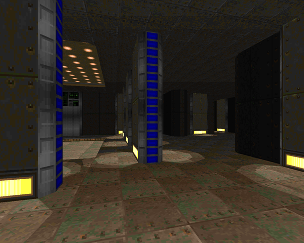 | A nice green techbase map with a decent outdoor area. The actual base interior is sectioned off by a series of gates you'll open with keys that gradually open it up as far as accessibility goes, though they're usually accompanied by a bevy of beasties that you'll have to fight through. The combat isn't terribly challenging on that front, consisting mostly of shotgun / chaingun and later combat shotgun spam as you clear the base of its larger monster packs. Those instances of Hell knights / barons add some pressure, though, and some areas will offer pressure in the form of mancubuses. |
| Crunch! | MAP21 |
|---|
| by Vlad "blod" Sosedkin |
|---|
| Vlad makes a fantastic, imaginative techbase level. The only strike I have to level against it stems from its one major feature; rather than doors, it has slow lift and crushing sectors that gate off map activity. The second part tripped me up as I thought the crushers were solely for dealing with the hallway arachnotrons. Little did I know... There's some neat scenery, like a big toxic gorge you're attempting to fill, plus the hexagon room overseen by an army of revenants with limited immortality. The really cool stuff is in the eastern area, though, fooling your brain with a crate area, a nukage octagon, and a Cyberdemon showdown with a really elegant solution that I didn't realize until having died a handful of times trying to pull an old-fashioned. Very cool stuff. | 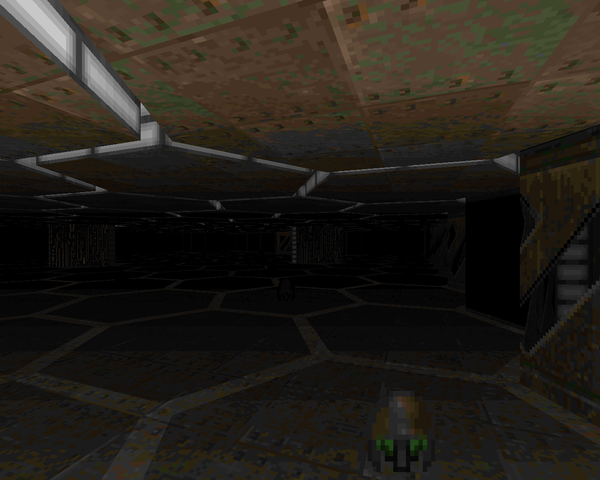 |
| MAP22 | Storm Approach - Dark City |
|---|
| by Robert Beladi |
|---|
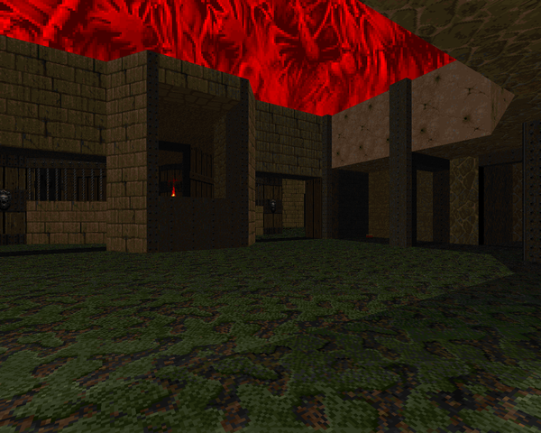 | A solid map in brown brick and metal. Beladi even reuses some of the ten sectors for scenery windows, which gives things a bit of a modern touch. The architecture is both neat and varied, which does a good job of obscuring the sector limitation. The fights aren't that hard - a level in this style gets most of its mileage out of traps, which really aren't present apart from a false wall with a revenant - but there is an end-of-level Cyberdemon that might be tricky if you don't figure out the BFG. Nice stuff. |
| Hell Prevealed | MAP23 |
|---|
| by Yashar "GeminI" Graibzadeh |
|---|
| GeminI nods in the direction of the now legendary HR.WAD with this killer obstacle course. The first leg of your journey is about as hard as it gets, at one point confining you to a tiny island attempting to avoid arch-vile fire while slowly whittling down the Hell knights blocking your progression, moving on to a solid wall of pain elementals where the BFG is a strong suggestion, plus that huge ambush with some viles immediately after. Things kind of mellow out after that as you're able to use enemy positioning to your advantage and an invul sphere takes most of the sting out of the ending sequence. Neat faux-3D bridge effects. |  |
| MAP24 | Hidden Facets |
|---|
| by Qingshuo "piXel reX" Wang |
|---|
 | reX presents a beautifully ornate but hard as fuck level, with survival style gameplay that's more in line with one of the CHORD levels than anything else. The trick is in the secrets, like the blood waterfall that lets you nab the plasma rifle and telefrag its Cyberdemon guardian, or the hidden teleport to the combat shotgun, which should help deal with some of the early ammo issues. It's just one of those hornets' nests with no safe places to start out with, so you have to painfully clear one out before you can take a breather. |
| Under the Horizon | MAP25 |
|---|
| by Jonas "Chrozoron" Feragen |
|---|
| A fantastic if short adventure level that sends you through a base build into a toxic lake with a ruined waterfront complete with lighthouse beacons, plus a spaceship that actually loads you inside. Gameplay is very forgiving though if you suck at close-quarters fighting you might fall pray to one of the Hell knights or barons that populate this level. The final room, which has a pair of arachnotrons plus a mancubus, is about the worst encounter you're going to see. The fact that all this was done with ten sectors is pretty astounding to me what with all the special effects. | 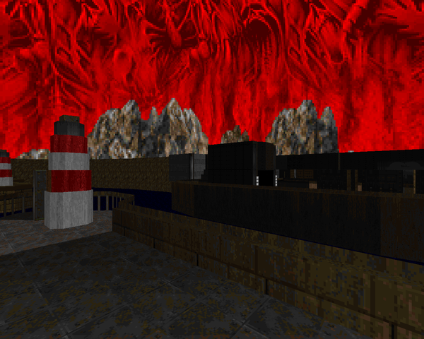 |
| MAP26 | The Aquaduct |
|---|
| by Chris Lutz |
|---|
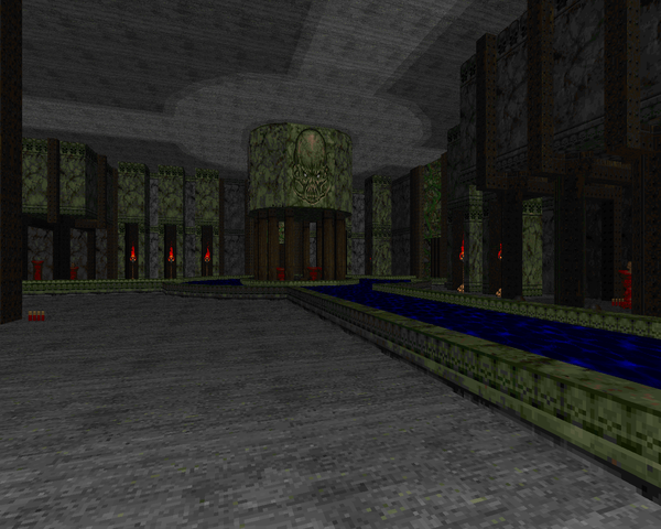 | Looking at the contest comments, Lutz tanked Boom with this linedef-heavy masterpiece that has a lot of deep water and tons of marble. It's got a lot of cool stuff, like a destroyed bridge you have to leap off to eventually get to the other side, and really just a metric ton of faux-3D stuff. As to how it plays, well, it's a bit of a claustrophobic nightmare at times, especially in areas like that cacodemon catwalk where you get hung up on the railing posts, which the demons can shoot ball lightning through. The finale has a potential "Gotcha!" showdown, but I couldn't figure out how to call up the Spider without having accessed the exit. Don't miss out on the megasphere or plasma secrets, either. |
| Gas Panic | MAP27 |
|---|
| by Jonathan Rimmer |
|---|
| Rimmer vaults over "Summercore" with this beige brick gothic island city. There aren't a whole lot of tricks with the actual plane of action feeling very flat (like the previous "Aquaduct") but it's a cool exploration level as you pick through the buildings, including an infernal church with a floating marine corpse, on your way to the exit. The long bridge walk adds to the atmosphere and the battlements are a nice cheat that strike a nice balance between usability and realism. You've got snipers everywhere, but the standout fight is in the exit room, putting you between a rock and a hard place. | 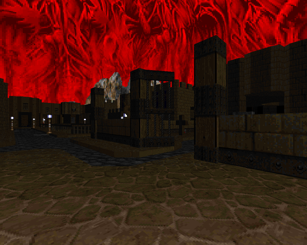 |
| MAP28 | Eviscer-Station |
|---|
| by Lee "Fen Boi" Szymanski |
|---|
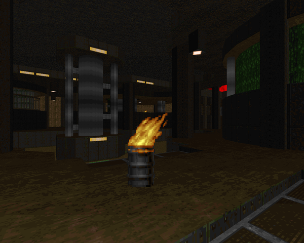 | Lee puts out a perfectly serviceable series of waystations in a big ol' nukage canal. The outer areas look kind of bare apart from the spaces where he's comfortable reusing his ten sectors but those inner areas look pretty hot, especially with all the height variation that's been mixed in. Szymanski has a ton of fighting to go along with it, too, even if a lot of the enemies are incidental Doom II trash. That huge southwestern area is a nice crossfire and there are a lot of beasties waiting for a piece of you just past the crate area. Fun blast-a-thon. |
| The Black Wind of Mayhem | MAP29 |
|---|
| by "NokturnuS" |
|---|
| This level starts out as full-on arena Hell, with monsters and snipers in just about every window and corner, before eventually settling down once you've cleared out some breathing room, to exploding once again when you trigger the monster-laden finale. Combat is fun but demanding as you try to gain purchase but it gets pretty congested in the northeastern area, especially with that tower surrounded by imp / Hell knight cages. The end is a combination of problems, but ducking down that long-ass corridor and shelling the arch-viles to death worked pretty well, after which I broke back in to kill the rest. Very cool. |  |
| MAP30 | Last Call |
|---|
| by Michael Mesko |
|---|
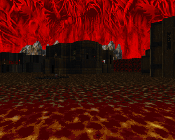 | Thematically, "Last Call" seems like an odd choice to end on, but this spot isn't reserved for finales, just the best overall choice. In that case, "Last Call" is very good at fooling you with its limited sectors. It plays like a tricky "Gotcha!"-esque map with four or so compounds built into a crater of lava, with one at the center. The roaming fliers you wake up near the beginning will harry you until you get enough of an ammo buffer to deal with them, all the while you're facing down exacting monster placement, like the clever arch-vile trap that's activated by using the universal elevator sector. A solid play. |





Hooray!!
ReplyDeleteas promised
DeletePlayed this a while back in a Zandronum server, because obviously it was a bright idea to play maps with dynamically changing architecture based on one player's progression with multiple players.
ReplyDeleteSeeing that the wad used doom2's default music, I supplied RAGTIME2.wad. This is a music pack that consists of nothing but ragtime midis.
i imagine the more complex issues went over like... a thing that doesn't go over very well
DeleteMap27 looks almost like it was spun off from Mordeth (and the actual episode, not the award)
ReplyDeleteit does have a pretty mordeth-y look, yeah
DeleteThere should be a tag for community projects/events, those are always my favourite reviews and my favourites to play.
ReplyDeleteyour request has been met with the "community project" tag. it isnt an exact science but this should be a good overview of all the community stuff ive reviewed
DeleteThis comment has been removed by the author.
ReplyDeleteThere's still at least a few more community projects that haven't been given review treatment (and not just the 32in24 one). Community Chest 3 and maybe even 2 are probably good enough to play, though CC1 not as much. There's also the Newdoom Community Projects too though. ZPack has some nice maps in it (number of duds too though), and is for ZDoom (as implied by the title). DMP2013 has no review yet either, and DMP2014 is more or less wrapped up, both mixed bags. And there's a couple 1024x1024 iterations not covered, though I'm excited about the new trend to 2048x2048.
ReplyDeleteAs for 10 Sector I haven't played it so I can't say whether I think this limit was achieved better or worse than other limit-based community projects. I can say though from a glance, it's VERY hard in the later levels to recognize the limit in the architecture! Thinking though it may become apparent in the gameplay, but I'll see.
Also always enjoyable when you pick some stuff from an earlier year. :)
ReplyDelete
The limit isn't always even clear when looking at the maps. Some pretty top shelf maps out of a strict limitation.
ReplyDelete