DOOMJÁ-VU
hosted by Realm667
hosted by Realm667
as featured in Super Serials
| Mouldy Old Void | Put Up Your Dukes! |
| dead.wire | Black Magnetic |
| The Heart of Stone | Celestial Site |
If you think about it, in a certain way, just about every community project is some kind of a competition, where managing to get a level in the running order is the reward. And then, you get events like Doomworld's 10 Sectors, which had almost 150 submission and actual prizes. Daniel Gimmer, aka Tormentor667, decided to do his own little contest in 2015 - Doomjá-vu. The grand prize was Spikey, a custom-made plush imp, but there were prizes all the way down to 5th place. The way things turned out, well, Torm only had six entries, so it almost turned out that everyone got a prize just for showing up. Ah, well, sucks to be that sixth guy!
The premise of Doomjá-vu is simple. Contestants take a base map provided by Torm and then work it over into something completely different, but for the fact that a side-by-side comparison should render the similarities. And, uh, you might get a feel of deja-vu while walking around. The seed for this particular instance was none other than a sort of stripped-down de-make of E1M7 ("Computer Station"), used primarily for its layout, I'm assuming. At first glance, it may seem like the contestants were given a lot of leeway when transmogrifying the point of origin, based on a cursory look at the rules:
- You may change any sector/line property (height, light, boundaries, shape, vertice position, linedef length/split, map size)²
- You may cut about 30% of the provided layout of necessary
- You may add custom textures/flats
- You may add custom actors (props, monsters, weapons)³
- You may add custom sounds (ambience, sequences)
- You may add custom music (midi, ogg)
- You may add custom graphics (w/o overwriting original ones)
- You may add additional rooms/space to your map's layout
- You may add scripts to your map (acs, dialogue)
- Your map must be vanilla-, boom-, zdoom- or gzdoom-compatible
- Your map must work with DOOM2.WAD (but it doesn't have to be only Doom-styled)
³don't go overboard, we don't need another Brutal Doom
The most important details are in those first two lines. As wildly divorced as the final product may be, the contest's main conceit is that you can still read the majority of the original layout. Torm was also kind enough to quote Esselfortium in that the intended purpose is "for each person to make something creative and interesting out of the layout, not for Torm to ask a bunch of people to detail the same map 10 times in slightly different ways." In this last regard, the final lineup fails to disappoint. Then again, I'm used to playing through so many megaWADs and episodes that use vanilla Doom or Boom as their engine, so perhaps I'm just naive when it comes to anything that busts up the format.
As mentioned, Torm got six entries, after which they were put to a community vote. The turnout wasn't really what I would hope for something like this, but when you consider that most of the enthusiasm for the project had dropped off with plenty of people busting in to talk about how the project should be run and then fading into the background, plus the fact that the cross section of people interested in GZDoom as well as Realm 667 shenanigans is pretty niche in and of itself, it's not all that surprising. Not that I have any room to complain; after all, this whole thing finished up in March of 2015, and I didn't play dead.wire until about six months, let alone the rest of the contestants.
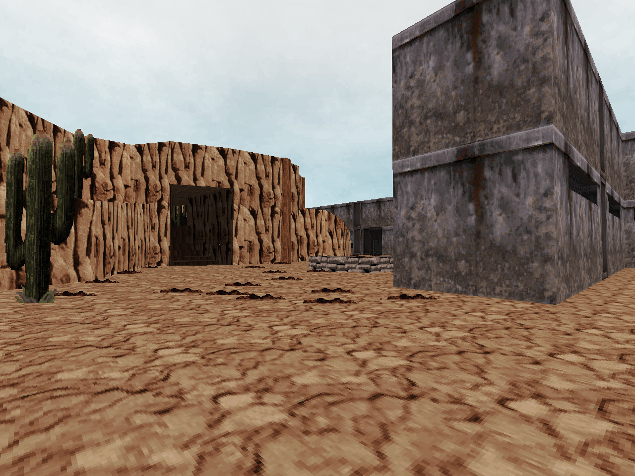
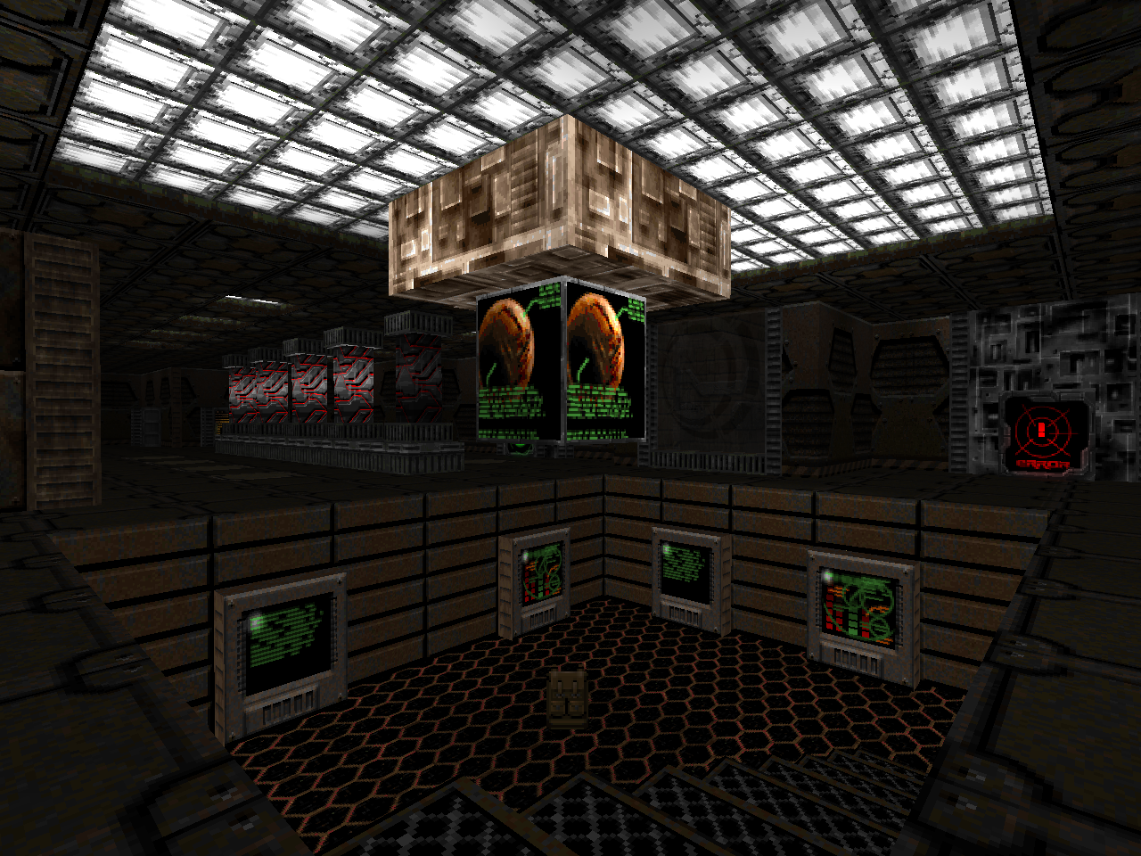
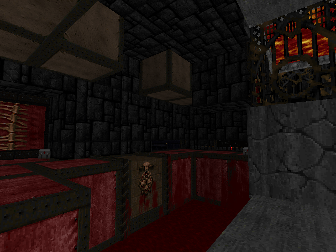
zrrion the insect won the competition with Mouldy Old Void, which didn't really change any of Doom's core conceits, but had a pretty original setting and some cool quirks. Sgt. Shivers took second with Put Up Your Dukes!, a short, arcade-style shootout through a mountain base. Xaser snagged third place with dead.wire, which combined a novel level theme with some gameplay switch-ups like new weapons and making all of the monsters belonging to the original Doom into specterized versions of themselves. Angry Saint came in fourth with Black Magnetic, a fairly complex 3D base using mostly custom hitscanners. evil space tomato slid into fifth with The Heart of Stone, which used mostly traditional gameplay on the Hellish equivalent of an orbital platform. Last, but certainly not least, came DooMSkeR Scratch's Celestial Site, an enormous space station-style map with plenty of Realm667 monsters.
I'm not really interested in who ultimately won the competition; after all, the end result was six new levels for Doom II which were each pretty unique to each other, and that's always a victory for the community. For those who can't help but ask, and you know who you are, I am still quite happy with our decision. For the rest, go ahead and load up the levels that seem interesting to you - or play them all.
| Mouldy Old Void | |
|---|---|
| by "zrrion the insect" | |
| zrrion pops out from hiding to give us this cool map. Set in a slice of high-rise apartments whisked away to Hell, Mouldy Old Void is a lovingly detailed Doom II level whose interior sections tread on BUILD engine territory. There aren't any real gameplay switchups, but there are a few neat gimmicks, like random starting locations (but not too far apart) and the floating portals in the air that link the disparate sides together. It's definitely a setting I'd like to see more of, hint hint. | 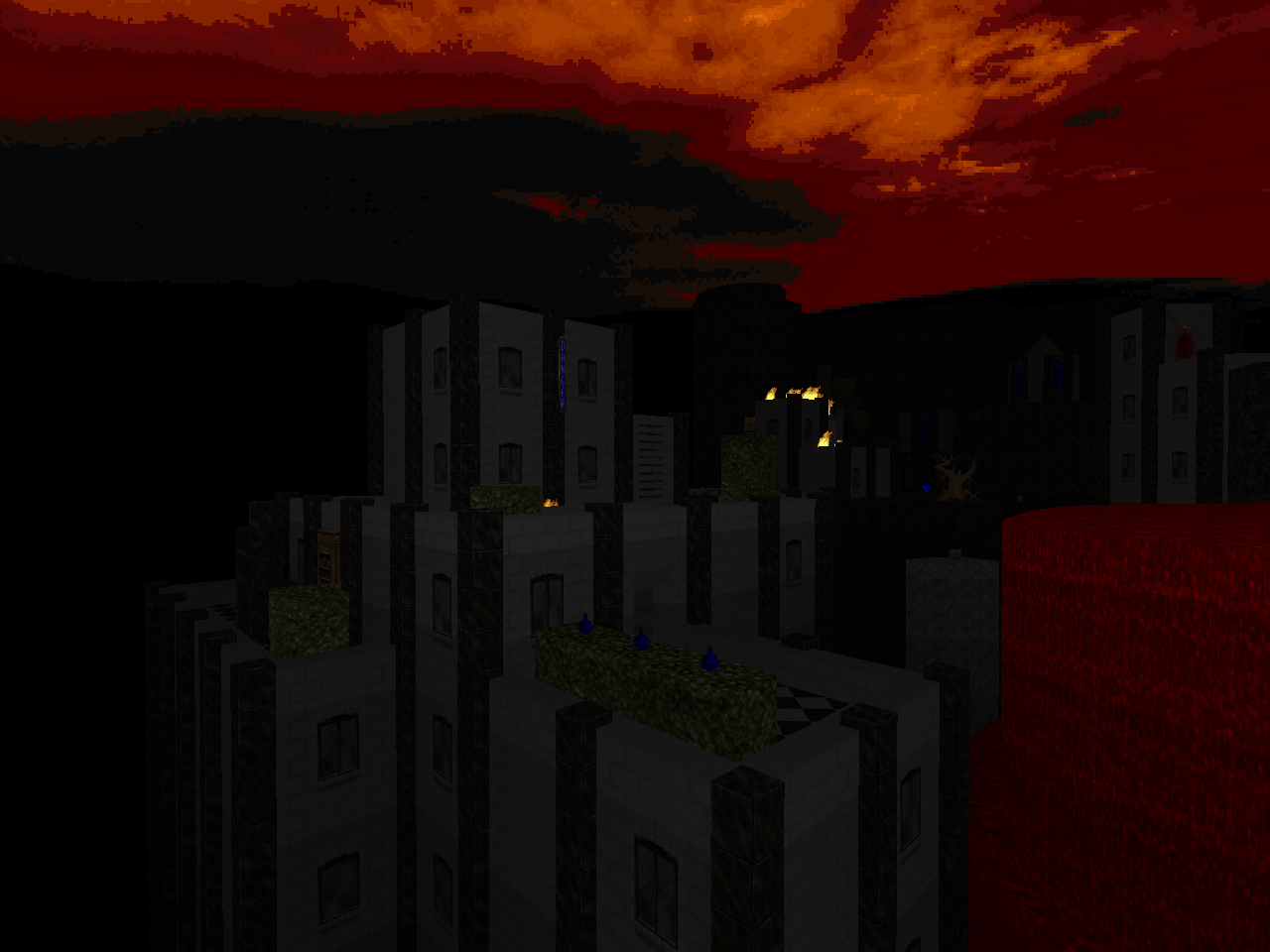 |
| Put Up Your Dukes! | |
|---|---|
| by "Sgt. Shivers" | |
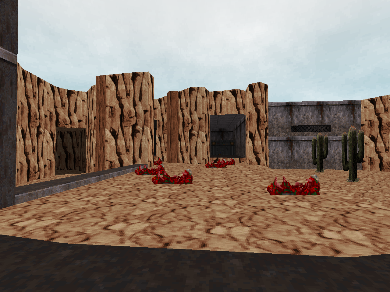 | This level is the most stripped-down of the bunch. The layout and architecture are pretty unremarkable, the (entirely custom) enemy variety is limited to three soldiers and you'll only see two of them regularly, and you only get one weapon which is a machine gun that shoots grenade-rockets as an alt-fire. It's deliciously arcade-like in its presentation and action, though, and you might have a ball if you can disengage from the expectation of the sort of complex gunplay that's associated with Doom II. It helps that your assault on the Cliff Base is peppered with explosions that are only ambient in the fact that they cannot harm you. |
| dead.wire | |
|---|---|
| by Xaser Acheron | |
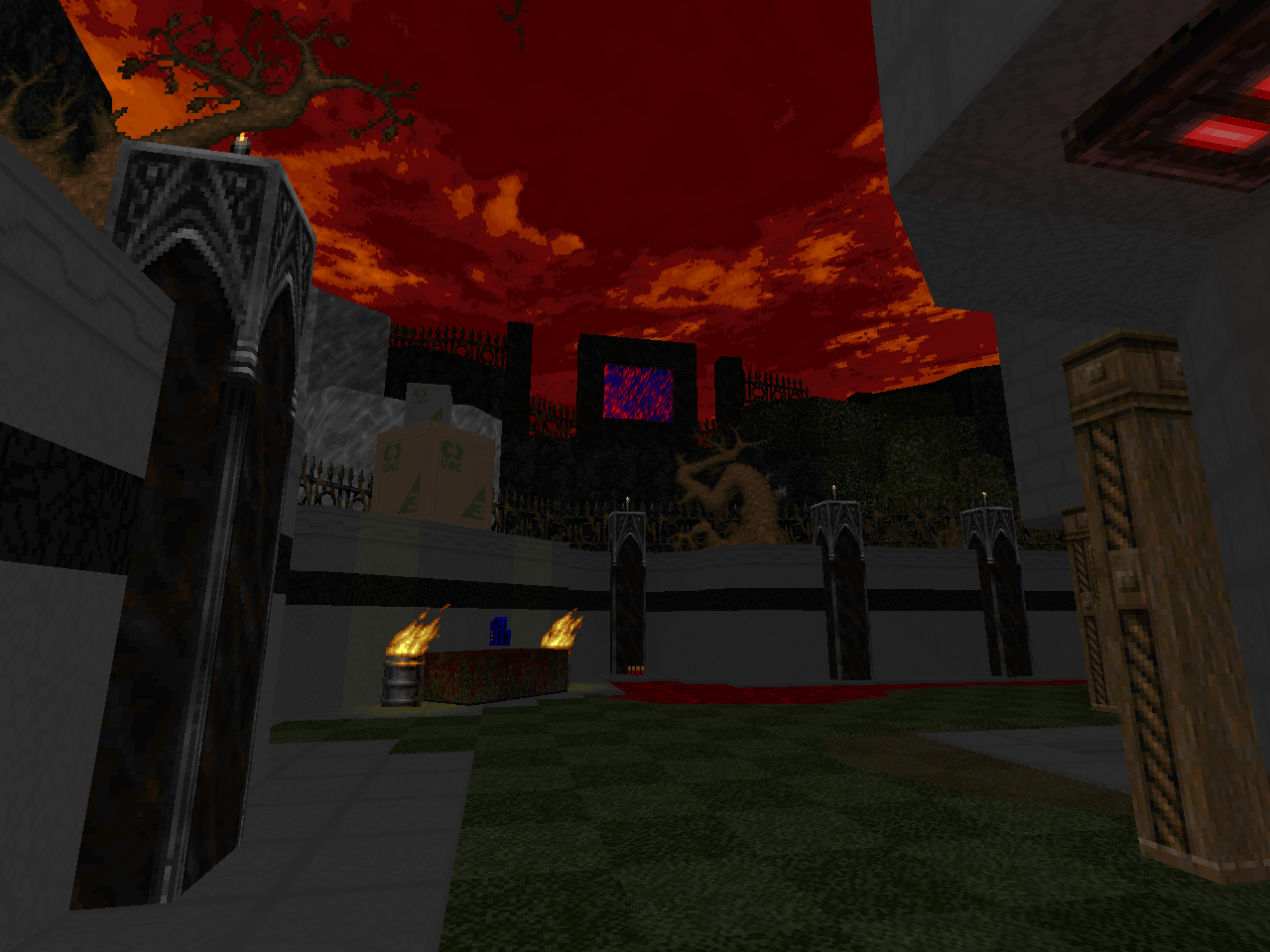
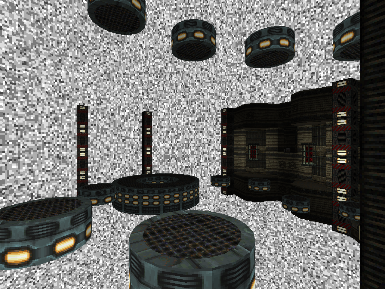
| A disturbing romp through a communication station that's been possessed by malevolent static. Xaser has a lot of cool visual hooks like geometry popping into existence from the scrambled void and walls of scrambled monitors. Together with all the Chasm textures, it's a solid theme. He's also made the static alive by specterizing all of the monsters from the original Doom, though this will no doubt grate on many players as nearly everything has decided to run silent, making it much easier for monsters to sneak up on you. Xaser's last tinkering outfits the player with a (mostly) different weapon kit, and while the shotgun may not look any different, rest assured that it's been granted More Power. | 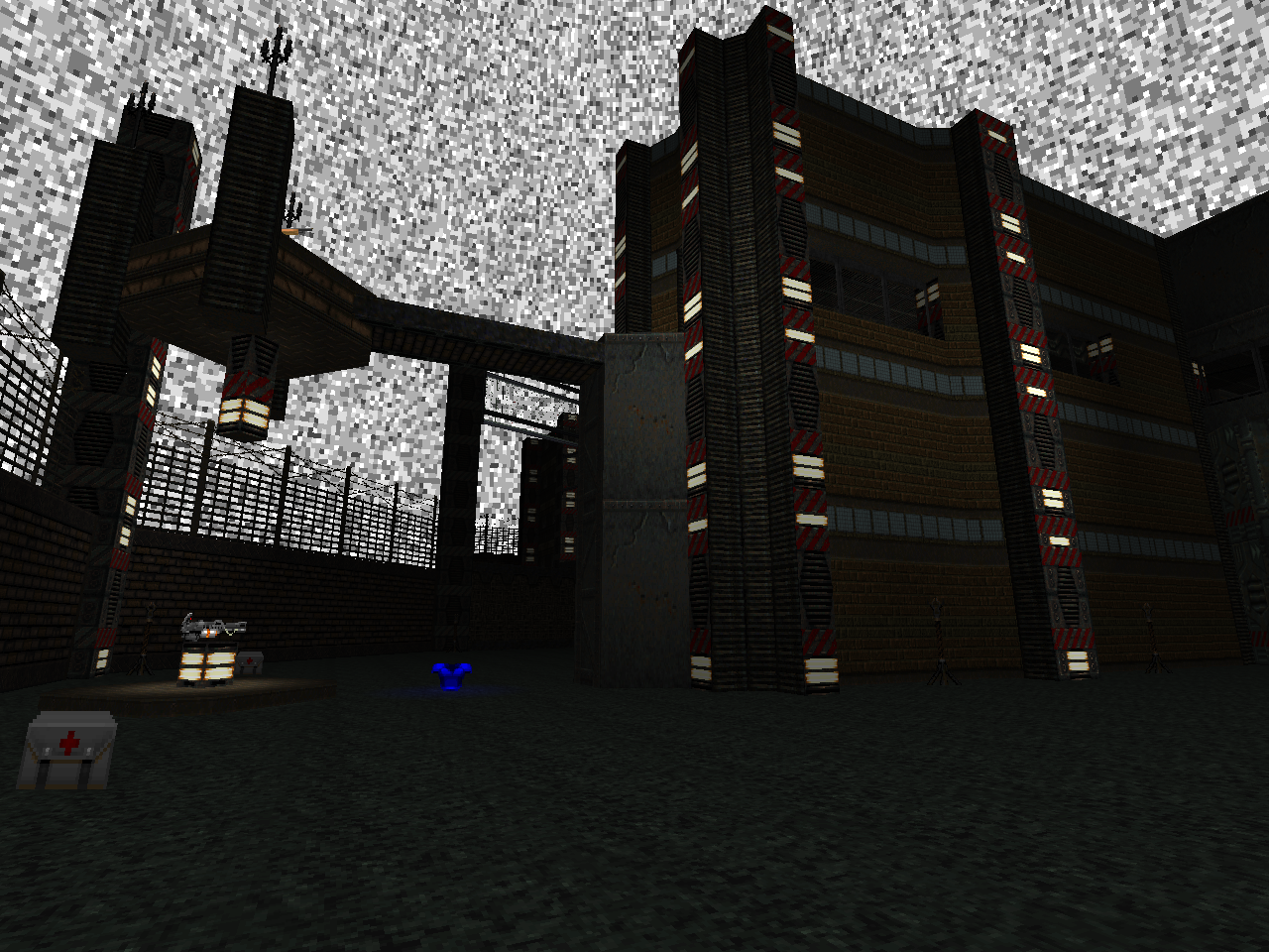 |
| Black Magnetic | |
|---|---|
| by "Angry Saint" | |
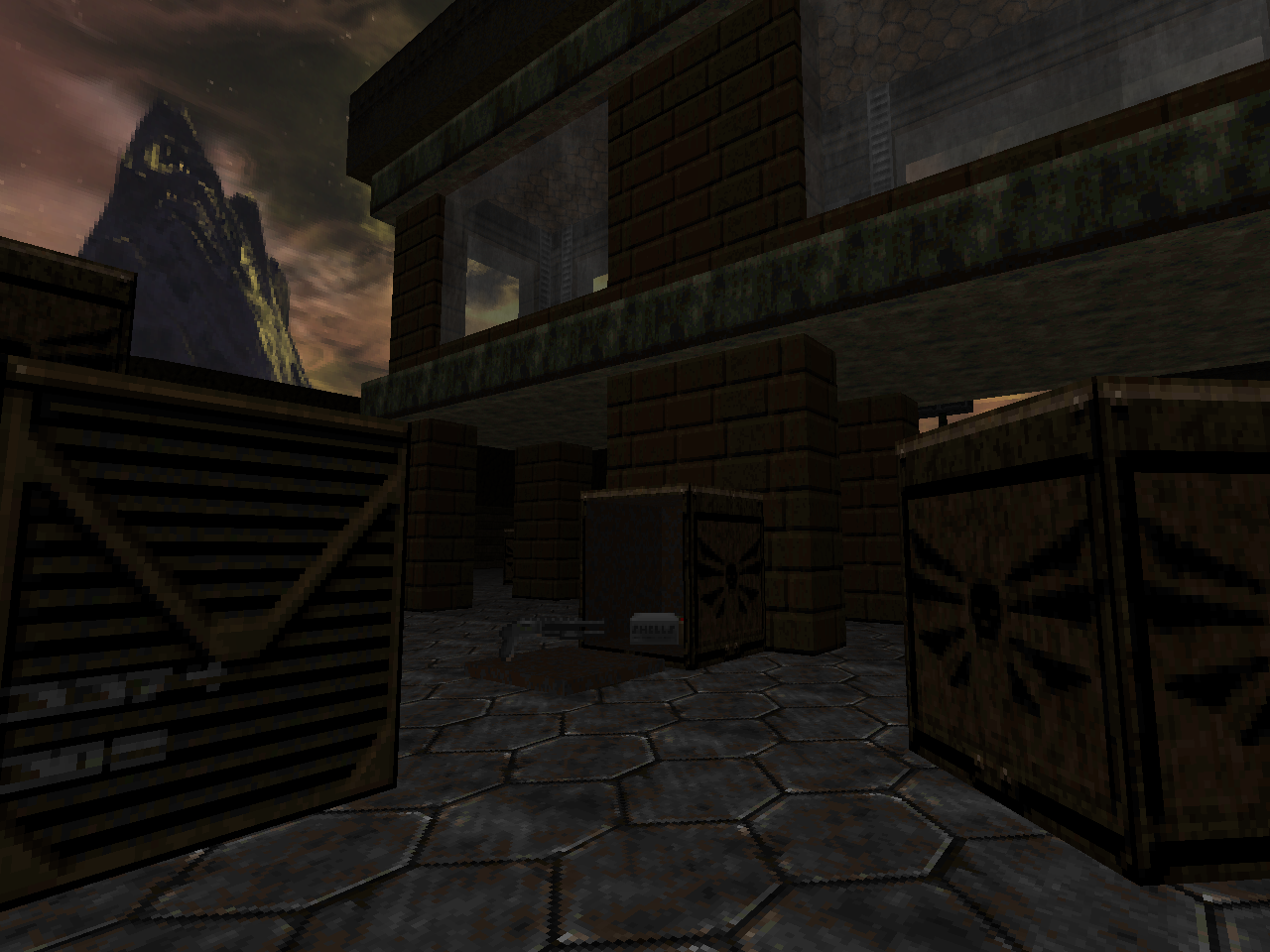 | Angry Saint's level takes place in the occult lab of another para-military organization, but it looks to me like the NMN Corporation has its shit together when compared to GoofUAC. Black Magnetic uses hitscanners almost exclusively and has some new sprites to really solidify the atmosphere. The layout is really complex due to how the author uses the two tiers of play, creating a truly 3D space that requires a lot of thought when you're used to puzzling out Doom's much simpler geometry. On the other hand, if you use those investigating feet, you might snag yourself a devastator! |
| The Heart of Stone | |
|---|---|
| by "evil space tomato" | |
| This one's set on Hell's equivalent of a space station, looking like a floating chunk of Pandemonium. You can actually jump off the platform, and the ship that brought you has enough juice to save you via teleport a few times, which is a neat little touch. The gameplay is pretty standard but for the fact that all of your weapons must be pried from the cold, dead fingers of the zombies. Yes, there's a z-man for every pickup. As could be expected, Hell attempts to defend their superweapon with gratuitous teleport ambushes, with the ones involving flying monsters highlighting your relative lack of safe spaces. | 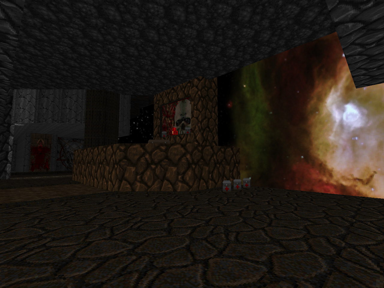 |
| Celestial Site | |
|---|---|
| by "DooMSkeR Scratch" | |
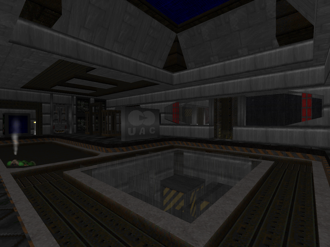 | Celestial Site is more or less what I expected from the competition, though the fact that it's the only level of its type - sprawling but congested map with some token GZDoom features and copious Realm667 monsters - makes it an oddity in and of itself. This map is supposed to take place on a space station of sorts, and while you kind of get that in the opening, subsequent reminders are few and far between as the setting develops into a hodgepodge tech labyrinth, part of which shows the mark of a Hellish influence. |
IF I HAD EVER BEEN HERE BEFORE
I WOULD PROBABLY KNOW JUST WHAT TO DO
DON'T YOU?
I WOULD PROBABLY KNOW JUST WHAT TO DO
DON'T YOU?
I actually have trouble seeing E1M7 in a lot of these maps, and I'm talking about looking at the automap. They're pretty different from each other, and at least the four I've downloaded (haven't looked at Dukes! or Heart), the automaps don't look very similar to each other either.
ReplyDeleteI had actually thought Black Magnetic had second, and Dukes! was in the bottom three. Guess I didn't read with enough attention when I checked the winners. Anyways, if going strictly by my personal judgement, I'd have given my top vote to dead.wire and second to Void; I don't know beyond that, haven't even played all them.
It's also interesting that every mapper decided to use GZDoom in this contest even though there was no such requirement (or pressure) to make a map for that port. The authors themselves range from those I've seen always make GZDoom wads (zrrion and evil space tomato for sure), to ones that have made all different kinds of maps (xaser for sure), to an author I had never heard of before at all anywhere in the Doom community (DoomSKeR Scratch).
Definitely good series coverage overall, both on Doonja-Vu and also on zrrion's maps leading up to Void!
it feels good to have the zrrion maps played, i had hvoid downloaded pretty much since it came out in 2012 but never got around to it for Reasons
Delete