DTS-T is not the worst PWAD in the world (nor the worst PK3). Released in 2012 by Ingmar Derks, it is a 33-level mapset for
Doom II to be played in ZDoom-family ports, featuring a lot of scripting and voice-acting from the author, delivered via a few audio logs and many one-sided radio communiques from your handler. It has a few new enemies and a handful of textures, mainly from R667 and
Final Doom. Most of its music selection comes from the IWADs (and
Duke 3D, of course). It's also been in development for awhile; Derks claims to have started work back in 1998 and a Doomworld forums search reveals an ancient news post circa 2002 teasing a potential demo (eventually released in 2003).
DTS-T is not the greatest PWAD in the world, either. The amount of fellating I've seen this project receive leads me to believe that ZDoom faithfuls are just so starved for something with features vaguely beyond the vanilla / Boom PWADs that currently dominate the landscape that they will hype up just about anything. I think Derks deserves some congratulations for managing to ship out a megaWAD, especially one with as much love poured into it as this, but the hyperbolic praise leads me to doubt the sanity of some of its champions, not that it's any fault of Ingmar's. You're never in full control of your hype train, as countless authors have found out.
The biggest factor to this WAD's detriment is its level design. It starts out as bland and unappealing as Wolf3D and then slouches its way at a glacial pace toward something more in line with the 1994 era of Doom. I'm not -just- talking about detail. Everything that makes even the IWAD maps appealing is found in short supply. Think long, featureless corridors stringing together rooms that are mildly interesting at best in terms of their basic architecture and encounters that are either too easy or lacking any artifice, like monsters were just thrown in a room together with little forethought. There are a few semiprecious stones rattling around in the first twenty-one levels, but they're weighed down by the surrounding material.
As for the much-touted plot and voice-acting... Oh, right, the plot. Well, there are these things called Dimension Time Space (DTS) devices. One of them went missing and the UAC has so far failed to recover it. The marine in charge, Reily, sends you to do it, because if it's in the wrong hands (and you know it is) then they'll use it to do all kinds of stupid shit. You know, like the first draft of
Plutonia's quantum accelerator, or the demons running through the time gate in
Eternal Doom, the cancelled
Eternity TC, or that J.K. Robertson dude from Time Chasers who turned the future into a dystopia, though they didn't really have the budget to show it. So you're off on a journey through other dimensions and times and spaces, like the first draft of
The Plutonia Experiment, the cancelled
Eternity TC, Terry Gilliam's Time Bandits,
Daikatana, or half of every story where time travel is a major element.
About the only thing that DTS-T does that differs from hundreds of more worthwhile PWADs is its presentation. Blackshire, Gogypt, the star base, Tityos... All of these places look like ass. But each one gets a little blurb giving some rudimentary background, sparingly reflected in the physical locales, alongside the occasional commentary from Reily, who operates somewhat like Strife's Blackbird. I don't see how Reily's story is deep, moving, or well-developed. He is nothing more than your handler until he becomes your nemesis because he was infected by a demon that bit him off-camera, after which it's revealed that he was going to leave the marines to become a full-time father. This was his last mission. This is also one of the oldest dramatic clichés that ever was and ever will be, and if you think this is worth using spoiler tags on, you're a dunce.
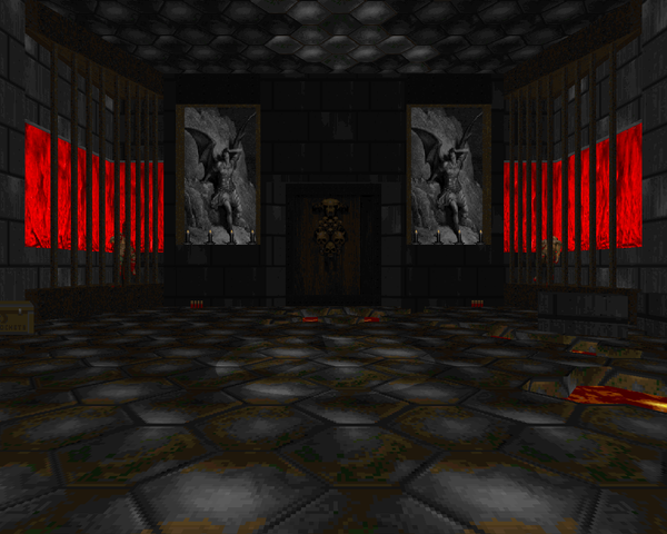
I don't really care one way or the other about Derks's performance. Well, his "YOU'RE IN A MINE" exclamation is embarrassing. I'm guessing (hoping) it's supposed to be a joke but it comes off as feeling aware of the player's bemusement. I can kind of see why the VA plus sidebars might improve the perception of the first twenty or so levels, but it doesn't erase the sub-par quality you have to trudge through in order to get to the Apostruct. The mapset starts out worse than
Tei Tenga and then crawls around for two-thirds of the project before you hit its final chapter. Now, don't get me wrong. Derks's hit to miss ratio significantly improves in Chapter IV, but it's more like going from batting .200 to .500, where that .200 still dominates more than half of the project. The total average is still about .300 (sucks).
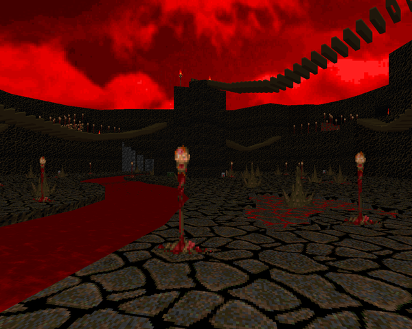
So, the Apostruct. It's a hub where you can tackle maps three at a time in the order of your choosing. It's got more good ideas crammed into it than the previous twenty-one levels, but there are still a bunch of stinkers and remnants of Derks's earlier design traits. The Apostruct shows a lot of promise in terms of Derks's ability to execute scenarios as he imagines them but his judgement leaves us with works like the ultimate test of patience, "Seven". Why this level got so much love, I don't know. Maybe it was all the penises and vaginas and imps fucking zombies in glass cases. And while he goes overboard in some scenarios, he leaves others without any teeth, like "Geonosis". It's frustratingly uneven.
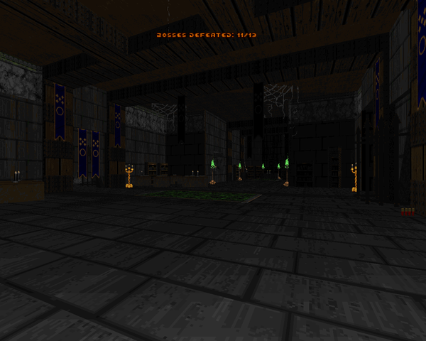
I think Derks is on to some good ideas. He at least tries to keep the player engaged in the story across the megaWAD. The meat of the mapset is lacking, though. I know part of enjoying the "theme" and atmosphere of PWAD levels is up to the player's imagination, but I would be stretching myself very thin to meet Derks the rest of the way. I question whether many of the concepts - particularly in "Seven" - were even worth exploring. Certainly, the first two-thirds would have benefited from a complete re-haul, and a lot of puzzle elements scrapped along with the pointless backtracking. I'm sure that some of my disappointment can be attributed to the fantastic exaggerations perpetuated by certain members of the community, without which I would probably say... "It could have used a lot more work, but good job on finishing it. I didn't care for much of it, but there were some cool ideas." Now, though, I'm compelled to go into great depth, because apparently "a great injustice" has been perpetrated.
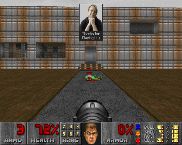
DTS-T is not the worst WAD in the world, but it's definitely not the best. I do like the direction Derks is heading with the Apostruct compared to previous levels - with some major exceptions - and wish him luck in his future sector-building endeavors. He certainly has an imagination. I just want him to take this criticism to heart - with a spoonful of salt, of course - and bring a greater level of professionalism to his next work such that I can agree with all the fist-pumping maniacs who are so unilaterally appreciative. While I don't think this is the modern megaWAD that the ZDoom engine deserves, it appears to be the one that the ZDoom community wants, and I think it's a shame that the bar is set so low.


DIMENSION TIME
SPACE - TRAVELER
by Ingmar Derks aka "Deathmatcher"
PROLOGUE
| Return to Phobos | MAP01 |
|---|
| Pretty bland opening; those shuttlecraft are vintage '94. It's supposed to be a retake on E1M1's "Hangar", as evidenced by a few features (its exit room and formerly armor room) but all I get is an underwhelming Tei Tenga vibe. All of the NPCs in the world can't hide the fact that you can't speak to any of them. The secret armor is a nice touch, as is the little bit of dressing in Reilly's office, but it's a fairly lame opening. | 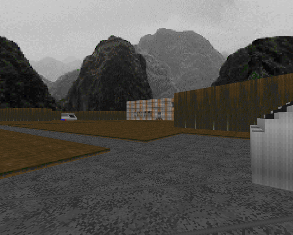 |
CHAPTER I
THE JOURNEY THROUGH
BLACKSHIRE
| MAP02 | Blackshire Fortress |
|---|
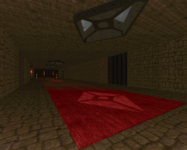
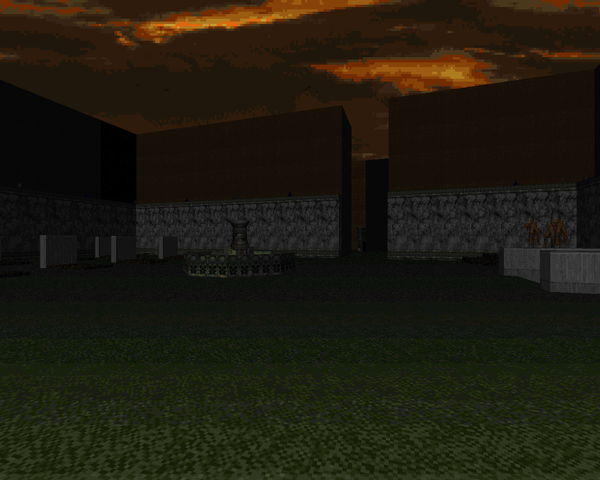
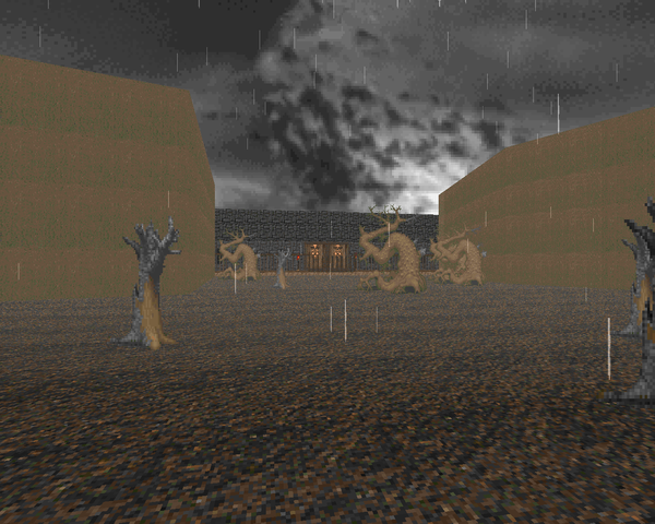 | No amount of passable weather effects can obscure the banality of the forest that marks this level's beginning. I think that something like the forests from Masters of Chaos would have worked much better. The fortress is too bland, with a squat, nondescript façade and a network of long, wide hallways staffed with the weakest Doom monsters. The ceiling lights are a decent detail but the level as a whole is just really boxy. |
| Graywood Village | MAP03 |
|---|
| It kind of resembles a village, but I prefer Heretic's village layouts over these spread-out and nearly identical huts. It's nice to start throwing more demons and imps at the player but they hardly make an impression in the more open areas. Derks is at his best in the stranger parts, like the underground cavern with imps and lost souls (my standout encounter), or the monsters boiling out of false walls at the exit. The tower on the other side of the canyon is the kind of thing that the front of "Blackshire Fortress" should have looked like. | 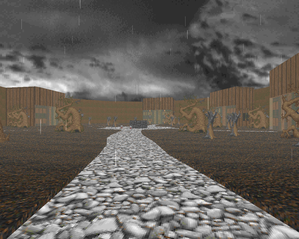 |
| MAP04 | Sir Enri's Dungeon |
|---|
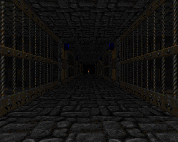 | Totally 1994, down to boring identical jail cells, long nondescript hallways, and an honest to Gott maze. Oh, and that "Chasm"-esque narrow walkway segment, which is actually about the only interesting bit of combat you'll see. A return to the boring-ass forest from "Blackshire Fortress" isn't very welcome, either. The overdetailed centerpiece in the torture chamber only serves to show how boring the rest of the design is. |
| Sir Enri's Castle | MAP05 |
|---|
| All of the sector furniture is hilarious but cute, including that hideous grand staircase that leads up to the library. A lot of the castle area is still incredibly bland, including the run up to the great hall, but Derks's ability to dress up square rooms improves ever so slightly. None of the fights really stand out except for clearing out the sheer muscle when hell knights, imps and demons teleport in to the ground floor (very boring to take out with the plain shotgun / chaingun). Well, that isolated series of demon / spectre ambushes is a bit above the usual snoozefest. | 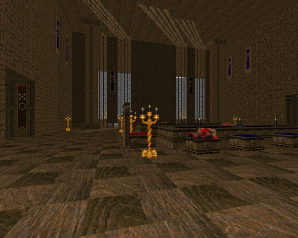 |
| MAP06 | The Rift |
|---|
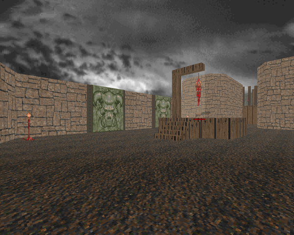 | Nothing in here is memorable besides claustrophobic demons in the darkened corridors, which is more of an easily anticipated cheap shot, and the boss, basically a Quake death knight you don't want to let melee you and who's pretty easy to kill. On the plus side, Derks decides to give you the SSG. that's pretty much it, though. |
CHAPTER II
DUST AND BONES
| The Temple of Edfu | MAP07 |
|---|
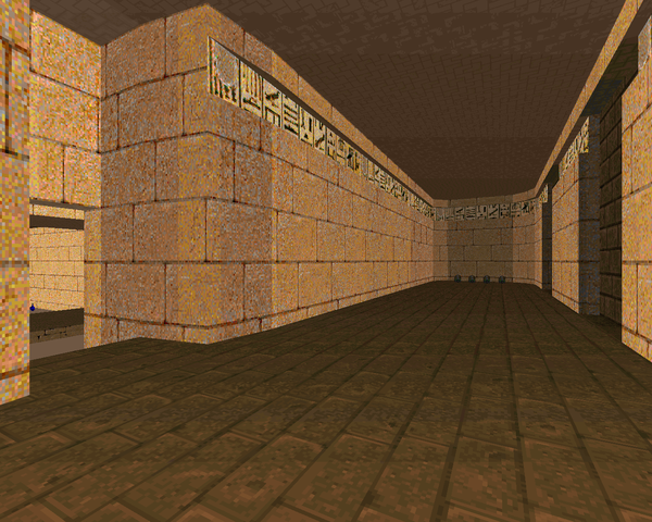
| It's a little better than the previous Wolf3D feel but not by much. There are much better Egypt textures out there than Evilution's. Two big game changers here - the introduction of the rocket launcher and the revenant. I'm not sure the latter is used properly (a lot of thematic standing on coffins) but the former is pretty welcome. The outer dunes are slightly less bland than the forest. Standout encounter for me was the hell knight / revenant room with the rocket launcher. | 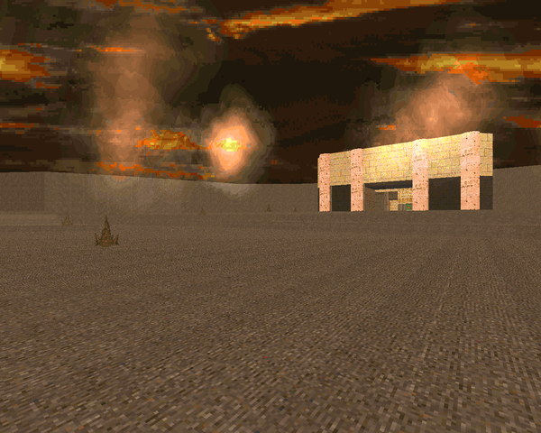 |
| MAP08 | The Inner Sanctum of Edfu |
|---|
 | Derks flexes his "puzzle" muscle with this semi-interesting level. The layout isn't that much better but the detail he's poured in to the puzzle rooms outshines everything that's come before. Most of it's pretty easy stuff, though you pretty much need mouselook for the light bridge bit, and that telefrag maze is a pain in the ass if you're not looking at the automap. The little mockup does not translate well. The fights are a little better but it's mostly cleaning out a few beasties at a time. I have no idea what's up with that roman numeral / factorial section. Maybe a setup for a later level? |
| The Devine Chasm | MAP09 |
|---|
| The super-magic rift that supposedly separated two cultures is less impressive than advertised. Derks does manage to split it between Egypt and gothic, though, and things look slightly better. He does do some stupid shit, like that mess of crusher traps in the Egypt halls or those tiered "gothic" metal elevators. That whole gothic section is basically a wash; you can throw some tougher stuff in those corner closets than single demons. I do like that sequence of monsters right before the yellow key room, though. | 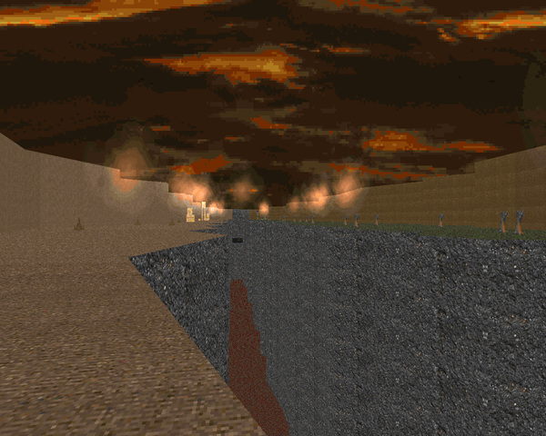 |
| MAP10 | Morbus' Death Cathedral |
|---|
 | Visuals are a bit better than previous levels. The main cathedral is passable and I like those red brick braziers. The action is a bit nicer, too, with a great excuse to burn some rockets after the yellow key pickup. It looks like Derks is being more adventurous with the encounters, and slimming some of the layout aspects down helps to give some of the player's edge back to Doom's bestiary. A lot of it's still pretty bland; the outdoors does not seem to be one of Derks's strong suits. |
| Gehenna | MAP11 |
|---|
| Derks tries to add some suspense by knocking your health down to 10% and then throwing some zombimen at you as you crawl through the marble / blood ruins. I'm not sold, but the monster-filled boss arena is decent enough, pitting you against a cloud of cacos and a cadre of revenants before a fairly boring spiderdemon fight. Whatever. | 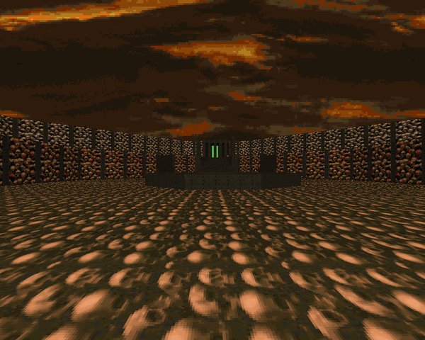 |
CHAPTER III
LOST IN SPACE
| MAP12 | Deck 1: Research / Cargo |
|---|
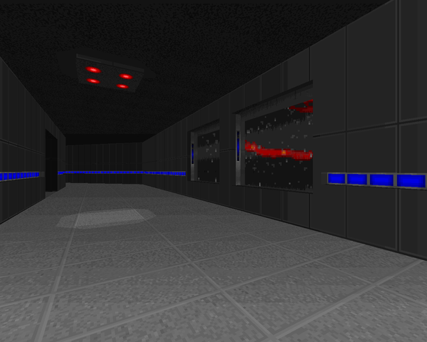
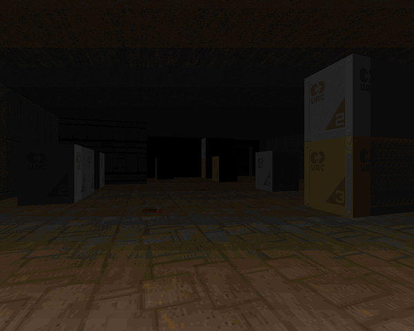 | Well, the layout of the first deck is a slight improvement over "Gogypt". It tries to be atmospheric but I'm not sold; you're really just killing time until you grab the plasma rifle, after which you should be so overstocked with ammo for practically every weapon that all the mancubi Derks throws at you barely register. I do like the contrast their silhouettes throw against the blue emergency light striping, reminding me of STRAIN's MAP28. |
| Deck 0: Purification Plant | MAP13 |
|---|
| Basically a sewer level. All the rectangular rooms don't help the look but there are a few indications of Derks trying something unique, like the secondary stage pump control room to the northeast, an architectural oddity. The scenarios are a bit more interesting with more high-HP monsters making an appearance; one of the rooms you'll want to drop down in with a hot plasma rifle or risk being overwhelmed. The finale is an assembly of huge but easily avoidable crushers; you'll do more damage to yourself trying to pick the enemies in between them off. | 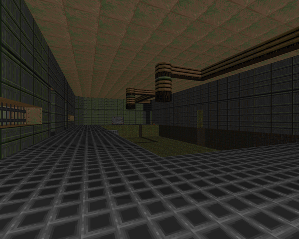 |
| MAP14 | Deck 5: Crew Quarters |
|---|
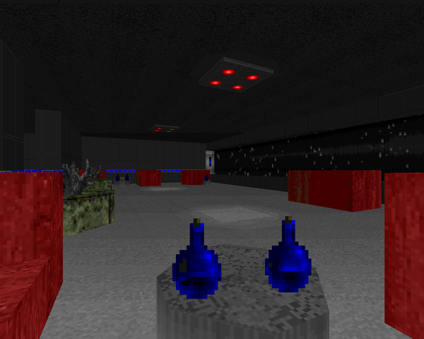 | This feels like a return to the boring, rectangular hallways of Blackshire, except with sector toilets. There's been a lot of care taken into sectorizing the realities of space life, but clearing out practically identical rooms full of monsters is pretty boring, all told. The only real highlight is the mess hall, and that's stretching it. I do like the rotating lighting that evokes duct fans. Oh - flipping a switch just to walk all the way back to some button in the air ducts is very lame. |
| Deck 4: Command Level | MAP15 |
|---|
| Short and straightforward. I kind of like the architecture, though, mainly the larger computer rooms. A lot of chunky enemies; the easternmost area stands out in particular, filled with arachnotrons and mancubi. Probably the most dangerous fight in the mapset so far. Other than that, bleh. At least Derks gives himself some leeway in constructing the command deck rather than his previous stolid regurgitation of past habitation decks. The secret exit comes in three parts. Getting to the first pretty easy; opening the second requires some monitor humping. After that, you're home free. | 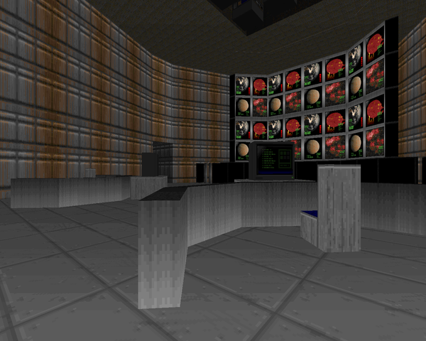 |
| MAP31 | Death Hostel |
|---|
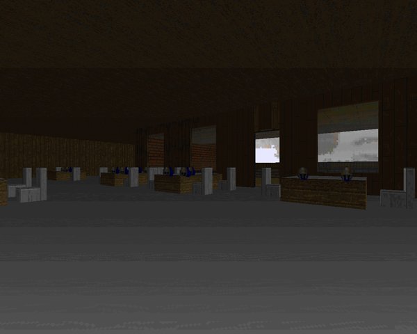 | Very boring. It's essentially one of those ancient "hotel" PWADs, slightly dressed up with more elegant teleport effects. If you clear the entire floor from bottom to top you'll just be killing countless zombies with the occasional imp / demon. There are a few easily accessible key doors, and nothing important is hidden in any of the non-key door rooms; the yellow key is actually found in the attic. Do yourself a favor and skip as much of this map as possible. Better yet, don't come here at all. |
| Deck 3: Core Level | MAP16 |
|---|
| A shining example of stupid, worthless level design. The little caco catwalk barely hints at what things will come. The imp-infested Jeffries tubes are narrow and long enough that you literally have to dodge fireballs by backpedaling and ducking around corners. Usually I scoff at people complaining about this as they're usually talking about 64-wide corridors (easy to dodge in if boring), but the yellow key maze is truly a beacon of shit, never mind slinging rockets down the corridors at those hell knight closets. Worse, though, is the "fuel rod" sequence, a pointless back and forth inter-mediated by hitting the fuel switch. You'll probably forget to tap it at least once as your eyes glaze over, requiring you to leg it on over. This...just sucks. | 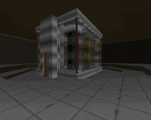 |
| MAP17 | Deck 2: Shuttle Bay |
|---|
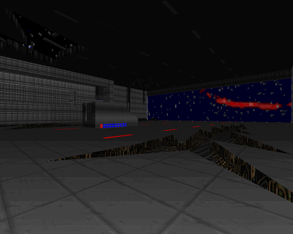 | Five minutes to escape the space station. The time limit and goofy stuff going on like falling equipment, momentary loss of artificial gravity, and lethal gaps in the floor almost distract from the artificiality of the obstacle course that is your run through to the shuttle bay, bolting through ruined rectangular room after ruined rectangular room. I did kind of like the tech pillar explosion race. This is a good place to burn all the plasma and rockets you've saved up to get through asap. |
| Tityos Surface | MAP18 |
|---|
| All the majesty of the boring Blackshire landscape plus senseless platforming. On the plus side there are some decent fights with a great infighting opportunity in the circular crater area if you trigger all the openings at the same time (resulting in three different sets of bars slamming shut in your face). The outer area of the mining operation is passable with a decent faux-3D bridge. I hate that long tunnel from behind the lava to inside the installation, though. I can't get over how 1994 most of this stuff still looks. | 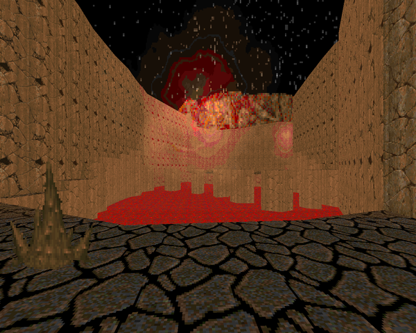 |
| MAP19 | Tityos Ore Mine |
|---|
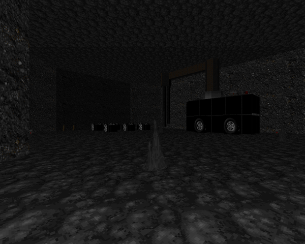 | Another ugly level, this one subterranean. It's got little tight shafts for the mine carts to ride through, which are too long and not at all interesting. The props for the machinery look nice and help to break up some of the monotony. I don't like the dead-end backtracking (the TNT switch blows a hole in the area you had to explore to grab the key to access the switch in the first place). The fighting feels almost entirely incidental and uninteresting. Whatever. |
| The Ancient Ruins | MAP20 |
|---|
| Boss map. The idea that you're fighting through the ruins of the space station 1000 years after you blew it up is decent but carries no weight in the PWAD's narrative. The two fights are a caged and staged ambush that's fairly easily handled followed by an encounter with two Cyberdemons at the same time. Maybe a little tricky but with the clearance you have it should just be a matter of your plasma ammo holding out. |  |
CHAPTER IV
THE APOSTRUCT
| MAP33 | The Apostruct |
|---|
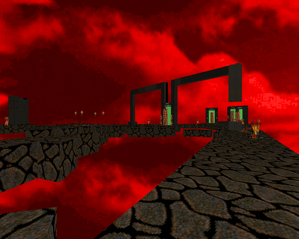 | Uh, an assemblage of barely connected broken earth floating in a Hellish void. You can access the rest of the levels here in groups of three, taken any order you like. I suppose that it serves its purpose with gusto. You'll get some "plot" advancements as you return but nothing really changes. |
| The Fading Place | MAP21 |
|---|
| A pretty cool Hell void map with bricks missing from the floating walkways; the usual. Combat is a bit more interesting with segments like the annoying baron teleporter fight (which I just blitzed through) and a pretty interesting if light segment in the finale, which takes place on floating flesh cubes that jiggle up and down when stepped on. They will throw off your run if you're not careful and restrict your mobility as you dodge the few imp and cacodemon fireballs that run your way. The pi puzzle is incredibly obvious, though, and the repeated pain elemental / cacodemon pincer attacks get old very fast. | 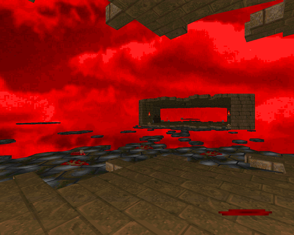 |
| MAP22 | The River Phlegethon |
|---|
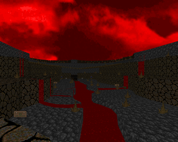 | I'm guessing it's at least partly inspired by Evilution's "River Styx". Derks has it basically down though those side-caverns in the outer area could stand to have a little more flash. It's a nice crawl downriver, dispatching tons of beasties, until you lower the level enough to go deeper. That outer area with mancubi and sergeants is a little rough, mainly due to the decorations blocking projectiles (which will plague you throughout). The Hell area looks pretty neat, where you get to chose the order of the challenges you have to pass so that you can lower the bars to the exit. Arch-viles show up in a big way, here. Be on your toes. |
| Vivarium | MAP23 |
|---|
| An old standard - monster zoo! Starts off with more than 500 beasties. You have to kill all of them to exit. The boxy enclosures look decent but fail to provide many interesting encounters given the monotypical monster packs and abundance of BFG ammo. Highlight - that little exchange with the Cyberdemon and the baron, an obvious Jurassic Park reference. I giggled. The arch-vile section wasn't funny, though. Just annoying. It works from a narrative angle but fails in terms of gameplay. | 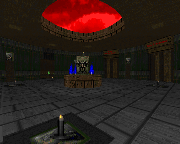 |
| MAP24 | Of Blood and Steel |
|---|
 | Ugh. It's got a neat hook - you're visiting the place in Hell where all the cybernetic monsters are assembled. To that end there's a lot of automated machinery, monster corpses and various items going through assembly lines, etc.. Sometimes Derks does interesting things with the architecture but it's a pretty orthogonal layout with two big nadirs. The first is a mess of narrow corridors with crushers with eight elevators you'll have to visit to find the blue key. Well, not all eight. If you find the blue key, just scram. The other is the Cyberdemon / Spiderdemon assembly room. The assembly / disassembly is cute enough but going into all twelve cages and killing monsters / flipping switches is just tedious. There are also many, many hitscanners, so watch yourself. |
| The Jade Cube | MAP25 |
|---|
"Jade Cube" is a puzzle map. There are a handful of fights involving barons and arch-viles but you will usually be operating switches or teleporters in isolated scenarios. The run to get inside the cube is a drag but once you're inside, you'll enjoy yourself if you're anything like me. My big stumbling block was refusing to consider that raising the columns to the ceiling in the red key room might reset them back to ground level (they do). Every puzzle here is easy but the combat can be tricky, namely the big baron clusterfucks. I really dislike the narrow baron catwalk. Apart from that, my favorite puzzles were the arch-vile jump, the movable colored pillars, and the color cube you rotate by stepping from the floor to the walls.
The exit to "Scholomance" is accessed in three parts. The first is in the arch-vile jump room and is pretty obvious. The second is in the sequence of areas suspended in the void and is also pretty obvious. The third is with the movable colored pillars and requires a dash of investigation. | 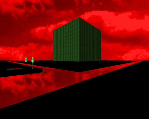 |
| Scholomance | MAP32 |
|---|
| A very loving recreation of Scholomance from World of Warcraft. The fidelity is very high; I'll even encourage Derks to translate more locales. It's pretty light gameplay with an RPG feel. You start out with your weapons stripped and then fight your way through a mostly proper Scholo dungeon order. Normal enemies (tagged with scripts) act as bosses and most drop cool stuff, like all of your advanced weapons as well as health and armor. He even has the "secret" chest in there. Worth just idcleving to; after all, it's balanced for pistol start. It could really use some custom enemies though... Still, very cool. |  |
| MAP26 | The Vault of Flesh |
|---|
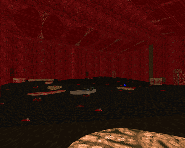 | You're shrunk down inside a human body! No, that doesn't make any sense. Maybe a satanic mockery of the human body, but not an actual human body. With thin, annoying as fuck veins a la the Jeffries tubes in MAP16. The individual areas aren't annoying, and the "floor is lava" stomach section has a neat gimmick (along with more great use of the bouncy floor effect). The combat is decent, though the cacodemons in the heart take too long to take down. Backtracking through the pillar area is stupid and so is getting pooped out. |
| Geonosis | MAP27 |
|---|
| It's an homage to the arena battle at the end of "Attack of the Clones". Looks great but the actual fighting is tepid. The battleground is too vast to house the few monsters Derks intended on using and the sheer size compounds the problem of battling lost souls even further. It's worse when you get in to the stands. At the very least, the author made sure none of the demons count towards your kills. You still have to go up and down and around the entire map before you can grab the blue key and proceed to the war room. It's got a great scale...but it's too big for its own good. | 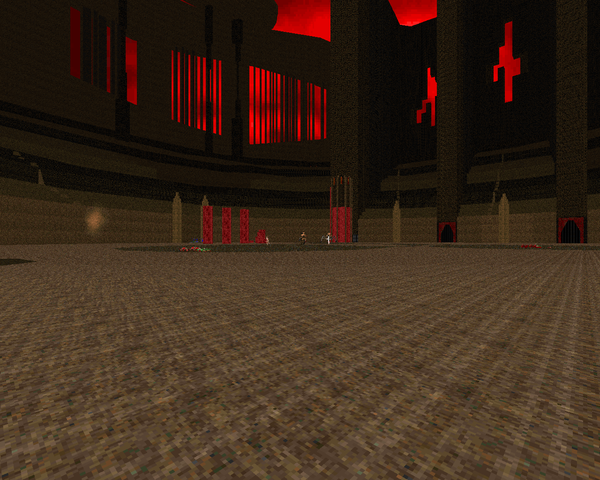 |
| MAP28 | Morannon |
|---|
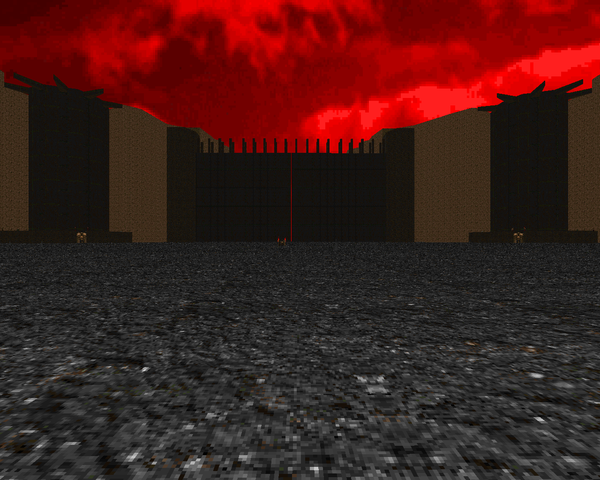 | Mordor distilled, essentially. You do the whole journey of the hobbits complete with the lembas in the cramped passageway. It's a nice linear trek, especially the spider cave and subsequent ambush. Once you grab the yellow key, though, you have to go back through the whole thing to the start of the level. After that, things pick up with a cool trek through the marshes. It's definitely better-looking than Blackshire (if still primitive). The finale is more cinematic than anything, clearing out two towers and two Cyberdemons before unleashing the armies of Mordor (and Gondor, who are just as hostile to your presence). Very nice, with a few poor decisions. |
| Seven | MAP29 |
|---|
| "Seven" is a hub inside a hub, where you handle six of the seven deadly sins before tackling the last. Each sin is represented by some kind of challenge. Pride is the best - it's over in two flashes. Gluttony I like, wrath is manageable. Both are somewhat-challenging BFG fests; the former is over very fast. I dislike the opening of greed - chainsawing cacos is kind of risky - but the rest is okay. He already did envy back in MAP11, but this time you only have your fists. Sloth is horrible, challenged only by the juvenile imagery of lust, capped off with its randomized switches. Who actually played this? | 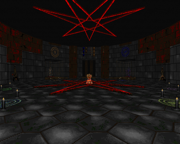 |
| MAP30 | Final Destination |
|---|
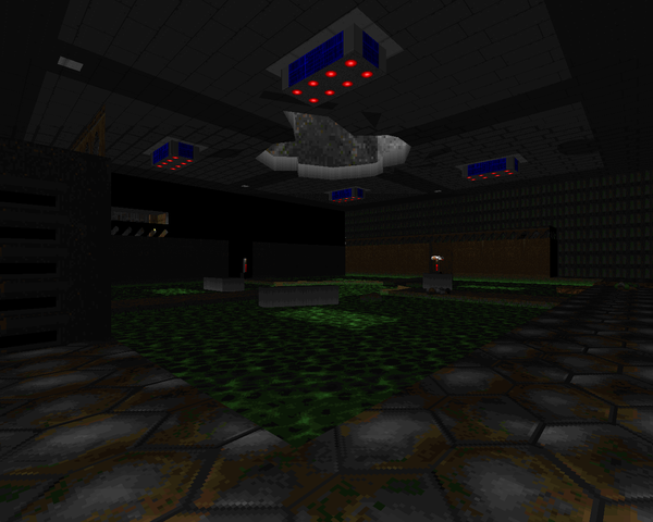 | Return to "Return to Phobos", except it looks like someone's been doing a lot of decorating in his spare time. It's a boss map with a few surprise encounters on the way. The revived marines are really annoying and best handled with point-blank BFG shots. The nastiest fight on the way to the finish will be a pack of arch-viles boiling out of an office (guess which one). The boss himself is annoying to fight. I managed to do a number on him by getting him corralled behind one of the teleporters and forcing the BFG down his throat a few times. He has a ton of health though and at least one neat scripted attack where he floods the arena with blood. |




I remember on Doomworld you were talking about this just a while back on the forums. I think it's a pretty average wad. I didn't really like it that much but at least it is better than myself having a go at making maps. Great work and I can't wait to see your review on Alien Vendetta
ReplyDeleteI think DTS-T would have a ways to go before I'd consider calling it average, but to each his own.
DeleteIt's been 2 years since you reviewed this but I feel that you should update some info for MAP08: The Inner Sanctum of Edfu.
ReplyDelete"I have no idea what's up with that roman numeral / factorial section. Maybe a setup for a later level?"
No, it's not. Not to insult your intelligence, but I figured this out the moment I entered the telefrag maze room. It's for the path you have to take for said room.
First, step on the green floor, then step on the red floor, then step on the white floor, etc.
It's similar to Evilution's MAP30, except replace the torches with what's in the room and it's more complex as you have to memorize 6 patterns instead of 3. Not sure if that's better or not, you make that call.
It doesn't have any relevance beyond that level, so far. (I'm currently in MAP09.)
To me, DTS-T is one of the best megawad ever done. Just play it until the end. A masterpiece of creativity and inventivity. You should reconsider your review.
ReplyDeleteno, i shouldn't, but I appreciate that you really enjoy it, and nothing can take that away from you
Delete