STAR TREK: VOYAGER
A TIME TO FACE YOUR FEARS
by Chris Hansen
A TIME TO FACE YOUR FEARS
by Chris Hansen
I wouldn't have known it looking at the maps he makes nowadays, but the .TXTs in Chris Hansen's early levels reveals an unabashed love of several things, as well as Sandra Bullock. He is (was?) a hardcore science fiction enthusiast, and liked Star Trek: Voyager enough to make a Doom level inspired by it. A Time to Face Your Fears happened toward the end of 1998, a MAP08 replacement for Doom II. Unlike his Doom 3: Ad Infernos maps, which were made around the same time (this one between The Unknown Chasm and Quail), VOYAGER has a strong tech / space ship feel, which is completely understandable.
The plot, also pretty standard. The crew on the good ship Voyager is having fun times on the starship, cruisin' through space, when they're hailed by the most horrifying creatures they've ever seen. Thankfully, since it's Star Trek, the demons speak English, and the crew rejects Hell's generous offer to abandon the ship in five minutes or be forcefully eviscerated / evacuated, whichever happens first. They fight, of course, and all of the extras are slain with the officers escaping, leaving you the only member alive. I guess that Voyager is back in known space, since your survival hinges on the ship passing nearby a planet with a Vulcan outpost and using the ship's transporter to escape. Another black eye on the Earth Defence Force...
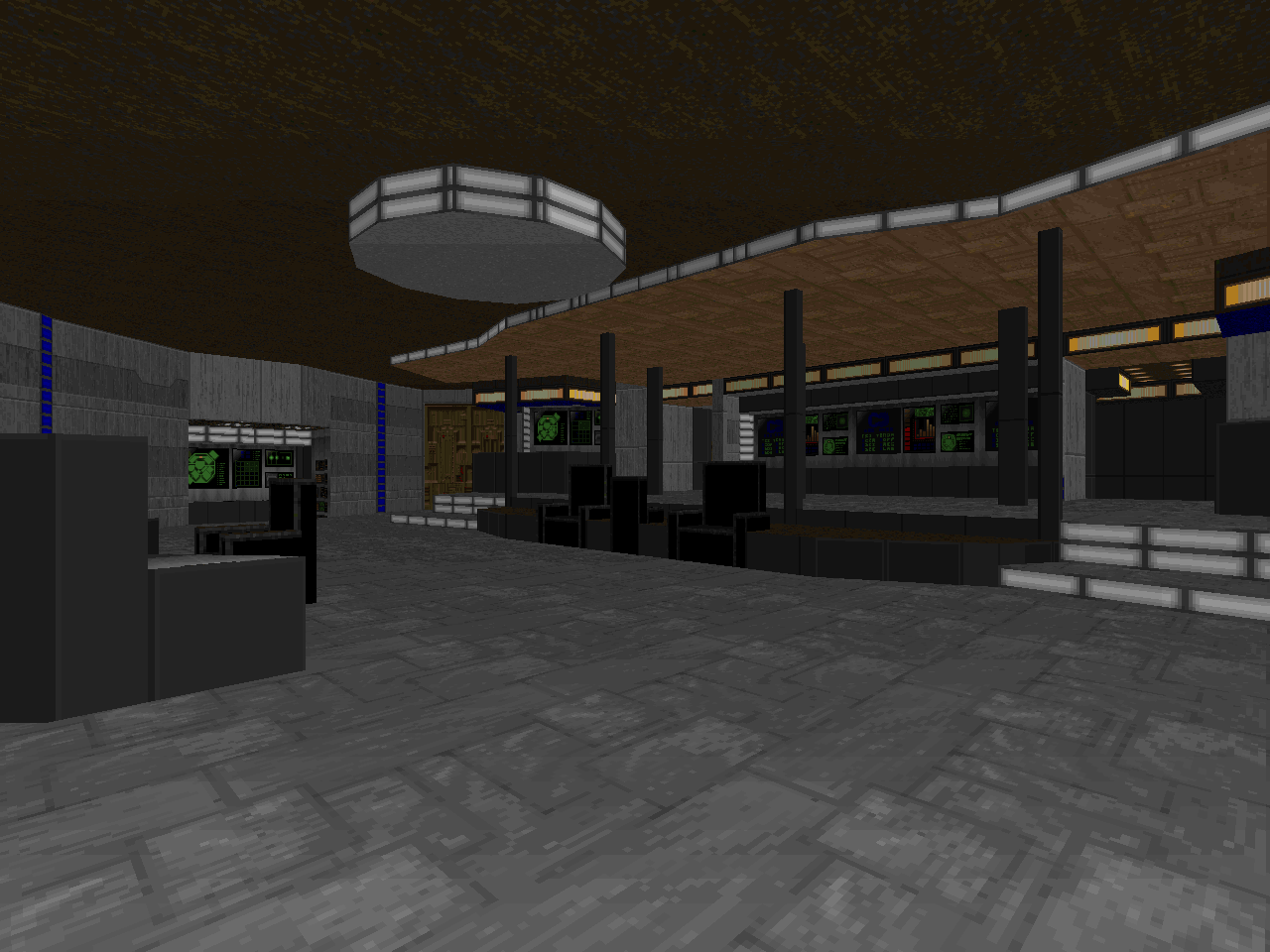
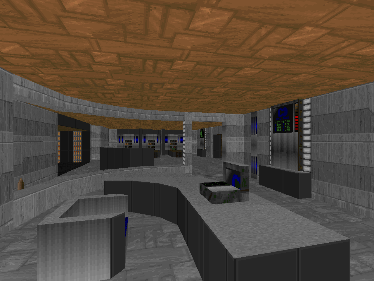
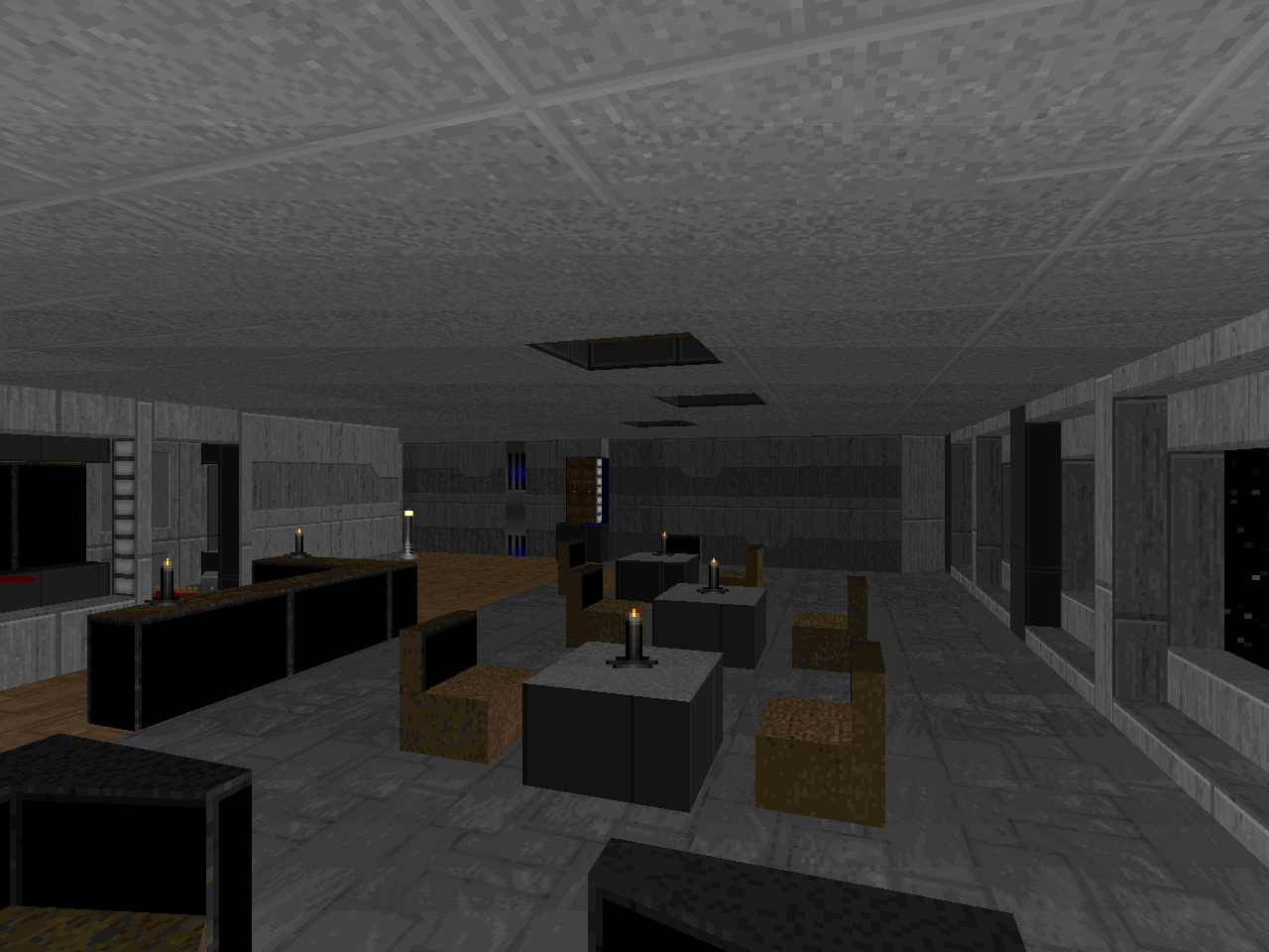
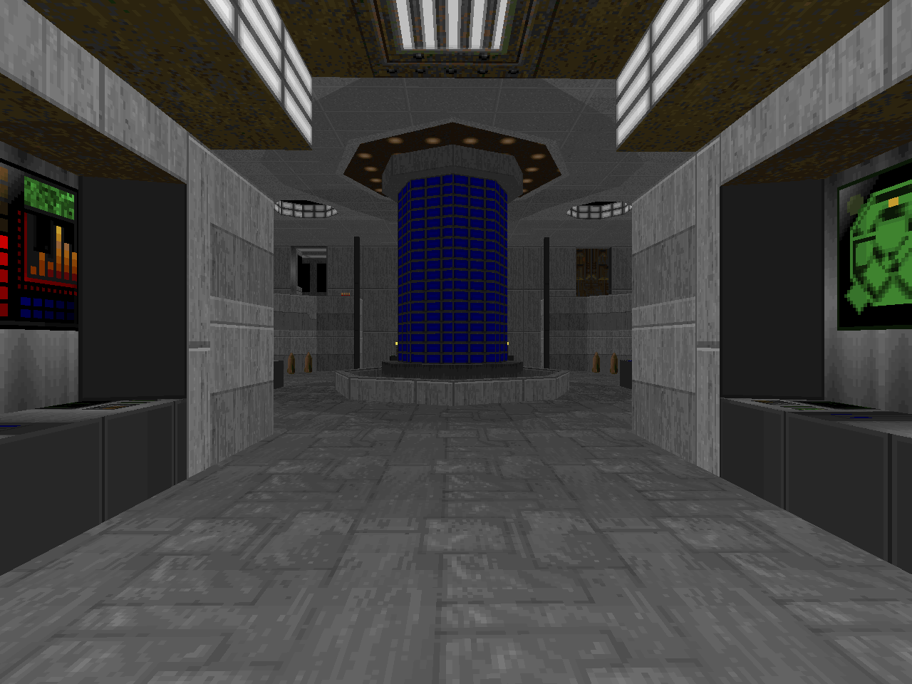
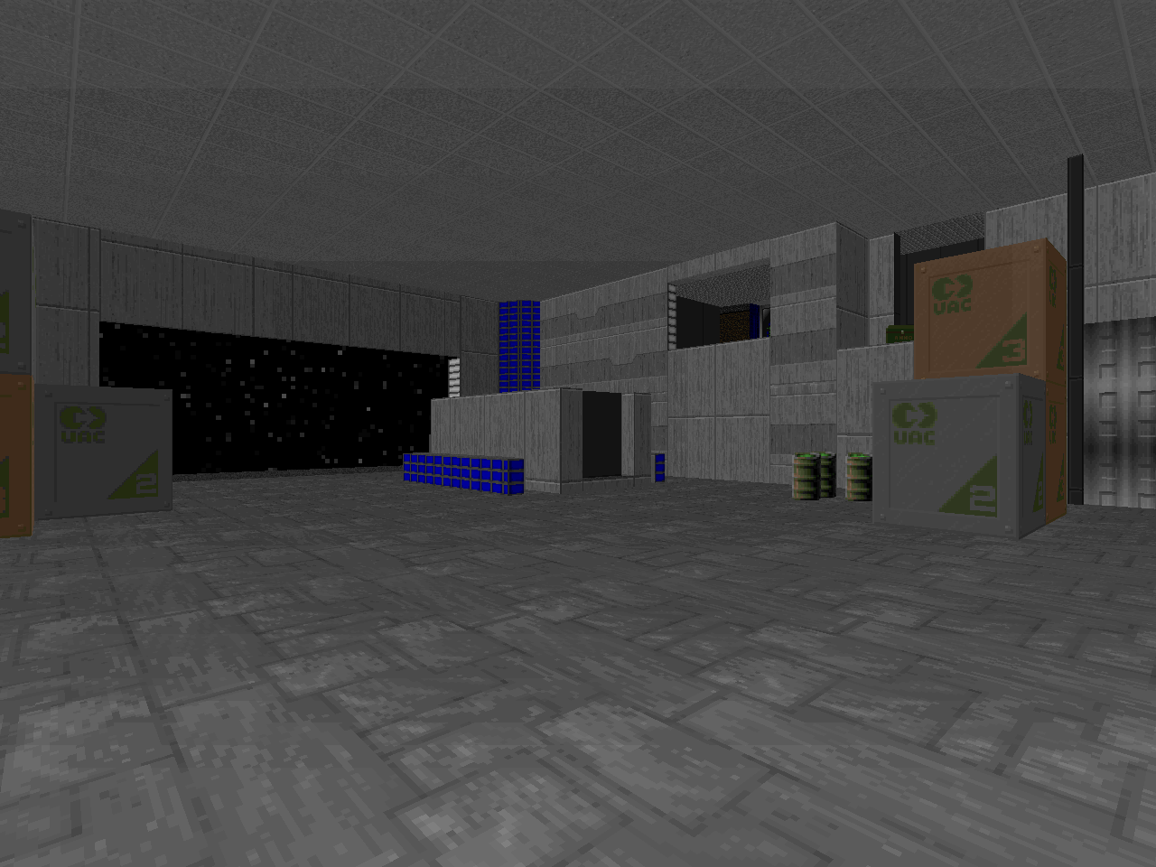
Voyager shares the same category as MYHOUSE.WADs in that it is ostensibly based on a layout that has been lovingly recreated in the Doom engine. I am pretty sure that other Star Trek maps have come before this one, but I haven't been arsed to play them yet (not counting 1KILLTNG). As far as the actual geometry of the ship's major locations go, it's pretty spot on, but I'm using Googled images for comparison since my memory of Voyager is pretty hazy since I was watching it around the same time Hansen was mapping it. Certainly, it could pass for any sort of Star Trek starship, provided it was covered - painstakingly - in Doom II's stock textures. You've got the bridge, the medical bay, the mess hall, the warp core, a shuttle bay (complete with shuttle), and the teleporter room to shoot through.
The combat is claustrophobic and awkward at times, since you have to grab your shotgun from a sergeant and do a dangerous dance in what I've just realized must be the holodeck if you want to take out the lost souls using anything but the pistol, after which there's a bunch of zombies and a pain elemental on the bridge. Mostly worried about that pain elemental. Your big break comes when you clear out sickbay, since there's a hidden weapons stash that gives you a combat shotgun, a plasma gun, and what will likely be some much needed health. The fights that follow aren't nearly as difficult with your newfound weapons, though the cacodemons in the shuttle bay may ruffle some feathers, and there's an obligatory skellington along with a couple of Hell nobles, who you'll see paired up again at the end. The hitscanners are probably the worst thing you'll have to deal with besides luring meatballs into hallways so you can cockblock their lost soul spawn.
Voyager is pretty standard room clearing through quasi-familiar confines. But, it's done pretty well, and there are scarcely enough spaceship PWADs as it is, let alone ones with as much detailing as Hansen has crammed in here. So, provided the idea of DoomCute realism rendering Star Trek's most beloved series doesn't make you wretch, you might give this one a play.

THE NOT QUITE YEAR OF HELL
Who doesn't love DoomCute? I thrive on that stuff.
ReplyDeleteNice little level if a bit simple and easy.
some people roll their eyes so hard when they see DoomCute furniture that their necks snap
Deletethey are too cool to play such pwads is what i am saying
Delete