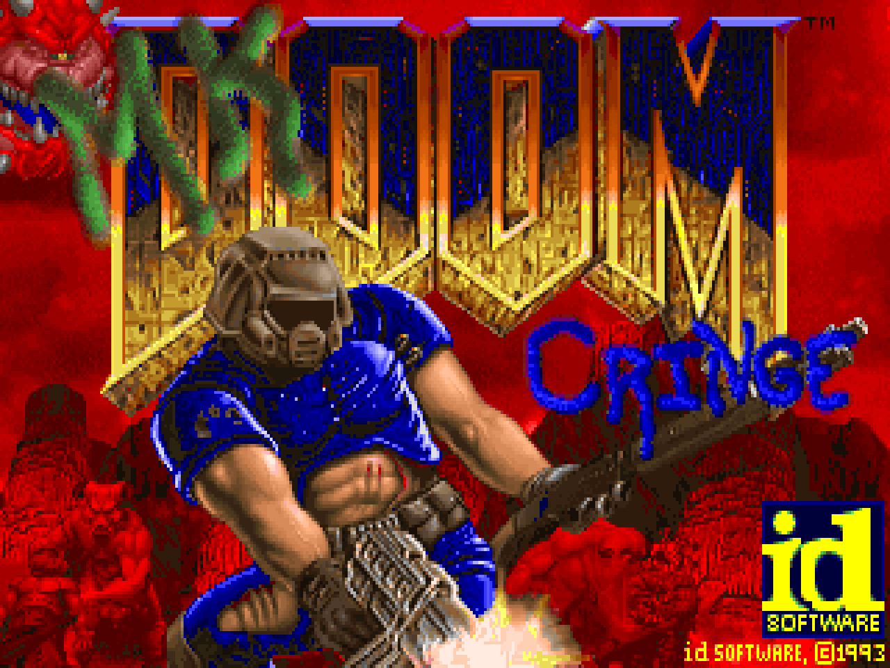
In the Doom community, Mark Klem is known primarily for his musical contributions. He was responsible for the entire score of the original Memento Mori but had a major role in the soundtracks of other classic projects like Requiem, S.T.R.A.I.N., and MM2. He made maps, too, for the same megaWADs as his good friend Eric Sargent. However their partnership began it made its official debut with CRINGE!, an episode two replacement for the original Doom. Released toward the tail end of 1994 (and uploaded specifically to the /idgames archive in 1995), it is a perfect example of the raw weirdness perpetuated during the community's early years. I suspect that the majority of modern players will hate it with a passion. The ones who don't, though, may be drawn into its unearthly delights.
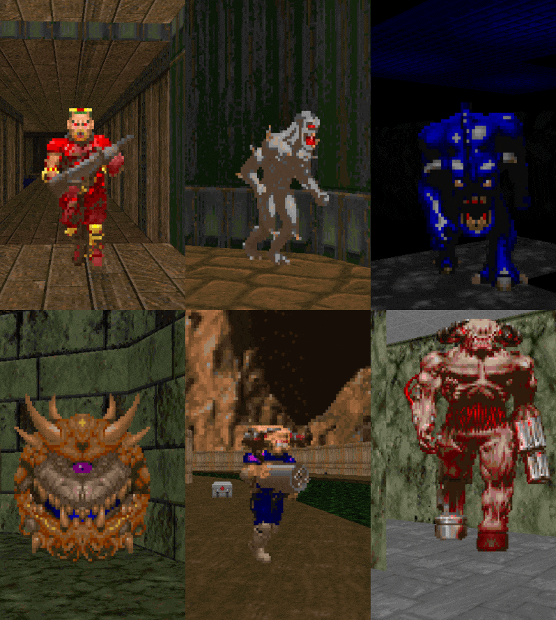
The Shores of Hell replacement lacks a story but it does have two supporting .WADs. CRINGE6 is the main package and contains all of the levels and the utilitarian resources like TITLEPIC, the sky, and status bar. CRINGE2 has rest of the graphical replacements. A lot of the new stuff - particularly the weapon and enemy sprites - are basically garish recolors. You won't get the full 1994 experience without them, though, which includes a ridiculous Baron wearing sunglasses and violent embellishments to the death animations. Oh, and the Baby Cyberdemon, which changes the look and sound but not the mannerisms of the Spiderdemon.
CRINGE3 consists of a handful of new audio effects. They're either brand new or slightly distorted / reverbed remasters of existing things. I'm not sure who voiced the DSSGCOCK sound ("Time to die, friend." but it's deliciously dorky. I assume that it was Klem himself. I like the new plasma gun and teleporter noises. The latter seems especially chunky. The most drastic changes were made to the cacodemon. It's a much subtler monster now since it no longer hisses / squeals on sight and has no trumpeting fanfare for its demise. The Cyberdemon gets a resounding echo to its death which gives a bit of gravity to your victory. It would probably be annoying if you had to fight any more than one at a time, though.
Most of the folks that hated CRINGE! on /idgames were also quick to point out its excellent music. Just about all of these tracks appeared later as part of Klem's Memento Mori soundtrack, the main exceptions being the tunes for E2M8 and E2M9. If you're interested in the compositional history of one of the community's classic composers then you ought to give these a listen. I can't say that E2M9 sounds familiar. It's a bluesy, simple tune based on a syncopated riff. The drum fills make it sound like it's about to take off on several occasions but it never really explodes in the same way as Mark's later stuff. E2M8's arrangement is super obnoxious and sounds like rapid-fire exotic instrumentation plotted out on the cusp of a full blues chord progression. I swear that I've heard the bridge section before, though. It has a slow, sweeping, and almost apocalyptic feel. I may just have those guitar tones seared into my brain, though.
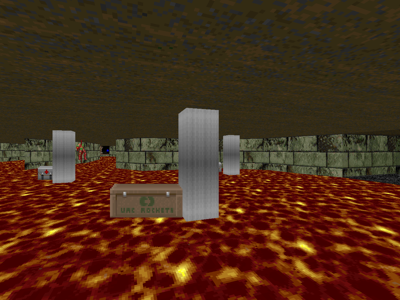
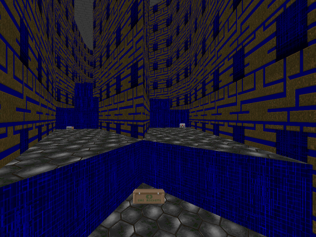
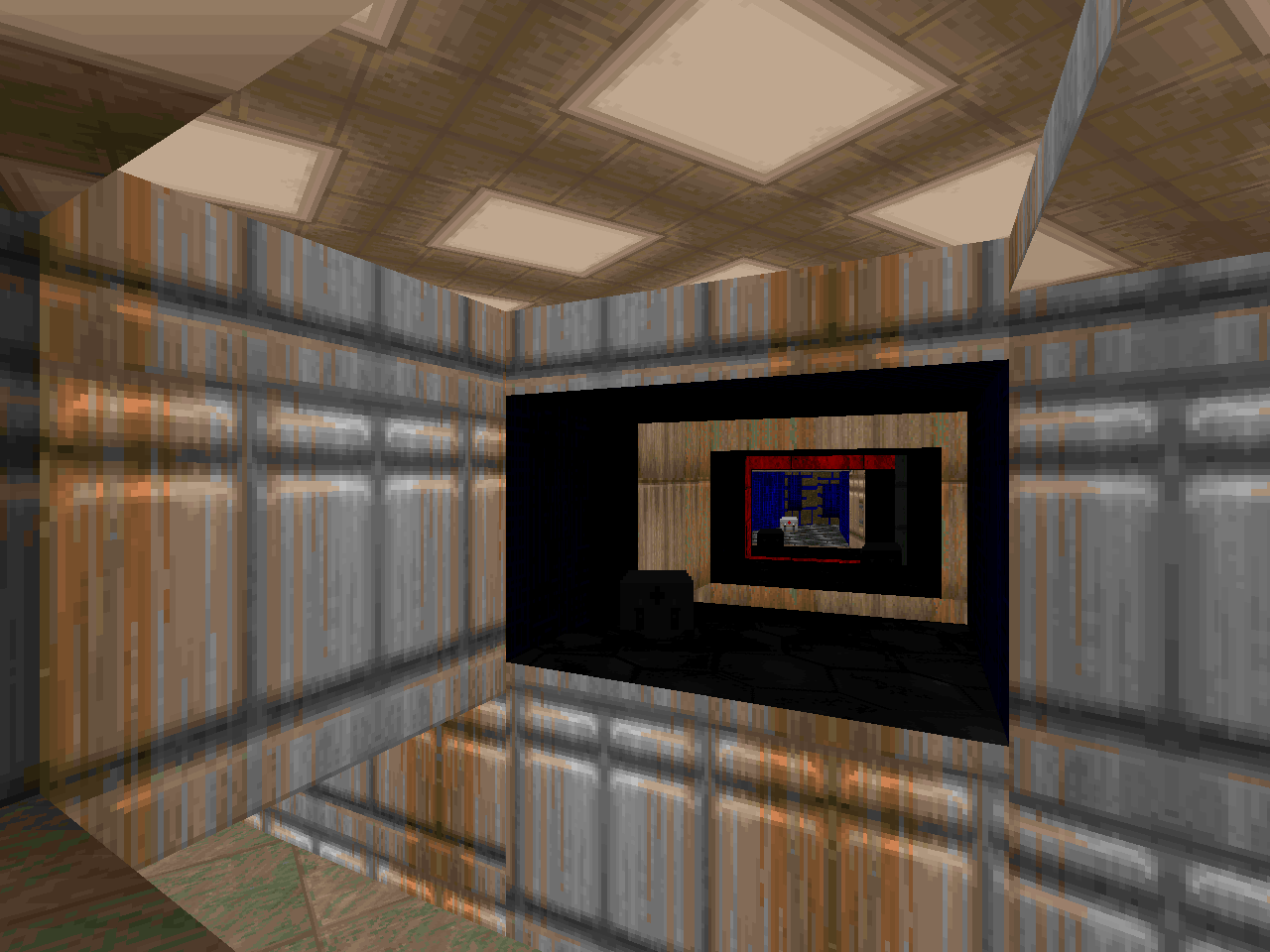
The graphics and sound replacements could have been tacky additions to an otherwise rock-solid 1994 set but CRINGE! cannot help but be divisive. Klem's level design is for the most part highly compact, labyrinthine, and loaded with both required secrets and death traps. Sargent's sole entry, "Secret Level: Salvation" (E2M9), is along the same lines but executed over a sprawling layout and sans killer sector machinery. "Cancer" (E2M3) is a great example of the forces at work. The blue key on full display and it isn't very hard to figure out how to get it since it has windows on two of its sides. Its purpose is initially inscrutable, though, because it opens up a barrier in the path to the exit. Not the one which reveals the route, mind you. You'll have to wallhump your way to that one on your own.
E2M9 is an exception for being more accommodating to the player but "Your Last Breath" (E2M7) marks the biggest break with the PWAD's design philosophy. It's still a huge level and full of nested secrets for you to get lost in but you are required to visit very little of its square footage. If you have no idea where to go and are just exploring it for the first time, though, then it's a pretty daunting adventure and no less dickish in its metaphorical pitfalls. I tried out a pacifist run for funsies and pulled out an exit in a little more than a minute with the bare minimum of effort. I'm surprised to see that only one person has recorded on it per the Doomed Speed Demo Archives but Mark's obscure sector machinery can only present itself as a significant obstacle toward the average player's interest.
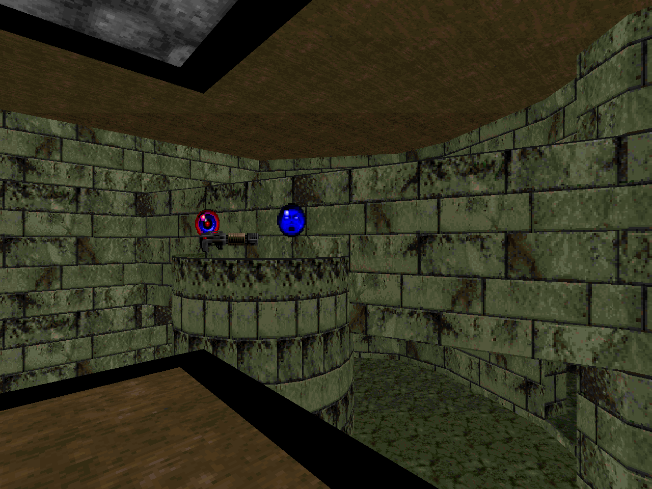
The encounter design consists of fairly typical room and corridor clearing interspersed with the occasional bout of peak pressure, usually brought on by cramming a ton of demons into the player's limited space. The painted blue devils are almost certainly CRINGE!'s MVP and are a major element of nearly all of my standout encounters. Even if said fights fall in the realm of surprise traps that will have some players crying "Bullshit!" The sunglasses-clad Barons try to steal the show but the navy nightmares feel lethal here in the same fashion as cacodemons in modern OG Doom mapsets. I suspect that part of this is a result of Mark's cramped indoor layouts not playing well to the cacos' strengths. It could just as easily be favoritism, though. Blue is the color of the episode and it was given primarily to them.
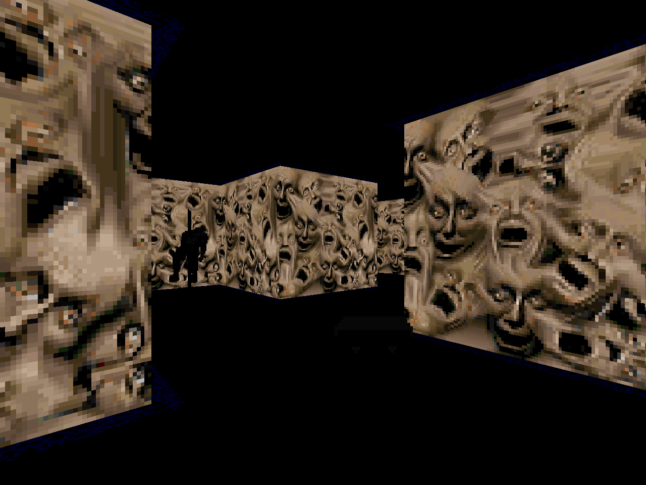
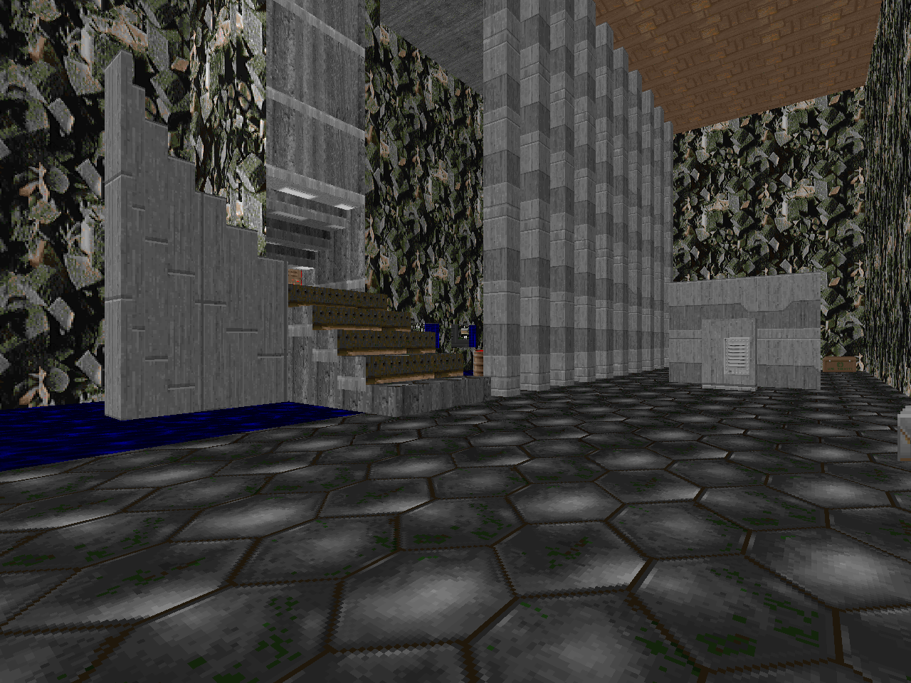
Klem has some really cool architectural ideas and they even extend to the mazes. However, none of the maps gel as a cohesive whole. They have that 90s patchwork thing going on where they feel as though they were assembled in a dream by a subconscious intellect. This is exacerbated by the recolored graphical patches and highly selective texture alignment. CRINGE! lacks the exceptional visual noise of anotak's Lilith but it does have a strange aura of existing beyond the boundaries of "acceptable" level design. Travelling down each haunted leg plunges further into quickly unravelling reality not unlike the carefully crafted glitch universes of Axiom Verge.
Happ was presumably inspired by the "hidden worlds" of the original Metroid. These emergent environments were a happy accident of the game cobbling together rooms on the fly based on pre-existing level data. The end result was a hodgepodge of palette-swapped rooms that were even more hostile to navigation than Nintendo's original design. You could find yourself trapped in a slice of a vertical shaft, the bottom looping forever to the top and vice versa. Klem's recolors in CRINGE2 supply the familiar yet alien feel but vanilla Doom is incapable of automagically producing maps by guessing what the player ought to be seeing.
The innocent indifference of Metroid is instead supplanted by Klem's very human touch. The author wants to confuse, trap, and kill you. The first bit is perennially evident in his labyrinthine layouts and level progression but the other two come in infrequent but powerful moments. "Evil Bliss" (E2M5) is an outstanding example. There is a switch that requires you to venture out into some nukage to press it. If you linger for but a moment then a player-sized sheath will cheekily descend around you, allowing the damage floor to do its job. You get another taste of this phenomenon in "Damnation of the Dead" (E2M6). Pushing a particular button next to some goodies causes a dam wall sporting Baphomet eyes to rise up behind you and watch you melt in your impotence.
The presentation of Metroid's procedurally flawed spaces was a result of the Nintendo's limited tools. The fact that its "hidden worlds" exist at all is a serendipitous circumstance. It would be too much to ask for any sort of logic to their arrangement. CRINGE! is obviously a product of Mark's (and Eric's) imagination. KlemCo actively spurns the player's interest through its obfuscated progression but their twisted universe was designed to be explored. While it is possible to find yourself trapped and then dead not long after, you will never be irretrievably stuck and incapable of reaching the exit. The final encounter of the episode even affords you the opportunity to peek behind the boss's curtain. It's an optional and perilous adventure but allows you to see the relatively simple mechanics at play. There's no other way to glimpse the Cyberdemon recolor, either. At least, within the confines of the mapset itself.
For good or ill, Mark Klem's earliest work is a galvanized representation of some of the most-maligned aspects of 1994 PWADs. I love it but I wouldn't recommend it to the community at large. You will know by its description whether or not CRINGE! is personally worth your time. If secret doors, laser-focused deathtraps, and garish color schemes are your sort of thing then you might give this one a shot. If not, well, try the tens of thousands of other levels out there, many of which were polished to the path of least resistance.

For the extra graphics, you'll need CRINGE2.WAD.
For the new sounds, you'll need CRINGE3.WAD.

CRINGE!
by Mark Klem and Eric Sargent
| Ticket to Hell | E2M7 |
|---|---|
| by Mark Klem | |
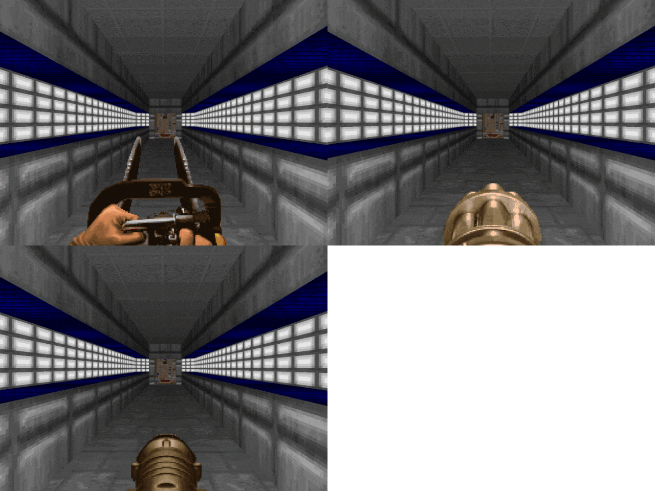
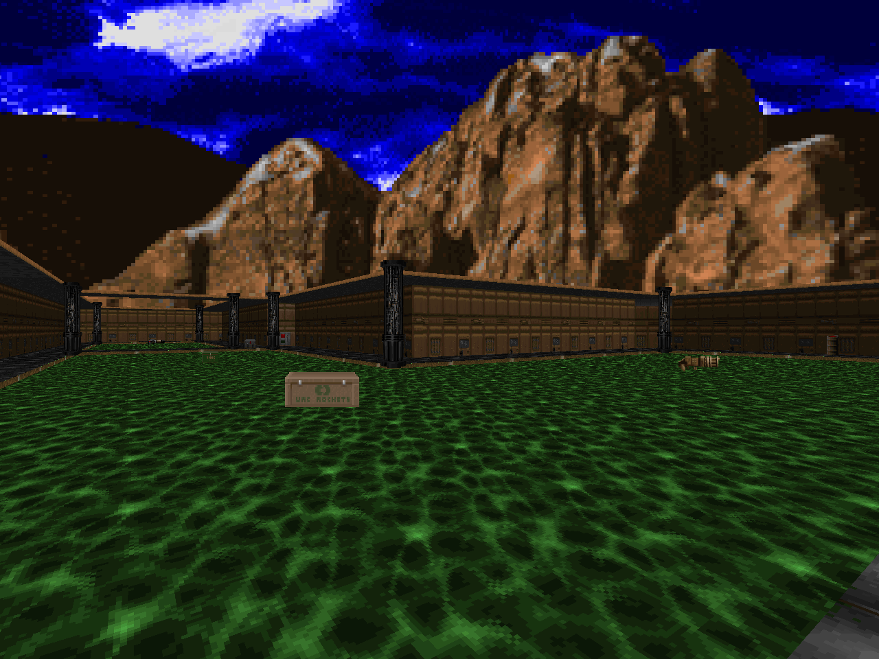
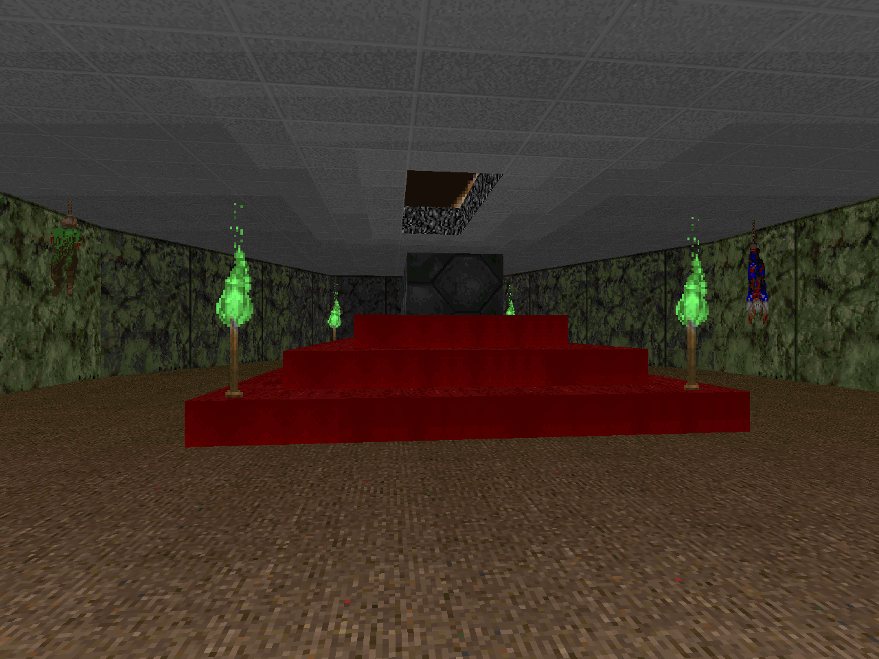
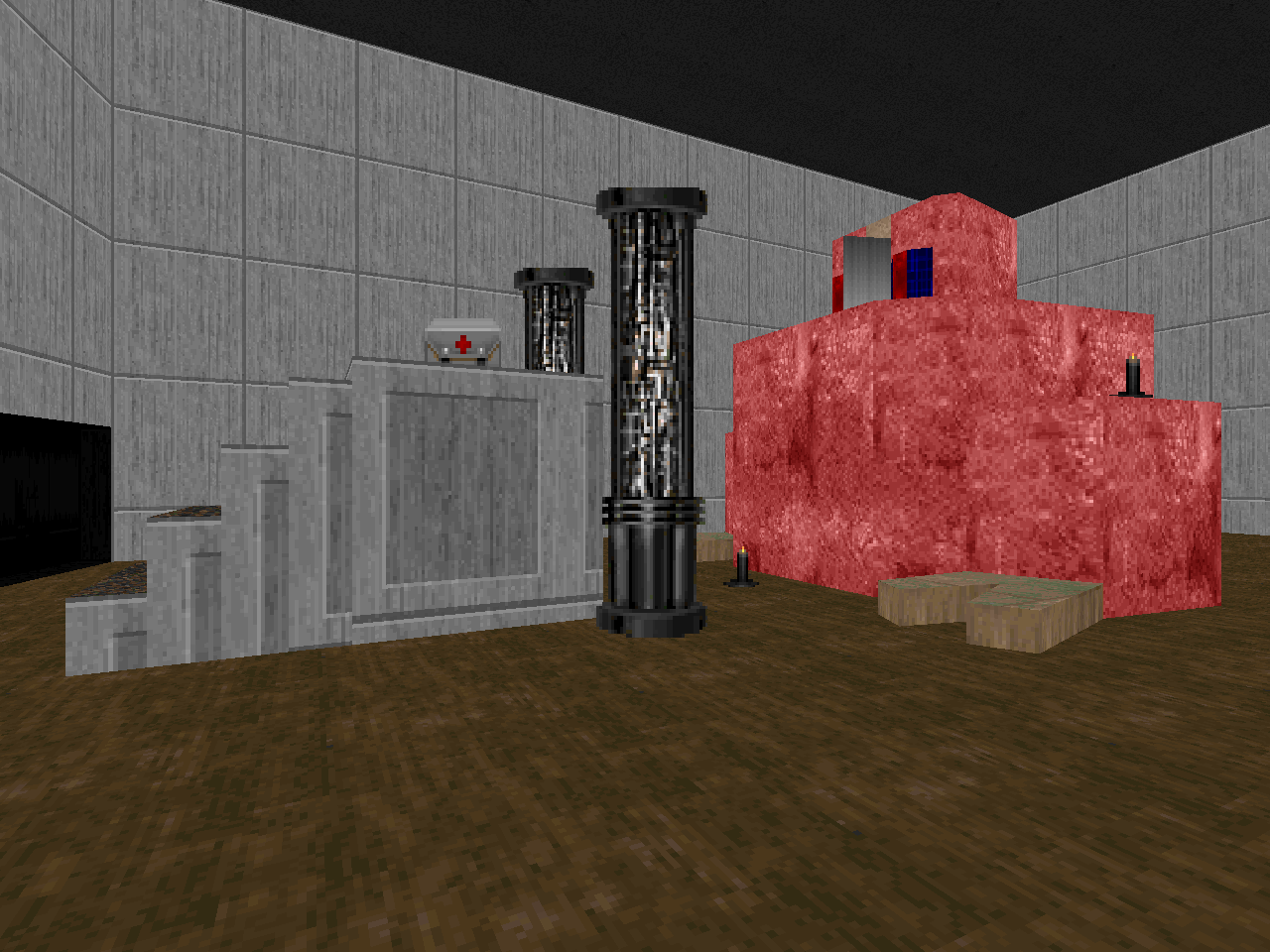
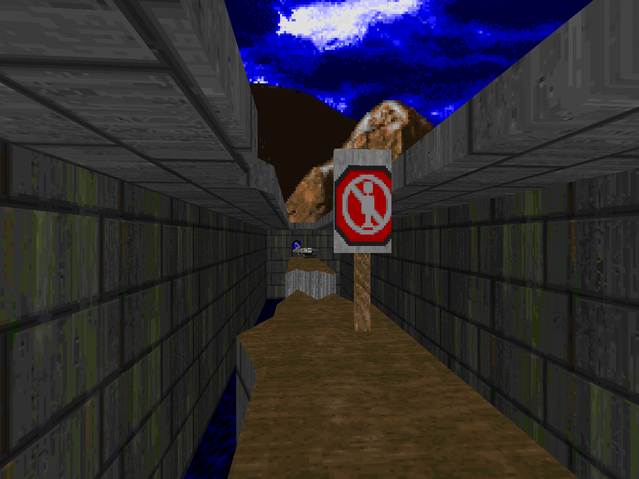
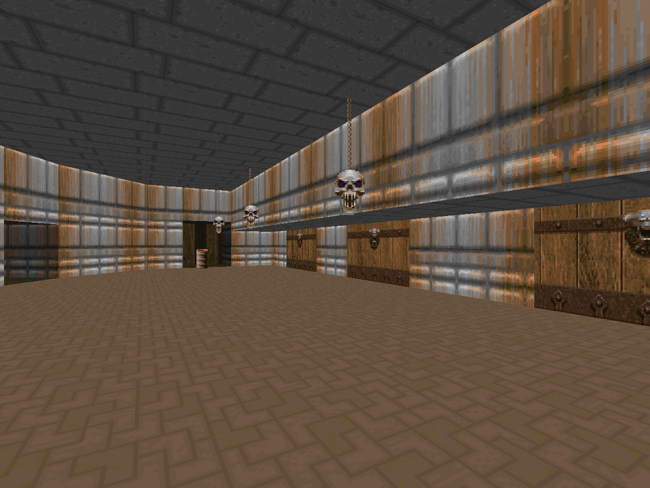
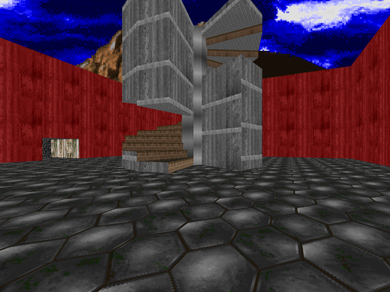
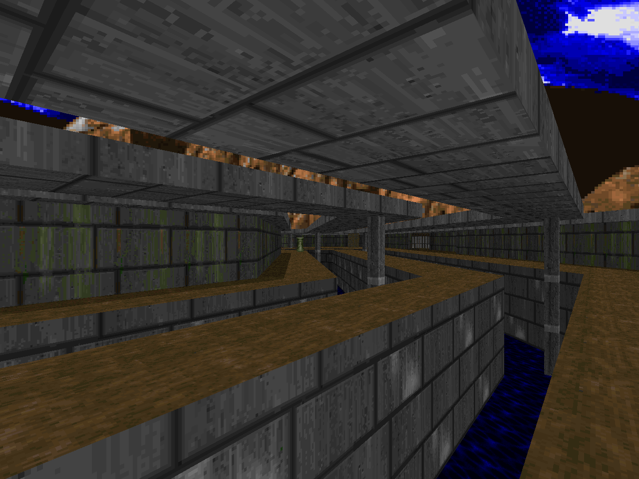
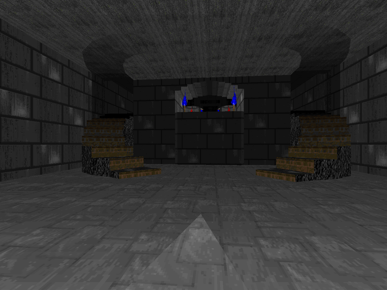
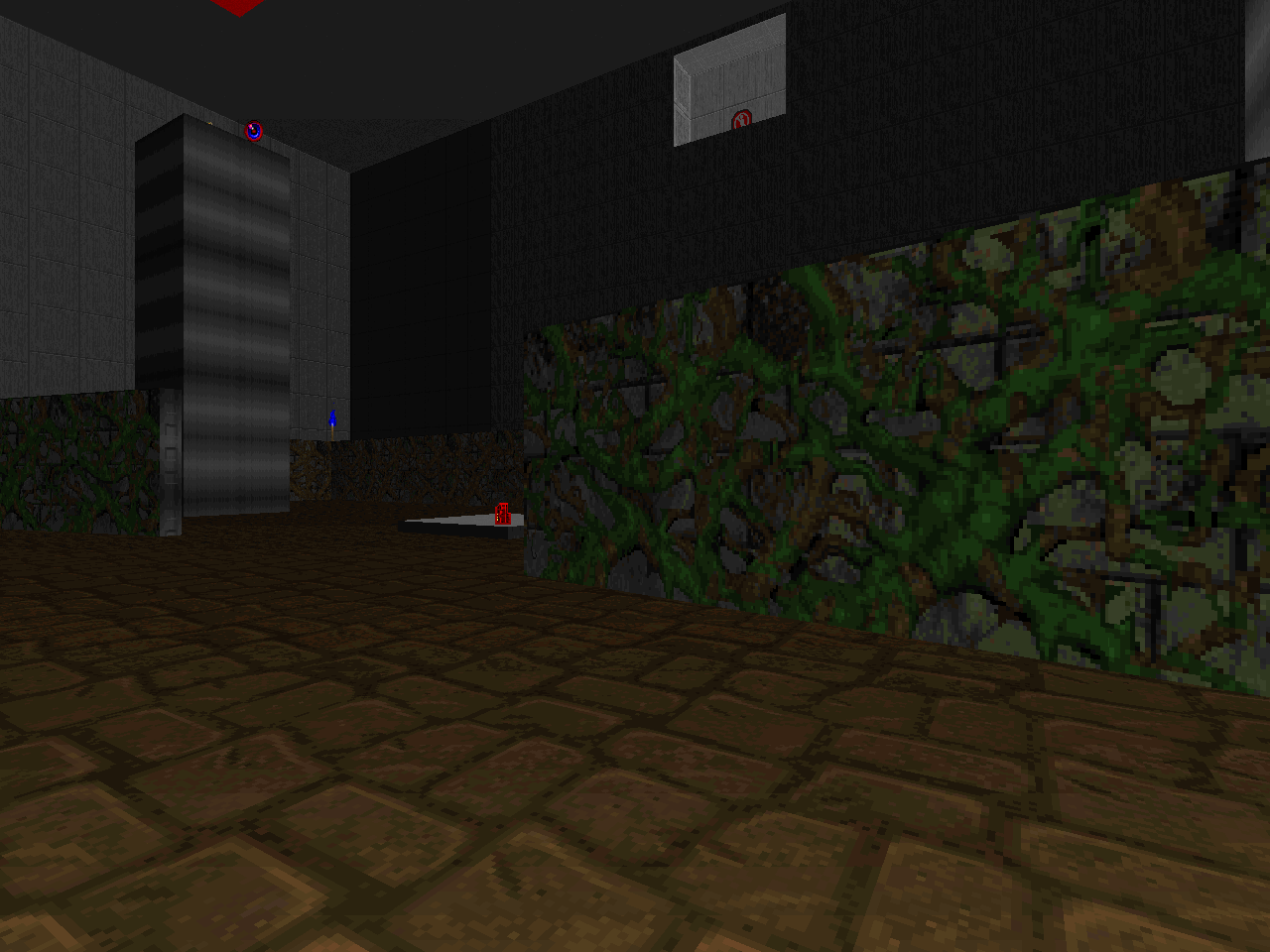
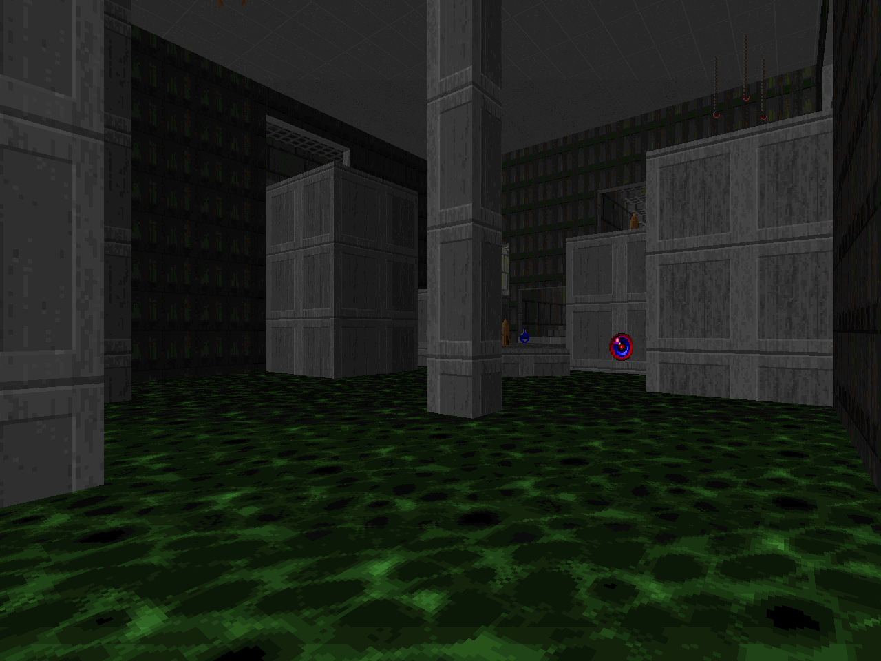
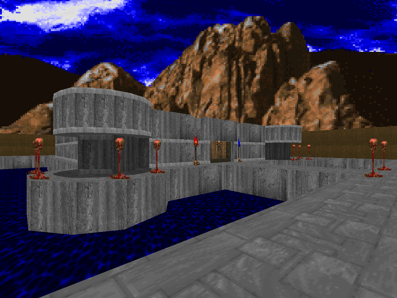
| This level's centerpiece is essentially an Express Elevator to Hell setup. You don't start out there and can easily get lost in the twisting passages branching to the west of the starting area. When you find it, though, you'll have seven new directions to take. Only two of them are required and you can get to the second from the first. If you know the score then you can actually blaze through pretty quick, your biggest obstacle being the demons waiting for you in the crate room. You'll miss out on so much weird shit, though, like the sprawling toxic channel or twisty strobe skull staircase. Perhaps the weirdest of all is a sector construction that looks like a giant plucked bird. When poked and prodded it will reward you with a plasma gun. | 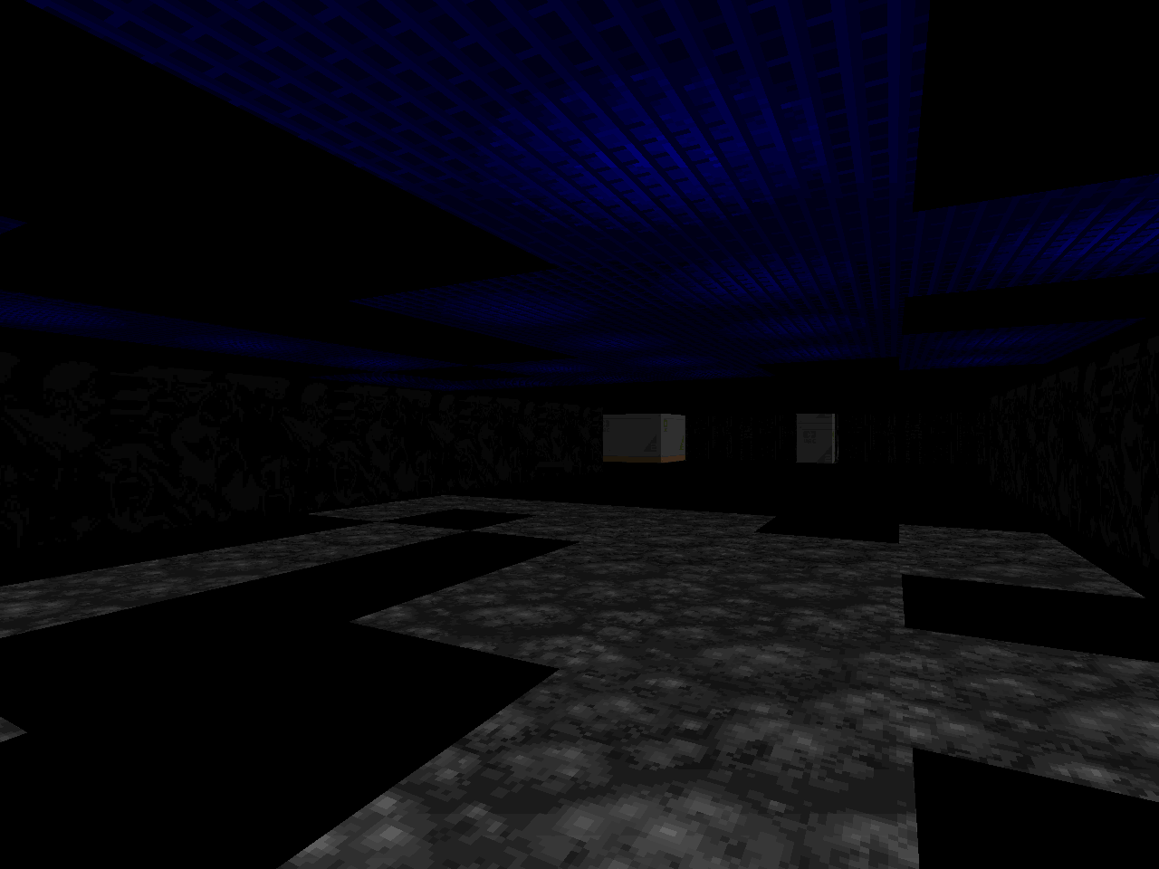 |
TRUE GRIT
Nice review. This really brought back memories.
ReplyDeleteThank you for stopping by and thank you for these crazy levels!
DeleteIt's me, Mark Klem. This was a great review. I never even thought about most of the stuff you said back then :) I know it sucked, but great review :)
ReplyDeleteidk if trolling or what, like is the implication that the first comment isn't mark, or that they are both mark and he re-read the review and really considered the comparisons and contrasts that I was making? I'm confused.
Delete