Doom has been ported to a staggering number of platforms but a select few of the commercial releases hold a special place in the hearts of a generation. The Playstation and the Nintendo 64 each got their own version (two in the case of the PSX's Final Doom). Both were created by Midway games and used the talents of three of the same authors: Randy Estrella, Danny Lewis, and Tim Heydelaar. They also featured haunting, atmospheric soundtracks from Aubrey Hodges. I am reviewing the 64 iteration first even though it was released later. Roughly a year and a half in 1997, to be exact. No offense to the PSX fans; there's just way more meat for me to sink my teeth into.
The narrative takes place after the events of the first two games. You're the sole survivor, haunted by nightmares of what you've seen and experienced. They didn't even send you to Mars; they just carpeted it with nuclear bombs. Something survived down there, though, and it's staging the next invasion. The resulting mutations could only be borne by reanimated tissues and they're more vicious than the previous brood. You have the most knowledge and you've survived where billions did not. You are sent to confront your worst fears head-on in the ultimate act of cathartic defiance.
Doom 64 was a forbidden delight for PC users. It remains exclusively available for the console that it was made for but it is essentially a total conversion. There are thirty-two brand new levels; all-new graphics; altered enemy behavior; and even a new weapon. If you for some reason had the assets back in 1997 then you could not have remade it in the original engine. The new special effects and level design features gave the world a different, enhanced feel. Things changed with the release of the Linux source code. The featuresets of ports closed enough of the gap for Samuel Villarreal to feel comfortable in heading up Doom 64: Absolution.
The Doomsday-based TC shares a somewhat similar relationship to the original release and its PSX conversion. The maps aren't exactly the same due to not only engine differences but also the fact that the levels were painstakingly reconstructed via screenshots. The Absolution team also added their own spin with new monster varieties and even levels. I remember downloading and playing the TC a few years after it was released but I never finished it and don't recall making it much farther than the first few maps. I can't speak as to its accuracy or lack thereof but it must have been a monumental undertaking.
Enter Doom64 EX, a source port that runs off the original cart's data. Kaiser has done a lot of work in getting disused classic games to run on modern operating systems and this was almost certainly a labor of love given his past history. It is the most accurate experience available on a PC without running it in an emulator. Plus you can actually make PWADs! While there has been a constant if low murmur of interest, EX user maps never really exploded as a genre. It's still more viable than Strife, at least. Hopefully the presence of large-scale projects like Beta 64 and Community Chest 64 will kickstart the production of smaller releases that form the lifeblood of a healthy scene.
There has been a glut of more recent projects hoping to bring the magic of Doom 64 to the GZDoom engine with varying goals. An in-depth discussion of their relative merits is outside the scope of this review but Retribution is probably the one to check out if you can't be assed to run EX yet want something that approximates the original experience. Without running a relatively older version of Doomsday, of course. If you're more of a Brutal Doom head then SgtMarkIV has you covered with BD64, built off a slightly older but inactive project called GZDoom64. I used EX for my playthrough because it best represents the worlds that its authors were attempting to make.
The base mechanics are pretty similar to Doom II. A handful of monsters were cut due to hardware limitations but some players will not mourn for the loss of chaingunners, revenants, arch-viles, or even Spiderdemon. The cast gets a new boss monster to compensate, the Mother Demon. She only appears in the final level. It would be a much more dangerous opponent if you were forced to handle it without the powered-up secret weapon or, for that matter, the BFG. Good luck if you try to stick it out using the "regular" arsenal; dodging its homing balls of red energy while avoiding its Maulotaur-esque exploding fire tracers is a tricky proposition.
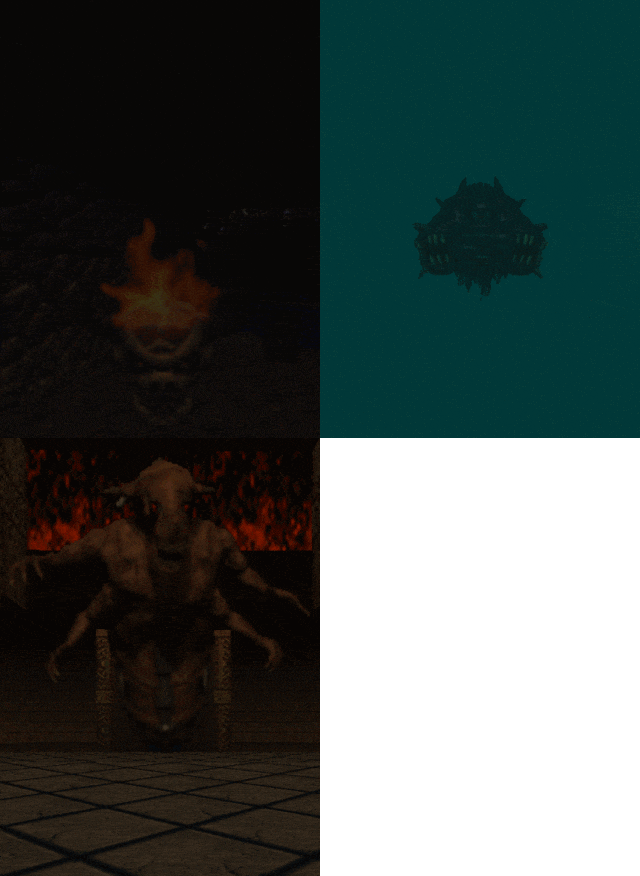
Some of the monster behavior has been altered, significantly so in the case of the pain elemental and lost soul. The latter is less robust, only taking a single shotgun blast to kill, while also charging faster and more often. The lost soul is easily one of the two most threatening enemies in the modified bestiary. On the highest difficulty they appear as deadly player-seeking swarms that are difficult to outmaneuver. The other is the modified pain elemental which spawns the things. It would be bad enough just from the altered lost soul behavior but it also vomits forth two at a time. If an errant skull is aborted upon creation, e.g. spawning in level geometry or an actor, then its explosion carries the blast force of a bursting barrel. I found this out while using a wall for cover in "In the Void" (MAP31).
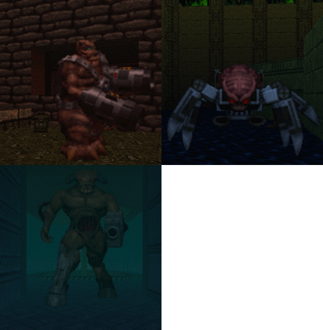
Arachnotrons and mancubi aren't too terribly different. The mancubus attack pattern doesn't seem to have the same odd series of angles but it still shoots in spreads. The arachnotron actually fires dual projectiles as well, they just do less damage each. I think that the most significant but subtle change is in the Cyberdemon. It appears to move a bit slower but its rockets are actually fired from the launcher which results in a natural decline when its projectiles are aimed at you. If you're dodging then they usually explode on the ground close to where the player was standing. To me, the ordnance travels significantly faster, but this may be a placebo effect. The bottom line: they make for an encounter that is much harder than its vanilla counterpart.
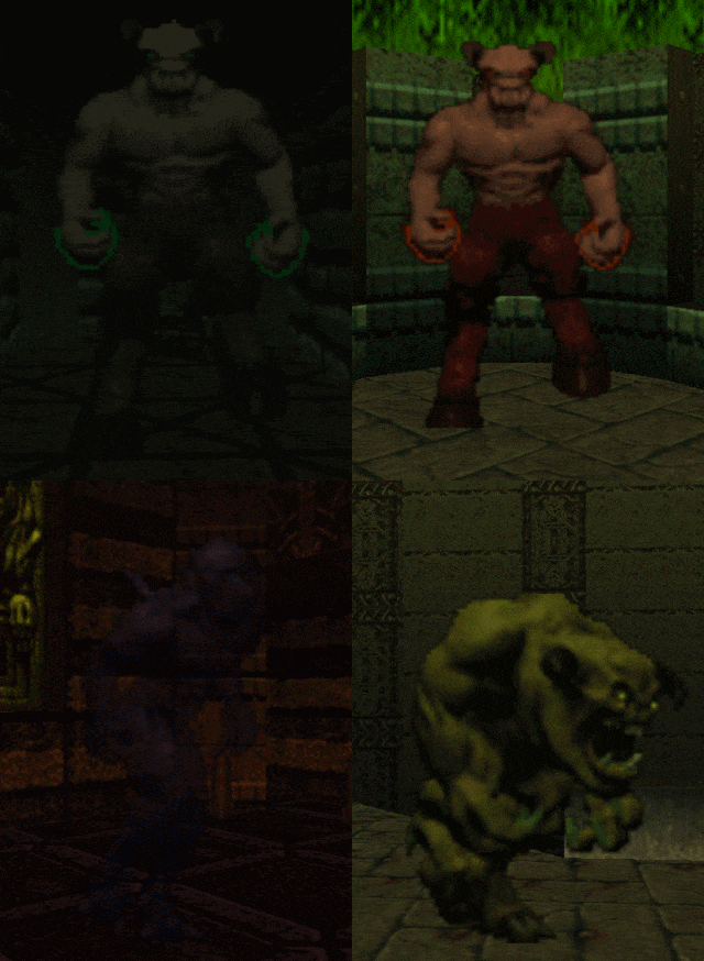
The nightmare imp is a new monster variety. It's just as tough as the regular imp but moves faster and has quicker fireballs while also being bluish-purplish and transparent. Their inclusion is far less burdensome than the changes to, say, the lost soul. The Hell knight and Baron are just about the same but they can actually infight. The change is carried over from the PSX version, which Doom 64 is based on. The player also seems to get hung up on monsters, an almost nonexistent occurrence in the original Doom where you can even "glide" on things for a speed boost. Facing down a pack of demons is way scarier when one is easily capable of pinning you to a wall.
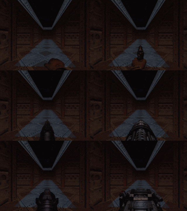
The toolkit should seem pretty familiar. I feel like both shotguns have a tighter spread but I think that this is mostly a consequence of the game's more intimate range of combat. The SSG feels like it has a much faster rate of fire but this does not appear to be the case when making a side-by-side comparison. While still handy, it's been hobbled somewhat due to the changes to the lost souls and pain elementals. The chaingun feels like a much stronger weapon overall. I don't know if the rate of fire was tweaked but the pain stun component is invaluable in the majority of cases. The plasma gun is a little slower. I prefer the way that it sounds but it didn't feel as satisfying to use. The chainsaw has two blades and kills twice as fast; it's a powerful single-target damage dealer.
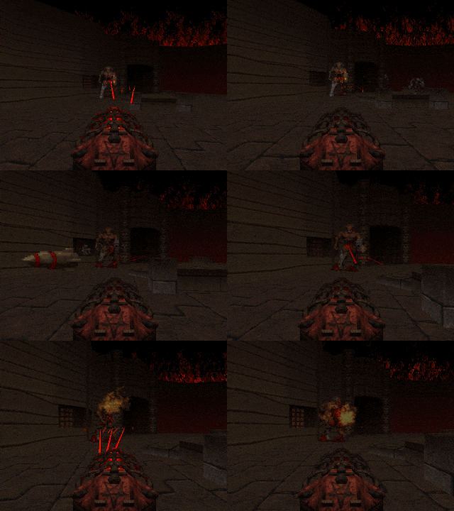
The big draw is obviously the unnamed demonic laser weapon, which the community has dubbed the Unmaker. The Doom Bible tool apparently wasn't in the Midway team's mind when they made it, though. It isn't a great armament to start with but becomes stronger as you acquire the coveted Demon Keys in the three secret levels. It increases the rate of fire at first and afterward drastically improves its power by causing it to shoot two and later three lasers per shot. It is ridiculously strong in its final form, chewing through both the Cyberdemon and Mother Demon at super speed. You won't find the laser cannon in but a few places, though.
You might think that a powerful weapon like this is only usable during continuous play but the functionality of Doom 64's perks is interesting. At least, it is in the EX engine. Simply acquiring a Demon Key appears to flag your playing session. If you use the "Restart Level" option from the in-game menu then you will still have it when the map reloads. In this way I was able to play each entry from pistol start while still powering up the laser gun for those rare occasions when it is available. As has been fully documented elsewhere, the keys also allow you to hasten the progression of "The Absolution" (MAP28) by sealing off three portals that usher in the initial wave of baddies during the level's first phase.
Doom 64 is often thought of as the spiritual second sequel in relation to the progression of engine features between 1993, 1994, and then 1997. The addition of colored lighting for the PSX version was important to its overall aesthetic but wasn't exactly what I would call a game-changer. Midway weaved in some new illumination effects for the 64, though, as well as fog and even skies both scrolling and parallax. They also got "limited room-over-room" which as far as I can tell isn't any different functionally from the way you would do it in vanilla. According to Tim, they just lucked out in having the sky render behind all level geometry. In idtech1 the sky texture supersedes anything that it happens to be in front of. This sometimes results in the upper portions of level geometry vanishing as you move around in some less visually polished PWADs.
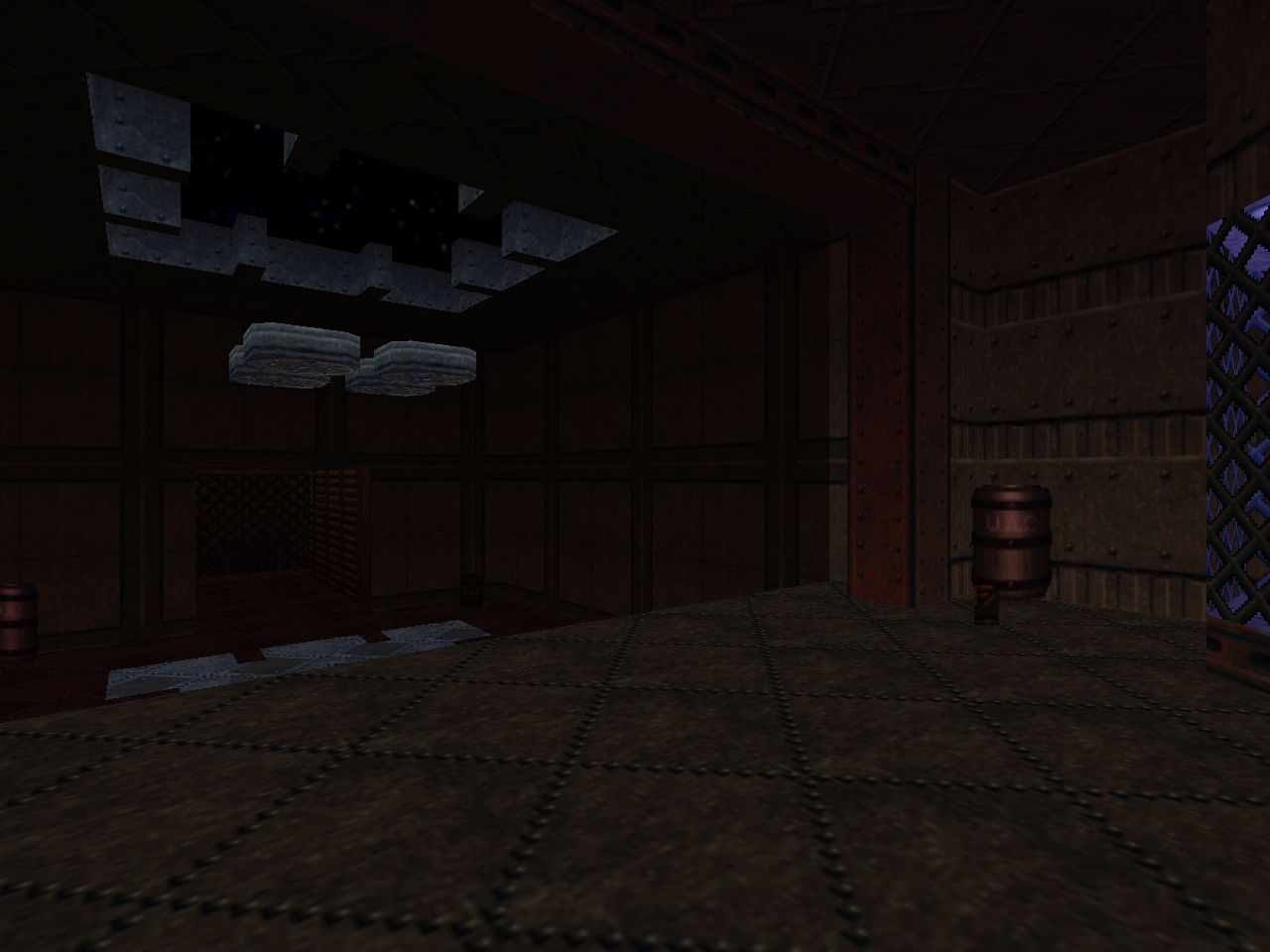
Doom 64's main advantage is in its scripting capabilities. Of course, Hexen brought this to idtech1 with ACS back in 1995, but Raven's use was limited by its commitment to sword and sorcery in relatively realistic environments. Midway shows off early on with the ground-pounding device in "The Terraformer" (MAP02) or the insane molding machines of "Main Engineering" (MAP03), after which it blends into the underpinning of the levels. Every now and then you get a surprise that makes the map geometry look frighteningly malleable, though. The moving walls in "Burnt Offerings" (MAP22), for instance, or the pain elemental summoning font in "Spawned Fear" (MAP18). One of my favorite demonstrations of the scripting is one of the bonus offerings, "Playground" (MAP27). The transition from the arachnotron fight to Cyberdemon showdown would have been a great abstract centerpiece to showcase Hell as being composed of nightmarish chaos.
Monster spawning via scripts isn't exactly a revelation but it definitely streamlines the process by making the cumbersome construction of teleporter coffins unnecessary. The authors also use it to deliver player pickups as part of the multi-stage fights that take place in levels like "Watch Your Step" (MAP17). The raw potential of both is best showcased in the abstract bonus levels like, again, "Playground". The silent fade-in adds to the horror atmosphere since they aren't presaged by an obvious teleporter sound effect. It also fits in with Midway's hallucinatory Hell aesthetic. I wonder if they could remove enemies from the map by using scripts just as easily as they shifted the blue key around in "The Terraformer"? Having to escort a monster from one portion of the map to another would be a wicked way to unlock a secret.
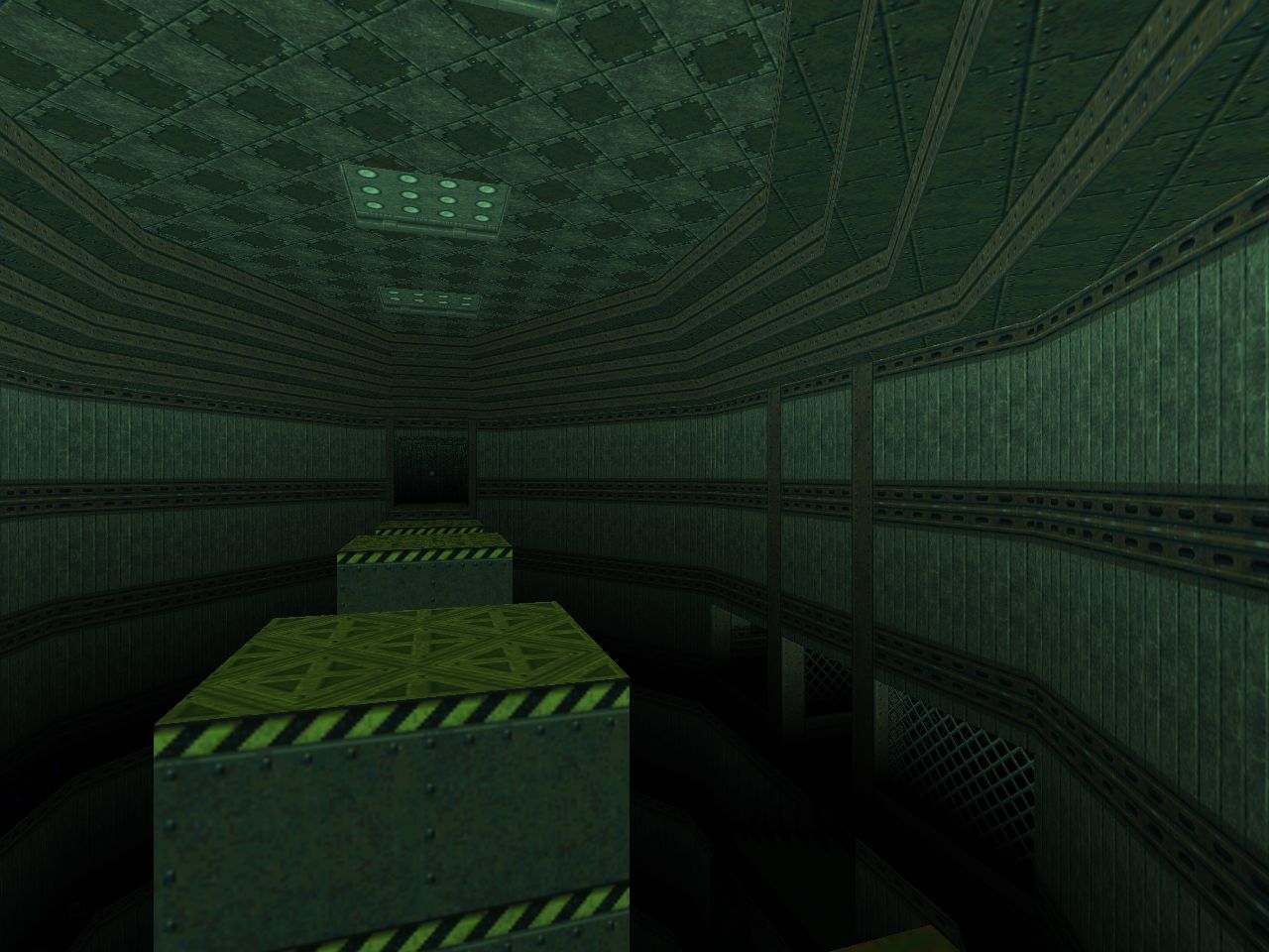
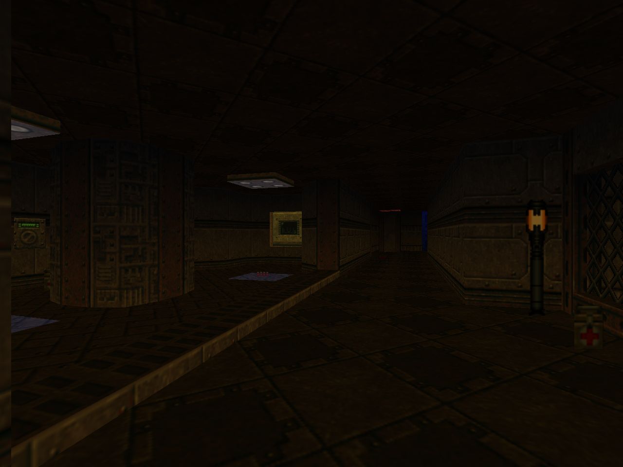
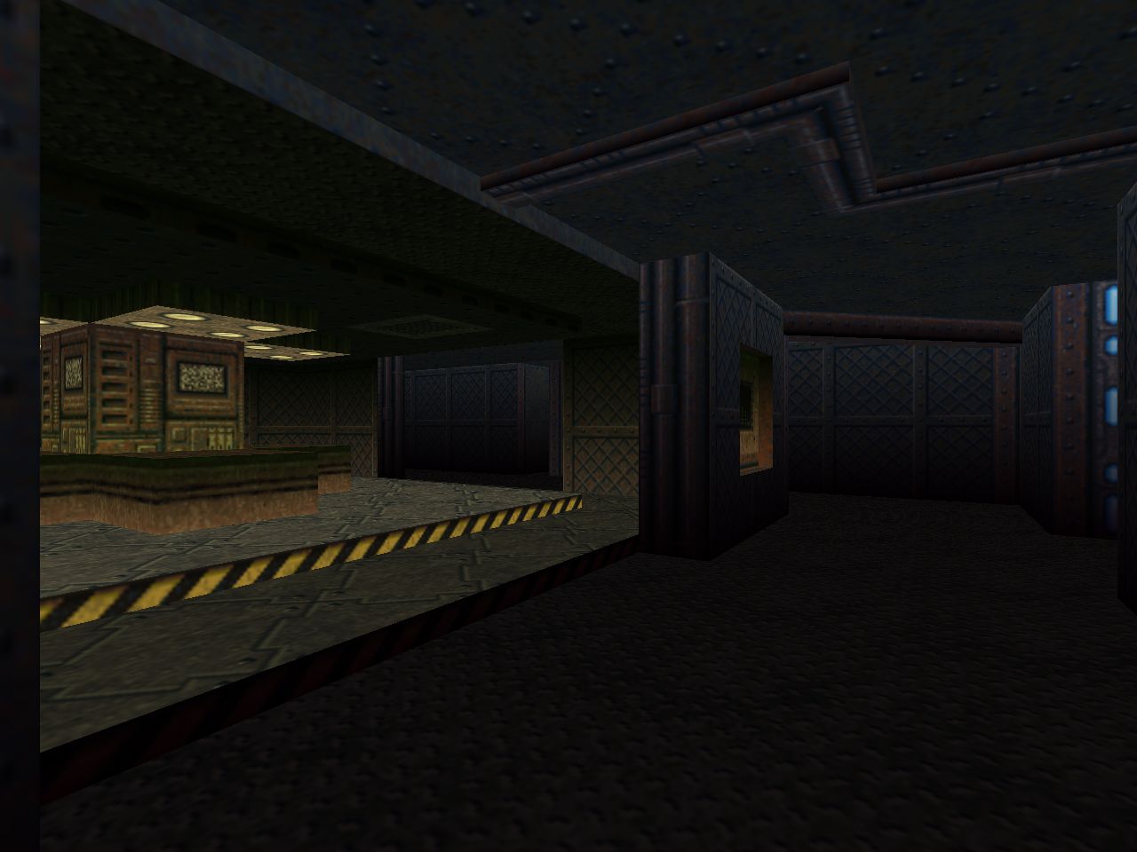
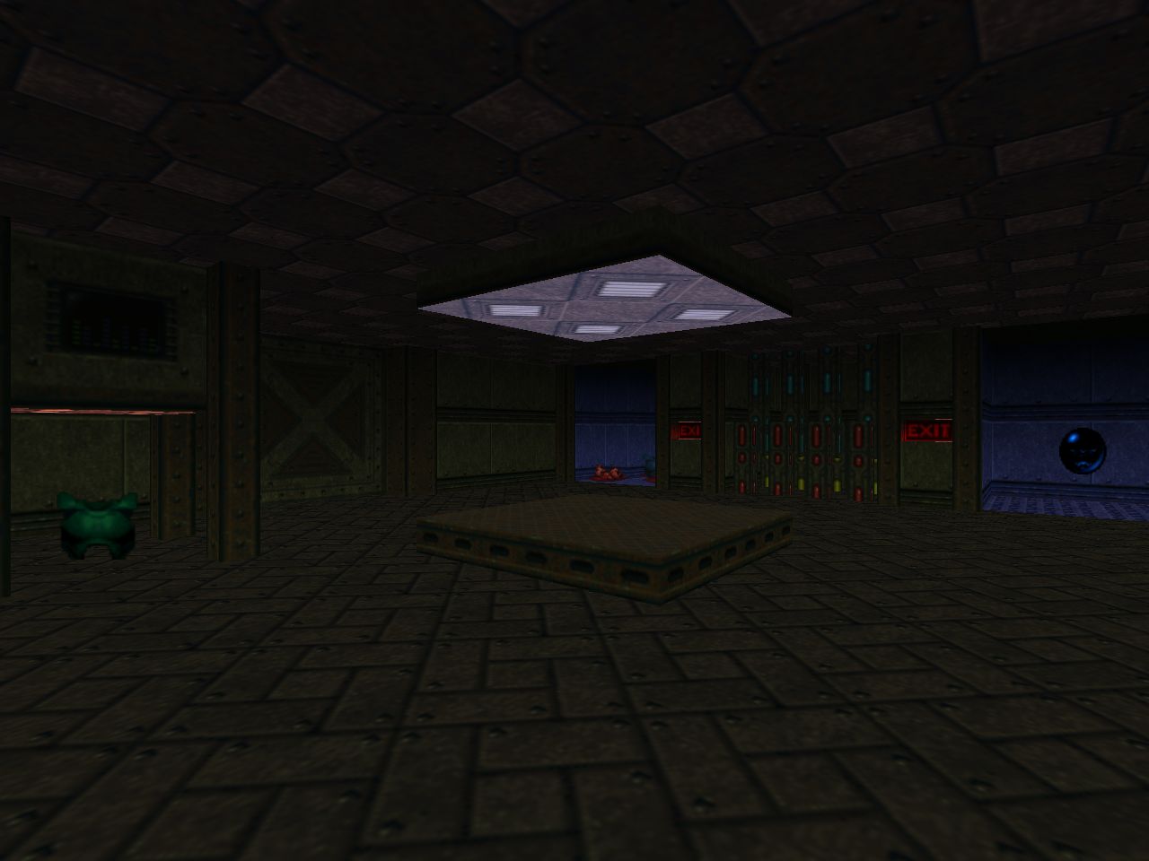
The scripting plays into more aspects than just changing the shape of the levels or porting in enemies, though. It also allows for dynamic sector lighting, changing colors and brightness among other things. MAP02 is again a great showcase of this effect with the blue armor kiosk lighting its room up. It's also worth pointing out that the authors involved did a lot of painstaking sector light work in the early techbase maps, notably "Staging Area" (MAP01) but others as well. When combined with scripting and softer strobe levels it approaches the visual impact of modern PWADs like Sunlust, just with a much smoother edge. The variety of luminescence is a major contributor to the visual feel and ambiance of the final product.
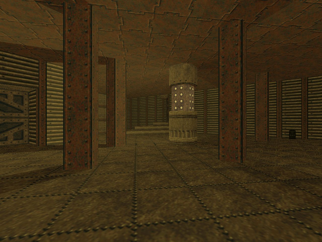
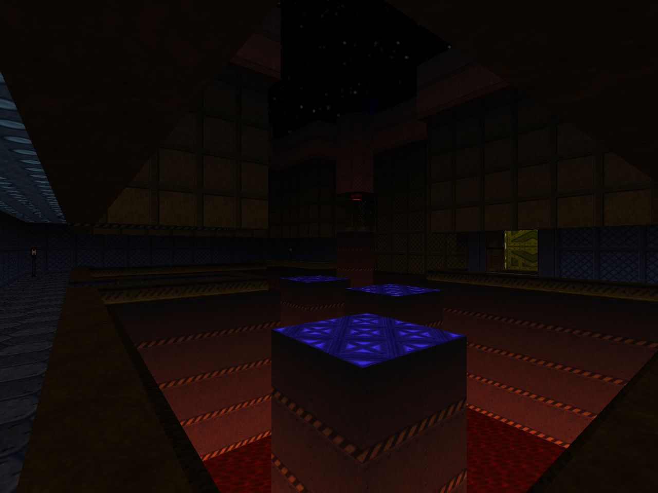
There are a bunch of other little features not native to Doom II. Security cameras, for one. The monitors are only used to supply hints for puzzles but are neat to have. You can see a conveyor belt clear as day in "Staging Area" and scrolling floors appear in a few other isolated scenarios; there seems to be a lot of untapped potential. One of the things that really blew my mind was the specter-pit room in "Alpha Quadrant" (MAP06). After parts of the bridge collapse it doesn't look like you can make it across by running. The three mechanical-looking platforms actually function as pistons, though, and give you the vertical push you need to clear the gaps. I have no idea what's going on under the hood but it's too amazing to be confined to a single level.
The homing rocket-shooting turrets and dart traps are at odds with the popular image of Doom as a run-and-gun playground but it makes more sense in the context of what the Midway team was influenced by. According to level designer Tim Heydelaar they were looking at the engine features that Raven Software brought to Heretic and, more importantly, Hexen. The latter showcased a lot of environmental hazards including wall-mounted turrets and perilous platforming. Their fascination also explains the strong devotion toward puzzle play. The Doom 64 team took a lot of cues from Beyond Heretic but implemented and expanded on them in their own particular way.
And yes - Midway takes the original game's dungeon-crawlerish tendencies toward new heights. Or depths, depending on how you feel about having to intuit the correct switch to pull. There's usually a clue, though. Setups include the Rubik's cube room in "Outpost Omega" (MAP29) where you can find the first Demon Key as well as the laser weapon; the randomized blue keycard roulette in "The Terraformer"; or, perhaps my favorite, the sequence required to unbar the exit door in "Unholy Temple" (MAP23). While some bits of Doom 64 evoke my memories of ETERNAL, the last one actually brings to my mind its more complex sequences, chiefly Sverre Kvernmo's "Dark Dome". Interesting side note - some of the key placement varies based on the difficulty level, placing them outside of puzzles.
Hexen is the most obvious mechanical influence but it's tough to tease out what other things that the authors may have drawn inspiration from, if any. By Tim's own admission the designers were huge Doom fans and consumers of community content. For his own part, he specifically mentioned Memento Mori and The Plutonia Experiment, and it's possible that the other team members were familiar with the same things by way of peers sharing their favorites. I can definitely see some parallels in the way the Casalis designed their levels but I would hesitate to say that Doom 64's maps were derived from Milo and Dario's work.
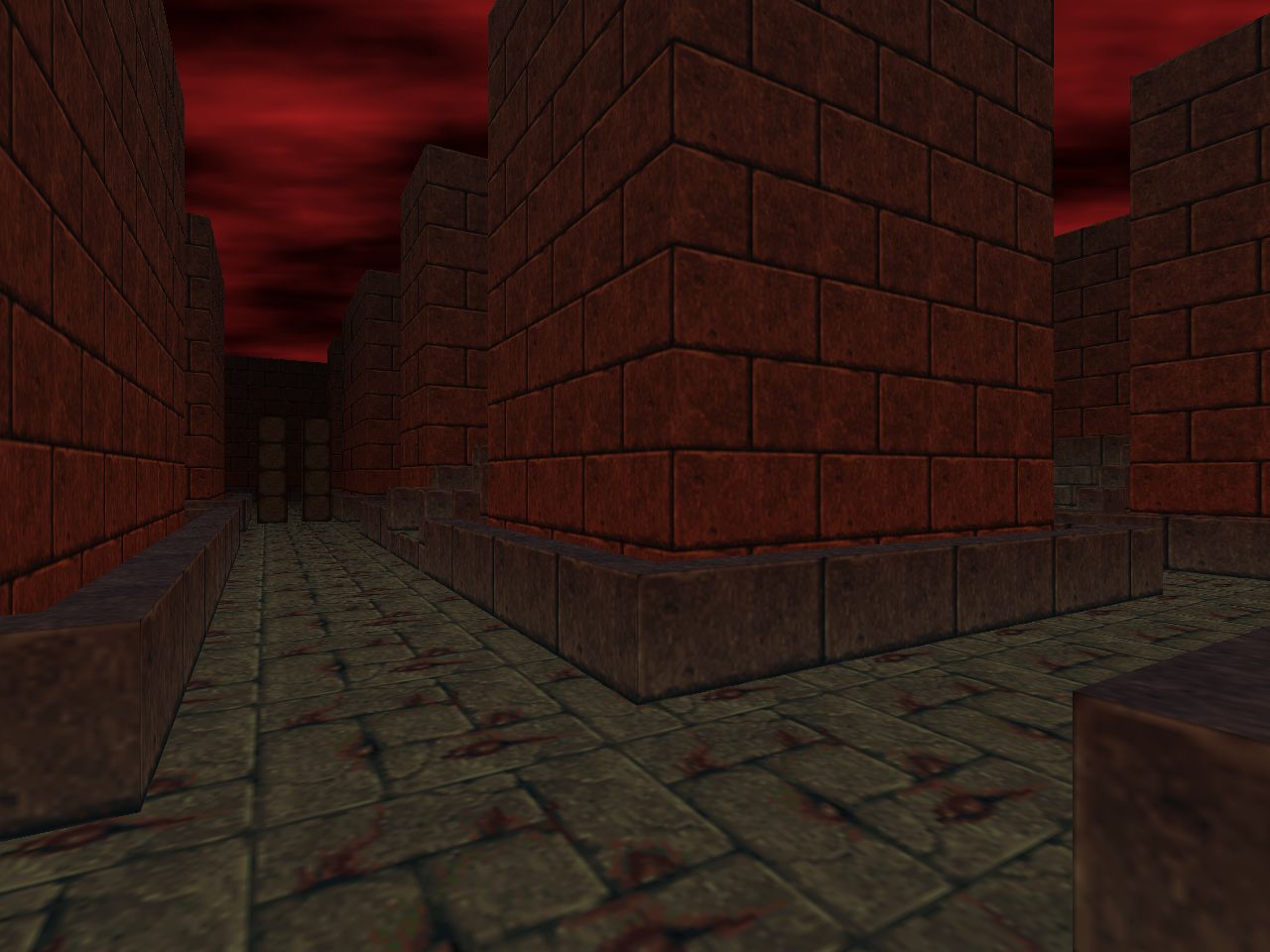
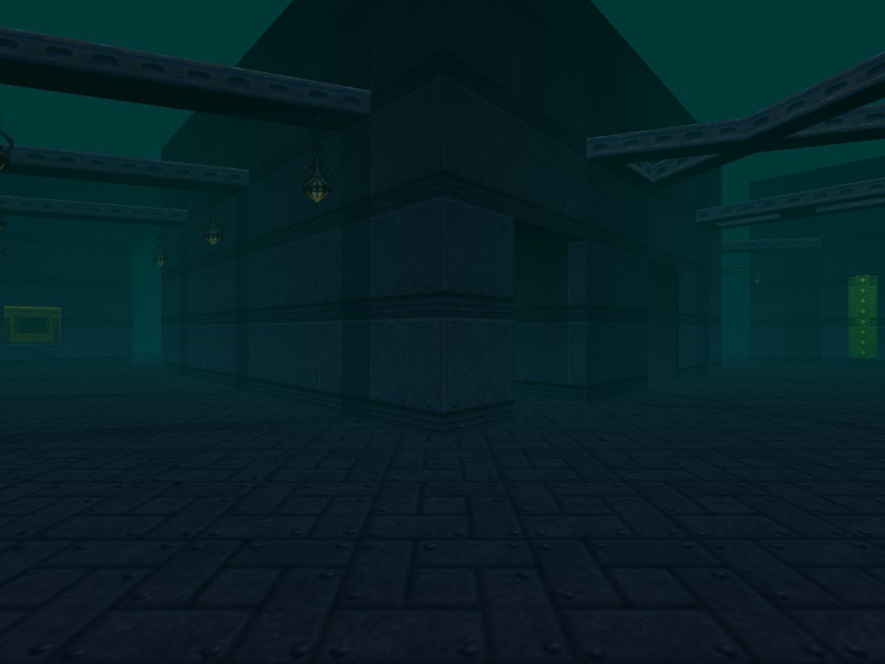
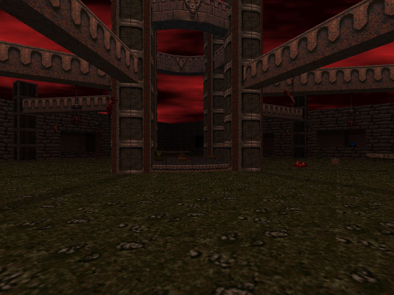
The easiest comparison to draw may be the most superficial. "Cat and Mouse" (MAP25) is a bonus level that consists of a deadly maze where you're stalked by a Cyberdemon. It bears some resemblance to the terror invoked in Plutonia's "Hunted", which features arch-viles in a mess of corridors sectioned off by walkover-triggered doors. The latter is more terror over the former's creeping dread, though, since you can hear the many archies and they move much faster than Doom 64's lumbering Cybie. Randy gets his mileage through a combination of angles. The rocket launcher draws out the length of the encounter, for one, and you don't have masses of missiles to make missed shots meaningless. The foggy haze also helps and monster-specific walkover lines teleport the Cyb to distant locations to aid in the uncertainty.
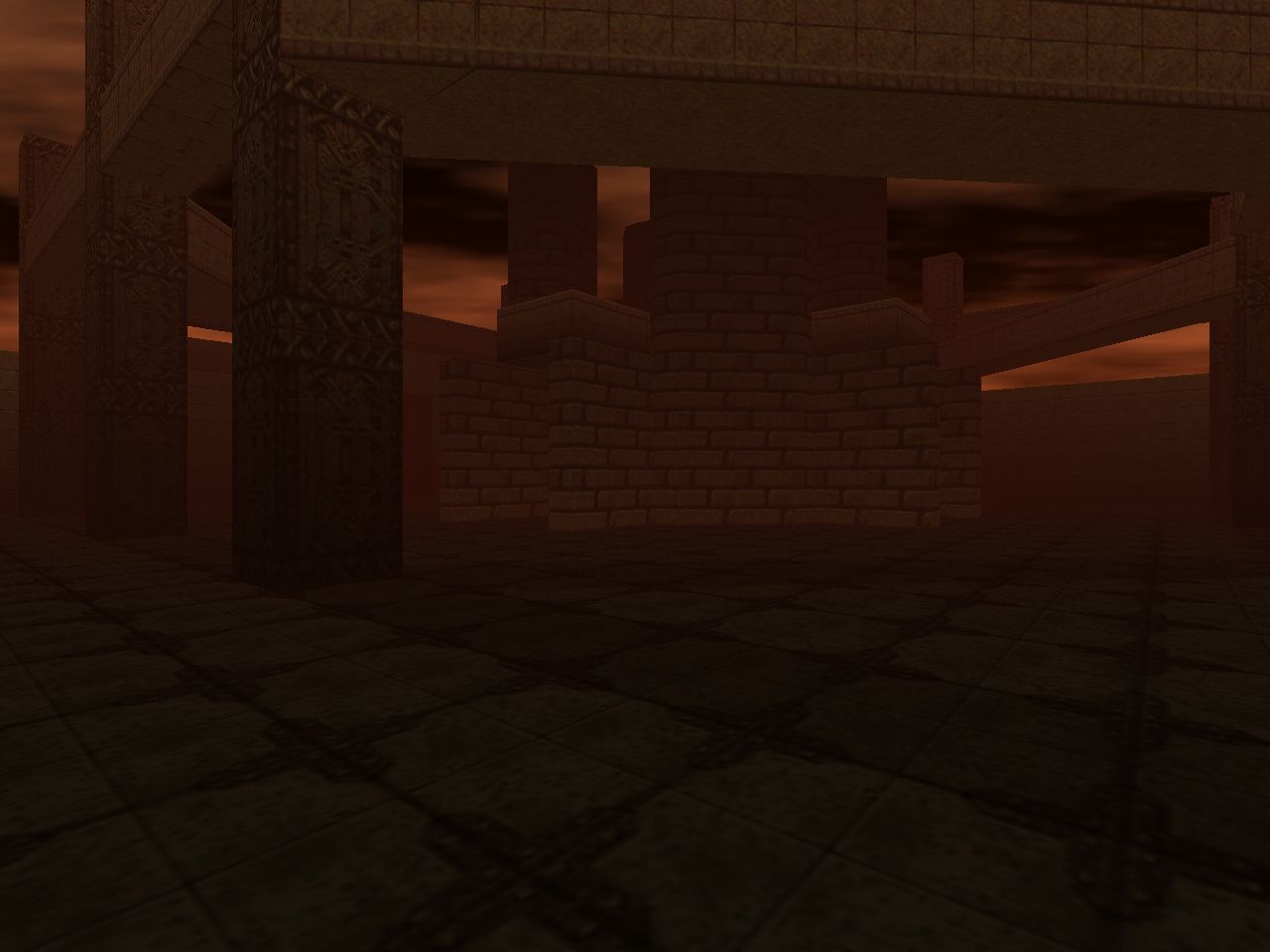
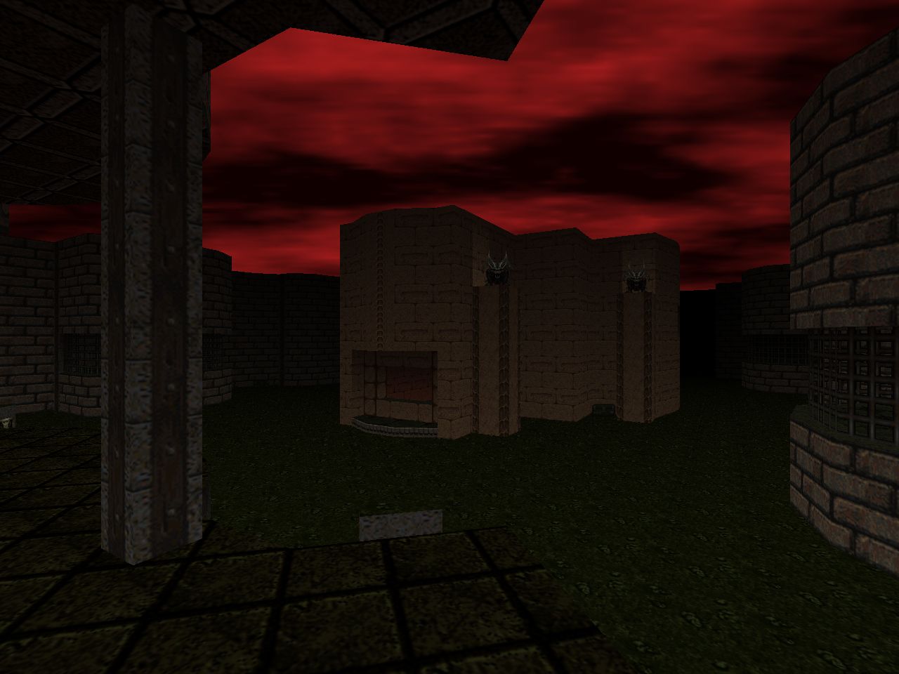
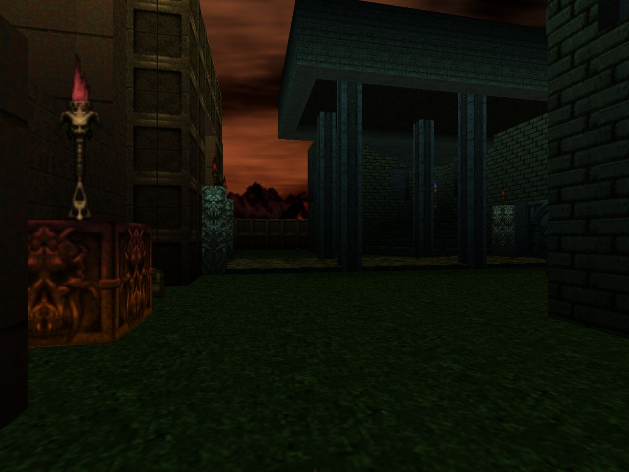
Some bits like the open crossfire yard of "Dark Entries" (MAP15) and the arachnotron clearing of "Burnt Offerings" feel the closest to the Casalis' work. This is partly due to the incongruous green grass in Hell and beige stone textures lining up with Plutonia's quasi-Mesoamerican theme. I wonder how much of this was due to the many-faces-of-Hell concept that was abandoned early in development. The open arena design of "No Escape" (MAP24) brings to mind "Cyberden" or even Memento Mori's "Showdown", especially when considering the eight-pronged central structure.
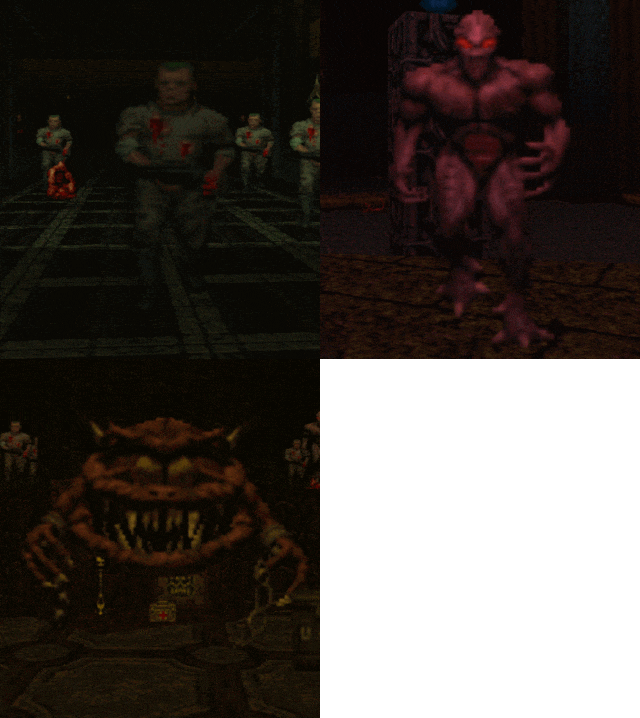
Doom 64 overall is still a very different experience from Plutonia in just about every conceivable category. Its pacing is slower overall and many of its encounters are weighted toward monotypical groups of monsters that simplify the prioritization of threats. I don't know if the authors would have done anything different had they access to the chaingunner, revenant, arch-vile, or even the Spider Mastermind. It would have changed up some of the filler material, which tends toward hallways sporting either zombies or imps with the occasional Hell noble. Knee Deep in the Dead had plenty of scenarios where you were forced to juggle mixed groups of monsters as they roamed around the corridors of the Phobos base.
I dunno how difficult it is to play Doom 64 with the Nintendo 64's controller and I wonder how much of the encounter design was based around any of its limitations. When it comes to larger encounters I feel that the team was fonder of attempting to overwhelm the player with brute force as evidenced through demon hordes and flaming skull swarms. This outweighs the chaos of open-layout brawls like "Even Simpler" (MAP09) and "The Spiral" (MAP19). These free space shootouts still exist, though, which implies the expectation of some level of mobility. I think that the neo-lost souls are harder to outmaneuver than any single revenant rocket. They aren't destroyed when they collide with a wall or actor so they can path to seek the player and then repeatedly bite the ever-loving shit out of him or her.
As I look back on these levels I find it difficult to make a generalization without some heavy caveats. If I were to summarize Danny's style then it would be economy of design as far as his marriage of map flow to each level's layout. His works are generally simple hub and spokes that reuse main spaces for multiple encounters through judicious monster spawn scripting. Say what you will about backtracking; he manages to keep it fairly interesting. When his maps aren't simple then they're closer to Tim's in being challenging to explore either due to the number of overlapping paths or in the case of "Eye of the Storm" (MAP14) allowing you to approach your goal from two parallel albeit identical paths.
Separating Randy and Tim feels more difficult. Each author has a challenging puzzle lying in wait for you, e.g. Danny's dense demon key warehouse in "Outpost Omega" or Tim's sequence-locked switches in "Unholy Temple". Estrella is the primary purveyor, though. Some of his stuff utilizes Doom 64's unique features for moments like "Terraformer"'s blue shift but "Final Outpost" (MAP08) is his real showcase. He also seems to be the guy most prone to punish you with a trap built from sector machinery, mostly crushers but in one instance a dropaway floor in an exit room. I also think that he's the one to go to for "hot starts" and open-air crossfires. Part of this is because he's responsible for "Even Simpler" (MAP09) but he carries the same energy into "Dark Entries", "Burnt Offerings", and "No Escape".
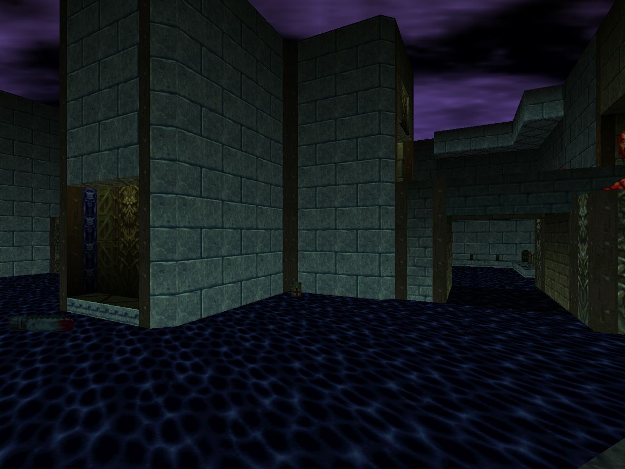
Where Tim stands out is his sheer consistency. Apart from "The Spiral" (MAP19) and to a lesser extent "Into the Void" (MAP31), his portfolio features well-developed levels built out of complex layouts that you slowly open up. They're also structured around a central hub-type location. There are a few major subversions, of course. The entirety of "Spiral" IS the hub and "Void" is complicated mainly by the use of teleporters. "Pitfalls" is the big change-up, though. It starts out looking like a bog-standard starting room and then quickly swerves away and toward an epic adventure as you dig deeper into Hell's underbelly.
Each of the authors had a hand in the super-secret map, "Hectic" (MAP32). Accessed via an arcane ritual, the original intent was to award the player with a "Features" in-game menu option that allowed access to built-in cheats like God mode. The selection must still be unlocked in Doom64 EX but remains open afterward through your config settings. It's a tiny death trap hub. Randy's segment reflects his sensibilities by thrusting you into a shocking arachnotron firefight and following it up with a fuck-you quick crusher. Danny's challenge leverages his fondness for scripted transformations by dangerously altering the chamber after your initial impression. Tim's feels the most divorced from his style at first glance but the grid of slow cycling-lifts is a classic Doom staple (see E2M3 / "Refinery"). Combining it with the network of dart traps results in a highly concentrated deconstruction of his cerebral level design. If you take your time and build an accurate mental map of all the moving parts then you can make it through without suffering a single strike.
Three of Doom 64's levels are normally accessible through the Features menu. They are not built like the rest of the entries and better resemble the setpiece encounters typically seen in larger levels. Randy's "Cat and Mouse" (MAP25) combines his tendency toward including miniature labyrinths in his levels with a start that faces you against a Cyberdemon... and then forces you to locate your gun and its ammo in the maze. "Hardcore" (MAP26), by Danny, best reflects his more complex level design by combining overlapping pathways into two circuitous loops. Tim's "Playground" (MAP27) appears to be incongruous when compared to his relatively large maps but its deathly haze meshes with the otherworldly atmosphere of "In the Void". He wasn't any stranger to knockabout fights, either, looking at the chaos of "The Spiral" or the ancillary areas of "Dark Citadel" (MAP13) and "Unholy Temple". The big surprise is his use of scene-changing scripting. Not to forget the shifting earth of "Pitfalls", of course.
A thorough look at this masterpiece would not be complete without considering Aubrey Hodges's background music score. It is a collection of desolate, ambient soundscapes and puts the final nail in the coffin - so to speak - that is Doom 64's haunted and horrific atmosphere. I've enjoyed virtually all of the inclusions found in PWADs but they rarely if ever compare to the sheer menace and loneliness imparted by Aubrey's soundtrack. It's one thing when you're actually in the grip of combat but the spaces in between have been some of the most unsettling that I've ever experienced in the idtech continuum. I'm genuinely interested in seeing how the Playstation version - and perhaps even the PSX TNT Evilution / The Plutonia Experiment / Master Levels conglomerate - feel after having played the 64 iteration.
The Midway team really put its heart into Doom 64 and I was drawn inexorably in to its unique aesthetic. I find myself wanting to see what the user community has done with the release of Kaiser's EX. Maybe someday an intrepid coder will see fit to develop an equivalent work for the Playstation for a similarly authentic experience. If you really enjoy a horror atmosphere in your Doom gameplay but haven't yet played the 64 branch then you should at least give it a try. It may be just the thing that you've been waiting for.
NOTE: You will need the actual game data from the Doom 64 cart in order to use Doom64 EX. It is not provided by its author in any way, shape, or form. You can get the Doom64 EX source port here.
EDIT: We sort of knew that this was coming, but Doom 64 was officially re-released on 03/20/20. You can purchase it for $5 on the non-GOG platform, console or otherwise, of your choice.


DOOM 64
by Midway Games incl. Randy Estrella,
Danny Lewis, and Tim Heydelaar
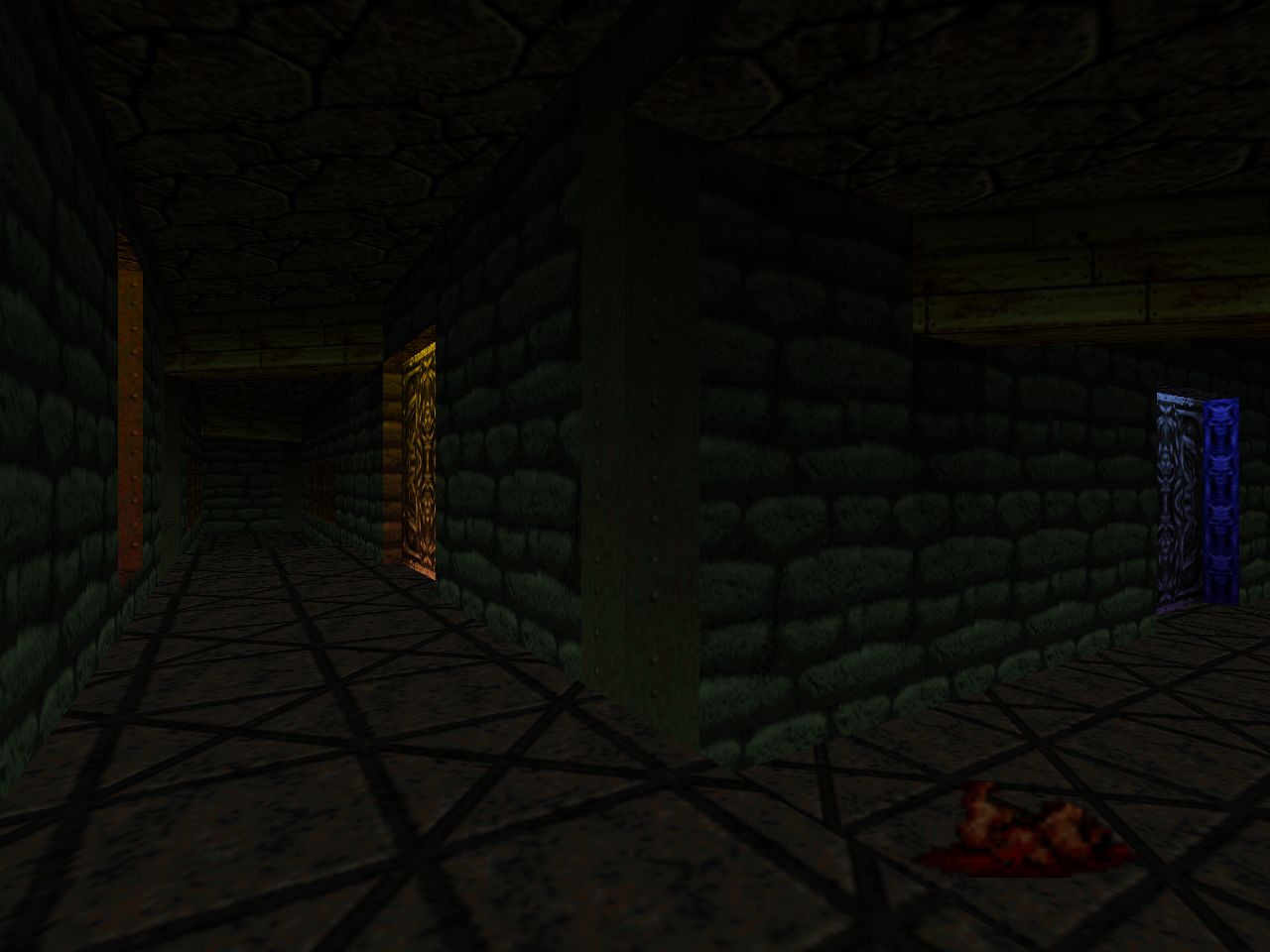
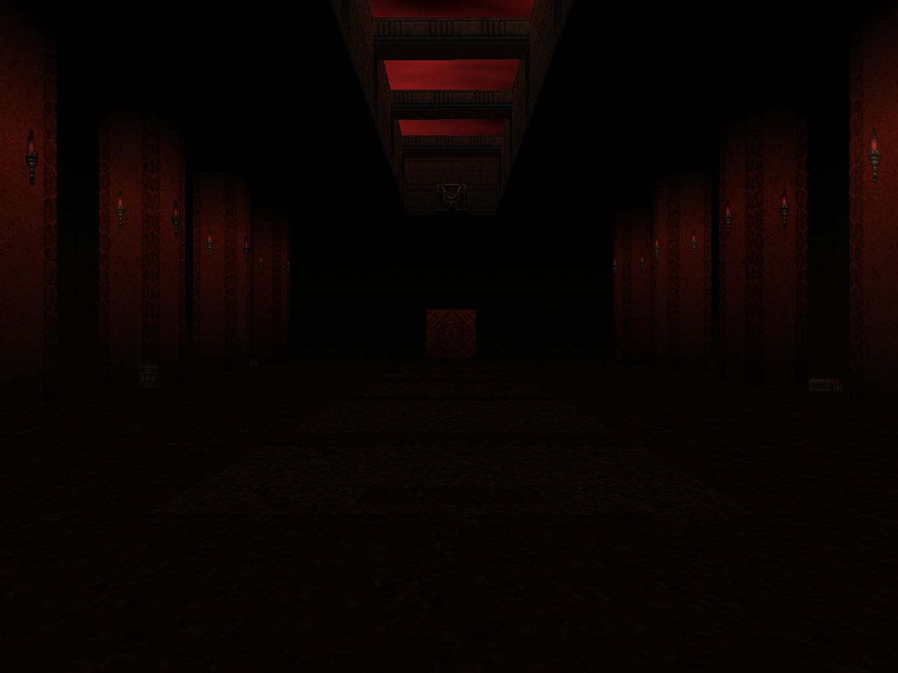
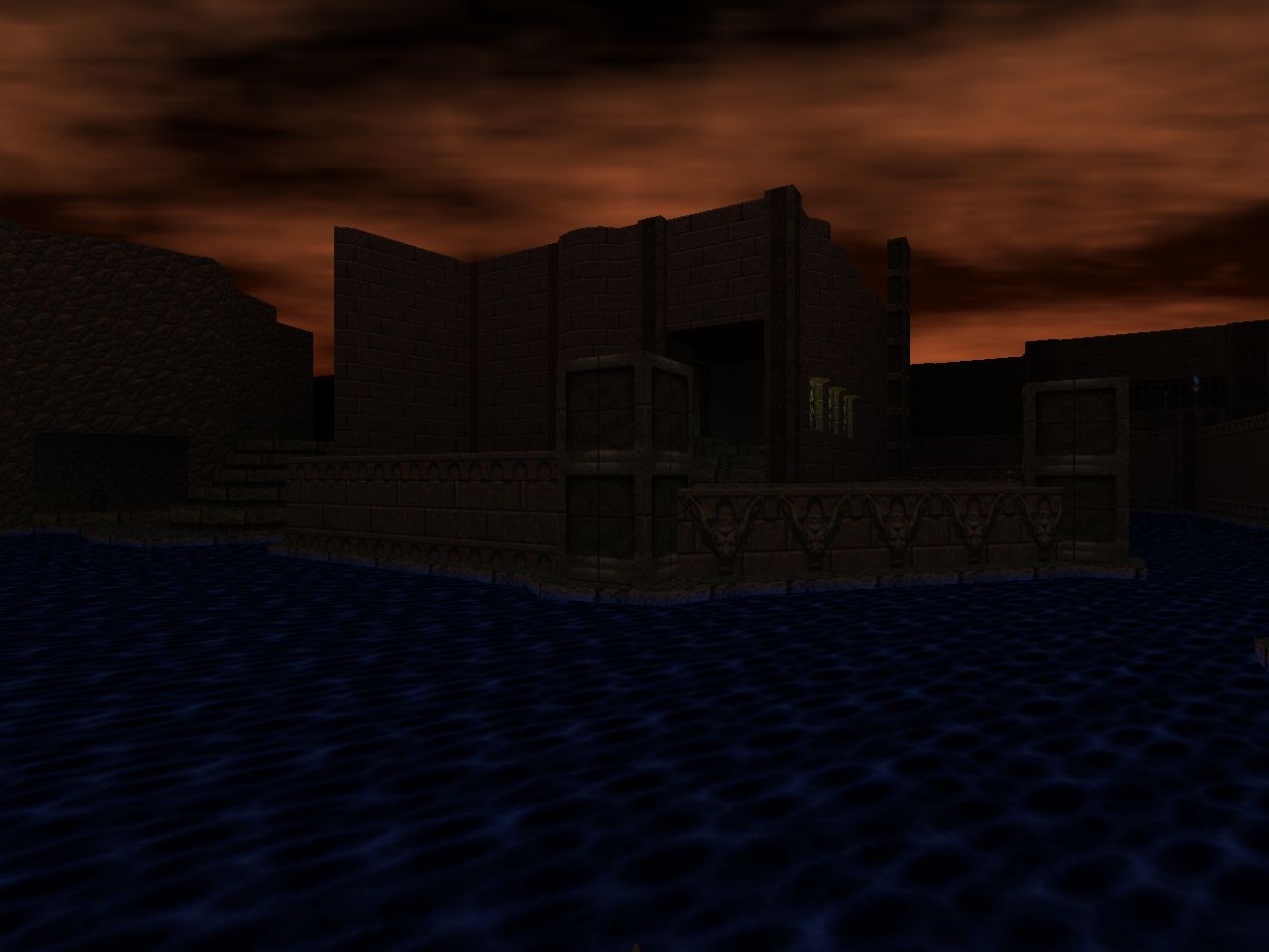
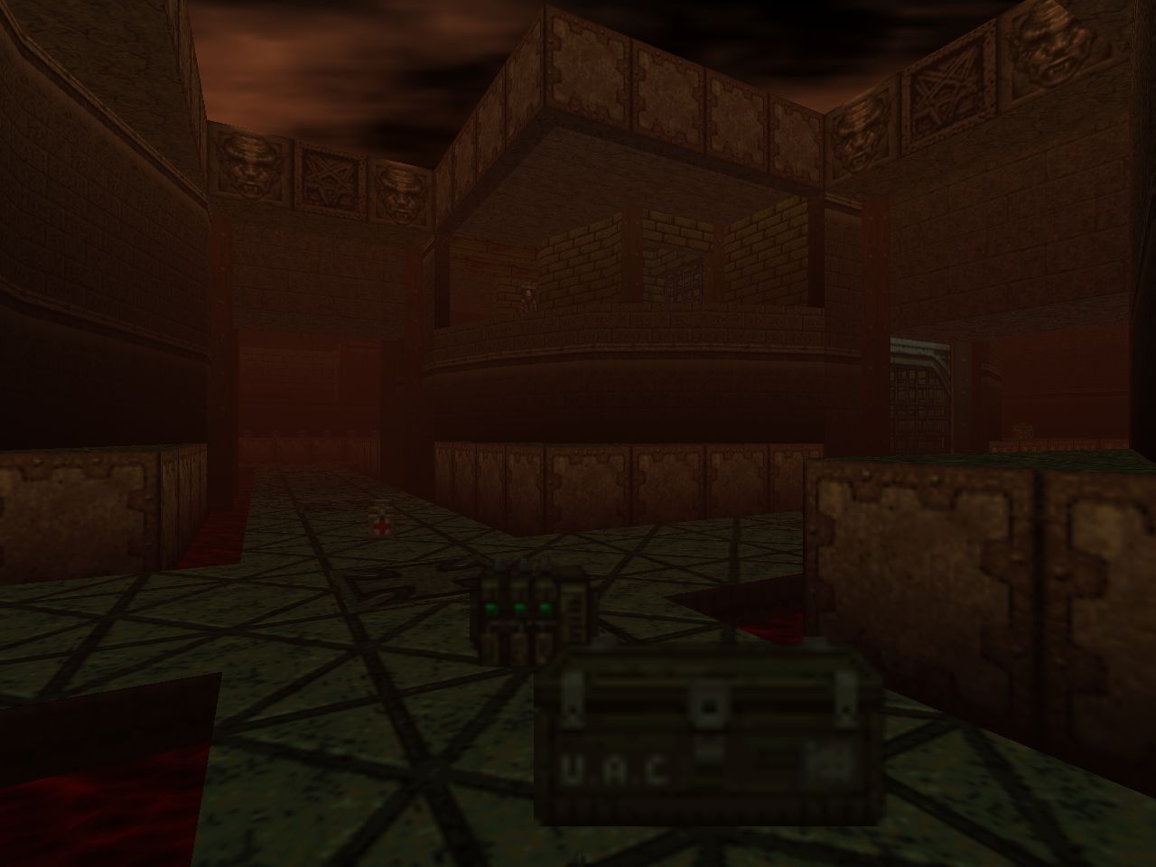
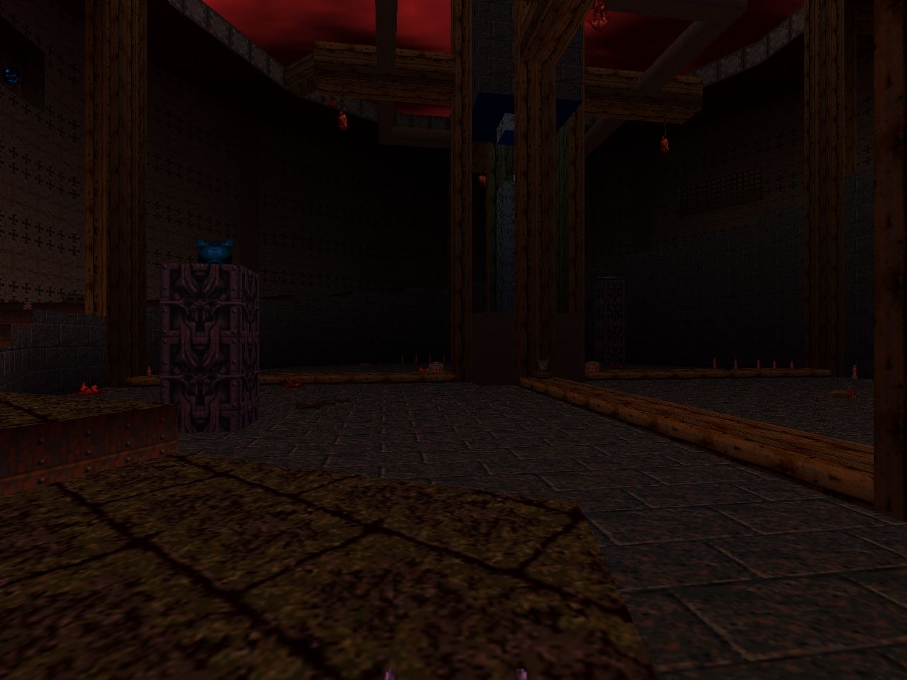
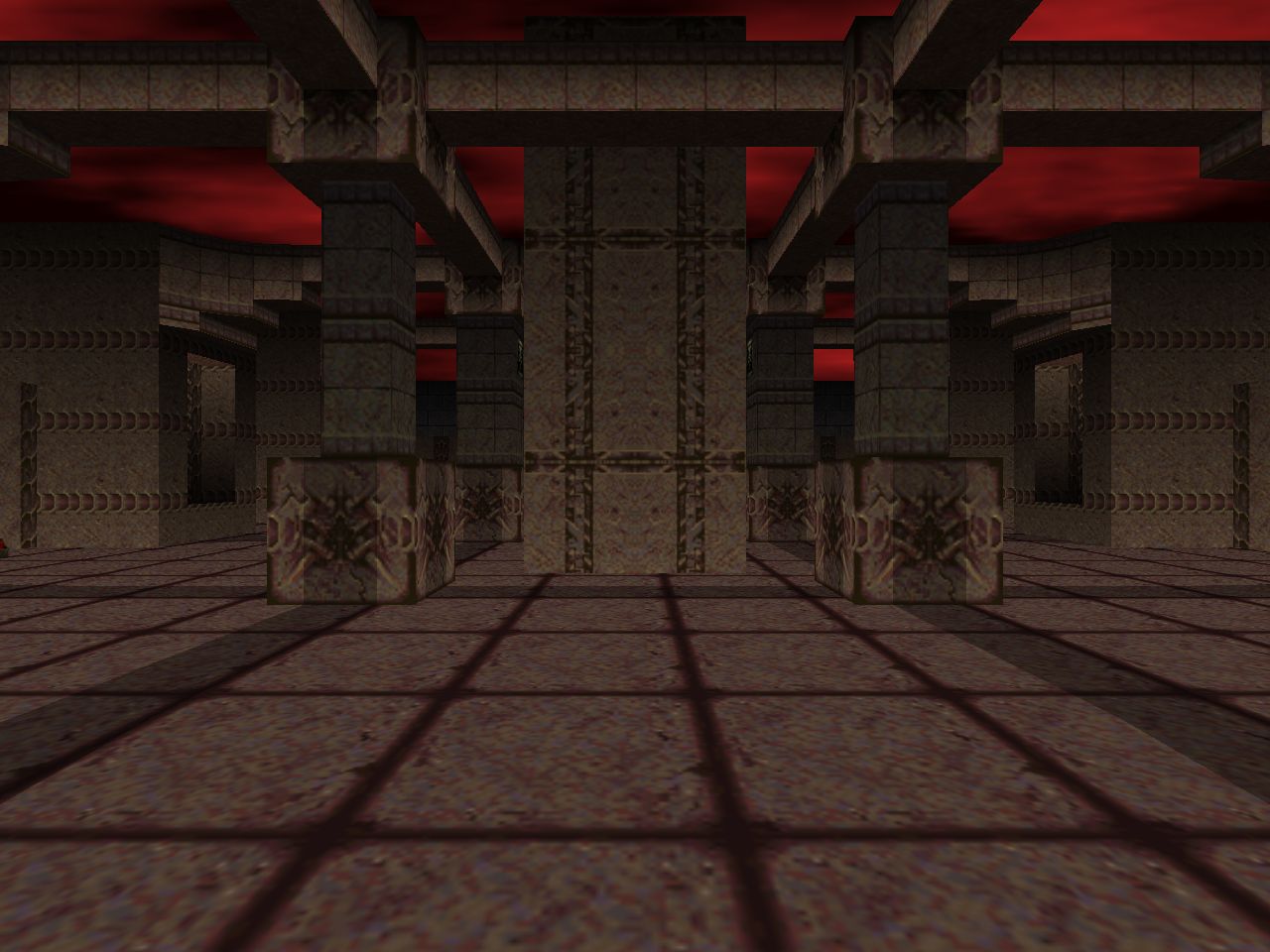
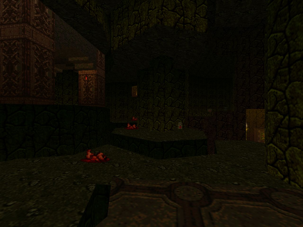
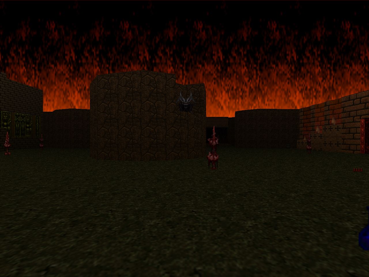
| Spawned Fear | MAP18 |
|---|---|
| by Randy Estrella | |
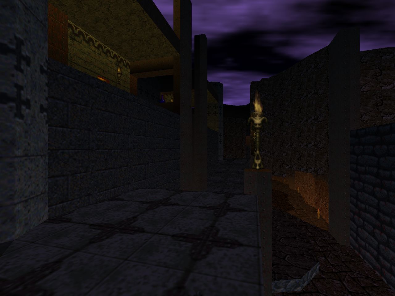
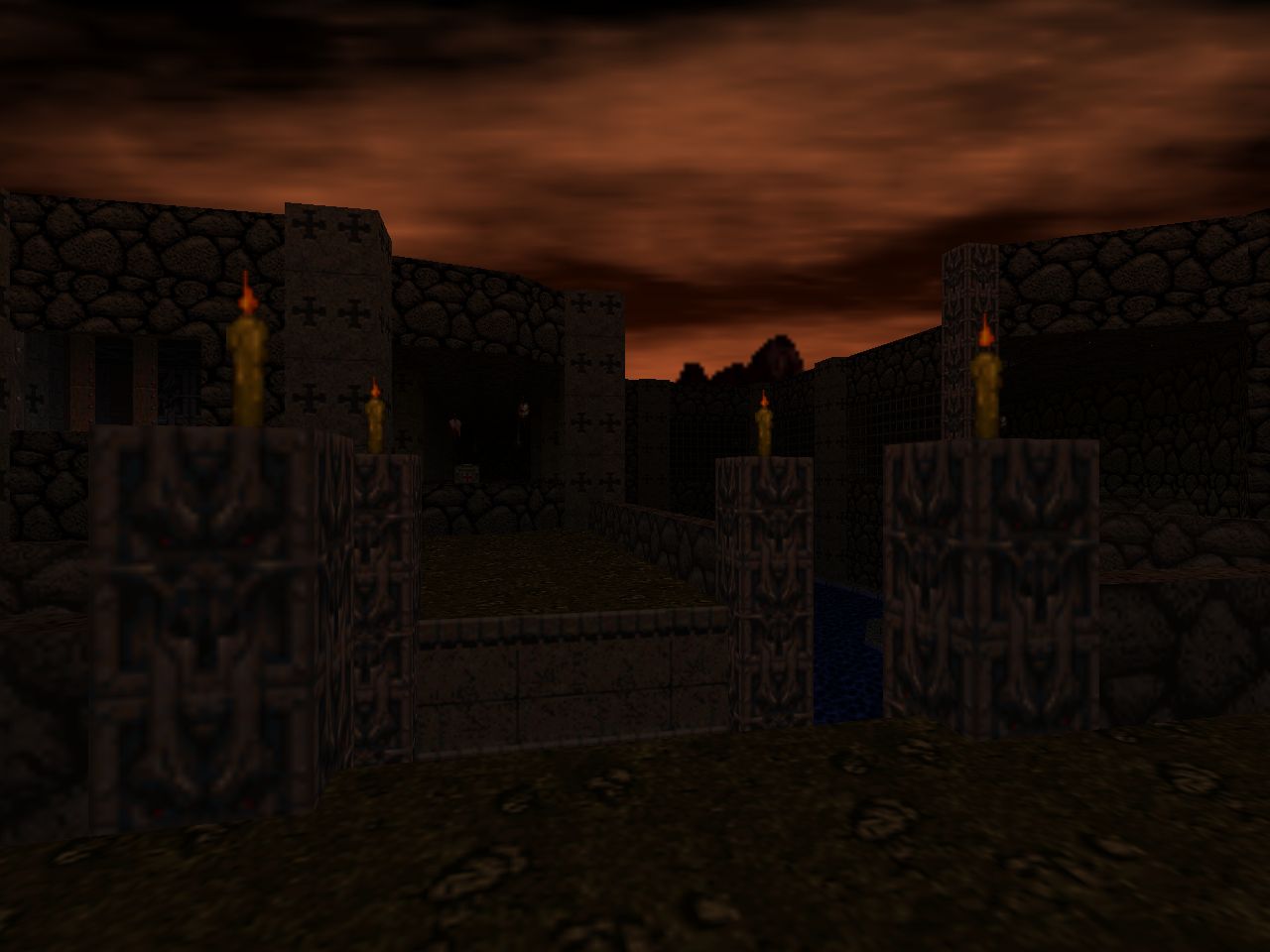
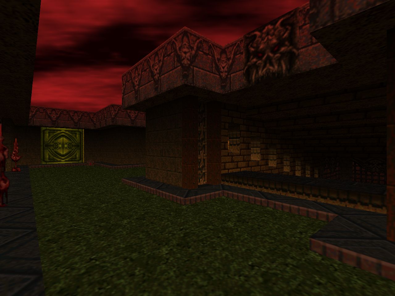
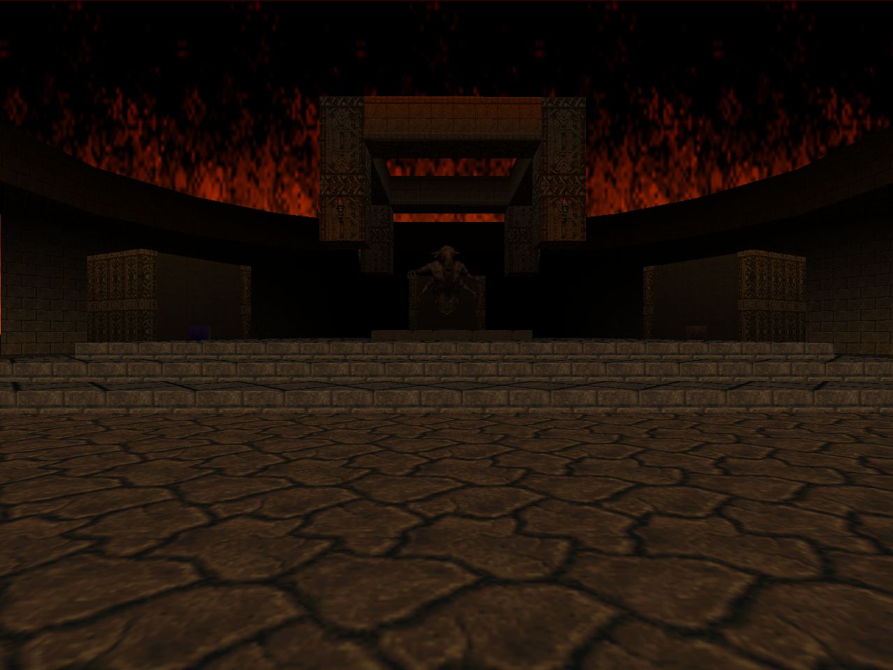
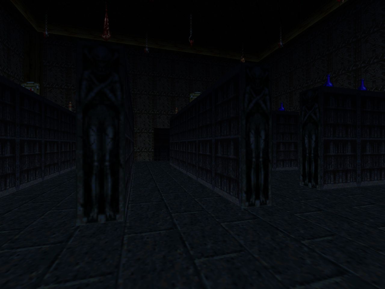
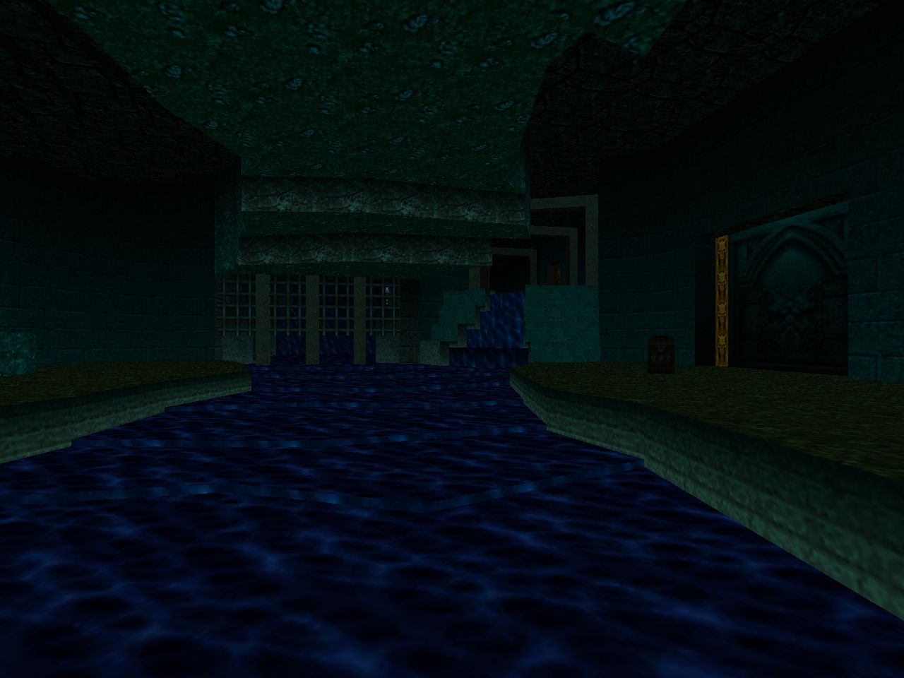
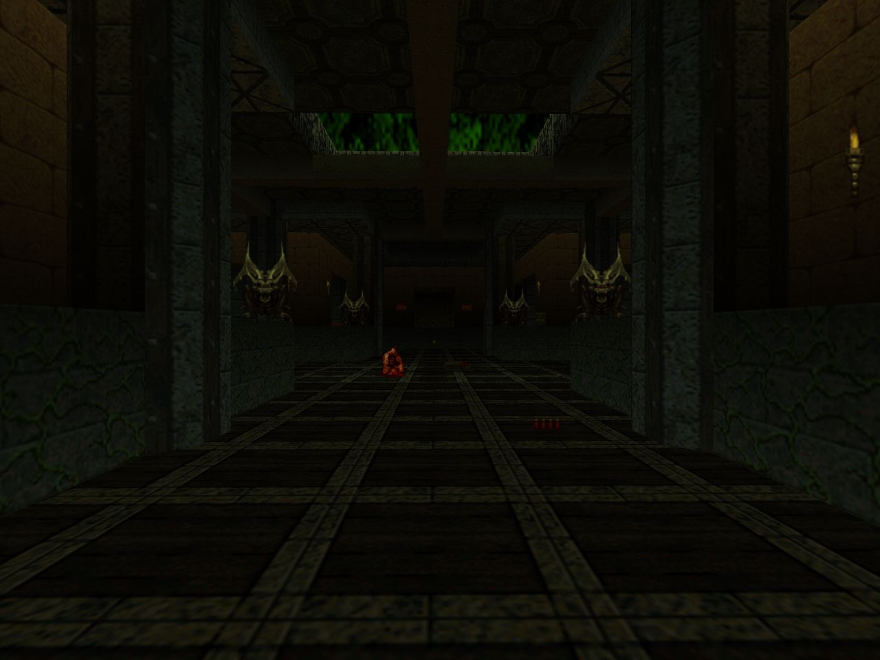
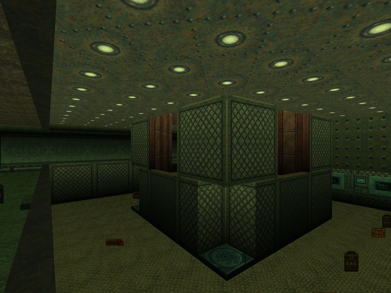
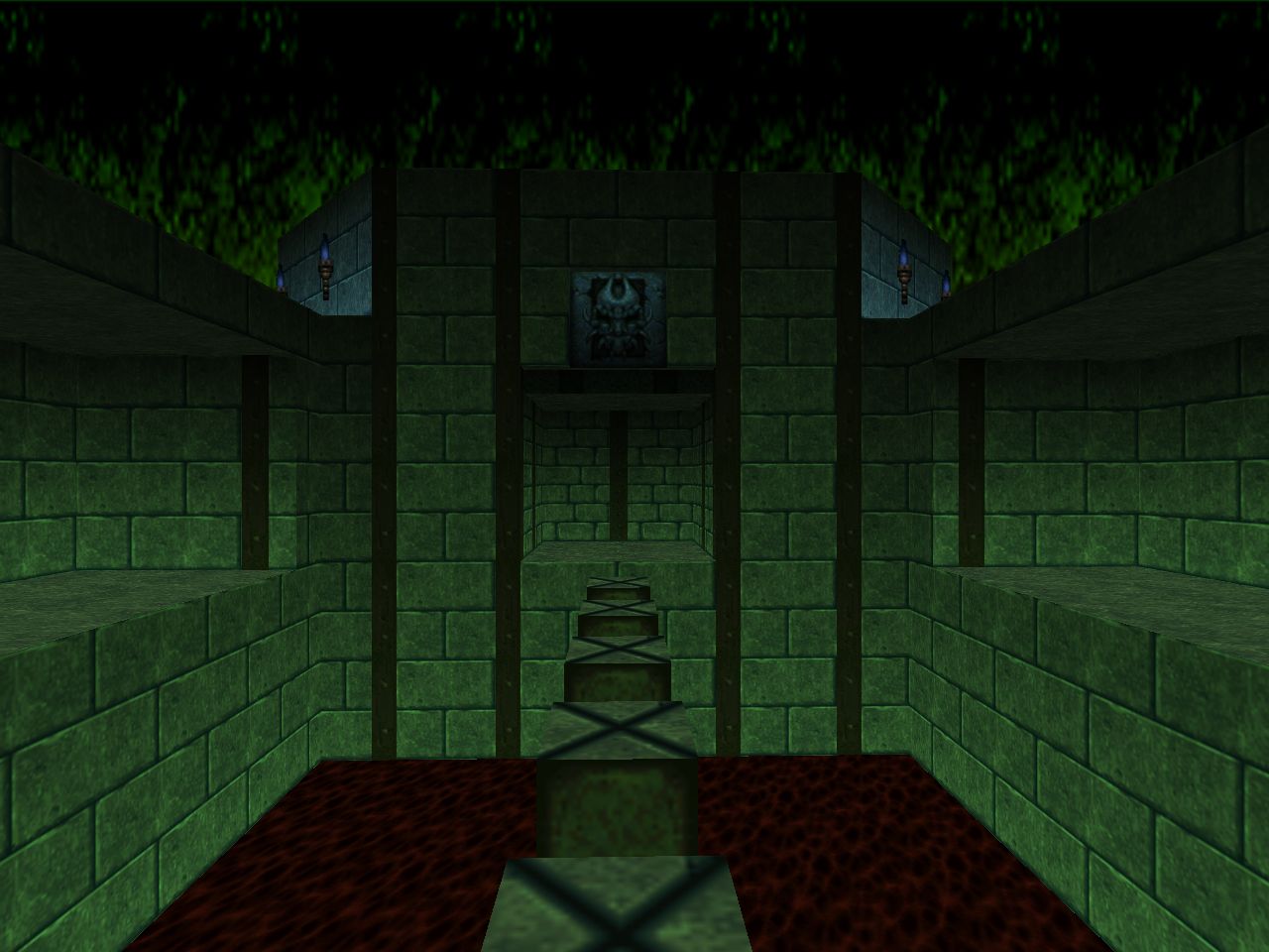
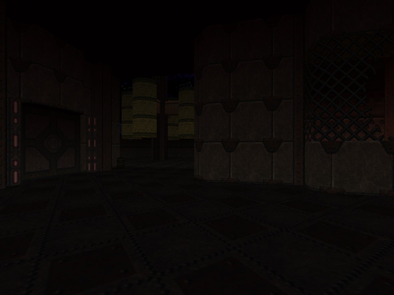
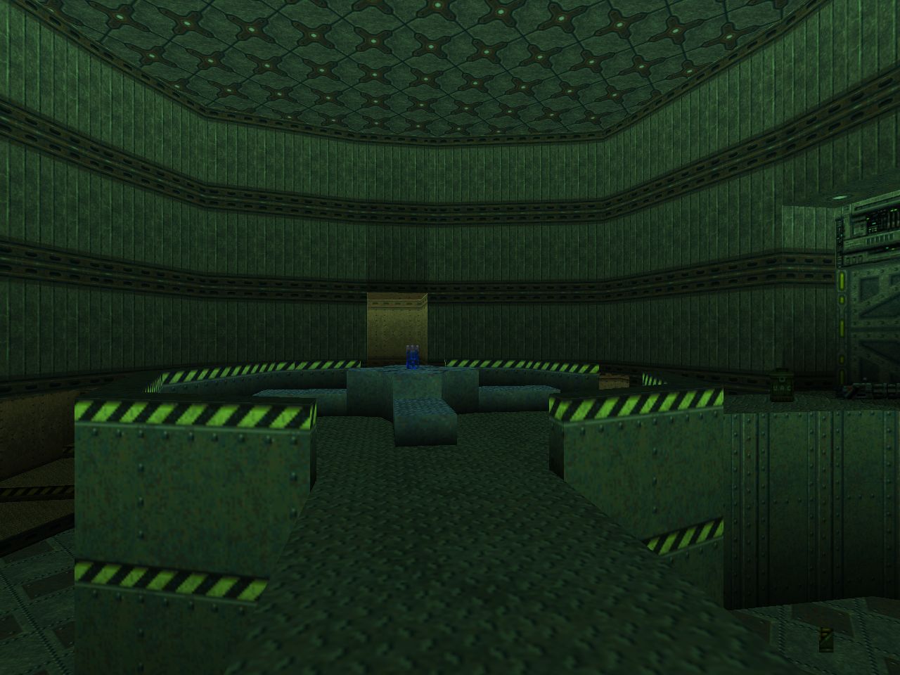
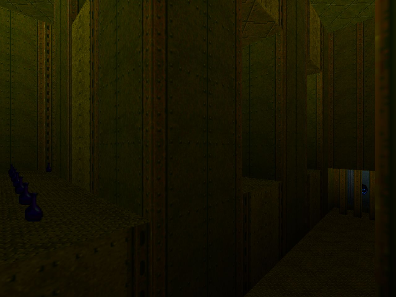
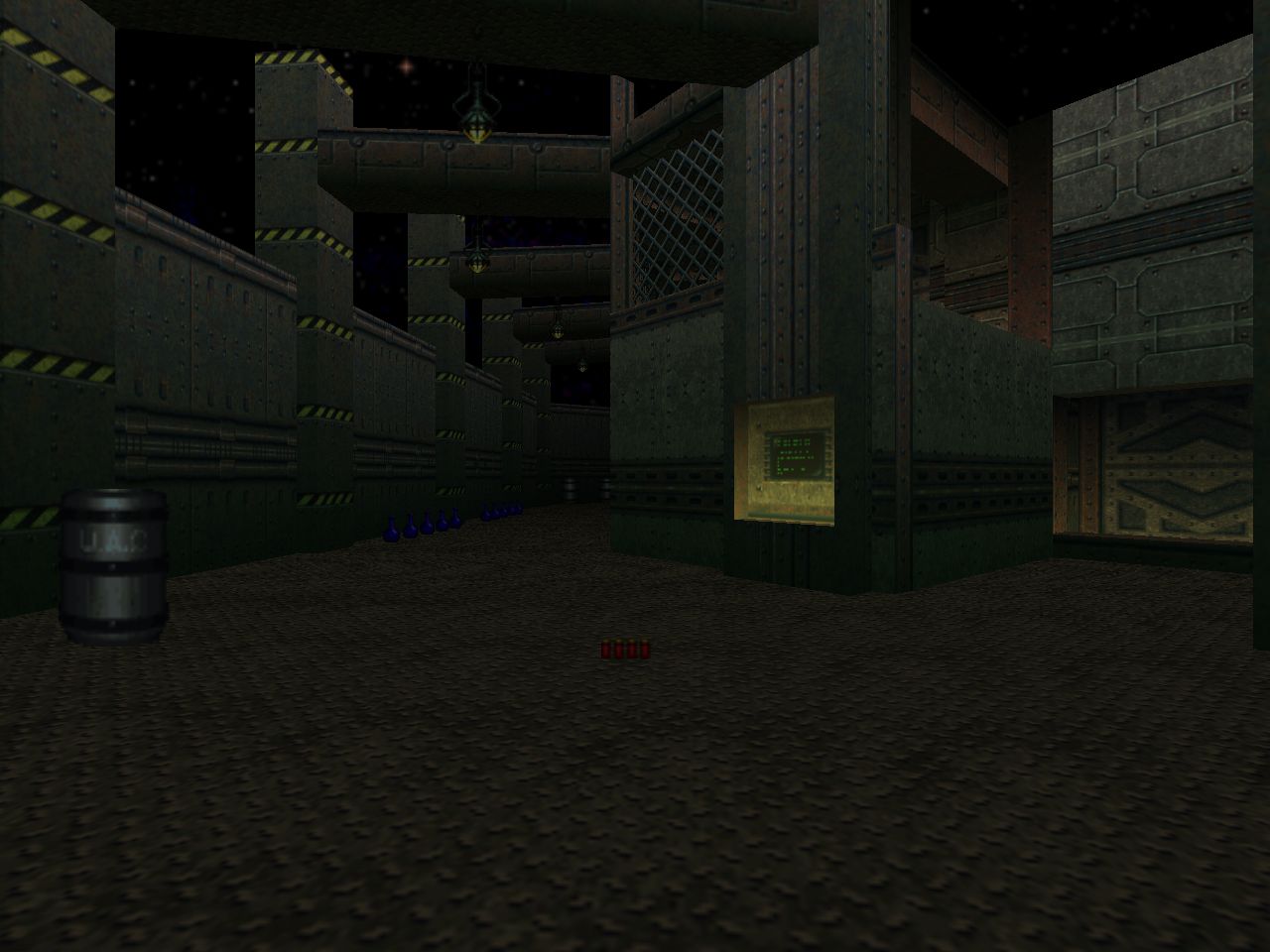
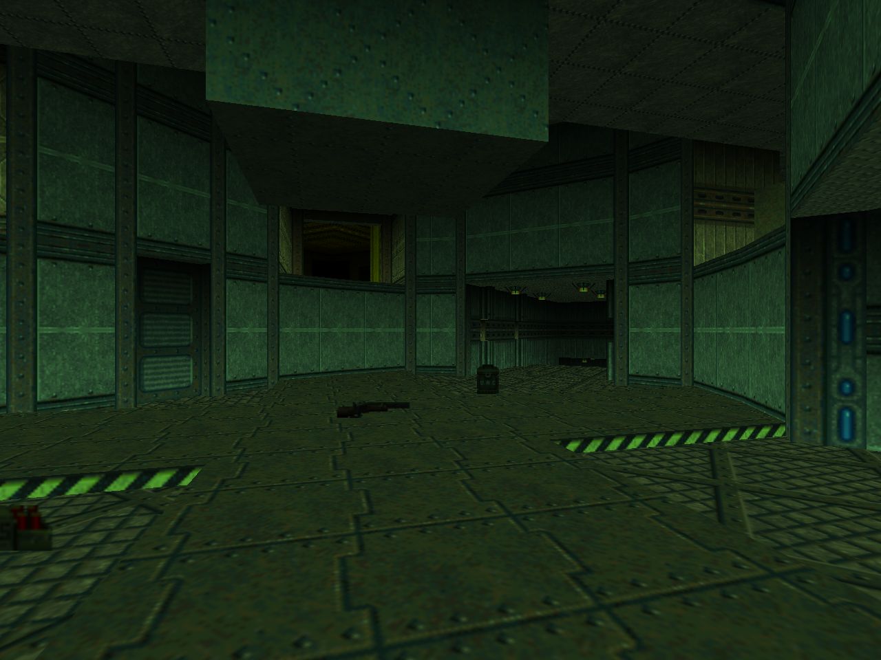
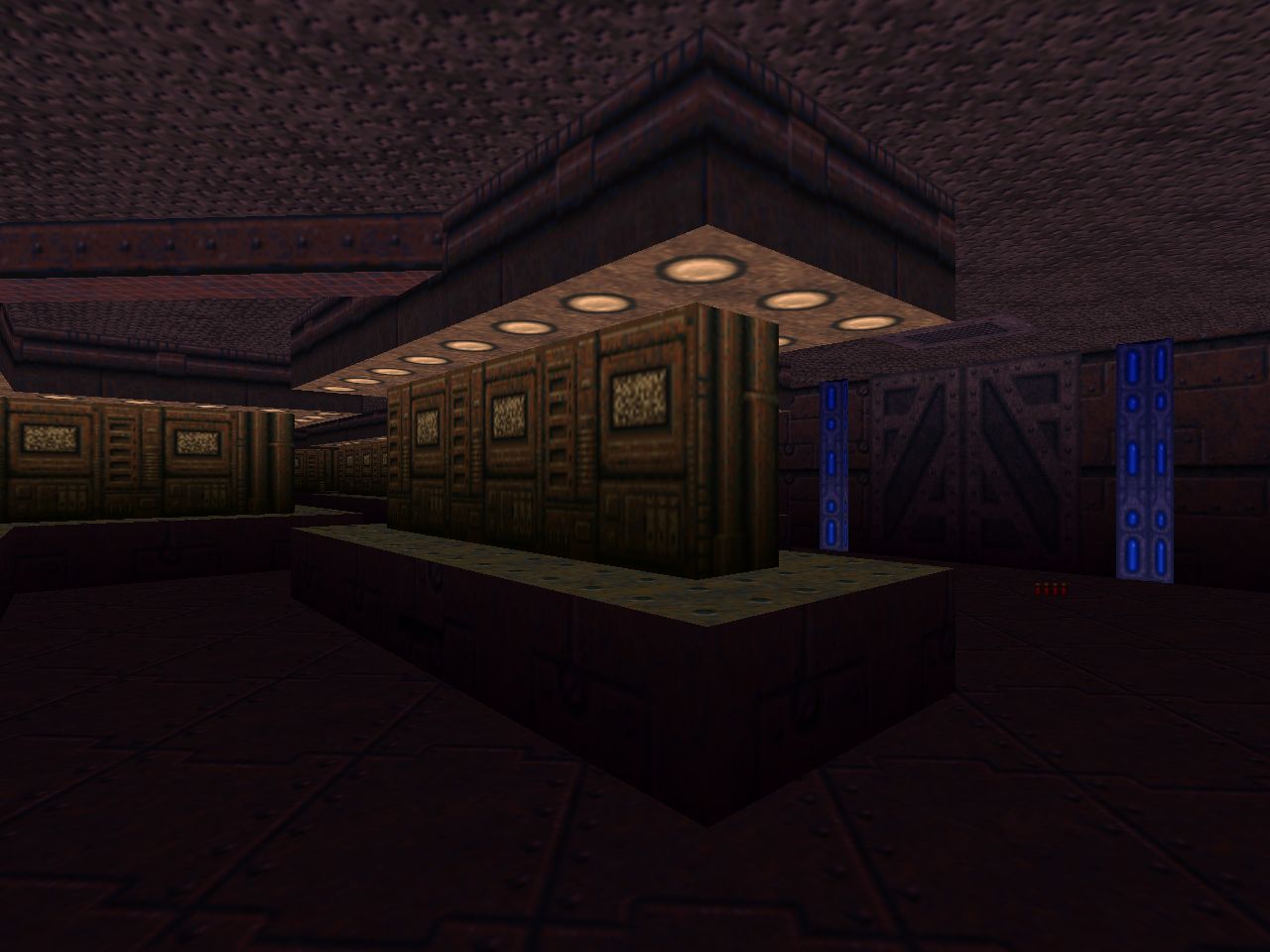
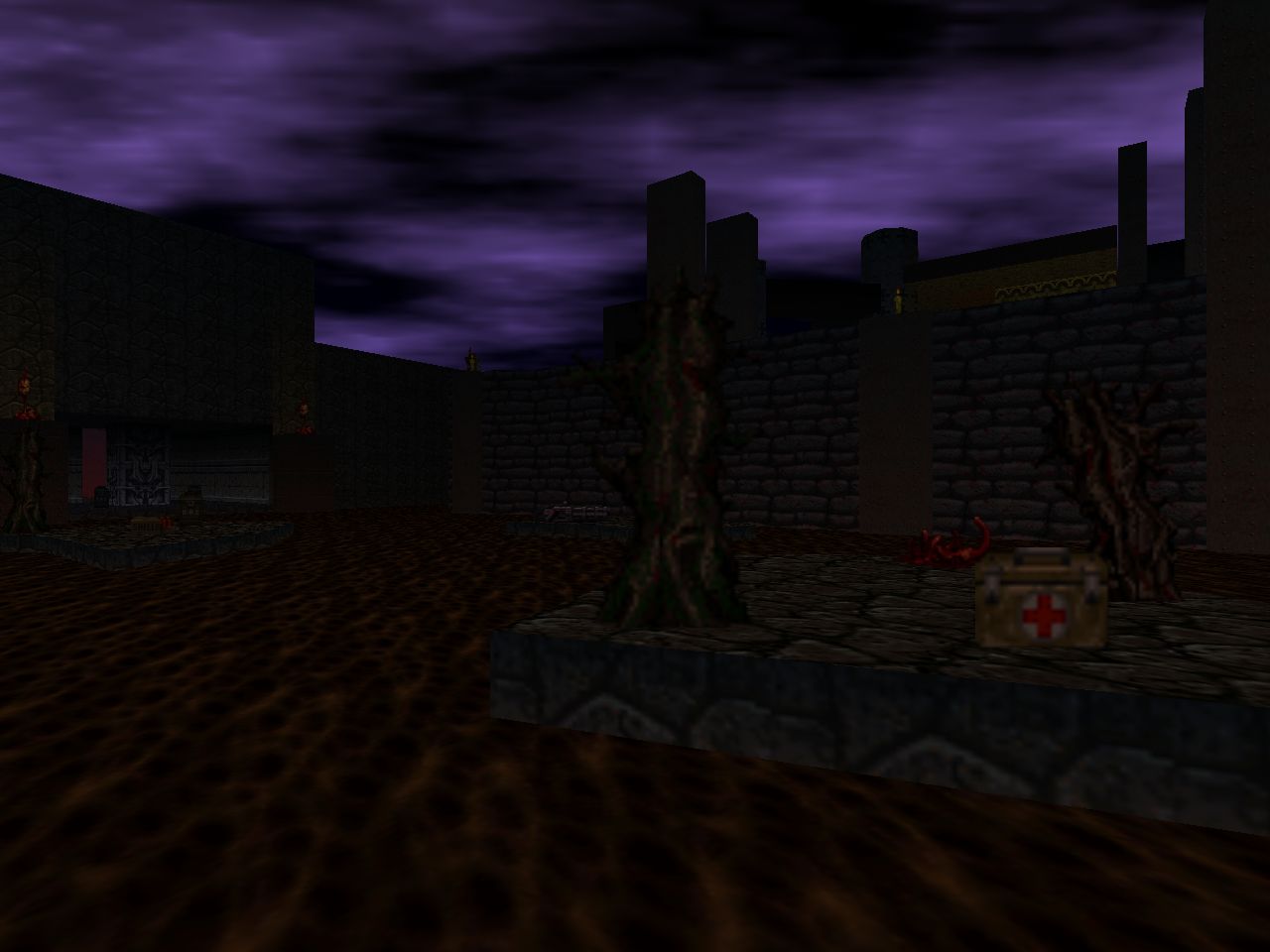
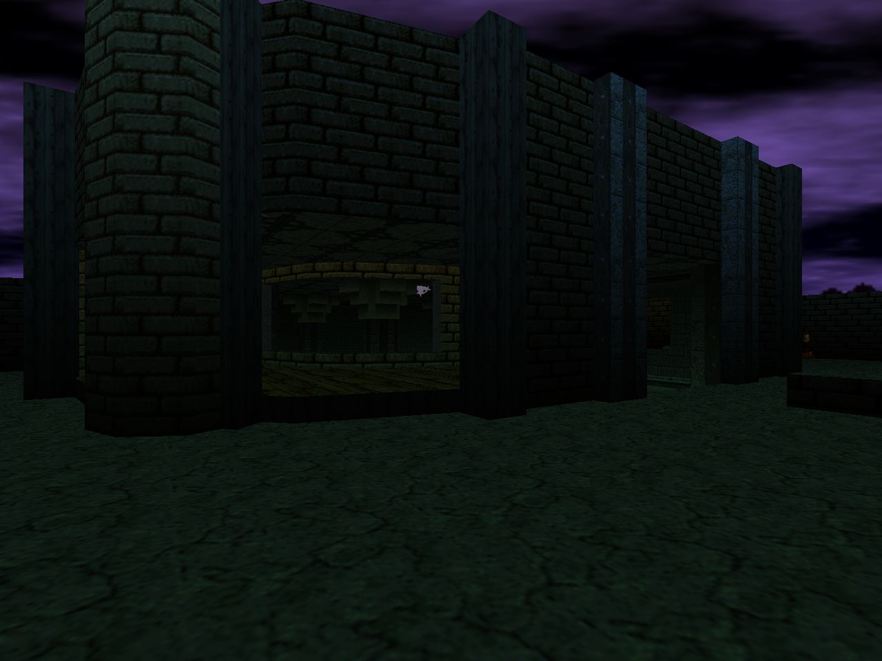
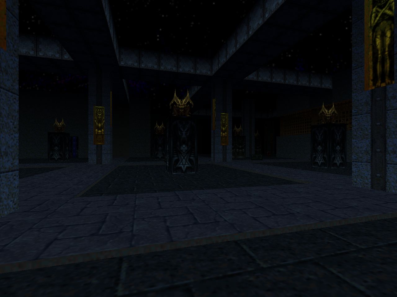
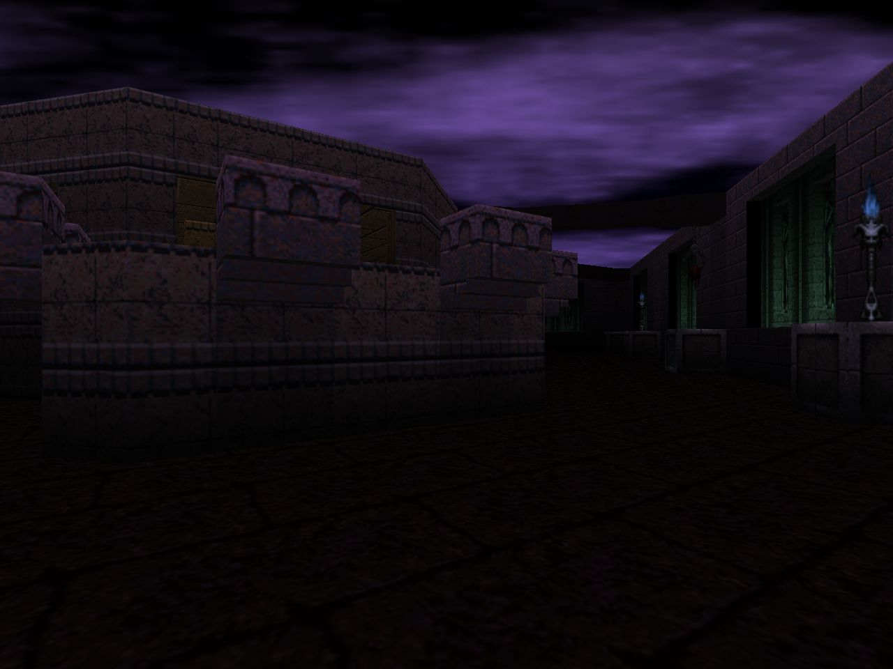
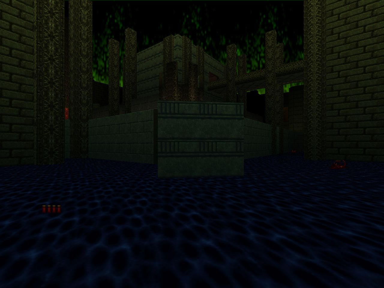
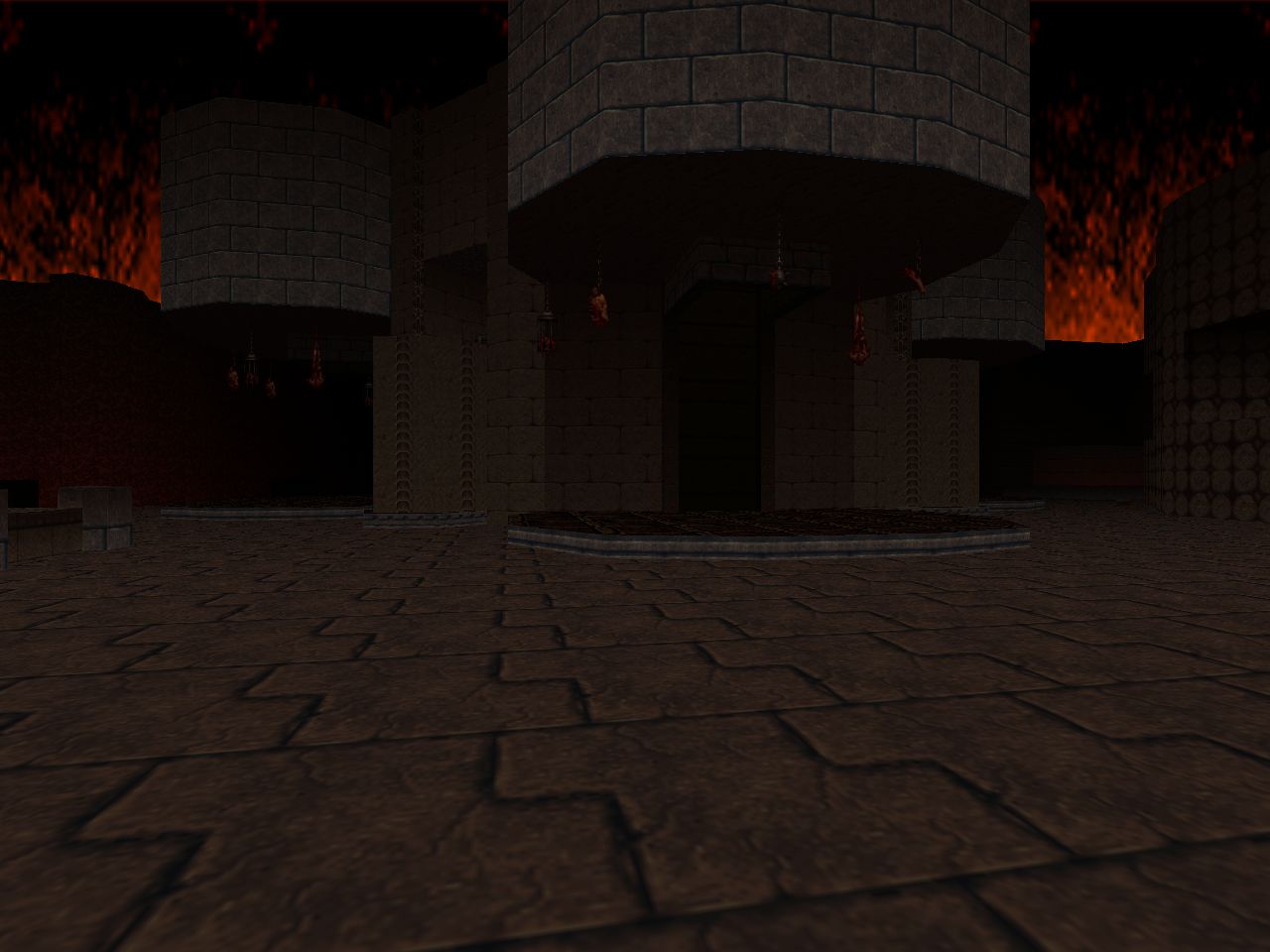
| A delightfully classic-style map that has you zipping back and forth through a common network of corridors. The outer area where you start reminds me of those clean green-carpeted techbase levels like, I dunno, Kurt Kesler's KBOOM_8. The library theme makes another welcome appearance. I was most thrilled to see the debut of a naturalistic badlands. It occupies almost half of the level and has a fiery trench for you to explore as well as some bloody brawls. The pain elemental ambush is, err, a pretty heavy "hold the line" moment. Speaking of ol' skullslinger, the scripted portal in the opposite wing is a great set piece. | 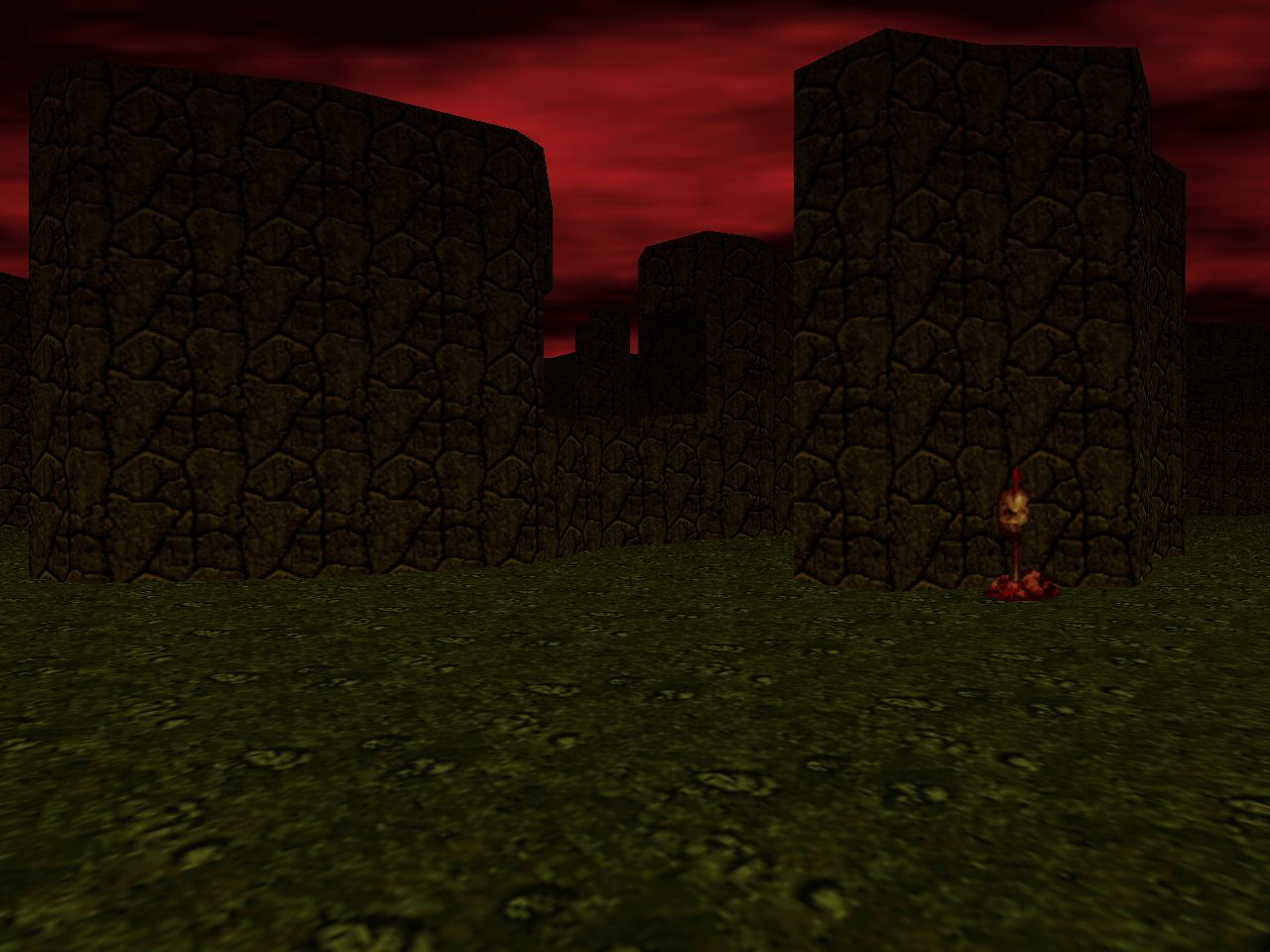 |
FUN LEVELS
These three maps are accessed through the Features menu, unlocked in the original game by completing "Hectic".
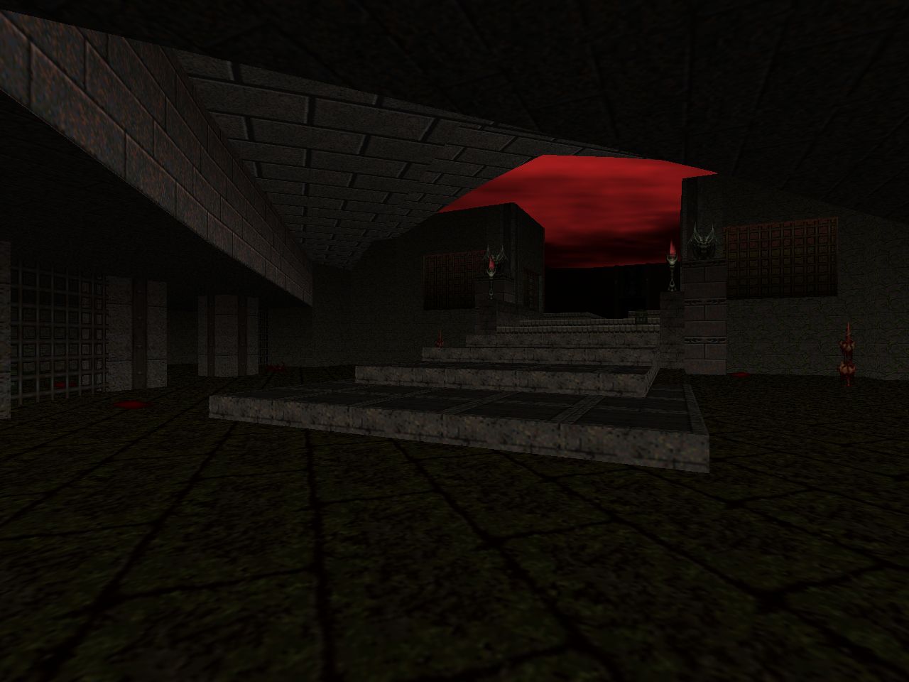
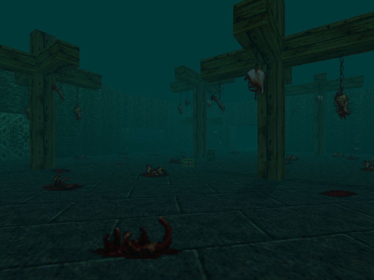
| MAP25 | Cat and Mouse |
|---|---|
| by Randy Estrella | |
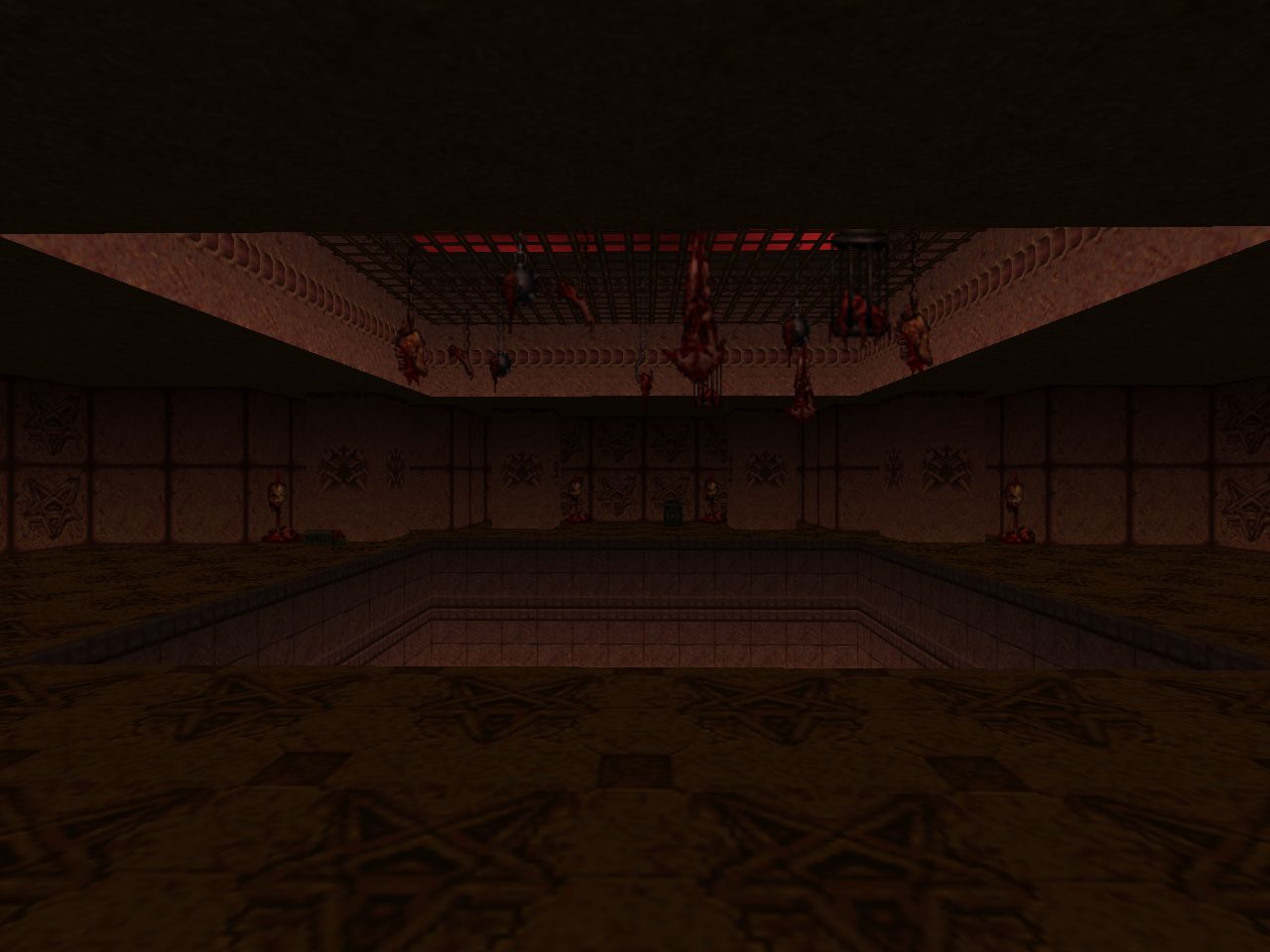
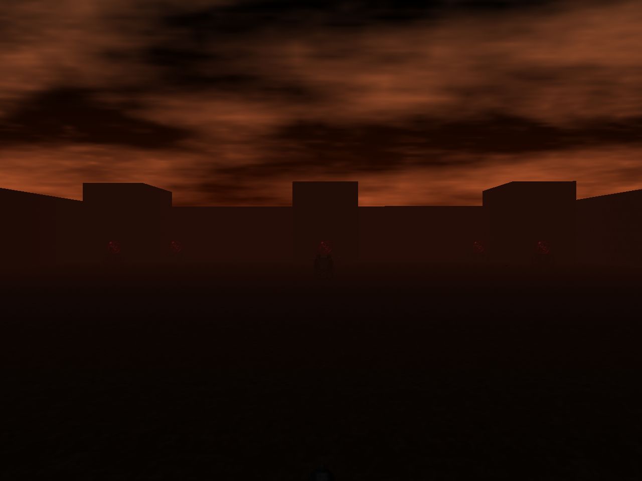
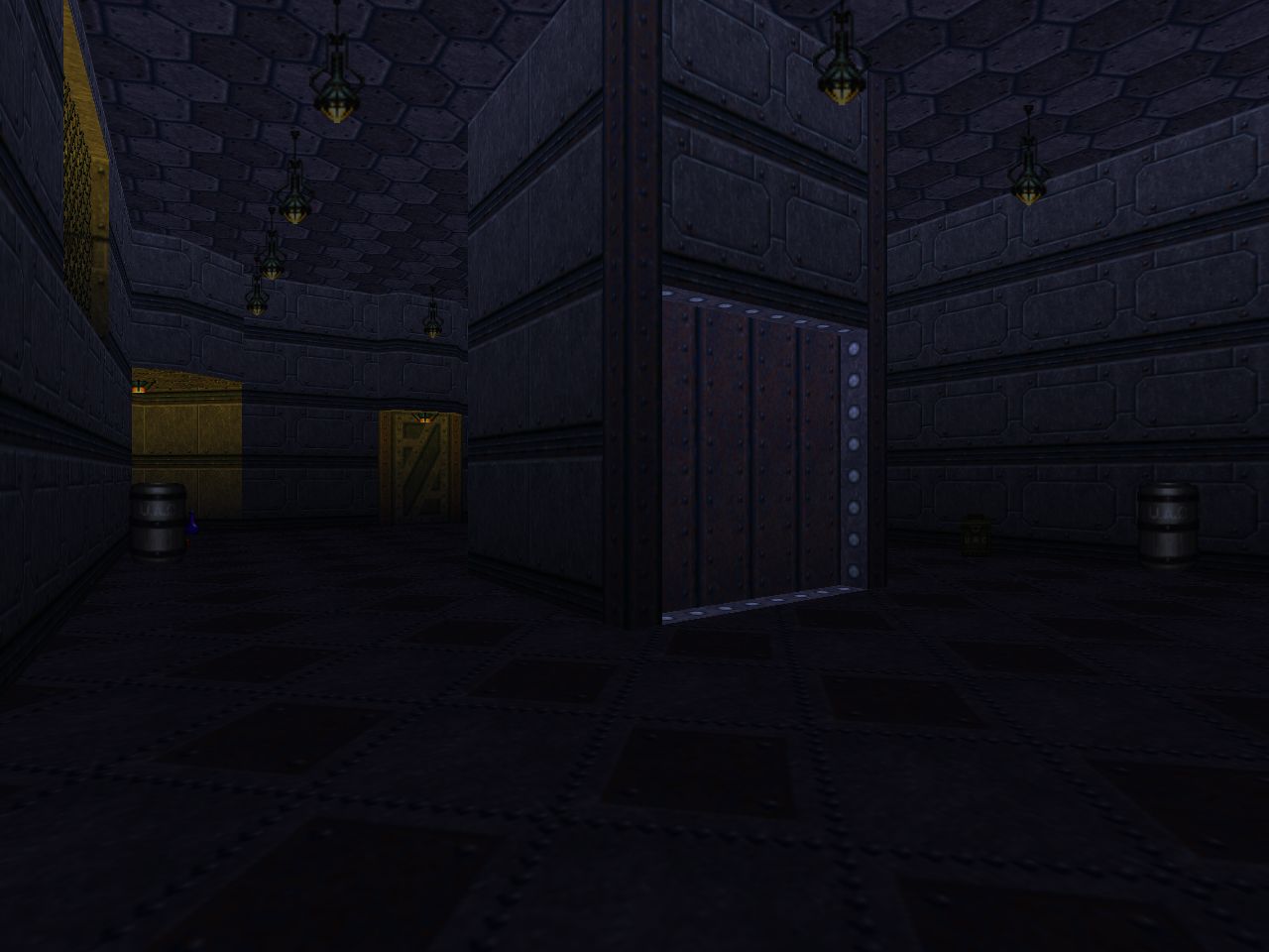
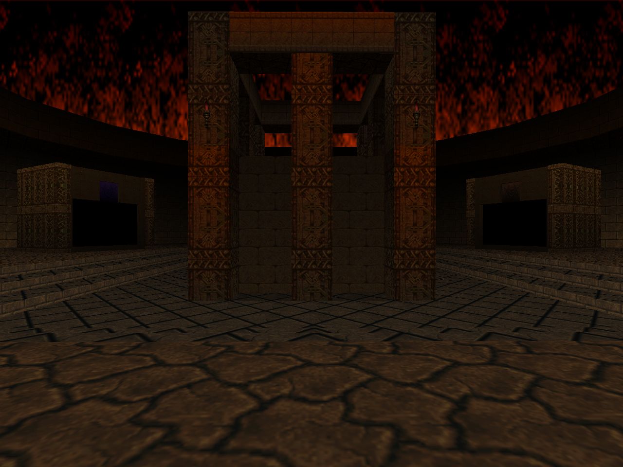
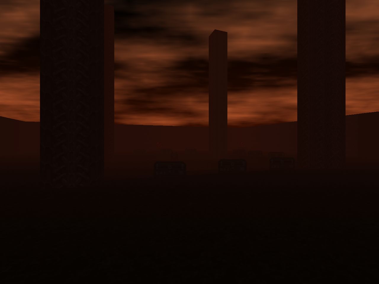
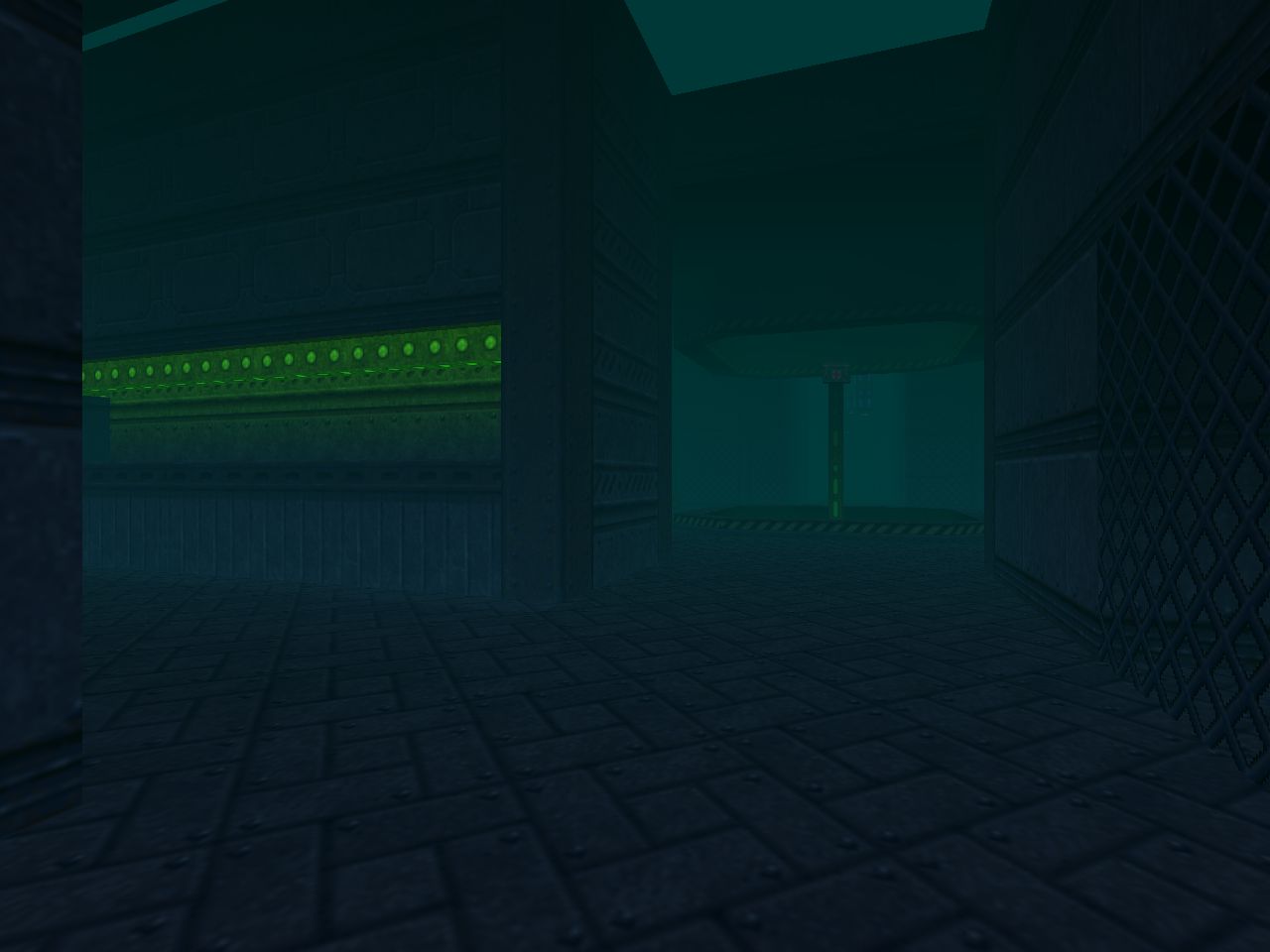 | This is the sort of fight you end up seeing as a setpiece encounter in PWADs. In fact, it appears to be the source of the psychedelic finish from Impossible: A New Reality. There are some cages where imps work as spoilers but the meat of the fight is in locating the caches of rocket ammo are and a sweet spot to engage it from. One of the corners has two long hallways, one of which has a secret corridor in parallel. I think that the real danger in this fight is being impatient and trying to squeeze out more rockets than is safe to. You also don't want to waste many if at all. |



Sometimes it feels like you're one of the few people in the community with any appreciation for exploratory pacing. Always nice to read something "vindicating" like this.
ReplyDeleteUnsure where the "SSG is faster" impression comes from. Its reloading sequence is quick, but it takes longer to get there. Overall, it feels about the same as PC version to me. Maybe the rest of the game being slower factors in.
Will there be a D64D2 comparison?
Re: "SSG is faster"
DeleteIt honestly feels like this but I just did a comparison using the same utility that I have for making animated GIFs and the duration from fire to re-fire for both weapons is exactly the same. This particular bit of apocrypha is also enshrined on the DoomWiki so I felt comfortable repeating it since it just felt right.
I got up the gumption to play Doom 64 for a variety of reasons and one of them was to see how the D64D2 crew did. I can't promise that it'll be anytime Soon (tm), though.
However I did take the time to investigate the claims that the Cyberdemon "led" its third shot in a rocket firing sequence. As far as Doom64 EX goes - which Kaiser made to painstaking fidelity - this is decidedly not the case.
DeleteAbsolution may have something to do with it.
DeleteI once read a negative opinion on Doom 64 formed via Absolution, and one particularly coherent complaint was about monsters being tall and ugly. No shit. Doomsday has aspect ratio correction that Doom 64 wasn't developed for, and it wasn't disabled for the TC. The graphics simply don't look right.
Similarly, Doom 64 runs at 30 frames per seconds instead of 35. As far as I remember, this wasn't addressed either. Some may appreciate faster pacing, but it kind of breaks that satisfying rhythm both shotguns operate in. The reloading sounds get interrupted by the next shot.
My first impressions came from an emulator. The support was pretty bad back then. Basically, you had to choose which bugs you're more comfortable with, depending on the emulator, plugins, and their versions. Fun times.
Gyatt
ReplyDelete