Bryant (aka "Gunrock") and Kevin ("The Solution") Robinson made Project Slipgate some time in 2001. It was a Quake-themed outing that explored the cool but sparingly-used (at least in the original campaign) "Complex" scheme as well as darker, disturbing fortresses. It also had something of a Doom 64 feel due to colored lighting, heavy atmosphere, and other aspects. The brothers decided to revisit the aesthetic with a side-story, released in 2002. Dissolution is yet another episode for ZDoom. It replaces MAP01-MAP07, though it's worth noting that the opener is a cinematic sweep of a fortress and neither requires nor takes any player input.
Team Robinson calls DISTION a side-story but it appears to be a prequel. The player character is a nameless soldier who finds themself transported to an ancient, alien world. This is in the middle of a conflict with an interdimensional-faring enemy who is invading ours through the use of devices called slipgates. The narrative isn't entirely clear as to whether you were attacking an enemy stronghold or under assault yourself. It looks like you found a teleporter and took it, though, whether out of duress or just professional curiosity. You're worried about your buddies but if they went through the same device then they wound up in a completely different place. You only hope that you can find a slipgate to take you back to your homeworld.
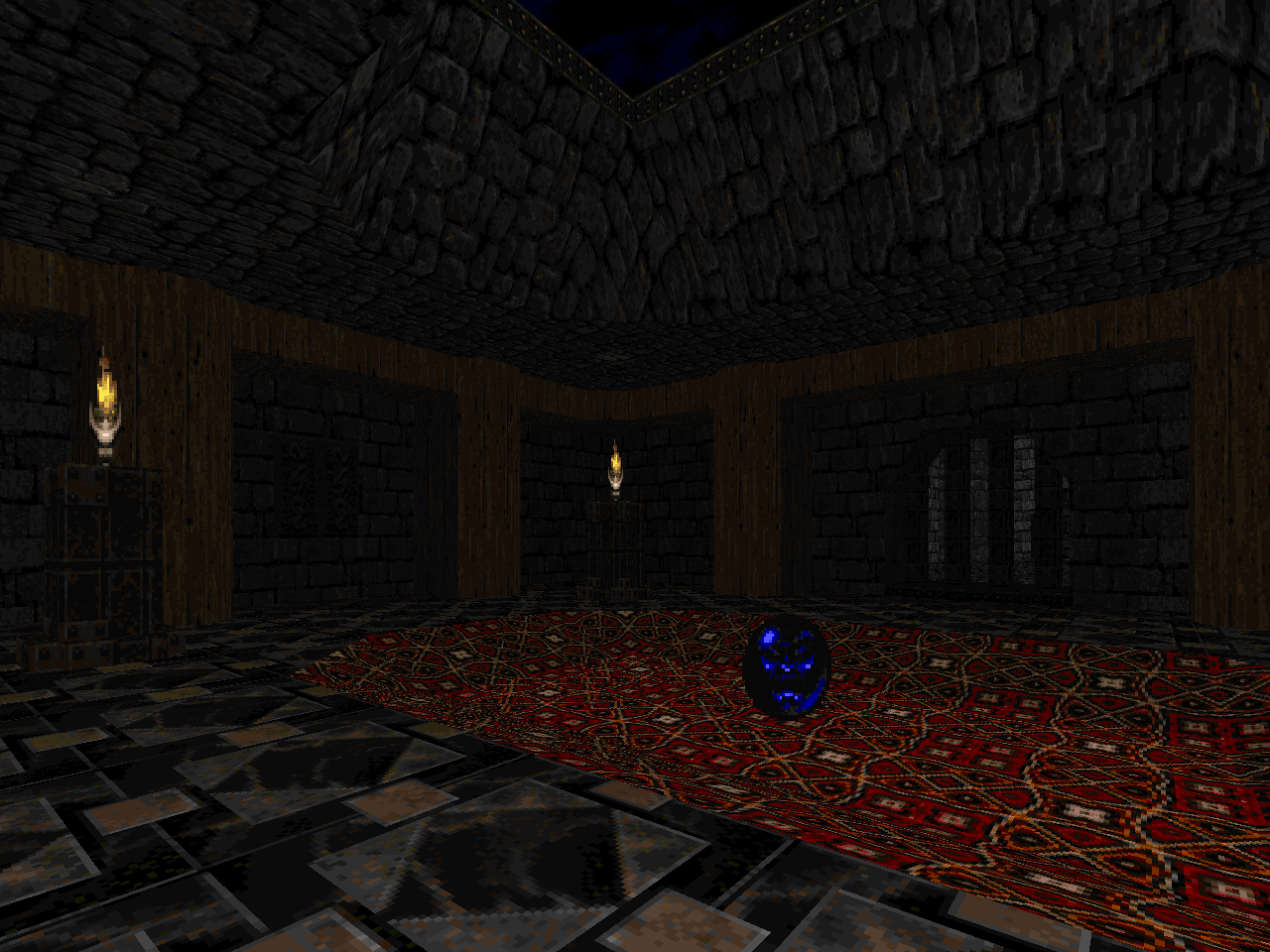
Dissolution is sort of but not quite an extension of Project's second half. Two of the levels actually reuse layouts, one more than the other. All of the locales are dark, gritty dungeons and / or ruins. I dunno whether there is any relationship between it and the Quake expansion pack of similar name; a cursory glance leads me to believe otherwise. I think that the presentation has a bit of a Hexen II feel, too, on those rare occasions where you step on a tile and it relates some world-building information to you. The first of these occurs in "Temple of Ages" (MAP02) but there are a few others squirreled away in the PWAD. I may have even missed a few since I didn't realize that some were wall panels until "Castle Rapture" (MAP06).
As it stands, DISTION is in a bit of an odd place in Team Robinson's dev history. It looks like they went back and made a big detailing pass at Project Slipgate but Dissolution's remastering as of now involved basic stuff like texture alignment. It looks fine, especially since it's invoking some comparison to Quake's geometry, but there's another before-and-after factor at play. Sloped surfaces were a big engine feature for ZDoom in 2001 and folks keen for "modern" features rushed out to use them, e.g. KZDoom7 and Sin City. You can see the affect of the advent had for Demise as DISTION uses them for all kinds of different embellishments whereas Project Slipgate has none. It would be interesting to know whether the Robinsons had slopes in mind from the get go or did some retrofitting to an in-progress episode when they came available.
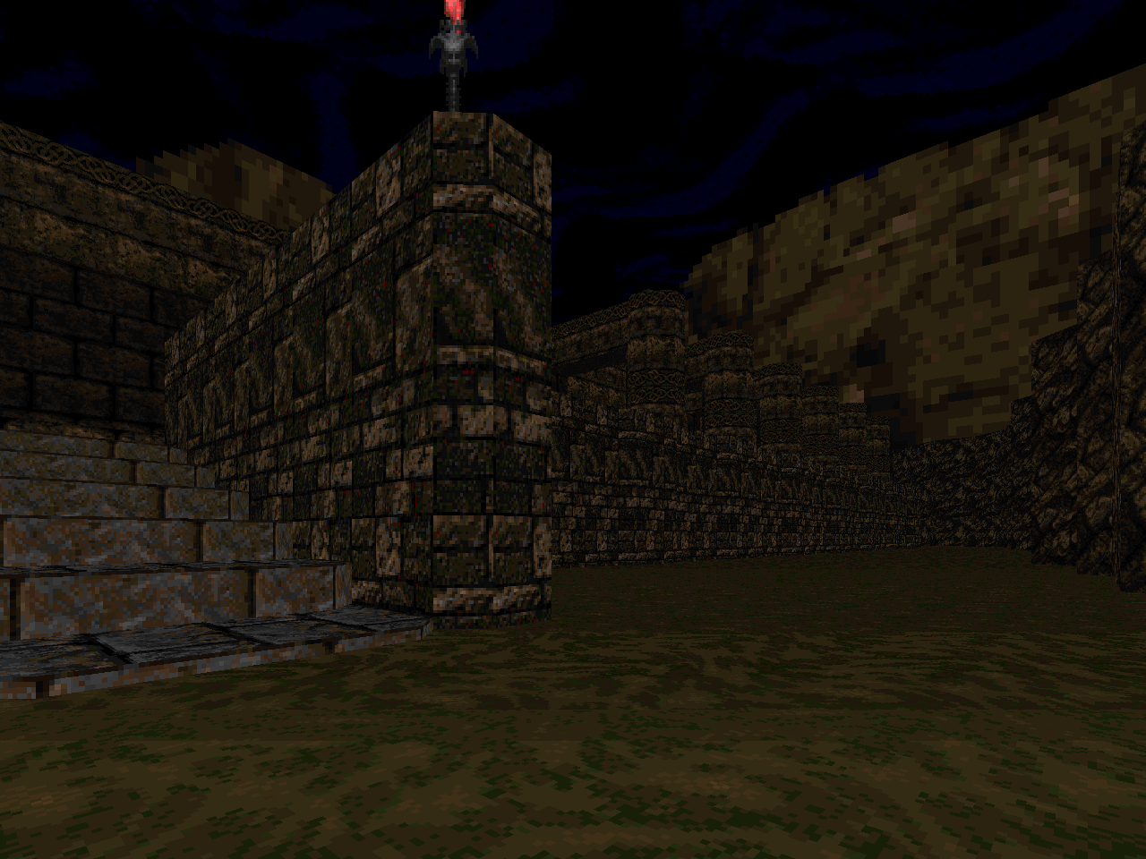
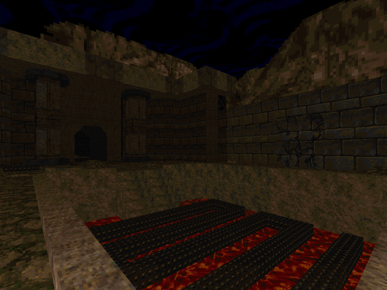
I say this because the tilted surfaces aren't featured very much. They're mostly used for things like support beams in hallways, arched portals, and - most commonly - terrain deformation. The last bit isn't terribly ornate and is basically limited to small mounds, minor depressions, and - in one specific area - sheared surfaces for outdoor bits. They help to soften the visuals by dialing back some of the right-angle geometry endemic of Doom but the impact is fairly subtle. Slopes just aren't used here in a way that really makes the level architecture pop. It never runs the risk of interfering with the gameplay either, though, so I suppose that it's better to be on the side of caution.
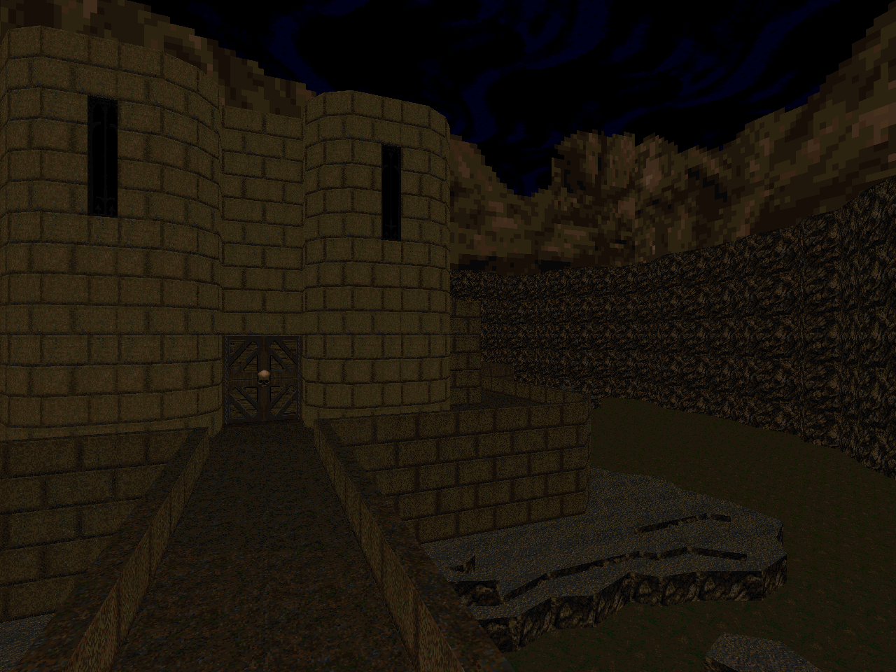
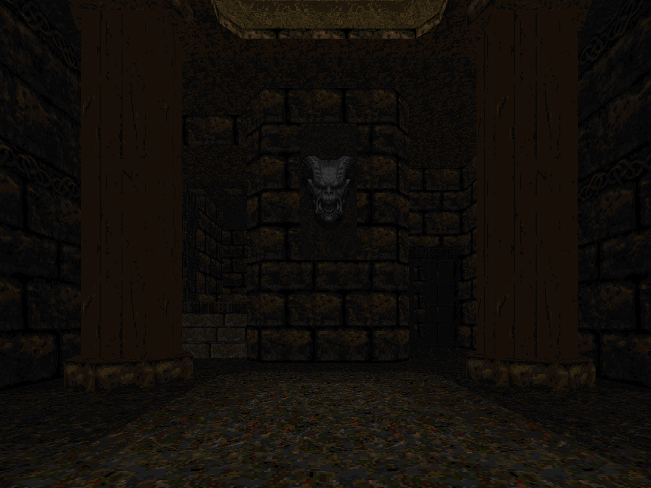
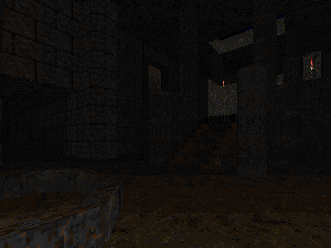
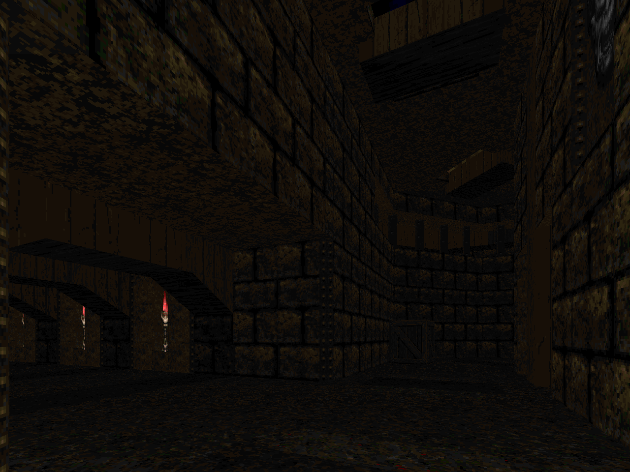
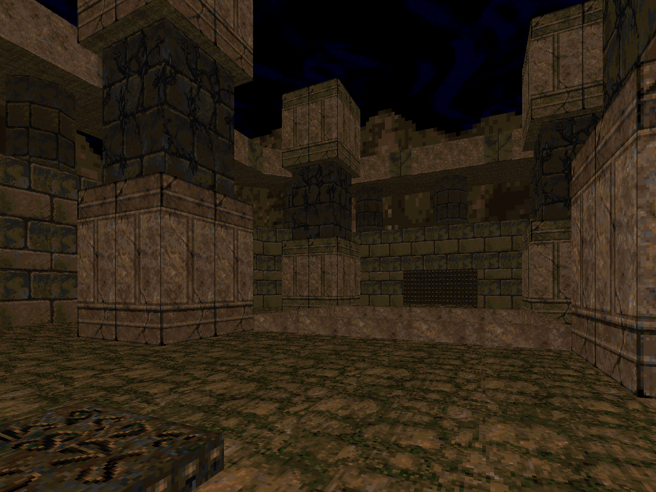
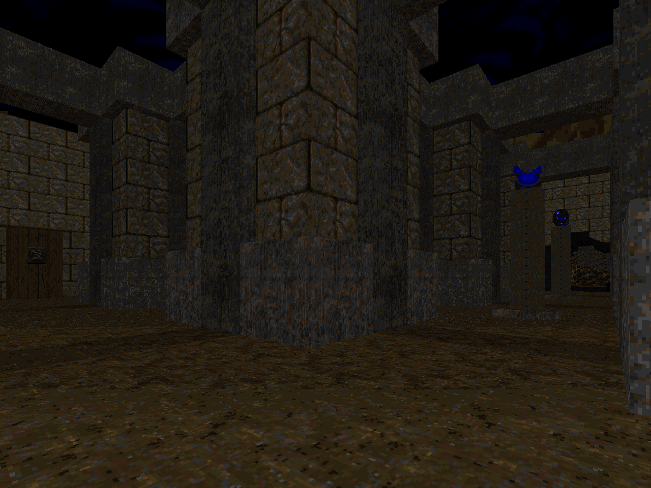
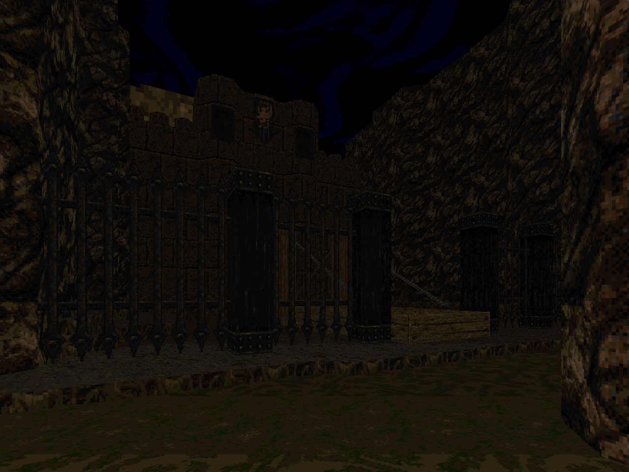
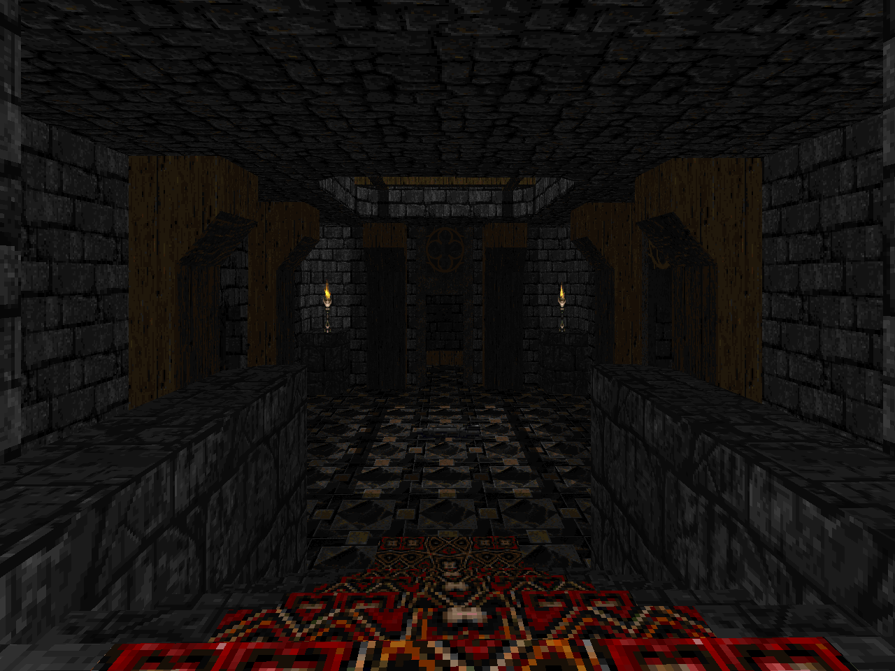
Dissolution has two primary colors: dark and light brown. This gives it a gritty feel that persists through the entire set. I miss Project Slipgate's visual pops but DISTION's tone is dirty, disgusting dungeon and it mostly maintains this feel up to the end. Team Robinson differentiates the aesthetic further by using Doom 64 weapon sprites and some of the sounds. The N64 effects have a similarly grimy quality, I think. The authors are just as big on building environmental atmosphere here as they were in SLIPGATE. Instead of music you'll be treated to a symphony of ambient noises along the lines of marsh sounds and whispering winds.
The basic principles of combat aren't any different. The big difference between Dissolution and Project is the almost complete absence of hitscanners. You won't find zombies of any kind lurking in these forsaken halls. It's a straightforward corridor shooter and ought to be played with carryovers. The later levels are very difficult but possible as survival-style challenges. I wouldn't recommend them unless you like picking apart monster placement as if it were an order of operations puzzle. You're better off collecting your kit as you go. The late debut of the SSG in "Castle Rapture" is treated like a major milestone but the designers fail to place an appreciable amount of shells in the map itself. The BFG is handed on a silver platter in "Fallen Hope" (MAP04) so you won't be hurting for firepower.
The gunplay isn't at all memorable but as a design decision this places even more emphasis on the episode's atmosphere. If you love the grainy, brown aesthetic and enjoy the idea of dungeoneering in castle-like environments then you'll probably get a lot of mileage out of Dissolution. It's closer to a gun-directed tour, though, and I dunno what the overlap is between people who enjoy the look of Quake but want to see it in a Doom PWAD. Especially when its more complex dimensional spaces are off the table. Mapsets that take advantage of ZDoom's scripting and the like feel increasingly rare, though, so it's good to know what's out there both past and present.


DISSOLUTION
by Bryant and Kevin Robinson
DISSOLUTION OF NOTETERNITY
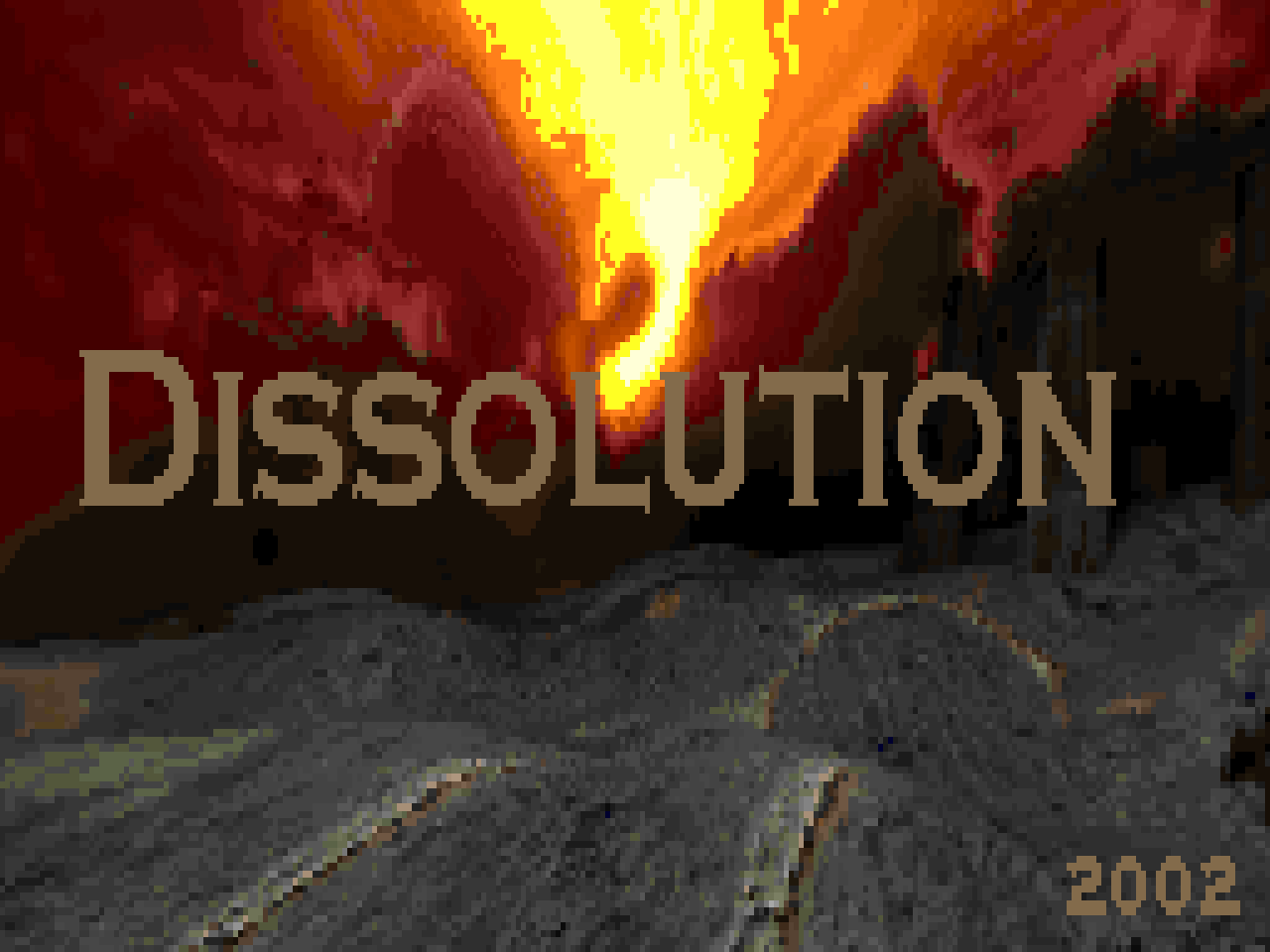


The titlepic is the sky from one of the Quake 2 expansions. And I think the same team that made the expansion also made Dissolution of Eternity. It thought it was curious.
ReplyDeleteHard to say if this has a more concrete relation to DoE, but one defining thing about DoE is that it felt like a lot of its content belonged in a game like Hexen 2 rather than Quake.
I was wondering about any potential links myself but I never got around to playing DoE, only admiring it on the shelves of stores like Babbage's.
DeleteWorth noting that the /idgames upload has been replaced by a "remastered version" which, however, only has four maps, and is thus a completely separate project from this. No idea why Gunrock deleted the old one, I can only assume it was done by mistake, but well, it might be worth putting in a new download for the original.
ReplyDeleteGunrock has a bad habit to do this to all of his old wads he has "remastered" leading bunch of his early works being lost. Luckily this wad was hosted also on Doom Wad Station. Wiki has a link for it if anyone wants to try it out.
Delete