A large portion of Chris's inimitable career has been spent taking classic
Doom themes and rendering them in his particular idiom. This began with his debut,
Inferno, but extends to
Phobos: Anomaly Reborn as well as several aborted attempts at a similar E2 scenario.
Doom the Way id Did's "Lake of Fire" and
No End In Sight's "Poison Control" were more id-oriented but the latter's "The Blood Beneath" is a considerable E4 take. I dunno how long Lutz had kicked around this particular idea but
The Dying End, its MAP29, was released individually in 2007. Not as a teaser or anything; as far as I know there was zero indication that
Hellscape was in development until its public unveiling in 2015. This
Doom II episode was finally released in 2017 and replaces MAP21-MAP30, Chris's least favorite run of levels in the original campaign. The bare-minimum compatibility is Boom / MBF but the author suggests using a port with more complex Z-clipping, e.g. ZDoom.
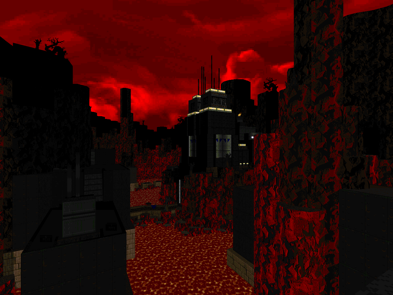
One of the biggest differences between Lutz's earlier, id-inspired work and Hellscape is that the latter consciously reuses the general layout and gameplay elements of the originals. Everything in INFERNO and PAR is composed of completely original material. Here, the core ideas - encounters and layout - are evident and recognizable to Doom II veterans. Many of the most iconic features are present but in versions that have been rendered through Chris's eye for architecture and detailing. The author has understandably made his own embellishments, transforming some of id's simplest scenes into new nightmares.
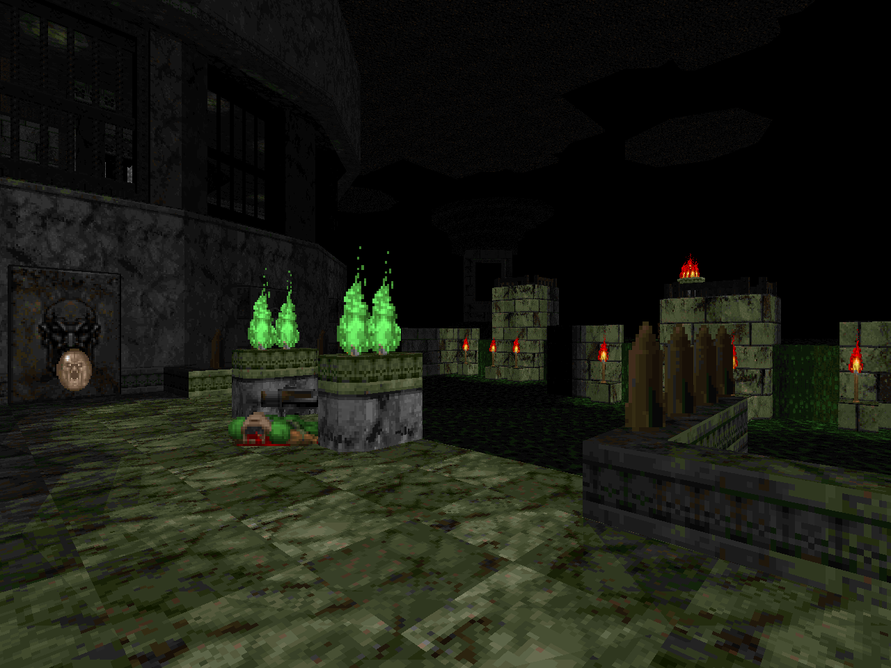
Hellscape benefits from the makeover in several ways. For one, it has a more unified aesthetic theme that presents with alternating levels. "The Suffering" (MAP21), "Cask-It" (MAP23), "Veil of Blood" (MAP25), and "Condolences" (MAP27) portray a sort of Pandemonium. Whether it's a city of demons or a cobbled-together fusion of our reality and theirs is open to interpretation. "Catatonic" (MAP22), "The Caustic Depths" (MAP24), "Quarry" (MAP26), "The Spirits Within" (MAP28), and "The Dying End" (MAP29) are subterranean and emphasize large, cavernous spaces. "Catatonic" (MAP22) is a bit of an outlier but it does have a few bits to suggest that the catacombs are built within or intersect an underground cavity. Of all the levels in the episode it feels the closest to, say, Lutz's
Caverns of Darkness.
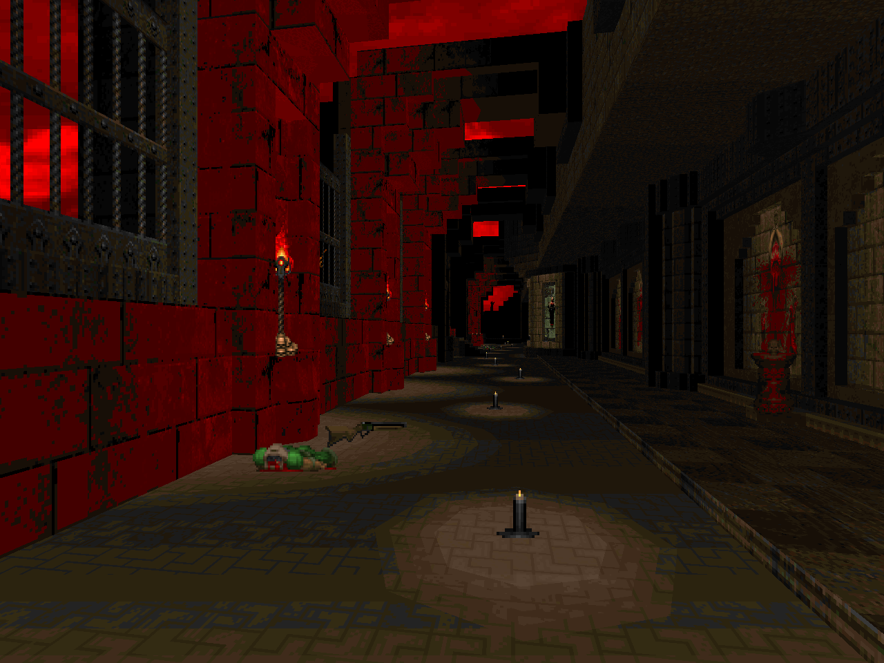
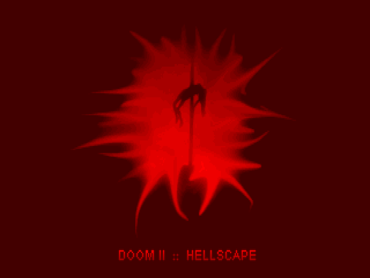
"Iconic" (MAP30) feels like a huge change-up since it takes place on what are ostensibly a few free-floating land masses in Hellish space. It's consistent with many of Chris's flashes to the outside world, though, as seen through windows and occasional outdoor spaces. They rely heavily on dark silhouettes of rugged rock and twisted trees contrasted against the red, clouded background - the titular Hellscape. The episode's presentation suggests that the entirety of your campaign takes place within and without lithic structures, which are suspended in a vacuum of freeform chaos. Even the sky-textured exit portals, a staple of the original campaign, reinforce this interpretation.
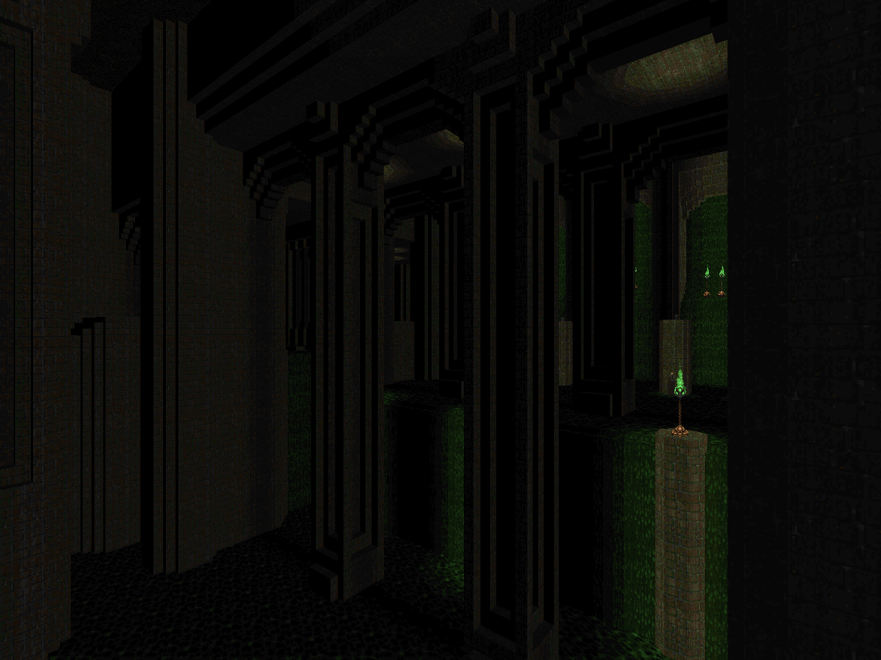
Whatever the unrealities of the setting, the resultant mapset looks exquisite. The Top 100 WADs writeup for Caverns of Darkness describes Lutz as having an "insane lust for detail". Back in 2003 - more than fifteen years ago as of this writing - his worlds were bringing contemporary source ports to their knees. He has since been supplanted by authors like Eternal and Lainos, whose works are more limiting due to the way in which they are structured. Hellscape has the same degree of filigrees but offers very little of the voodoo doll-derived sector machinery that made his 2002 and 2003 levels feel interactive. The most you'll see are a few barriers to be broken down, fires that spring to life, and a moving midtexture gate. Two of these elements are found in "Catatonic", which for additional reasons feels closest in spirit to his earlier material.
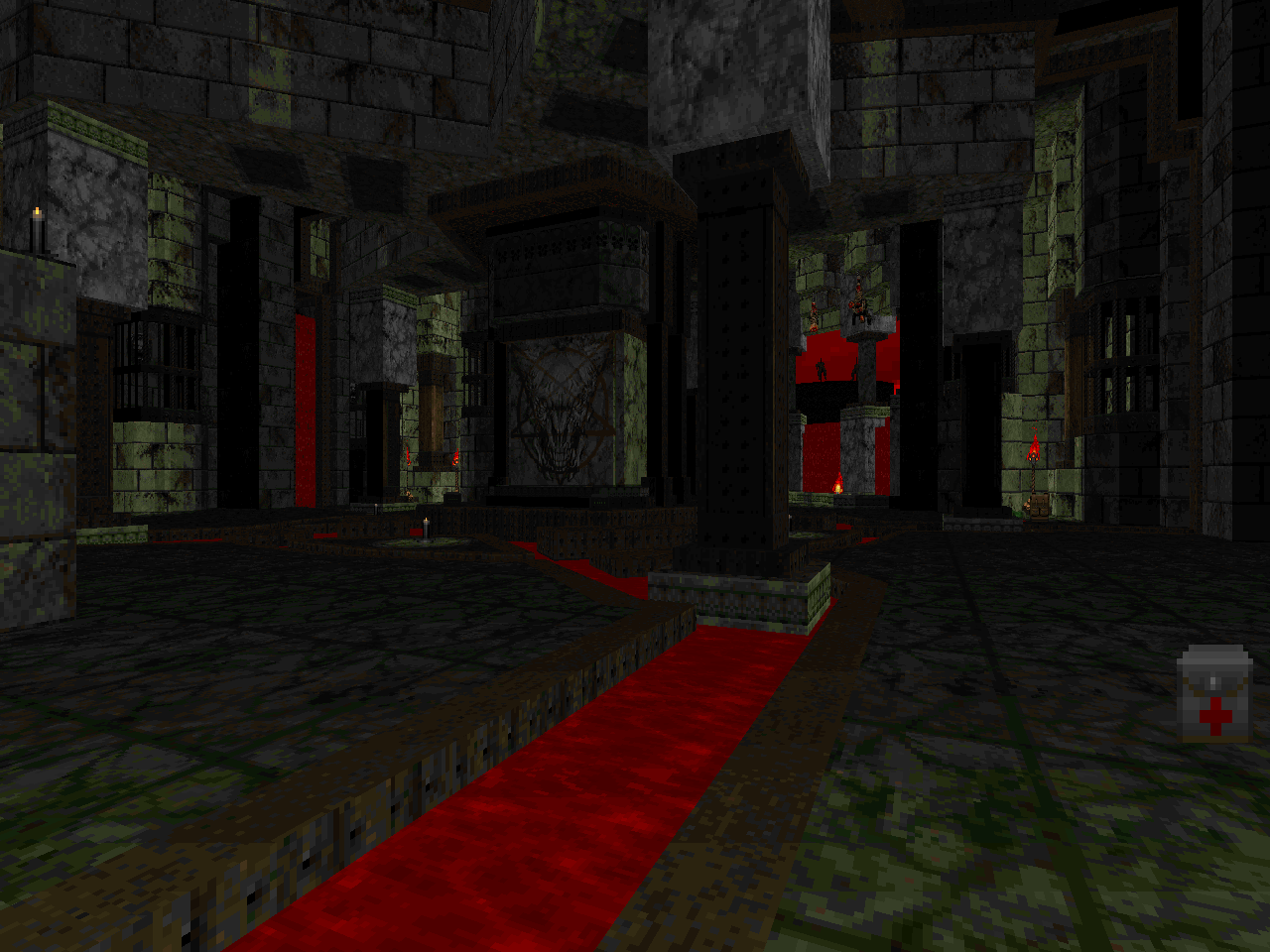
It pays to be familiar with the Doom II originals because Lutz borrows much of their skeletons. You'll have an idea where some of the secrets are and the monster placement leads many encounters to feeling like sinister echoes. Hellscape is largely more difficult than the original, though, if not overwhelmingly so in some cases. "The Dying End" is the most notorious of the bunch and I imagine that much of this is due to its brutal, beachhead beginning; constant player exposure to snipers; and a particular teleport ambush. You'll be surprised by a steady stream of road bumps, though. You're already dead if you aren't kitted out for the final room of "Veil of Blood", for example, and the spider track of "Cask-It" comes with multiple, unwelcome hitscanner waves.
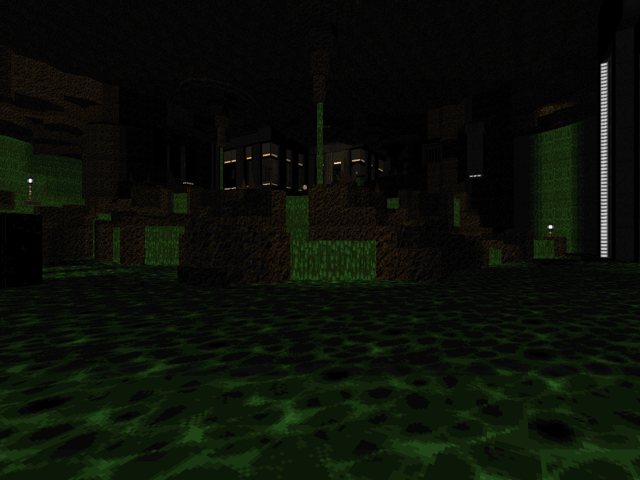
Chris suggests using a source port with the ability to handle complex Z-collision instances. The engine's original behavior is typically referred to as "infinitely tall actors". I played through the mapset using vanilla-ish behavior to see what would happen and the only time where it really screwed me was in "Catatonic". This is mostly due to the random imps and spectres found in the nexus's nukage trench. Some of the vaulted ceilings and open areas could lead to fliers blocking you in a couple of the larger spaces but these particular encounters never got out of hand. At least, not in the same way as some of
Hellbound's levels.
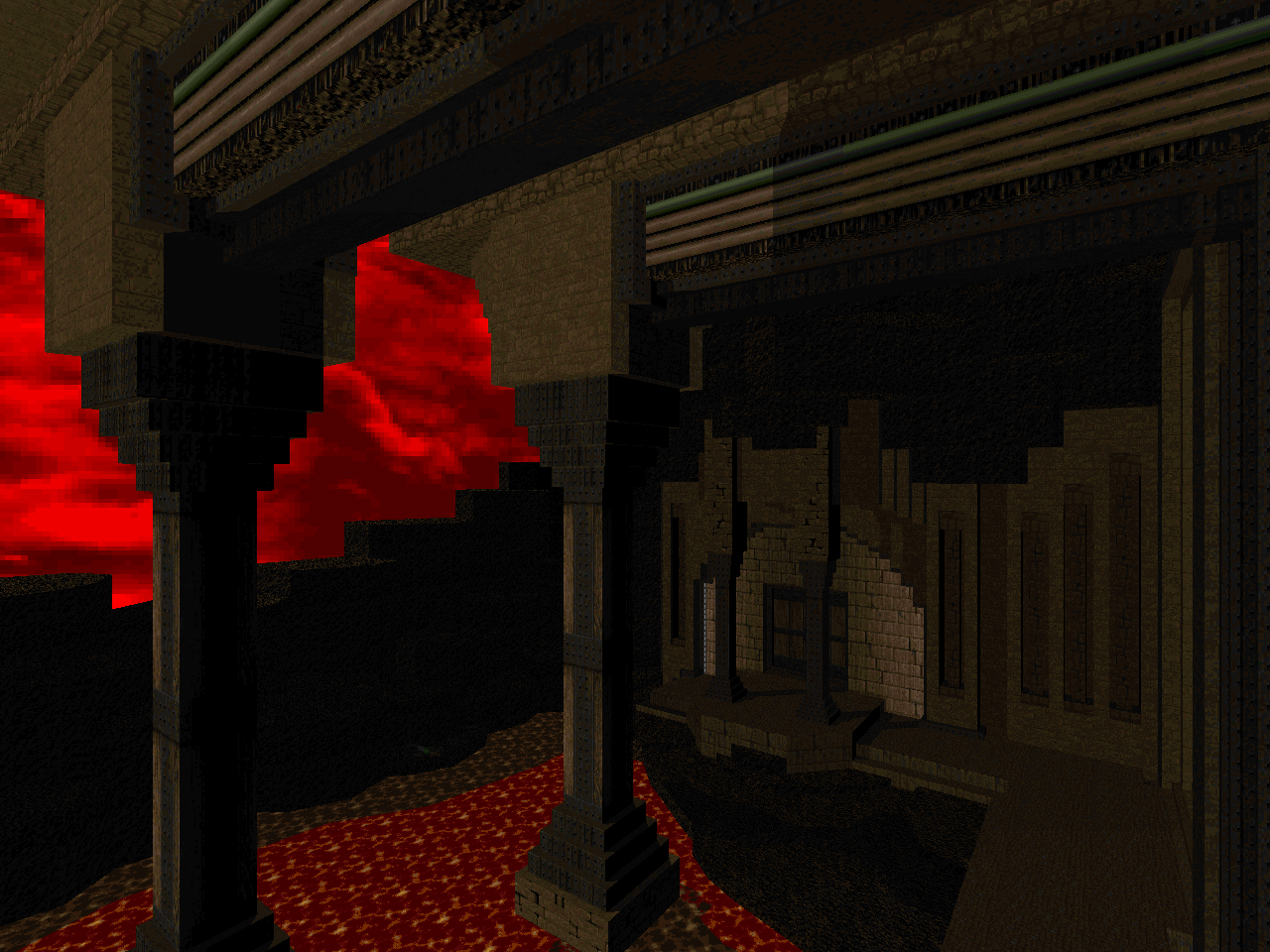
I like all of these maps but my favorites are in the cavernous category. "The Caustic Depths" may not make converts out of folks who hate platforming / tightrope segments but the makeover gives the setting a modern adventure feel. Not to forget how much of it is optional. I love "Quarry" for similar reasons but also because of how its various areas are networked together by secret passages. I was always partial to MAP28 so "The Spirits Within" is a dream come true due to the remodeling of the cavern scene alone. "The Dying End" is just a fun layout to play through and Lutz has amplified its peculiarities like its usage of three-dimensional space. I feel that it has the most restrained detailing of the bunch though it's still not comparable to Romero's required simplicity.
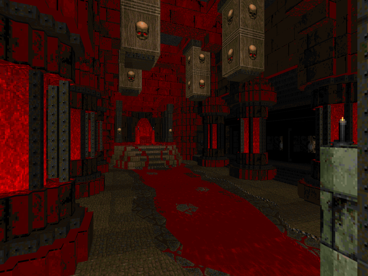
This isn't to detract from the work done in the episode's other levels. I appreciate the way in which the existing abstract themes of "Nirvana", "Barrels o' Fun", and "Bloodfalls" have had their texture schemes re-contextualized. The direction of "The Suffering", "Cask-It", and "Veil of Blood" suggest the fringes of a demonic metropolis, after which "Condolences" delivers. MAP27 is both a joy and a terror to explore since it's been further fleshed out. The mechanical motifs in these odd-numbered levels include teleporters to link disparate areas together as well as physical sawtooths. The latter tends to dump the player onto a damage floor, forcing them out and into a potential ambush.
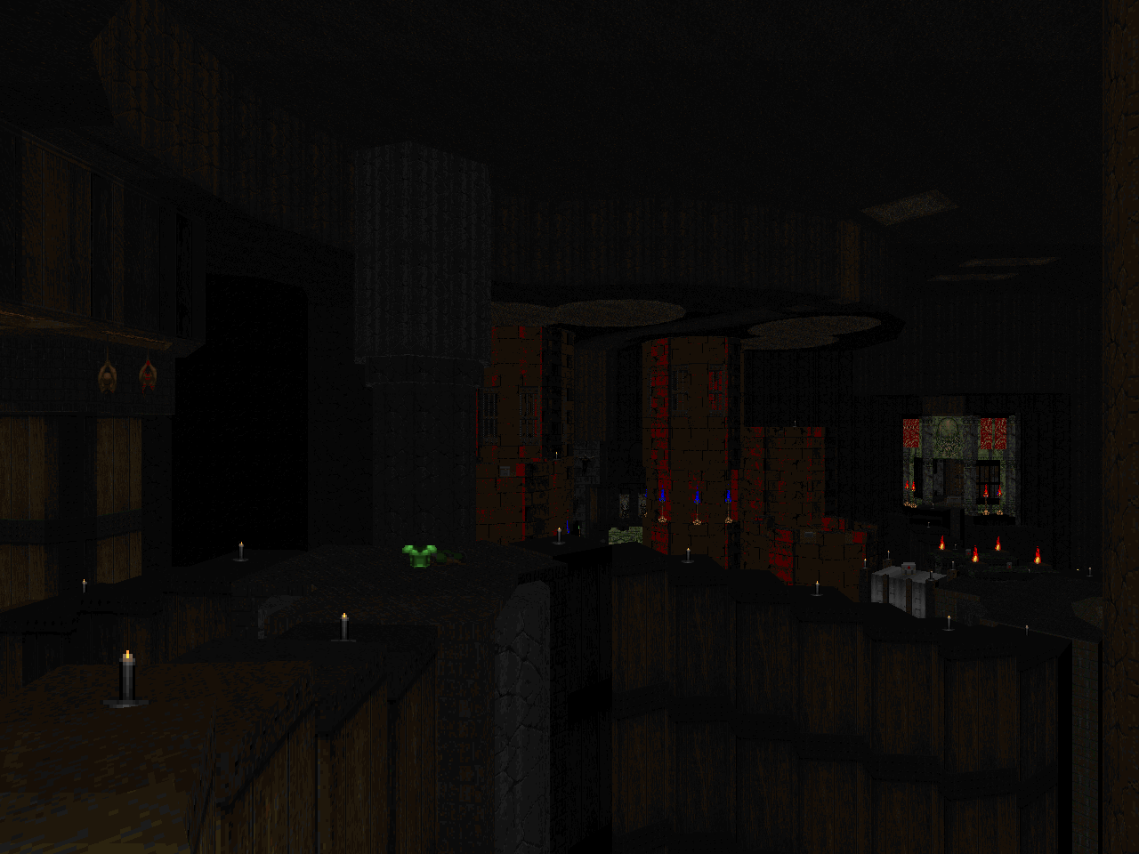
Atmosphere is pretty big in Hellscape. This is largely due to Lutz's immaculate sector lighting but also comes from a willingness to embrace the quieter moments of the original. Some members of the community tend to cram monsters into every inch of a level, at least during the initial exploration. Doom has gotten the reputation of a run and gun game, of course, and when you are looking for brutal efficiency any time not spent killing monsters is wasted. Chris took id's cue and leaves many areas with their tense, pre-ambush atmospheres. Some, like the ones in MAP25 and MAP28, have no twist and remain haunting spaces for you to hyperventilate in.
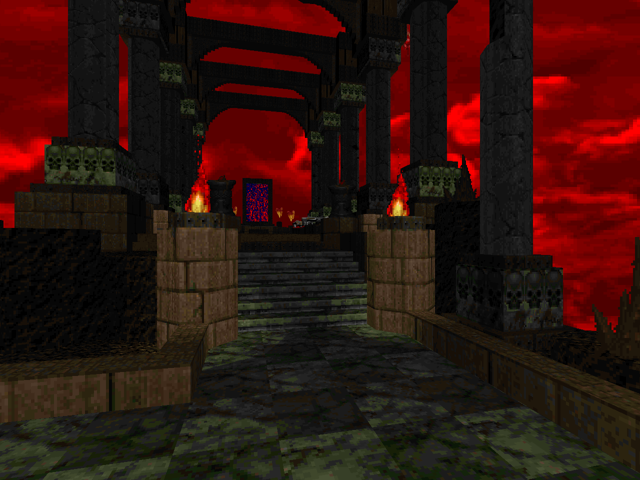
I still enjoy playing these levels in their original forms but I love the new look that Hellscape gives. If the simple, abstract appearance of these levels - particularly "Nirvana", "Barrels o' Fun", "Chasm", and "Bloodfalls" - turns you off then this may give them new life. I would especially recommend them if you were a fan of the look of Hellbound's third episode. They may not match the colossal scale but I think that their environmental design has similar aspects.


HELLSCAPE
by Chris Lutz
| The Suffering | MAP21 |
|---|
| "Nirvana" was always a weird one and its abstract uncertainty was an interesting take. Lutz takes the transitional world approach and hammers it home with city blocks and tech facilities consumed in the Hellish morass. Anyone looking for the author to enshrine it within a more understandable context ought to appreciate the new look. It's great stuff for an E3 opener and it feels like the more ridiculous aspects of the original's crowds have been toned down. As before, the level consists of a variety of areas that are linked together by teleporter. There's nothing confusing apart from maybe not being able to see one of the shadowy side areas. Instead most of the difficulty comes from the analog of the final area's key cave. It's a Hellish crater with metal platforms and spread-out snipers everywhere. It's pretty easy for the various hitscanners and even fireball-tossers to get in cheap shots. | 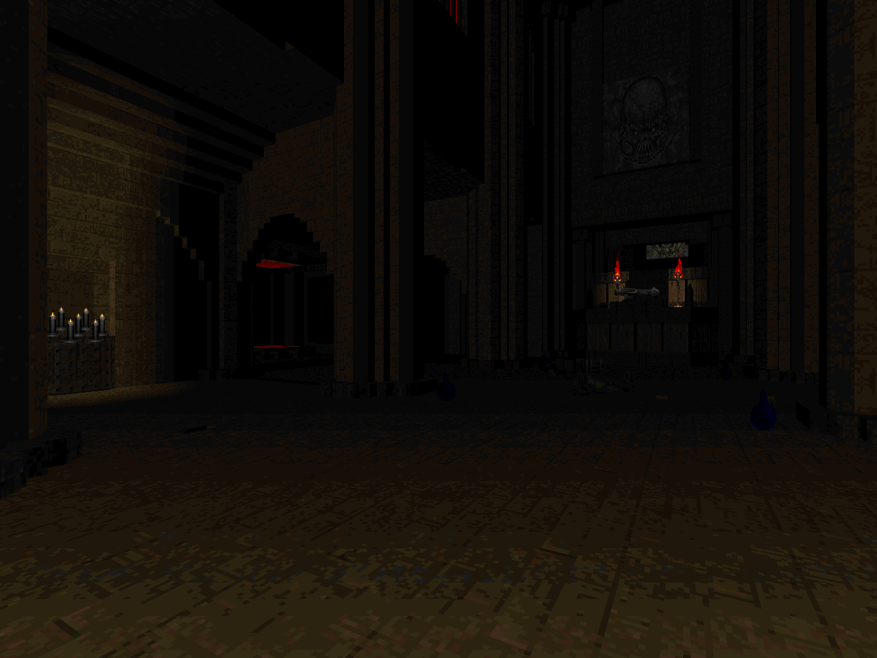 |
| MAP22 | Catatonic |
|---|
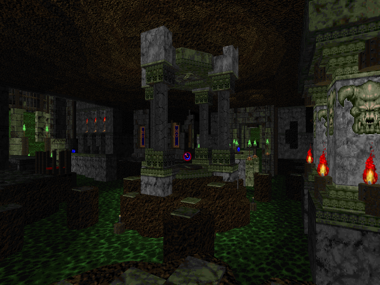 | "Catacombs" strikes me as a sucker punch level and Lutz basically holds true to its type. The biggest confounding factor comes down to whether or not you left "infinitely tall monsters" on. This is the first major situation where it will bite you because the spectres and imps in the crossroads trench make crossing the gaps difficult. The setup is already pretty hard thanks to the revenant sniper cages but it helps to know that you can find a plasma gun and soul sphere nearby. It is otherwise a gorgeous and fun marble ruins / earthen caverns / green goo dungeon. The central crossfire and northern sluice are tricky to break into because of all of the hitscanners / awkward monster placement. The first pain elemental creates an unwelcome dynamic, particularly if you managed to miss the very early secret SSG. The level gels with the eastern teleporter ambush since the two-front assault is a classic, engaging combat scenario. It helps that FIREBLU catches the eye. If you've been saving up cells then it's a great time to unleash your kit. The other quintessentially Lutz bit is the grate / door which must be lowered in order to return to the eastern annex's front half. |
| Cask-It | MAP23 |
|---|
| The raw DNA of "Barrels" is here but Lutz has re-contextualized it within the same theme as "The Suffering". It's appropriate considering how it's just as linked together by teleporters. With the author's artistic license, the layout turns into a formidable slice of red rock Hell plus brown brick and metal intrusions. The transformation of the major linked playing space is excellent. You don't get the iconic barrelling demons in the tiered hallway but the shadows and stronger monsters pack more punch. It's also interesting to see Chris flip which tier you begin on. The little castle in the teleporter fork is cute; the curled western staircase looks gorgeous. I really enjoyed the new look of the arachnotron / Spiderdemon wing; I completely forgot what was coming. Barrels still figure into the action but they are about as invasive as the original. They might be a tad bit more likely to hurt the player. Only the goofy, final trap surprised me... but it did get a wry smile. The opening combat is a little rough but the main drag comes in the northeastern annex. It doesn't feel as though there is enough health laying around considering how many hitscanners get dumped into the square track. | 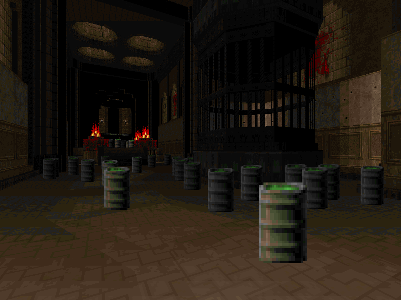 |
| MAP24 | The Caustic Depths |
|---|
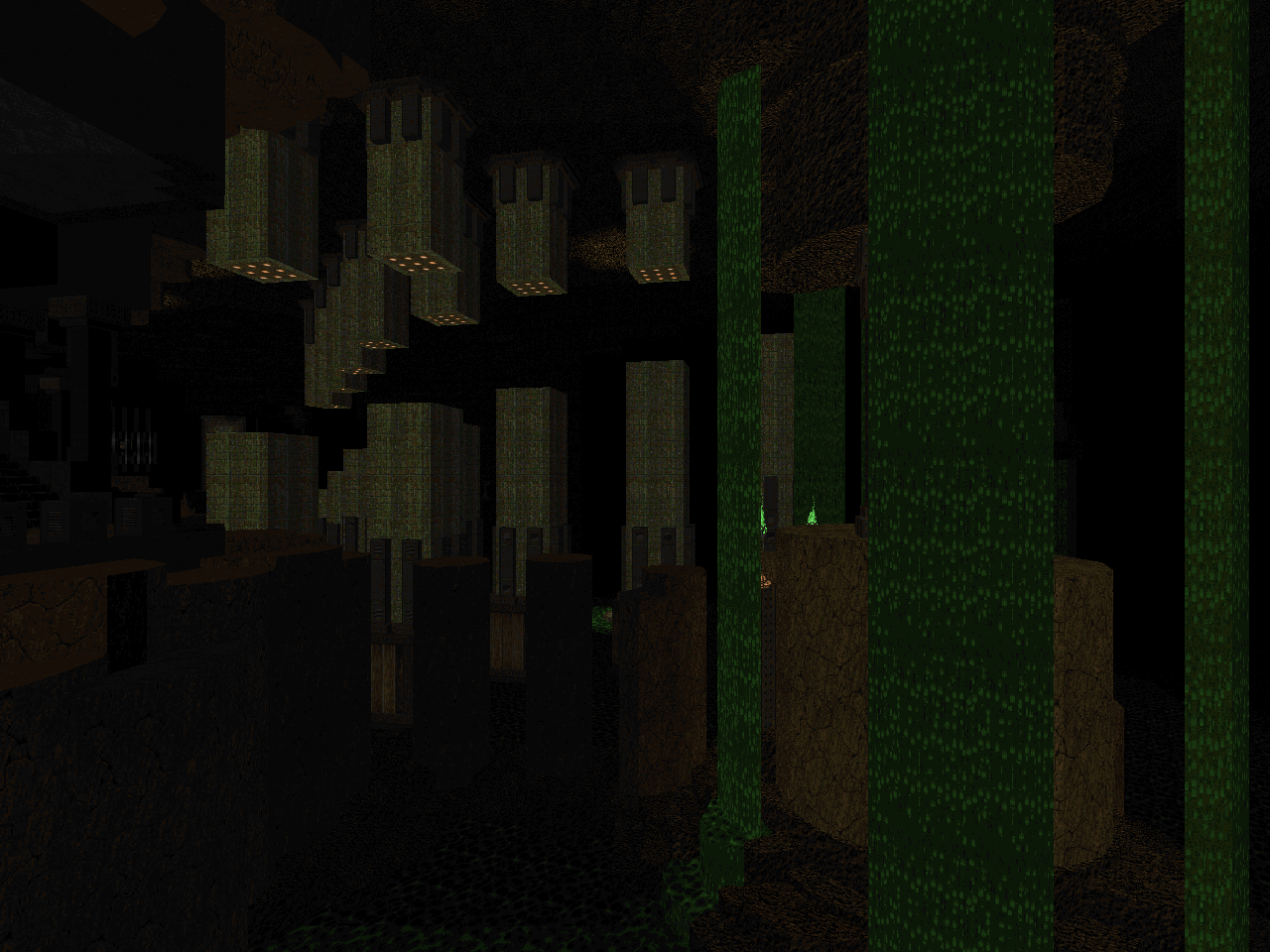 | It's definitely "The Chasm" but it looks freakin' gorgeous. The earthy look sort of reminds me of the subterranean portions of PAR. It isn't quite as "pitch black with islands of light" but it's close. The architecture is beautiful; if the abstract ugliness of the original turned you off then Lutz has you covered. The stepped edges help to give it a more organic feel. I adore the vast, aqueduct look of the level's northwestern portion. I sort of miss the sheer slimewall fortress but a monotextured edifice isn't really Chris's style. I'm glad that the optional areas remain as such; I had a fresh sense of mystery when I accidentally beelined to the exit. You might be surprised to see how little the author takes advantage of the open space - if you forgot the original's gameplay. There are a couple of cacodemon ambushes but they're pretty small. If you hated the rail-thin catwalks then I have news both good and bad. The average width of the paths is wider but there are systemic bends in every tightrope segment. They're actually pretty easy to run across, just difficult to dodge revenant rockets on. Besides simply jumping into the poison, of course. I barely recognized the formerly incongruous red key chamber since it fits in with the rest of the theme. Its ominous look is not a portent of the actual combat. Outside of the hitscanner ambushes in the tech facility the worst of the fighting is more awkward than threatening. |
| Veil of Blood | MAP25 |
|---|
| The stringy layout of "Bloodfall" is entirely evident but Lutz has amped up the encounters to an excruciating degree. This is the sort of level that you have to bumble through, finding secrets, and then replay with your newfound knowledge. I got myself into an untenable situation at the finish; even the hidden soulsphere was practically worthless. I dunno how you'd tackle it sans secret BFG and the prior pain elemental clusterfuck seems designed to trick you into blowing all of your cells. The room itself is virtually ringed with hitscanners, has an arch-vile in the back, and another spawns on the starting platform if you step down. It's a much nastier retread of the outdoor blood fountain yard, I guess, but it fails to prepare you for the last dance. Pretty much everything past the blue key door is especially designed to fuck with the player. I guess the linear design lends itself to increasingly dickish deathtraps. The individual areas look cool and Chris does some world-building by adding inaccessible scenery in the platform staircase rooms. There's a lot of pretty things but the most iconic moment is the eastern annex. The subtle stone texture makes the caverns feel like they're hewn out of solid darkness and I love the illumination / monster pop-ups. Easily my favorite part, and not just because of its relative lack of difficulty compared to the following segments. | 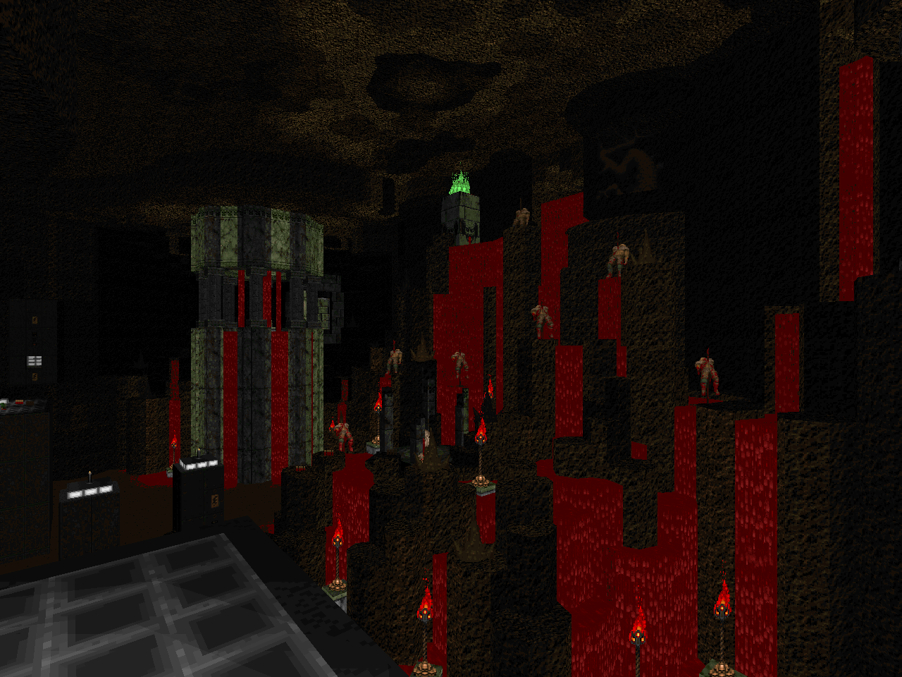 |
| MAP26 | Quarry |
|---|
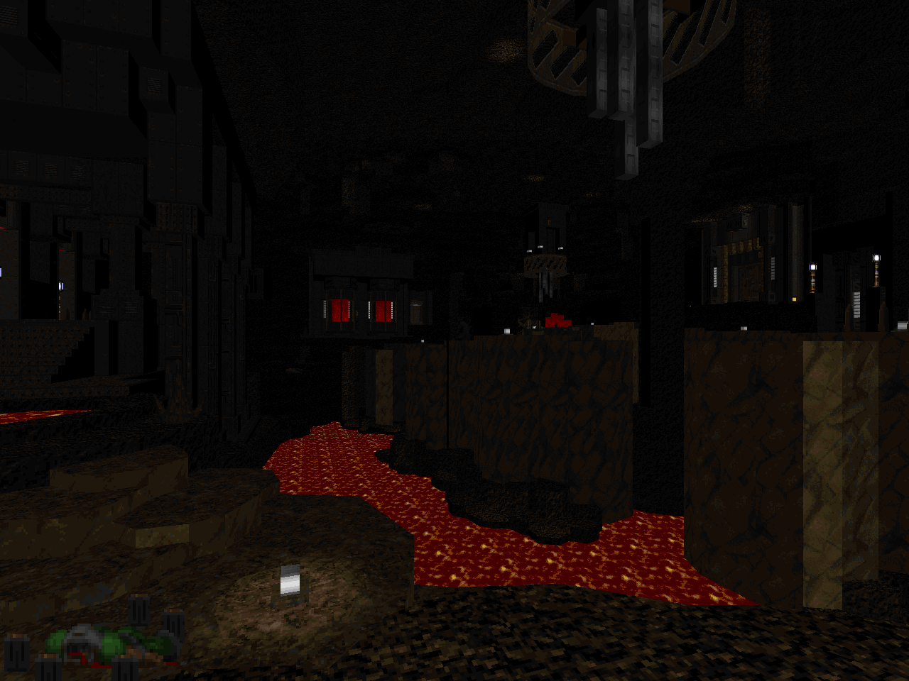 | Some lovely embellishments, here. Part of the fun is in just exploring to see how to get to the various annexes since they have been so greatly expanded. The network of air ducts was a nice surprise, for instance, and I like the transformation of the old plasma gun catwalk. The map begins with pockets of snipers but enemy fire rarely feels truly oppressive. Many of the monsters have been reserved for strategic deployment, where Lutz drops packs of trash enemies into the caged crossroads. It's a fun blastathon. One of my favorite scenes is the old winding road bit. The vast space has a haunting quality since Chris is content to leave a single arachnotron gunner and lurking lost souls as your opposition. The return trip gets a little more heat since it's a suitably awkward battleground for the inevitable cacodemon ambush. Very cool. |
| Condolences | MAP27 |
|---|
| A great re-imagining of "Monster Condo". The general style is in line with MAP21, MAP23, and MAP25 as far as a sort of broken, jumbled reality. It's fun to explore, first to unravel Lutz's interconnected take and second to see the extent of remodeling. Combat alternates between open-air shootouts and claustrophobic skirmishes against mid-tier brawlers. In some ways the original was about the art of the monster closet and Chris plays this up with minor and major enemy reveals. Often-distant hitscanners make attrition a real threat but chaingunners (and shotgun guys) are just as likely to walk up in your face. In my experience health and ammo felt tightly balanced but the latter is likely due to obnoxious pain elemental placement. As for the former, well, the map actually has quite a bit of health. The mirrored teleporter trap room affords a pair each of Berserk and soul sphere. This is on top of several armors and other life-giving powerups. I missed the secret megaphsere! The player just spends a lot of time exposed to enemy fire, I think, and Lutz's contrasting light levels / detailing makes sourcing attacks tricky. I still had a ton of fun! | 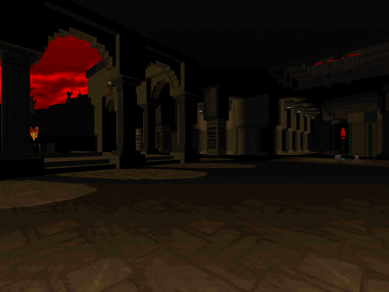 |
| MAP28 | The Spirits Within |
|---|
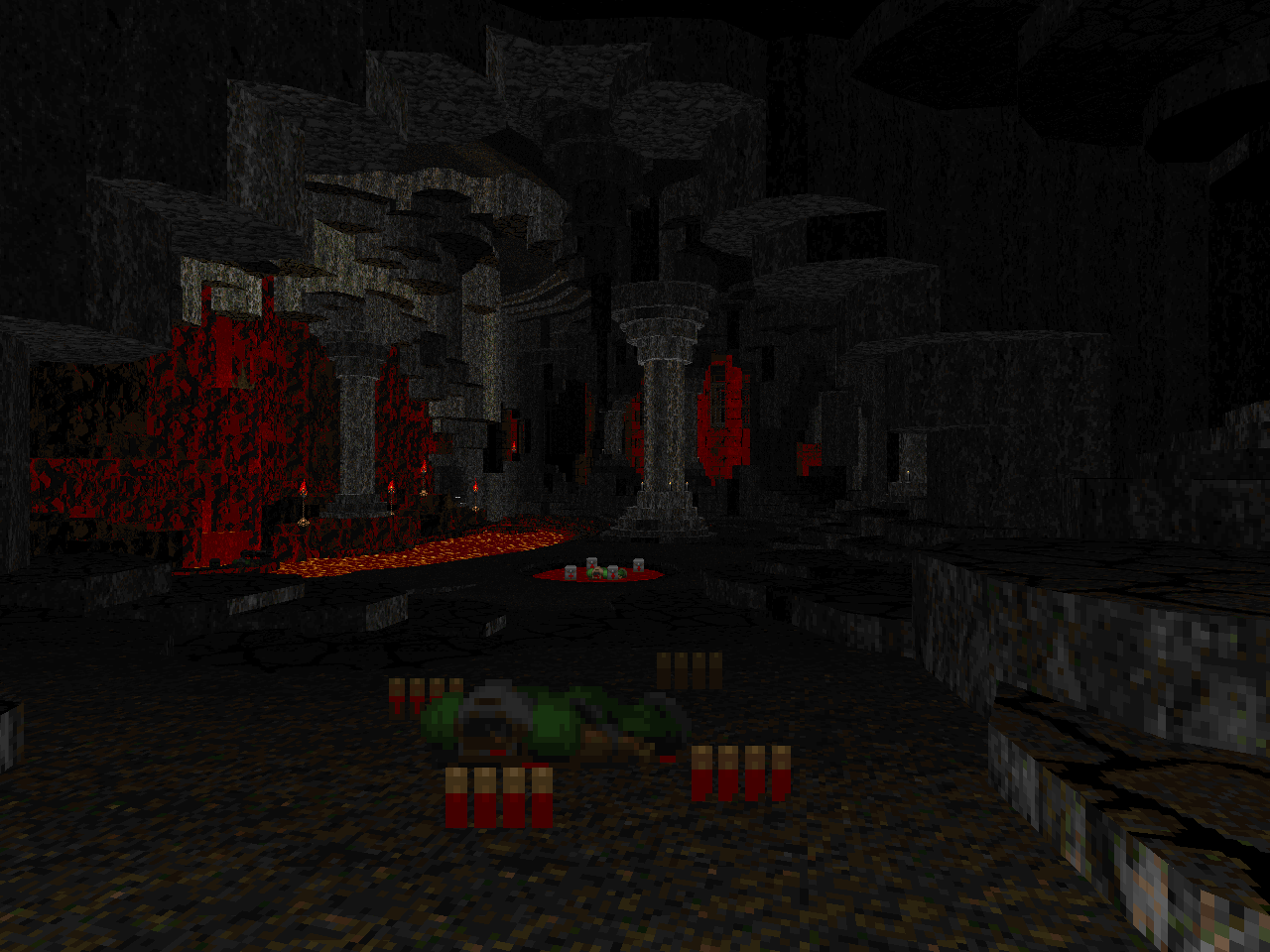 | This was always one of my favorite maps in Doom II. Lutz amplifies and adds to all of its iconic visuals, resulting in an adventure that's just as fantastic but less garish in its color combinations. Chris's ambient lighting adds so much to its scenic character but he has a few fun additions, too, like the red brick fortress in the granite cavern. You lose some of the sheer spectacle due to the construction of the Spider chamber but the level is as lethal as ever. More so in some cases, too. The early northeastern bit is one of the nastiest change-ups since Lutz has made the room even more congested. I imagine that this is an attempt to balance out his relatively liberal super shotgun placement. His transformation of the ridiculous revenant clown-car monster closet feels like an uncomfortable echo of the throne room. However, the dynamics of the encounter are a bit different given the monsters involved and it still comes across as a fresh twist. In some instances the monster placement is more accommodating. You don't have to worry about an arch-vile lurking in the shadows of the bit stone cavern, for instance, but I wouldn't let my guard down entirely. Altogether, I liked this new take on a - to me - classic level. |
| The Dying End | MAP29 |
|---|
| Originally release alone in 2007; check out my review of TDE for a longer description. The changes between then and now are subtle. The core of Romero's original is here and it follows the progression give or take a few switch-ups, most of the liberties taken with the northwestern section. It's a super-tough level but a lot of the difficulty is front-loaded. Part of this is the sheer exposure and number of monster closets encountered during the early portion of the cavern crawl. The big northwestern teleporter ambush feels hard in a very modern way. The wave of monsters lasts a while, throws down beasties in both the back and ground floor, and requires some gutsy weapon use. Lutz stays true to the peculiarities of Romero's design; much of the combat remains tricky due to limited maneuverability. As long as you don't prolong stuff by just jumping into the lava and taking a teleporter back, at least. The use of three-dimensional space is more complex in a few spots, requiring the player to leap over previously-explored paths. TDE still kind of sticks out amongst the rest of the set; its detailing has an almost classically restrained feeling. It may not have the crazy steppes that Chris built into the rest of Hellscape's vast underground caverns but it's a freakin' gorgeous hellhole. | 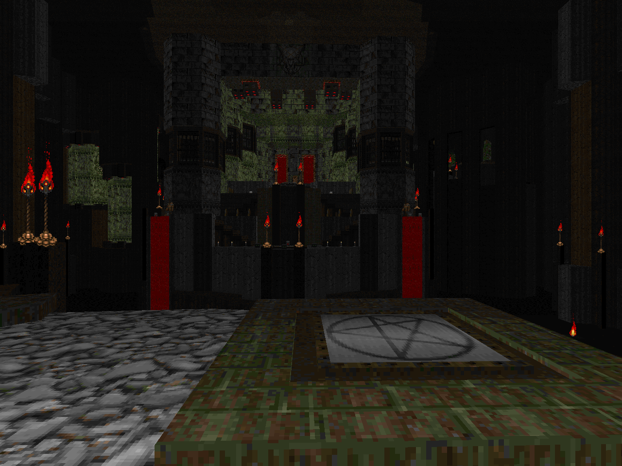 |
| MAP30 | Iconic |
|---|
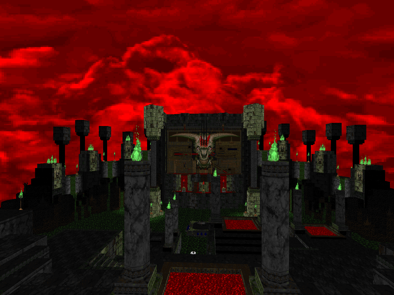 | The IoS has rarely looked better. Lutz abandons his previously subterranean stylings and unctuous Pandemoniums for floating islands in the red, cloudy void. He has sort of hinted at it with some of the exterior glimpses but it appears here in its most explicit form. This includes minor chunks of terror firma floating nearby. The starting atmosphere is superb and the boss arena is a great re-envisioning. I daresay that the design is easier than the original. The climb up is a little tricky but the monster spawn locations are clearly flagged. The tiers are smaller and have obstructions so monsters are more likely to both infight and get their shots blocked. You still have to deal with the fucked up rocket / brain timing but it's pretty easy to clean house for subsequent attempts. |
I WANT TO PAINT YOU
LONG POEMS FILLED WITH FIRE




Hellscape is amazing.
ReplyDeleteI think that it's exquisite
Delete