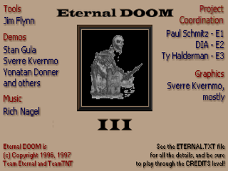
Eternal Doom began life as a 12-map episode for
Doom II, produced by Team Eternal and under the direction of Paul Schmitz, the author of
Artifact and
Welcome to Hell. A number of WAD authors cleaved unto him, including Sverre Kvernmo, who is responsible for many of the new graphics (that is, the stuff not ripped from
Heretic and
Hexen).
Eternal Doom was updated two more times, adding fifteen and six levels, respectively, to turn it into a mega-megaWAD. I know this project eventually came under the purview of Team TNT, but I have no idea when that happened. I'm guessing some time during the development of
Eternal Doom II, but I have no basis for that assumption. For sure,
Eternal Doom III was headed by TNT, given Ty Halderman's involvement.
The plot is pretty canned, though well-written. Basically, the UAC puts the kibosh on teleporting through space, focusing instead on time travel. As if messing with causality is safer than battling the hordes of Hell. Anyway, with the laws of physics breaking down, pretty soon demons come pouring out of the quickly overrun time gate. Which wouldn't be that big of a deal, except that the minions of Hell immediately turn around and use it to travel back into the past and exterminate humanity in its infancy. You, a genetic paragon of humanity's warriors, are sent on a suicide mission to re-secure the gate, go back in time, and halt the invasion of Earth's past. The penalty of failure is to never have existed.
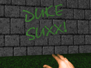
So, Eternal Doom. It's big. It's huge. It's also quite gorgeous. The mixture of Heretic and Hexen textures with all of the new stuff makes this mapset shine like nothing else. It's hard to appreciate the number of elements that were created for very specific purposes, like the simulated arches, railings, blasted-out walls, and tons of floating text, usually used to mark exits but also utilized quite extensively by Jim Flynn for his offerings. Also included are a smattering of futuristic textures you'll rarely see, especially after Sverre Kvernmo's MAP05, "Time Gate". The only real downside to all this effort is that, well, I hope you really like the castle locales. The authors manage to keep things fresh but it's medieval all the way down. If you're less forgiving the sameiness might begin to wear on you fairly early.

Another fair criticism of Eternal Doom is that, for all the vastness of the maps, some feel sparsely populated, which you can only expect with levels of this size. The authors have taken care to make the encounters fun, regardless of the time spent between them, and in some locations the maps end up with an old-school feeling as you bump into wandering monsters on your way to the next objective. It can falter, though, as the vast yards and low enemy count can leave the player feeling overwhelmed and bored, a feeling that didn't really hit me until the final map, Bob Evans's "Excalibur".
Which comes to the final bone people have to pick with Eternal Doom, that being the puzzles. Truth be told, Eternal Doom isn't that puzzle-centric. Sure, there are some unorthodox solutions if you stand the average level against the Doom II IWAD, but it's generally consistent with its applications of breaking glass, shootable walls, and switches are rarely obtuse in what they affect. If any maps could be accused of being too puzzle-centric, they would be the ones by Bob Evans and Jim Flynn. Solving their challenges is very edifying, but gameplay in "Excalibur" devolved into walking around until I noticed something I hadn't seen before, with as long as five minutes of dead time in between the puzzles themselves. They're all great, and I especially enjoyed Flynn's stuff and his sense of humor, but after a full megaWAD of this stuff, I have to throw in the towel.
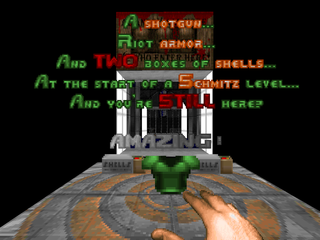
If this all seems pretty negative, I'm just pushing it out of the way so I can start the praise. There are tons of neat bits like breakable glass / stained glass, shootable walls a la Quake II, ladder mock-ups, swinging doors, and 3D bridges, not to mention core Doom values like orgasmic architecture, gorgeous lighting, and meticulous detailing. Maps like Kvernmo's "Darkdome" and Schmitz's "Timeslip" are a true feast for the eyes, in addition to a generous helping of secrets and unusual methods of progress. Toss in the snazzy new status bar, an excellent soundtrack courtesy of megaWAD veteran Rich "Weeds" Nagel, and some other minor changes (sound and the newly-colored imp), well, you've got a classic megaWAD on your hands that pushes nearly every boundary we've become comfortable with. It's not flawless, by any means, but I love the total package so much that it might as well be.
There's also the Eternal Doom frontend, developed by Jim Flynn. I didn't use it in my playthrough, but I checked it out, and it's pretty neat. It houses a wealth of information and options, including the ability to install different skies, or uses skies depending upon the computer's internal clock. Which, uh, you may be interested in doing, as all Eternal Doom maps use the dark blue sky by default. It also launches both Dia's credits map and Flynn's impeccable bonus work, "Cybersweeper", which you should play. No, really. In conclusion: Eternal Doom is awesome, puzzles are awesome, and time travel is awesome. Play this WAD, but don't feel bad if you find it boring or confusing. It's definitely not for everyone.


ETERNAL DOOM
by Team Eternal / Team TNT
| Genesis | MAP01 |
|---|
| by Alex Mayberry |
|---|
| Small (well, relatively) and simple starbase map. You'll have to do a lot of running as the map's sections are linked together with one large, sparsely populated corridor. Of course, you'll have your fair share of beasties sneaking up on you after you fire your first shot, but it's pretty sedate. Lots of nice bits here like the suspended animation pods or the cargo bay section showcasing the new, attractive crate textures. Among the map tricks I like are the ladders behind the blue key doors (very fresh!) and a shootable secret wall. No real standout encounters though I feel I should also mention the jail cell sequence. | 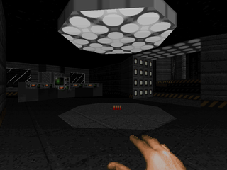 |
| MAP02 | Tower of Hell |
|---|
| by Adam Landefeld |
|---|
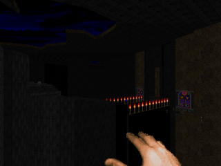 | A large, earthen level with some techbase bits. Lots of neat things here like the eponymous tower and its stained glass windows or the opening hellhole you begin in. I particularly like the mineshaft sequence. Other fun stuff includes exploiting player exploitations with the not-teleporter-traps in the northwestern section and to spice things up a small pack of revenants in a section with plenty of cover for them and you. The arcachnotrons rising from the muck is also another great moment in a nice level, as well as numerous glass panels, some of which are broken to allow ingress. Still fairly basic puzzle-solving, keeping things moving at a great pace. |
| Inter-Base | MAP03 |
|---|
| by Dietmar "Dia" Westerteicher |
|---|
| Nice, predominantly techbase map. Things get a little trickier puzzle-wise and you're forced to use some brainpower to solve some of the puzzles, though some like the red key can be simply brute forced. A few higher-order shootouts but the standout encounter here is probably the penultimate fight, vs. a Cyberdemon and a number of barons, with a nasty followup surprise. I also like the first shootout in the yellow key room, that is the one after you activate the switch. One of the cooler sequences has you reveal a grand pillared hall and then shut the columns down with your next move, but the most meaty series of encounters has you conquer three different wings in the base's north in the order of your choosing. | 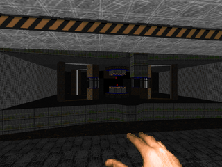 |
| MAP04 | Nucleus |
|---|
| by Sverre Kvernmo |
|---|
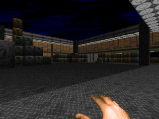 | Kvernmo busts into the mapset with a lovely warehouse / sewer map. Detailing is to the extreme, with an astounding amount of care and detail put into the warehouse section that dominates the north / center of the map. Crates are generally stacked in an orthogonal arrangement, though you'll see that some columns are slightly askew, giving a very shuffled appearance. The sewer portion winds around the warehouse with one main pipe going around and a nice bit to the very south, a side-segment where you climb into a pipe and investigate a different-looking section of the waste tunnels entirely, using cisterns as a motif. Of course, being a Kvernmo map, it's got a fair number of tricky encounters, with an emphasis on zombies. Of course, some bigger guns make an appearance, including a fair number of arch-viles and a novel Spiderdemon shootout with unstable cover and a time limit (your rad suit!). An excellent adventure. |
| Time Gate | MAP05 |
|---|
| by Sverre Kvernmo |
|---|
| A considerably shorter but no less attractive map, this one taking place around a facility housing the eponymous time gate. It's a bright gray structure around which is some turf, and around that a moat. It's a pretty laid-back opening as you grab your guns and ammo, taking care to dispatch the difficult to see imps on the outer edges. I especially dig those outer columns. The structure itself has some of the best visuals, and while there is some normal futuristic stuff enhanced with excellent lighting, what stands out in my mind are the gorgeous blue interiors of the security lock facility and the time gate itself. Also take care to note a hint on one of the terminals. There are four possible exits, two of which lead to literal dead ends, one in a post-apocalyptic aftermath, the other in the fires of creation. While the level feels less intense than MAP04, it's still got a few curveballs, especially a few teleport ambushes and the final encounter, a bout with two arch-viles. |  |
| MAP06 | Pathos |
|---|
| by Alex Mayberry |
|---|
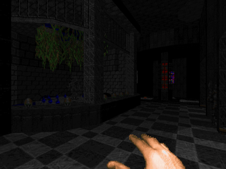 | A bit of an improvement over his previous entry. Pathos signals the shift from the present to the dark ages with a medieval romp through a demon-infested cloister. There's lots of great lighting and some neat vanilla hacks, including a swinging door and a deep water romp through an underground channel. The rest of the map is a series of monastery-like compounds built on the side of the mountain with three different vistas to remind you of the fact. There's no part I'm not fond of, though I particularly like the room that leads into the sewers and the one prior to the exit. Standout encounter is a high tower fight with an arch-vile and his private army that's facilitated by a very clever layout. |
| The Abbey | MAP07 |
|---|
| by Paul Schmitz |
|---|
| A natural extension of the medieval abbey theme from Schmitz, here. It's not as bafflingly intricate as the maps from his two trilogies, but it makes excellent use of the Heretic / Hexen textures to create quite the journey. Highlights include an eye-catching water pool in the center of the western area as well as a waterfall cascading down the cliffside that houses the red key, in addition to the abbey proper. Fighting is pretty sedate though Schmitz has a few neat encounters, including the penultimate room (riddled with chaingunners) as well as a hitscanner ambush in a courtyard that later houses a token Spiderdemon / Cyberdemon fight. My favorite moment, though, is when you're locked outside early on, having to fish the shotgun and some ammo out of a water pool. My big bottleneck: figuring out the skull switches in the eastern section of the abbey. I could just barely make out the Keen noises over the music and mistook them for a pistol sound addition I hadn't recognized before. Otherwise, an excellent offering. | 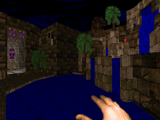 |
| MAP08 | Woodhead |
|---|
| by Dietmar "Dia" Westerteicher |
|---|
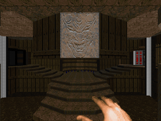 | Another excellent medieval building that emphasizes wooden textures. The main castle compound is pretty snazzy with excellent lighted hallways as well as a neat secret segment but the true stars in my mind are the two exquisite outdoor areas that, much like MAP07 before it, frame the starting area on either side. The northern section is a nice, though not difficult romp, while you get a nice shootout in the southern one. Westerteicher is great at economical use of his assets, throwing the same Cyberdemon at you on three separate occasions. The best and most difficult fight is the climax, a final showdown with your special friend, but you can use the opportunity to get some good infighting going on, which helps as he teleports everywhere, making him hard to get a bead on. |
| Forlorn Fortress | MAP09 |
|---|
| by Chris Couleur |
|---|
| Another great castle-style level. This one feels like the largest yet. There's some gorgeous architecture, particularly the symmetrical northern hall and the grand staircases in the southern dining area. Also no less than three grassy outdoor areas to spin things up, with plenty of fighting to be had. The map still feels a little empty, but most of the harder-edged fights are pretty sweet, and there was a bit of a surprise waiting for me at the map's very end. Couleur unfortunately uses a number of secrets as puzzle solutions. Most of them were fairly obvious (hit a dead end? Prolly a secret!), but the final switch to start the end sequence was particularly obtuse. Still very nice. | 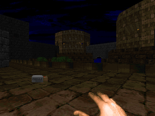 |
| MAP10 | Crimson Tide |
|---|
| by Kathy & David Bruni |
|---|
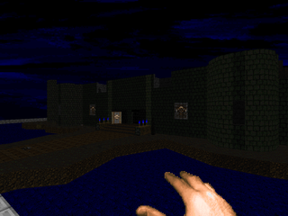 | This particular keep has a large moat that surrounds it and some nasty snipers in the towers. While not as lovingly detailed as some of the other maps, it still looks great due to the Eternal textures. Highlights include the cacodemon wave at the map's opening, the sensible cathedral complete with snipers in the balconies, and a "secret" that dumps you on the ramparts of the final battle making it a tad less dangerous to confront. While you'll do plenty of running between the particular key wings, the Brunis repopulate the castle foyer. I just wish they'd pick some more thrilling opposition... Also, the blue key is in a secret area. What gives? |
| Dawn of the Dead | MAP11 |
|---|
| by Chris Couleur |
|---|
| An enormous, nebulous construction with plenty of running and switch hitting to be had. The amount of secrets alone is pretty impressive. Most of the running around appears to be based off of two major courtyards, one of which houses a pretty conspicuous BFG, the other a number of goodies, including the yellow key. Generally you'll be darting to and fro, pressing buttons and monitoring the changes. Fighting is a little more intense, with some nastier monster packs, but none of the encounters really stand out except the final battle, between three Cyberdemons. The true test will be your puzzle-solving skills. I did like the vine-covered room, a bit of a departure from the immaculate castles presented so far. | 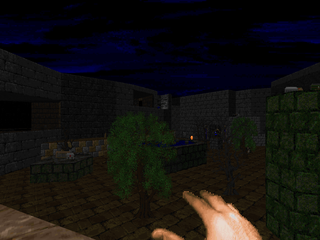 |
| MAP12 | Darkdome |
|---|
| by Sverre Kvernmo |
|---|
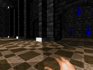 | A masterpiece to top off this chapter in the Eternal saga. The lighting is immaculate, with darkness, brightness, and shadows cast every which way. Absolute care was poured into every portion, from the docks you arrive at to the grand checkered hall that dominates the map's center, to the gorgeous east and west wings. It's a Kvernmo map, and he doesn't disappoint in difficulty. There are some nasty ambushes, like the trick floor by the blue key, some nasty arch-vile placement, and plenty of close-quarters encounters with toughs, not to mention the hitscanner assault at the map's onset. The encounter that had me sweating involved an arch-vile and four revenants emerging from some nasty flames... Puzzle-wise, it ranks among the toughest. Mark the location of all the yellow switches you see, because in order to grab the key, you'll have to go back and hit each one, thankfully livened up by some surprise encounters. Not to be missed. |
| Drop 'em! | MAP13 |
|---|
| by Dietmar "Dia" Westerteicher |
|---|
| The original release ends here, with Eternal Doom II picking up. This map is just a way to enforce a pistol start in the next segment, by way of one of three poisons. "The Bird" forces you to execute a simple arch-vile jump. The "Exploding Fist" has a Cyberdemon "punch" you into the exit segment. "Burning Feet" is just a simple dust-up with two revenants on some acid while you wait for the teleporter to descend. It's a nice way of starting things up without messing with Kvernmo's offering. | 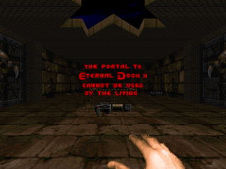 |
| MAP14 | Pistol Only |
|---|
| by Dietmar "Dia" Westerteicher |
|---|
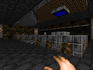 | This map lacks the pristine architecture of previous Eternal Doom maps while forcing the quirky gameplay of the Tyson style on the player. It's in kind of a castle style, emphasized by a very baroque score. At the very least, Westerteicher varies things a bit by showing that, while pistol and fist will be your only weapons for much of the map, they're not the only things you'll use to kill. Infighting, telefrags, barrel blasts, and crushers become part of the player's arsenal. Just watch your health when you're getting punchy as there isn't a lot between the oases. Standout encounter, probably the Cyberdemon fight, just for the sheer infighting spectacle. |
| Celebration of Evil | MAP15 |
|---|
| by Adam Landefeld |
|---|
| Landefeld's replacement for MAP15 takes the medieval theme in a bit of a surreal direction, with the opening area suspended in midair. The lighting stands among the best this WAD has to offer and the detailing is superb, especially usage of the hanging banners. I particularly liked the bit in the northeastern section of the main area. It's actually not that puzzle-dense, thankfully, with the main attraction just being a series of excellent encounters, like the arch-vile fight on the isle of fire, or what feels like a constant stream of cacodemons trickling into the map bounds. I also liked the very curious cathedral to the east and its eastern burning tree. And, uh, that's quite the surprise at the exit. | 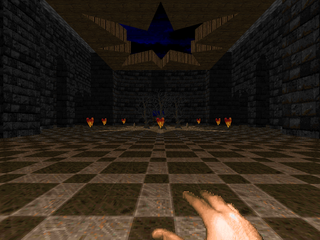 |
| MAP31 | Monster Mansion |
|---|
| by Jim Flynn |
|---|
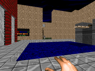 | Refreshingly, Jim Flynn's maps are still Jim Flynn maps. This particular iteration is a fairly realistic facsimile of a resort of some kind. The grounds have features like a fountain, garage, and mountain scenery, while the main building houses things like a den complete with manipulable TV, a security room, swimming pool, the works. Combat is mostly rough cramped quarters stuff excepting one major fight on the west side, a pretty cool long-distance shootout. Inside it's textbook Flynn, with complicated puzzles that slowly open up the map as you solve them. It's a good feeling when you figure out a solution, not unlike hearing the shell horn from La-Mulana. The bit with the TV is one of my personal favorites, but there's so much to see and do here, my blurb won't do it justice. |
| Halls of Disarray | MAP32 |
|---|
| by Matt Bollier |
|---|
| A fairly banal level for Eternal Doom, clad primarily in wood with some stone showing here and there. Most of the map takes place on raised walkways over fluids. It's also not that puzzle-centric. Most of the difficulty is in the encounters, which aren't tough, but set against a general lack of health and you'll have to be somewhat careful. There's a neat imp ambush for the unwary as well as a few not so dangerous arch-viles. Really, most of the memorable action in this level revolves around imps. Well, there's a nasty crossfire on your way to the blue key room, but you can sidestep it and take care of the lower area first, leaving the upper for later. Biggest issue is that the fairly long opening segment is entirely devoid of monsters. It didn't help build my suspense. | 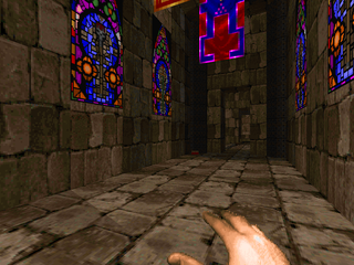 |
| MAP16 | Guardstation |
|---|
| by Adam Landefeld |
|---|
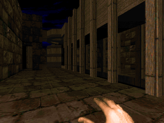 | An interesting diversion rife with fun architecture like columns and, most importantly, aquaducts. Other neat bits include a spiral staircase only slightly marred by the non-silent teleporter as well as megastructures like the northeastern amphitheater and the main hall around which the map is based. The monster fights aren't that tough, with a few surprise ambushes. Mainly what you'll feel is Landefeld's tight grip on health and armor, tempered with some secret knowledge. The only encounter that sticks out in my mind is the battle in the station's basement on account of its cramped quarters, but the total environment looks great. |
| The Crypt | MAP17 |
|---|
| by Dietmar "Dia" Westerteicher |
|---|
| Continuing in the vein of smaller offerings comes this mortuary-themed map with a small graveyard, crematorium, and chapel, the last of which has a very nice front. The intimate setting lends itself to some more tailored encounters, with a few potentially tricky arch-vile fights as well as a pretty simple Cyberdemon battle followed by an invulnerability-aided corridor clear. Some good uses of revenants, too, putting some pressure on the player. I like the more prevalent toughs; they help sell the action despite their small number. | 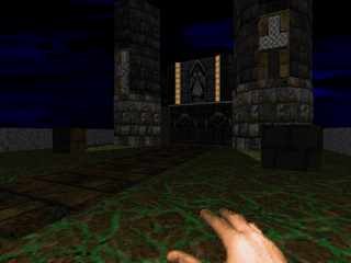 |
| MAP18 | Stands |
|---|
| by David Brachman |
|---|
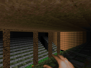 | Another short map that starts out in some sewers with a great passage reveal. It feels a little more punchy, similar to MAP17, with a lot of monster ambushes, particularly the one at the top of the spiral staircase in the northeast. Brachman uses some of the tech textures from "Time Gate", namely the computer panels, in a less than intuitive manner, but that's the only failing I can really give. The action in this level is very nice and there are a few tiny puzzles to solve, as well as a secret that lets you neuter a trap up close and personal. |
| Warheroes | MAP19 |
|---|
| by Chris Couleur |
|---|
| Another gorgeous, dense brick and mortar map, with a lot of running about and a constant trickling in of enemies, mostly cacos, imps, hell knights and revenants. It's dominated by water in the center of the map, whose navigation is key in order to solve the level. Most of my favorite encounters happen in the southern section, particularly the successive arch-vile battles by the red key and the whole southwestern section, where you have to take out enemies on islands at a distance, as well as a Cyberdemon bridge guardian to gain access to said islands once you feel it's safe to proceed. The action isn't that intense, but Couleur keeps things constantly busy, so the areas you backtrack through rarely feel deserted. | 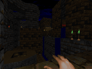 |
| MAP20 | Silures |
|---|
| by Bob Evans |
|---|
 | Evans busts into Eternal Doom with a fusion of metal and classical fantasy architecture that's as dense as it is packed with monsters. It can be frustrating for a variety of reasons. All of the higher-end firepower (super shotgun, rocket launcher, plasma rifle) are tucked away in secrets. The SSG and RL are part of the same branch early on in the level, so if you're feeling outgunned, take a step back and thoroughly plumb your explored locations for better weaponry. It's also up to Jim Flynn levels of puzzle-solving, so if you don't see anything obvious, start activating things you wouldn't ordinarily think of as being switches. There are a lot of optional areas to explore. Finally, this map has two exits, an early easy one and a harder one which on UV requires an AV jump somewhere down the line. Standout encounters for me are the red key cacodemon / mancubus ambush and the rocket launcher room. |
| Fire and Stone | MAP21 |
|---|
| by Adam Landefeld |
|---|
| Again, a little bit of a breather from Landfeld (welcome after the last few adventures). More of his large architecture and outdoor areas, with a nice cathedral and some great use of the burning fire texture. Some neat sequences here, like the arachnotrons in space shootout or the cathedral floor that erupts around you, forcing you into a tight fight with another arach. The most memorable section, though, is an outdoor area with arch-vile torches. After you get blasted up onto the outer wall you have to extinguish each torch one by one by entering the dead recesses. I also feel I should note the fire fountain that closes out the level. | 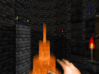 |
| MAP22 | The Seeker |
|---|
| by Chris Couleur |
|---|
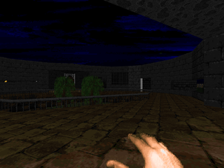 | Absolutely massive castle-style map, clearly divided by the author into two major sections. The first involves virtually all of the map's puzzle-solving, and a whole mess of fights as well as secrets, including a very memorable trek through the map's outdoor section that makes up the southwestern area. Actually, there are a lot of nice-looking open-air segments. The puzzles are all fairly straightforward this time, too. The big change of pace occurs upon crossing through the yellow key doors. Couleur has built a massive, square-shaped arena with grand architecture worthy of Hell Revealed, and while the exterior fighting may not look the part (monster use is fairly light considering its size), the inner section has plenty going for it, including four Cyberdemons split between two tiers. Very fun. |
| Time Gate 2 | MAP23 |
|---|
| by Dietmar "Dia" Westerteicher |
|---|
| An amusing and short sequel to Kvernmo's original where the "Time Gate" is the focus of the map and not its ending gimmick. The main structure that houses the gate looks very nice and has a fairly obvious secret sequence; one might think that Westerteicher was just too proud of his caco heaven fight to let it just slide on by. He does a good job repopulating the base for when you return from the other two areas. The first is a small but pleasant stony romp in some kind of volcanic crater, its highlight encounter an instance of monster crossfire in the large, circular room. The second is set in the ruins of the future, where you have to conquer four demon-infested buildings, including a spiderdemon visible from the onset. And, of course, the super secret caco heaven, which while fairly simple and easy is some good mindless fun. |  |
| MAP24 | Rainbow Bridge |
|---|
| by Chris Couleur |
|---|
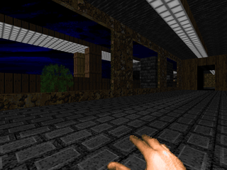 | A mastodonic semi-medieval contribution that feels more like a ruined cityscape. This map has two distinct sides, the west and the east. The west involves the glut of the map's puzzle-solving including a particularly dense building with plenty of lifts and switches to navigate. There's also a memorable shootout where you crawl along a bridge while monsters from all the desiccated buildings fire upon you. The eastern battle has shades of his MAP22 finale except with a little less action. Most of it's based around a central outdoor area surrounded by a raised bridge where you'll have plenty of monsters to kill (and more keep wandering in from other parts of the map). My favorite part has a building collapse into flames before your very eyes, lending to its post-apocalyptic landscape. |
| Beginner's End | MAP25 |
|---|
| by Jim Flynn |
|---|
| Another modern-style Flynn masterpiece, this one set in a labyrinthine bank complex. The puzzles are comparable, with some great bits like the Diablo defense system or the northwestern room with its pillars and security code. The overall flow is quite different, however. Flynn exercises much more control over player movement, sealing off bank wings by doors, with movement only becoming transparent once you've reached the end segment. Fighting is also a bit more cramped than "Monster Mansion", as the level takes place almost entirely indoors, and the sections that aren't usually have plenty of obstacles to contend with. Some great moments to be had here, like the burning cage with the Unknown Doomer or the potential ghost caco trap as well as the vault itself or the final erupting construction that delivers you to the exit. Favorite encounter, I dunno. I think the main bank offices to the south are pretty keen. |  |
| MAP26 | No Parking |
|---|
| by Jim Flynn |
|---|
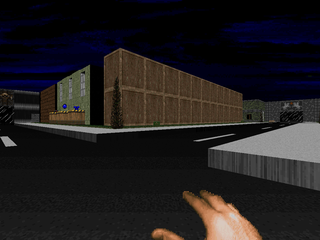 | Flynn's final offering in Eternal Doom's standard set is another puzzle-laden modern map, this one with a downtown-ish layout. As with his previous levels, it's quite dense. The main city block is populated with plenty of opposition, not to mention the northwestern and eastern segments, with a memorable arch-vile battle and clever Cyberdemon puzzle, respectively, the second with a little bit of blockmap trickery. Besides the city block and massive eastern library complex (well, library-ish), there's a large canyon to the southwest complete with campgrounds and a list of rules (which you have to break to even get in!). Your main goal is to get into the four arachnotron nooks located in the street center to hit the four switches, but it won't be easy. It's possible in several places to mess up irretrievably, one of them being the "rocket armor test" room. Be on the lookout of well-camouflaged switches in the canyon section. All in all, it's a very fun (and tricky) map, worthy of Eternal Doom. |
| Paldorian | MAP27 |
|---|
| by David Brachman |
|---|
| Brachman bangs out another map with a fusion of futuristic and medieval sensibilities. It's a fair shake larger than his previous level, "Stands", and has many more puzzles as well as some pretty hairy situations. The opening room, for instance, houses a number of pressing encounters, including several hordes of demons with low ammo as well as the final battle, a congested baron / hell knight hunt with a number of short pillars serving as obstacles. Among the features I found most memorable were the yellow key puzzle (neatly orchestrated) and the southwestern section with the tiered corridor loops / sewer fight. It's a very cool map, a bit more consistent than "Stands", and managed to keep its manic energy up throughout the entire journey. | 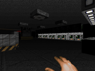 |
| MAP28 | Timeslip |
|---|
| by Paul Schmitz |
|---|
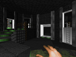 | Schmitz counters his earlier, gorgeous medieval offering with an absolute masterpiece of a futuristic base (with some more organic bits). While the map seems daunting at first glance, it has a very specific flow, with the player beginning in the northeast section and then sweeping his or her way clockwise deactivating forcefields to facilitate better movement. Architecture and lighting are top-notch and help paint it as a very believable location. Difficulty is fairly punchy despite its low monster count through use of dangerous beasties in cramped corridors (namely the revenant). Puzzles, however, are very straightforward. I'll hold the "secret" Cyberdemon fight as my favorite encounter (fairly dangerous) while my favorite areas include the creepy southwestern basement-type halls as well as the portions surrounding the two main computer cores to the north and south. I believe that "Timeslip" rivals the best of the maps Eternal Doom has to offer. |
| Dominion | MAP29 |
|---|
| by Chris Couleur |
|---|
| Couleur's final entry is another megacastle much in the style of MAP22 or 24. There's a nice central hub, where enemies are re-seeded along with some handy supplies, and three major wings to the north, south and west. Each of the wings must be conquered and explored in sequence, earning the key to the next. Despite all the baddies, the three hundred or so monsters seem pretty spread out most of the time, with plenty of space to maneuver, but you'll have your fill of revenants, cacos and even arch-viles. None of the big bads, though. Each of the wings looks and plays pretty great, with the western one being my favorite with its puzzle sequence and excellent second-tier reveal. Also of note are, of course, some grand outdoor vistas, including a burning tower which a number of cacos pour out of. | 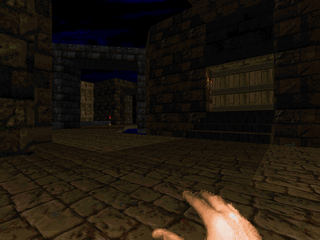 |
| MAP30 | Excalibur |
|---|
| by Bob Evans |
|---|
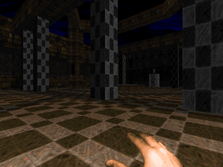 | An incredibly expansive castle map to finish out the set, and as difficult to solve as Evans's "Silures". Actually, it's harder, requiring you to find six keys in order to exit to the final battle. The castle grounds feature a variety of scenarios and examples of Evans's imagination, and while the map isn't packed tight with bodies, what's still kicking around are among the tougher monsters Doom has to offer, including two Cyberdemons. Most of these puzzles kicked my ass. I managed to find everything up to the yellow keycard solution on my own, but I threw in the towel around there, and that's after two and a half hours. One particular neat gimmick has Evans sending arch-viles back into the main hall when using the keys. Thankfully, you're not lacking for health. Medikits may be in short supply but there are plenty of megaspheres to be had. Just sit down, take your time, and if all else fails, look the solution up. |
And, hey, here are the two bonus offerings. You can run
CSWEEPER and the
CREDITS wad outside of the shell as MAP01 replacements, but the former has much of its functionality stripped out when played alone.
| Cybersweeper | MAP01 |
|---|
| by Jim Flynn |
|---|
| Because Jim Flynn is such a stud, he included this little gem. It's Minesweeper, of course, but with Cyberdemons instead of mines. You just walk up to each square and hit spacebar, removing the square and telling you how many Cyberdemons are nearby. The Cyberdemons are confined to a 6 x 6 grid, with the number changing depending on the difficulty picked in the Eternal Doom shell, though there's another layer surrounding it that gives you your beginning hints. When played outside of the shell, I believe the map only has eight, the number allotted for skill 1. When you've isolated all the Cybs, you pop in a teleporter and telefrag them all. Even classier, Flynn included a utility that randomizes the placements (RANCY.EXE), giving it virtually unlimited replay value. Very cool. | 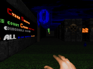 |
| MAP01 | Credits |
|---|
| by Dietmar "Dia" Westerteicher and Ty Halderman |
|---|
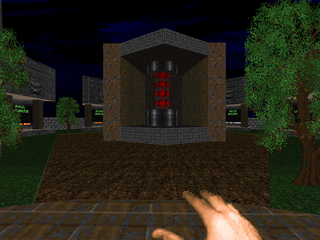 | Just a short little credits map with monuments to most of Eternal Doom's authors utilizing those scrolling textures. The second hall is a nice reveal, with a tribute to the "God of Doom". You can probably guess who that is. |
CONGRATULATIONS!
YOU MADE IT TO THE END OF THE REVIEW




I was looking forward to reading your review of Eternal Doom. Certainly the most epic megawad I've ever played. Good job. ~valkiriforce
ReplyDeleteThanks! It was both a treat and a chore to play, but I'm grateful to the authors for the experience.
ReplyDeleteGreat review, but a little correction/info is needed.
ReplyDeleteThe credits level isn´t by Jim, but was created by me.
And some info about Team Eternal joining TNT. This happened shortly after the release of EDII, wich was probably the last time ever something creative happened on compuserve. :)
And also you should mention the great score by Rich *Weeds* Nagel. He has earned the praise. :)
Thanks in advance
dia
(Dietmar Westerteicher)
Glad for some clarification (and the reminder for Nagel's work). Thanks for the comments and your excellent maps!
DeleteI wonder if you are going to review Eternal Doom IV. I think technically it's a demo, but as far as I know it's never going to be finished, so might as well consider it a "complete" work.
ReplyDeleteyes, but if i showed you the list of stuff I intended to review, you may realize that such a statement on my part means very little.
DeleteCan you believe the cruel trick dobu played to get this wad to the DWMC? Get my hopes up for a brand new megawad that doesn't exist. How cowardly!
ReplyDeleteif memento mori iii was in production, i probably would have heard about it
DeleteI just want a new surprise 90s style megawad by lots of authors I recognize now.
DeleteIt doesn't have to be called Memento Mori 3 (or III).
Eternal is classic, even if it's not for everyone. I continue to be amazed at how awesome some of these maps look for levels made between 1995 (earliest ones - Eternal I) and 1997 (latest ones - Eternal III). In particular I think Sverre, Chris Couleur, Paul Schmitz, and Bob Evans managed to create what are arguably the best-looking levels among all pwads released through 1997. Even their own solo work (excluding Chris Couleur since he has none) doesn't have this standard of aesthetic, IMO!
ReplyDeleteGameplay is an acquired taste, but if you're willing to look solutions up, then thankfully there's just about enough on the Wiki to iron out those frustrating bits (puzzle wise).
Eternal is a two-pronged battle between the monsters and the level's sector machinery, both plied against the player. Many will have issue with the latter, but the community is all the richer for its existence.
DeleteIt probably inspired other wads in some way that ultimately are more 'acommodating' on level progression regards, I only wish there were more maps made specifically with the Eternal resource package and same type of atmosphere (including music as that's another 'definite' high point of the wad IMO).
DeleteWatching the DWMC thread as well, I don't see the hate for Silures by so many; it was fair for me combat-wise even without the SSG or RL (both secrets). And I hardly found the blue key exit that 'cryptic' to find, the hardest thing is the dead tree switch IMO - otherwise, I could see most people managing to stumble upon it (with the key).
ReplyDeleteit requires a very different mindset as a player and some people will not engage, and that's their right. no one is required to enjoy Eternal Doom, and Eternal Doom is not required to cater to... most notions of playability
DeleteI'm just saying in Silures, the only required part of the progression I had to do anything even that could even be considered close to 'cheating' to figure out was the dead tree switch, and then I spanked myself for not noticing it sticking out like a sore thumb against the rest of the trees in the Plasma Gun courtyard. (For the blue key exit route.) On that topic the other exit would've made a good Map15 (or 31) IMO, if only this wad had secret levels.
DeleteBob Evans does also make it into my top four ED authors, with Couleur, Sverre, and Schmtiz being the other three. The biggest strength they all share is aesthetic - they know how to make levels that stick to their theme while consistently looking much better than you might expect from maps made in 1997 or even earlier. Even misaligned textures can be hard to come by with these guys - impressive!
yeah, these guys pretty much made Eternal Doom for me, not to denigrate Landefeld, Dietmar, and the others. Dietmar actually has some really cool sector machinery going, and while Jim Flynn was doing bang-on theme maps, Dietmar feels like he's channeling Flynn's earlier, abstract levels in spots like "Inter-Base". When I eventually get off my duff I'm going to love walking through Eternal Doom again, taking some gorgeous, higher-res screenshots without the Doom marine hand.
DeleteI kind of should give Jim Flynn an explicit honorable mention, his maps obviously took a TON of effort to build and for sure, they have their impressive parts. Still they can at times rival Bob Evans for complexity and the aesthetic isn't quite as 'clean' IMO as Couleur, Sverre, Evans, and Schmitz. Also they are pretty heavily themed maps that can depart pretty significantly from the rest of Eternal, aside from sharing some textures.
Deletea megawad of theme maps a la flynn's eternal doom levels would easily make my top 10 wads of all time
DeleteVery true, I'd just like to see a bit more consistently clean aesthetic compared to Flynn maps (certainly wouldn't be too much to ask in 2016!) and just a bit less emphasis on puzzles, at least overall. But there's certainly authors among my 'top four' I've previously mentioned who I'd also have wished to see solo work from that is at least on par with their ED work. (Sverre's CABAL and Master Levels can't hold a candle against his 3 maps here, for instance.) I need to actually try and play Schmitz' Artifact: Boom Edition (honestly I don't understand why even bother with the original Artifact). Odessa series might be comparable, though just by the dates I'm guessing those maps were designed before Silures and Excalibur. As for Couleur, well, he doesn't even have any work in any wads not under an 'Eternal Doom' name...(but he does have work outside this wad, hint, hint)
Delete"(honestly I don't understand why even bother with the original Artifact)"
Deletegiven everything i saw between the original artifact and the boom version, there are at the very least some large differences in their aesthetic feels, such that a person that might be put off by psychedelic pwad visuals might do well to stick with the original... but, the Doom II version isn't even the original, as iirc schmitz first made Artifact for the original doom.
also, kvernmo recently released a level (Plasmaplant) as well as a few in the 5 rooms of Doom megawad. presumably they aren't up to your snuff.
the Odessa maps are all pre-eternal, except for odessa_14. odessa_7 was the last Evans level before Eternal Doom. Silures started out as an odessa level, probably odessa_15 on account of its secret exit.
Actually I forgot about Sverre's maps to be honest. I need to give Plasmaplant a go, I'm hoping I can put up with its puzzles that look to be a bit more devious than his three Eternal maps. But it looks cool, regardless.
DeleteThe Boom/Return version of Artifact looks to have much 'cleaner' visuals to me, closer to those of Schmitz' Eternal maps, but with stock textures still mixed in. The original version (both Doom and Doom II) has relatively primitive aesthetics with misalignments and such. That combined with the maps themselves have been expanded upon, I don't see what's the point in sticking with the non-Boom Artifiact, unless you just like simpler stuff.
I've always wondered if Odessa 14 was REALLY designed after Silures and Excalibur, despite it having a 1998 time-stamp. It's the only Odessa map that even might be later, though.
Silures' red key exit would've made a great secret exit, IMO, if it had been in a wad with a secret level.
"I don't see what's the point in sticking with the non-Boom Artifiact, unless you just like simpler stuff."
Deleteding ding ding ding ding
i would look at the Boom versions of the artifact levels like an author's remix of his own material, just like John Anderson moving from the original iteration of Dante's Gate to his final Doom II release. it doesn't invalidate the appeal of anything that came before, in spite of being perceived as an "update". not all updates have universal appeal; some of my favorite visuals from Phobos Massacre were removed for Oblivion. i would never call either release "definitive", because i do not believe that all doom authors are gradually moving toward some sort of platonic form of the level they are envisioning. ARTIFACT is as much a reflection of Paul Schmitz circa '95 as the Return-oriented versions are a product of Paul from '99. i would rather have both in hand than sweep one aside under a misguided notion of progress.
bob evans may not have BEGUN odessa_14 after eternal doom, but he definitely finished it AFTER. my actual impression is that all of the maps existed in one form or another in 1995, but saw refinement and release over the next three years, with the unreleased entries not meeting his standards for one reason or another. i think that in some cases he just could not do what he wanted to do in vanilla doom II and gave up.
I don't think that's true for all the Odessa maps, as the time stamp on the wad file is March 1, 1996 for Odessa 7 and earlier than that for all other released maps in the first 13. So only Odessa 14 looks like it was 'tuned up', if it indeed was started prior. Silures must have been made in 1996 perhaps finished in early 1997 (Eternal Doom II, which is where it first appeared, has a released of January 31, 1997), while Excalibur probably was made in 1997.
Delete(FWIW the first, 12-level, release of Eternal was on August 1, 1996, making it all the more impressive IMO when you consider it contains all three of Sverre's maps, which rank among the best in the wad.)
uh, i don't think you get what i was trying to say, but i just realized i'm arguing with you when you've done the bare amount of research, so this whole exchange is predicated on your perception of your knowledge, derived from WAD timestamps, as being absolute. the .TXT of ODESSA_X states that "This wad is one of 17 levels of a large wad not uploaded yet "LORDDOOM.WAD"." he also says "In LORDDOOM.WAD this is level 8." given that at least four of the levels were never uploaded, depending on whether you count ODESSA_X as ODESSA_1 or ODESSA_8, and that the levels were all timestamped and thus uploaded to Compuserve in an irregular order, and based on some comments he made when he was briefly with us in 2014, it's clear that Evans had the whole thing in one form or another back when ODESSA_X was published and then polished off stuff until he was comfortable releasing it, with a large break between ODESSA_7 and ODESSA14, probably because he was hanging out with Team Eternal. another note in the .TXT that you might find interesting - "The setting is somewhat medieval/modern. I do have a keen interest in castles and I think it is reflected in my wads."
Deletebut here is what you ought to read. no, the odessa levels are not comparable to his eternal doom releases, with the exception of odessa14. odessa_7 points the way toward the intricacies of "Silures" and "Excalibur", but it is clear that he hit something of a watershed moment while working on ETERNAL that he brought with him when finishing up odessa14.
I can see the Eternal 'magesty' starting to show up in Odessa 7 and carrying forward somewhat in Odessa 14, but I'm still not sure if I'd include Odessa 14 in his best two maps or leave both those slots for his Eternal Doom work. Odessa 14 would definitely be in the top three though (and Odessa 7 likely fourth).
DeleteAs the main producer of Eternal II I hope I can clear up some of the odessa stuff. Silures WAS surely planned and startet as an Odessa Level. When we got Bob to join the team he already had finished the main layout.
DeleteWe planned to include two of his levels, but at this time he really was even more of an perfectionist than we were. We got the first version of Silures about four weeks before the initial release of Episode II and our playtester had a really hard time with it (obviously). :)
The second level planned for ED would finally become Odessa 14 and Excalibur was a complete new work (and so his only level exclusively made for ED).
As Sverre before him he got hired professionally after ED and so wasn´t available anymore for further projects. It would have been so great to have both of them for Daedalus or the never finished Eternal Doom IV.
Speaking of EDIV - I finally finished my level which was planned for this release after more than 15 years - so if anyone is interested:
https://drive.google.com/open?id=1iUXYNFAXOWCLGFXUMTcjQvRKFWHZn4f-
Thank you for the info! I'm looking forward to seeing what you've done in INVIS10.
DeleteThis is a hardest WAD I've ever played, and I didn't really enjoyed it. Puzzles are just too hard. A real turn off for me. BAD puzzles design. Architecture of most levels is great though.
ReplyDeleteunfortunately the puzzle language of vanilla Doom (and Doom II) is so basic that it all boils down to switches and sector machinery, such that some people opine that authors shouldn't attempt puzzle play at all unless it comes with a litany of custom resources that enhance and disguise the true nature of your labor. contrast with something like Star Wars: Chibi Rebellion, where some segments - like the tower of hanoi puzzle - have more of a 7th guest approach. i think there's room for both in doom, though the former will inevitably appeal to the minority; that is, players like me. 7th guest doom does sound pretty cool. "the 7th marine", anyone?
Delete"The Las7 Marine" MAKE IT HAPPEN
Delete