The
1994 Tune-up Community Project started with a simple concept. The general opinion of WADs from
Doom's earliest era is not glowing; most 1994 maps are considered crude by today's standards. The disparity in appearance and playability is attributable to any number of sources, but Doomworld forum superstar
Snarboo presented an interesting idea for a project, assisted along by GreyGhost and
Travers Dunne. Rather than bitch about how awful '94 WADs are, why not take the ones authors released free to modify and renovate them? The target was limit-removing and Boom-compatible, freeing mappers from the dreaded visplane specter and allowing for a limited number of "advanced" features. The only caveat was to avoid rendering the layouts of the original maps unrecognizable, though contributors were free to make their own additions, provided they not increase the map's size by more than 100%. As a general rule.
As could be expected, there is no story to the overall collection, though many of the maps have little narratives in their original .TXTs (included along with the original WADs in the total package). Map styles progress about as can be expected, with smaller, easier levels in the beginning and larger, more difficult levels toward the end. The secret maps are everything that should occupy those slots. The overall appearance of the works tend toward techbase, which I can only assume is a byproduct of '94-'95 sensibilities. You will see some more exotic locales, though, including underground dungeons, city blocks, and fortresses of various materials. There are things here worth seeing...and at least one thing you'll wish you could unsee.
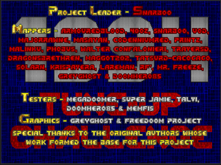
To be honest, I played none of these maps in their original incarnations. Glancing at map comparisons (available
here), I can say that the amount of changes in each level varies greatly. Aesthetically, they're much improved from their counterparts, as a glance at the intermission screenshots can attest. This isn't necessarily a result of an overdose of filigrees, though. Some authors use lighting to make their maps quite breathtaking, and sometimes a simple re-texturing job does wonders. I couldn't tell how much Boom pervades these works. I noticed some instances of voodoo doll scripting (very nice!) and translucent walls as well as deep water, and maybe a scattered few instances of motion floors.
As far as action goes, you have your work cut out for you. Few of these maps are slaughters, tending toward more traditional, even OG Doom gameplay. You'll find yourself making good use of the shotgun and chaingun, sometimes to the effect that it kills the pacing of of some maps if you're more into the run and gun style. Players who prefer to battle against overwhelming odds will be right at home, however. It's kind of like carrying Doom's style of pressure to Doom II's larger bestiary. Of course, if you're playing the maps with carryovers, you'll hardly notice this detail. The pistol starts have carefully crafted for each level, especially works like "Return to Ultima" and "The Nightmare". I sometimes (often) whine about having to shotgun mancubuses and arachnotrons (and the occasional baron) but I'm conscious that it's a clash of gameplay styles. Not every map reflects the feel of Doom 1.5, and I must confess that the SSG is just an incredibly comfortable weapon for me.
1994TU is pretty good. It underwent some criticism due to its design goals, especially when the expanded features were added to the mix. Personally, 2011 was a year focused mainly on vanilla-compatible projects (though I admit that seven of the Cacoward winners require a source port of some kind).
Doom Core, a megaWAD by Valkiriforce, was pared down from Boom to vanilla. It's nice to see an effort that went in the opposite direction - achieving balance, if you will. I don't think
1994TU has to compare to its base material. The participants each took a raw idea and made it the core of their own work. Perhaps it's a bit disingenuous to call it a tune-up in some places, but I hardly see any of these authors slam-dunking these maps in the faces of their originators, whatever the text of the README may imply. If you want some excellent looking
Doom II maps with some added frills, or are at all interested in what map concepts from '94 might (emphasis MIGHT) look like today, look no further.


1994 TUNE-UP
COMMUNITY PROJECT
by assorted authors
| Bitter-Sweet | MAP01 |
|---|
| by James Bearden, ed. "Mr. Freeze" and "Krispavera" |
|---|
| Very short brown techbase with a couple of rough patches. It's got a spiral structure that has you start at the center and work your way around until you teleport back to the beginning. Then the level opens up and you think you're gonna flip a switch and reveal something. Nope; teleport to an outdoor section. Lighting is very nice and most of the detailing seems to be chunks taken out of the walls. The red cable is particularly eye-catching, but the main attraction is when things get weird at the end of the spiral. Standout encounter is the fight with a revenant and two chaingunners which forces both cover use and mobility. | 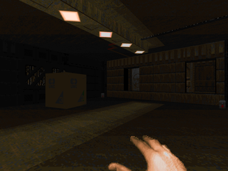 |
| MAP02 | Taredone |
|---|
| by Brad "Bilbo" Spencer, ed. Chris "Codennium Red" Oliveri |
|---|
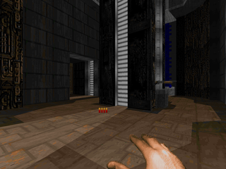 | Fun and fast blue techbase that's pretty linear but with nonstop action. It's mostly lightweight monsters, dispatching the various zombimen and imps with the shotgun. The cacodemon reveal in the circular room with pulsing veins on the ceiling was a nice touch, and the slightly non-rad suit section left just a hint of environmental danger. My standout encounter was the penultimate fight with two pain elementals; enough of a shock to startle you but enough breathing room to react in a non-embarrassing manner. Detailing was very nice; the lighting especially caught my eye. |
| Hyper-Vyper | MAP03 |
|---|
| by Shane aka "Ash", ed. Travers Dunne |
|---|
| A short but challenging (and awesome) techbase with some cool bits like the main room area with its grated walls and the toxic piping, not to mention the lights. Among the tougher encounters is the chainsaw section, which puts you between a rock and several hard places, especially if you head there first off (low ammo). There's also a wave of monsters triggered when opening access to the yellow key. You'll have to handle enemies on two fronts, so take care. My favorite segment, though, puts you on the "roof" of the building, lowering a soul sphere which is then accessible on the ground floor after jumping down some duct work. | 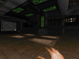 |
| MAP04 | Hades House of Horrors – Part 1 |
|---|
| by Robert Zubek, ed. "Mr. Freeze" |
|---|
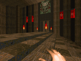 | Partly a more organic affair with wood and stone and dense tangled roots, with a bizarre modern interjection complete with a helipad. It's got horrors, particularly the yellow key room and the ground floor entrance, a grisly mausoleum worthy of Bluebeard. It's a bit of a tense situation as you're fighting shotgunners in the dark. My standout encounter is a pretty simple fight with a baron complicated by the damage blood floor at your back. If you don't find the hidden SSG (pretty easy, actually) then you'll be further distressed by an arms restriction. Pretty fun, if a little schizoid. |
| BSC01 | MAP05 |
|---|
| by Brian and Craig Sparks, ed. "Masayan" |
|---|
| Very fun and challenging techbase with a bit of toxic flair. The opening wakes up a number of monsters that pile out of the entrance like a clown car. You can dart in and grab the shotgun for some extra insurance or restrain yourself to pistol and chainsaw action. The eastern and western wings have some neat fights, like the imp crossfire right outside the blue key door and the revenants and chaingunners patrolling the outer area. The action heats up when beyond the blue door, where you quickly acquire (through secrets) the plasma rifle and SSG, which make the arachnotrons and barons more entertaining. The final fight stands out the most, however, as it's an arch-vile sitting behind three toughs. A little dirty, but nothing you're not equipped to handle. | 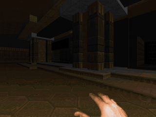 |
| MAP06 | Hades House of Horrors – Part 2 |
|---|
| by Robert Zubek, ed. "Lareman" |
|---|
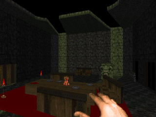 | The sequel reflects Zubeck's eccentricities as much as MAP04, except the predominantly wood theme has been ditched for brick and mortar (and a marble dinner chamber). Lareman's chief aesthetic addition is the use of transparent walls to put an unhealthy sheen over the more gruesome details as well as add some glass to other areas. There's also some of that hexagonal tiling that crops up so much. The only encounter that really stands out in my mind is the one in the rocket launcher room, which has some cool walkway raising effects. It's not demanding but puts a little pressure on you. Amusingly, there's another section (similar to MAP04) where you're trapped between a baron and a difficult spot. The only real negative is the cloud of cacos at the end which are pretty boring to clear out. |
| Dead Temple | MAP07 |
|---|
| by Steven Doornbos, ed. Travers Dunne |
|---|
| This is a gorgeous marble temple with a great leadup, grabbing a few weapons while the bodies of various humanoids litter the way to the teleporter. The fights are a series of difficult, staged "Dead Simple"-ish encounters. The first is a mancubus crossfire with a crowd of cacodemons storming in from the outside. You have to punch through one of the packs quick to grab another weapon to fight the fatsos off with greater efficiency. Afterward is an arachnotron fight with your back to the wall and a number of barons and hell knights infiltrating the ground level to make your life even more complicated. The final fight is a good kicker, not too tough but can catch you off-guard. Dunne's touch-ups in lighting and detailing are superb, and some of the special effects (like the teleporters) are to die for. Great stuff! | 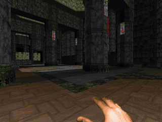 |
| MAP08 | Helipad |
|---|
| by Sean R. Malloy, ed. "Snarboo" |
|---|
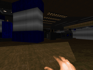 | Very fun techbase map with lots of low-tier baddies to kill. You start on the eponymous helipad and then fight your way through the structure, grabbing keys in order to open the exit door, near the level’s beginning. Detailing is neat without being obnoxious, with particular restraint given to the hexagonal tiles. My personal standout encounter is the yellow key room, which is swarming with monsters you’ll have to carefully pick off as you wind your way through the clutter. Other dangerous bits include the major toxic room (kind of dangerous with the chaingunner crossfire and imps in the chutes) and the blue key trap, which reveals a wall of beasties. I also dig those cool secrets. |
| Bug Hunt! | MAP09 |
|---|
| by Daniel Griffiths, ed. "GreyGhost", Sebastian "DoomHero85" Graham, and Travers Dunne |
|---|
| This is a huge, complex techbase with plenty of outdoor space filled with nukage and mountains that kind of plays like the original Doom with a few Doom II additions. It’s a bit of a key hunt but you’re open to approach the map from a variety of angles. It’s mostly low-tier monsters with pockets of cacodemons along with a few more memorable encounters, like the Spiderdemon gamble or the big showdown when you lower the shutters near the end of the map, not to mention the finale, a cramped and dangerous battle with monsters teleporting in to several locations. You can beat a retreat as long as you’re comfortable with facing an entire horde with an arch-vile at the back. The most annoying enemies are of course the snipers spread out everywhere, especially in a map as wide-open as this one. It’s a great adventure, though. Also – love that briefing theatre. | 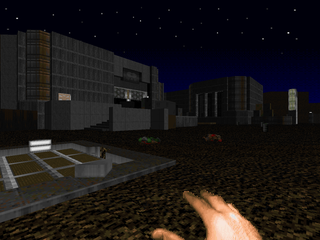 |
| MAP10 | Melange v2 |
|---|
| by Kenneth S. Forte, ed. "maggot202" |
|---|
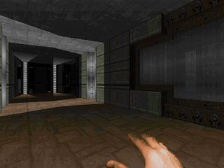 | Here’s a techbase map that starts out looking normal but quickly gives way to demonic corruption as walls tumble revealing architectural intrusions from Hell. Combat is kind of boring, tending toward taking down cacodemons and hell knights with the shotgun. Well, sometimes you get rude surprises, like entire hordes of monsters teleporting to your location at once. I just wish maggot had seen fit to drop some stronger arms in here somewhere, if only for the final fight, which has two cacodemons and a baron in a fairly open area. That’s a lot of single shotty time. Otherwise, it’s a very cool and somewhat creepy level, with my standout encounter being the rad suit enhanced battle vs. a ton of imps and a hell knight. |
| Elements | MAP11 |
|---|
| by Henry Chang, ed. Christopher "ArmouredBlood" Shepherd |
|---|
| Maintains and, perhaps, enhances Chang’s original division of three elements. To win, you’ll have to pass through dark earth, bright fire, and the relatively unassuming water. The addition of Metroid’s Norfair track helps to drive home the map’s emphasis on exploration, drawing some curious parallels to the famous platformer. You’ll have to find the rocket launcher and plasma rifle behind secrets, and there are a number of soul spheres and armor sets packed away like energy tanks. Combat is a little dangerous near the beginning with all the monster closets in the "earth" section. Things quiet down afterward except for ArmouredBlood’s love of letting revenants loose right next to you. Pretty cool stuff (and I dig that odd line texture in the SSG area). | 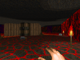 |
| MAP12 | Rawnwood |
|---|
| by David Damerell, ed. "MajorRawne" and Travers Dunne |
|---|
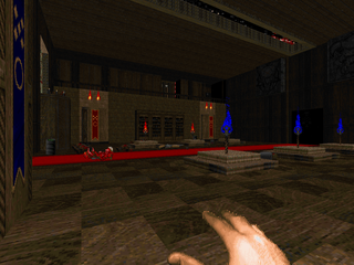 | This collaboration is a predominantly wooden fortress with a marble maze-like annex. Things start off in a library where opposite rows of mancubuses fire down on you from upper walkways and things rarely let up with various hordes of monsters appearing, including three pain elementals in the same cramped area (not that dangerous). It’s loaded with clever and not so clever secrets, though my least favorite bit is probably clearing the revenants out of the blue key balcony. My favorite sequence is the northwestern library, which puts lost souls to devious use. A cool little excursion. |
| The Unwilling | MAP13 |
|---|
| by William Leslie, ed. Travers Dunne |
|---|
| Dunne does another Hell of a renovation job, giving us a brick and metal offering that is absolutely loaded with tough ambushes and fights. The whole red key sequence is a series of pushing forward, getting locked into a new area, and having to clear out a host of invaders, time after time. The blue key wing isn’t much different, except maybe a little more dangerous (or not, depending on how spritely you are). Then, finally, the outdoor section, which has two great free-for-all fights, the first with its swarming and varied demonic brethren offering plenty of opportunities to get the monsters killing each other. My only complaint is that combat tends to drag as you’re stuck with no better than the shotgun / chaingun for most of the level, which makes bits like the barons by the blue key pretty tedious to take down (though I suppose if you can figure out how to get to and use the invulnerability, you could hit them like the fist of God provided you also found the berserk pack). Other than that, awesome stuff. |  |
| MAP14 | COMCON2 |
|---|
| by Patrick Hipps, ed. "maggot202" |
|---|
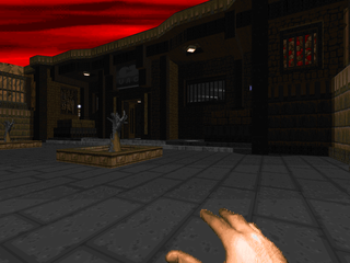 | Similar to Melange in aesthetics, but "COMCON2" is much larger and non-linear. maggot's use of Boom trickery has him teleporting health and ammo into ambush rooms, a sneaky design decision that obscures many of the traps. And there are a lot of them, either monster closets or teleport waves. The action’s all pretty good, except for what is beginning to be a common complaint, the lack of the SSG (though there’s a plasma rifle available for latter portions and, indeed, a rocket launcher). Then again, a combat shotgun would be ideal for this very intimate environment. Most of maggot’s other special effects echo his aesthetics in MAP10, especially the use of translucent walls. Also, I found a secret switch that let me hear an arch-vile die without even seeing him. Excellent! Only the final fight stands out in my mind, mainly because of its very apparent danger. |
| Cratebase | MAP15 |
|---|
| by Brandon Reinhart and Geoff Allan, ed. Travers Dunne |
|---|
| Another very large techbase with, you guessed it, a ton of crates. Gameplay is basically Doom plus chaingunners and hell knights. Among its delights are satanic static screens, a cool door puzzle, a very boring spiderdemon fight (though it has a phenomenal intro) followed by a more thrilling wave of monsters, and lots of nice elevators. The secret exit sequence in particular is very nice, involving a tense darkened tunnel hunt for several mancubuses before flipping the switch that unleashes Hell. It lets loose packs of enemies in several places; to avoid being overwhelmed, you’ll want to clear to a strategically located plasma rifle and then fry them all. It’s my favorite fight in the whole map, though the normal exit wing and its lowered pit fight is a close second. | 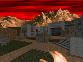 |
| MAP31 | Original Sin |
|---|
| by Jeff Bird, ed. Travers Dunne |
|---|
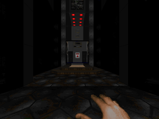 | Hahaha. Okay, Dunne starts you off back at the end of E1M8 with a ton of chaingun and shotgun ammo. You walk into the teleporter...and are immediately teleported into the slaughter room of E1M8, except this scenario plays out a little differently. You have two rooms to clear out, with the second being a bit more dangerous with the inclusion of some nasty hardbodies. If you’re intelligent, though, you might find a few juicy secrets to make your job much easier. All things considered, this was an excellent way to turn ORIGWAD into something most everyone can enjoy. Actually, I’ll go so far as to say this was the best way. |
| Cyberpie | MAP32 |
|---|
| by James Ojaste, ed. Walter "Daimon" Confalonieri |
|---|
| Confalonieri gives us a ridiculously fun arcade-style level chock full of Cyberdemons, barons, and a few things that aren’t meant to be crushed or telefragged. It starts out on a giant helipad surrounded by cargo, then quickly gets goofy. It’s more of a puzzle map as few of the Cyberdemons pose any challenge. Among the more memorable sections I’ll count a sewer bit where you telefrag a ton of Cybers, turning on the switches behind them in sequence, which raises the water level in sections. Another is a maze with Cybers in cages as you run around trying to flip the switches to lower the teleporter pad (and crush the demons) before your invulnerability runs out. And, well, there’s a bit of silliness with a Cyber in the honeymoon suite. Good stuff. | 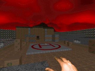 |
| MAP16 | Infinity Plus |
|---|
| by Darrell "FRODO5" Bircsak, ed. Andrew "Malinku" Rehberger and James "Phobus" Cresswell |
|---|
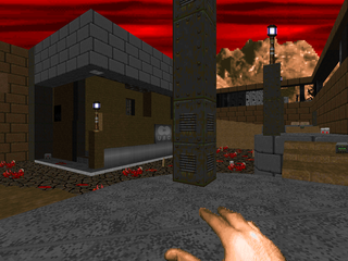 | An interesting nonlinear techbase with two completely optional keys. Aesthetically it’s a mash-up of different ideas and areas, similar to Polygon Base (but a bit smaller). Similarly, the combat isn’t that intense, excepting a few spots, like the wave of monsters in the infinity room or the bit when the walls lower in the northeastern annex. My favorite encounter is the Cyberdemon fight, which throws a lot of other monsters at you as well. I smirked at the ‘94 / ‘11 centerpiece. Also, that bit in the Hell cave right before the exit was a nice easy shock. |
| Tunnels | MAP17 |
|---|
| by Dominique Lavergne, ed. Jon "40oz" Vail |
|---|
| The quintessential corridor shooter rendered in a mixture of techbase and sewer. 40oz makes this map pretty fun in spite of its mazy layout. It’s a series of similar tunnels connecting a number of larger, more diverse chambers. Most of the action is by shotgun and chaingun, and for the most part, that’s all you’ll need to conquer the single-file Hellspawn. Later on you get the rocket launcher and SSG (and, as a secret, the plasma rifle). Among my favorite encounters I’ll number the rocket launcher room (infighting ahoy!) and the red key ambush. For having 500+ monsters, it doesn’t really feel like it, which is a good thing. There was one particular detail I enjoyed, the use of a translucent texture to create nukage flowing over a wall. | 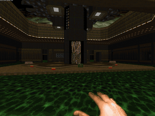 |
| MAP18 | Subway Redux |
|---|
| by Neal Ziring, ed. "UOD" |
|---|
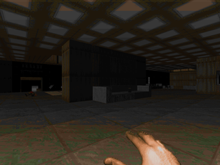 | It’s a huuuuuuuge subway line. It’s got a few stations, but you can divide it into two main areas. The first is the main station, liberally infested with zombimen and imps and is quite dangerous at the onset. It has the actual subway car. The western area has the meat of the gameplay, wrapped up in a few cargo stations (crates ahoy!) and a large, dangerous sewer excursion which has the most challenging fights. Make sure you fully explore the areas or you’ll be down a secret rocket launcher and plasma rifle, both of which aren’t strictly necessary but which will make your life much easier (particularly that red key trap). The finale is pretty good, throwing you into the outer yard with lots of snipers and ground troopers, with a Cyberdemon guarding the entrance that you can’t risk getting too close to. |
| Undersea | MAP19 |
|---|
| by Brian Plumb, ed. "Dragonsbrethren" |
|---|
| Another techbase that’s succumbing to demonic influence. Except, this one is (mostly) underwater! Dragonsbrethren uses translucent windows to get the level’s point across as well as Boom’s transfer sky property to set an additional sky for the sojourns to green marble Hell. It’s a little tough with some tricky traps (beware the crusher!) and cool segments like the retread through the first leg of the level, where a maze erupts from the ground in the starting room and everything up to the blue key door has been repopulated. Not sure what I’d call the standout fight. The maze is pretty good but the yellow key trip is a pretty neat fight as well, with hell knights acting as turrets. | 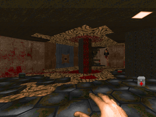 |
| MAP20 | Outland |
|---|
| by Russell Gruber, ed. Tatsuya "Tatsurd-cacocaco" Ito |
|---|
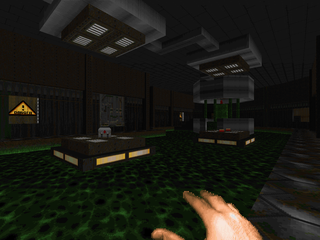 | This is a cool semi-sewer map with a green marble finisher. While it’s fairly linear in its flow, its map space is used a bit more cleverly, with nice details like a secret facilitating speedy access to the red door after acquiring its key. The fight is a mix between careful crowd control and sniper handling, leaning toward the latter in some rooms like the shooting gallery behind the red key door, which is fairly obnoxious to deal with but has both armor and health stashed nearby for those who catch more than their fair share of bullets. The detailing keeps your eyes busy without cluttering up the place. Favorite encounter for me happens just after grabbing the rocket launcher in the marble annex. Very fun. |
| Return to Ultima | MAP21 |
|---|
| by Jon "Chaff" Charlson, ed. Jon "40oz" Vail |
|---|
| Vail’s workover of Charlson’s Ultima 1 is a pretty fucking good answer to the question, "What if Doom were more like a dungeon crawl?" Supplies are not strewn haphazardly around the map; if you want the rocket launcher, or the SSG, then you must fight your way to their locations in Ultima’s Underworld and wrest them from the demonspawn yourself. It’s a remarkable approximation within the confines of Doom’s engine. Due to this fact, of course, there aren’t a great many memorable fights as they resemble more the incidental trash you’d encounter in such a setting. The battle I had that stuck out the most may have been purely incidental while I was exploring the river that cuts the map in twain; something involving a pocket of hitscanners, suppression fire from a revenant and imps, and a rogue pain elemental mucking everything up. It’s a great adventure, though. | 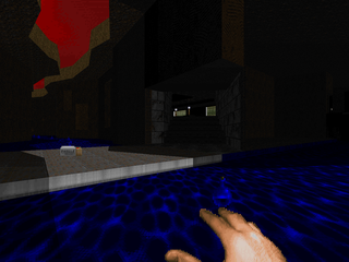 |
| MAP22 | Retour en le Nefarious Chateau |
|---|
| by Denver J. Curtis, ed. Walter "Daimon" Confalonieri |
|---|
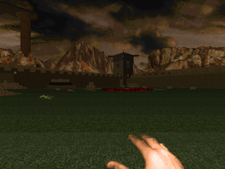 | A fantastically weird but memorable fortress map. It’s very big, but most of that size can be attributed to the countryside surrounding the Chateau, which includes a village and a lake. There are several challenging fights, like the courtyard overseen by an arch-vile or the surprise attack in the throne room. Managing the whole courtyard area is my favorite segment, especially when the heavy hitters are introduced. Thankfully, there’s a teleporter that leads to an underground Hell (and a rocket launcher) you can take if you get overwhelmed. The fortress itself is loaded down with nooks and crannies; there’s plenty to find here for the diligent secret hunter. Perhaps my favorite vista is the center room with its ruined bridge and skylights shining down into the poisonous water, but there are at least a few other things (some secret) that look very nice. |
| BCS03 | MAP23 |
|---|
| by Brian and Craig Sparks, ed. Tatsuya "Tatsurd-cacocaco" Ito and "Solarn" |
|---|
| Things take a turn to full-blown Hell with this tough and unrelenting map. In the opening moments you’re treated to a ring of barrels blocking an outer ring of barons. Other deathtraps include the caged cacodemon fight and, after a long tunnel trek, the highlight of the level, a massive circular structure in a lake of blood with precarious cobblestones to balance on. Clearing the outer area is already tricky as it’s wide open and you’ll meet a pack of cacos and pain elementals. Grabbing the yellow key, though, kicks things into high gear for a battle royale you’ll want to save a few choice powerups for. It’s crammed full of eye candy, with creepy details like the peering eye through the wall stones or the cools backdrop in the southeastern hallway. | 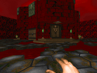 |
| MAP24 | Fortified Castle |
|---|
| by Dominic Lavergne, ed. "Krispavera" |
|---|
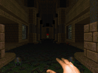 | A Hell fortress map with a lot of really cool architecture, like the graves and mausoleums, or the giant spiral staircase to the northeast, or the blood drainage to the northwest. Also plenty of outdoor areas. It’s also a bit of a toughie. From your first shot fired until you hit the exit switch you’ll be harassed by a number of enemies. One of the highlight fights pits you against an arch-vile, a pack of revenants, and a squadron of imps in between. The northern spiral staircase yard is also a pretty good romp, dodging arachnotron fire until you grab the plasma rifle (of course, you’ll have to deal with an arch-vile and his guardians). Plus, a level that starts off with the SSG and rocket launcher? Sign me up! |
| Fort Borg | MAP25 |
|---|
| by John C. Boyle, ed. Christopher "ArmouredBlood" Shepherd |
|---|
| While Shepherd’s revision of Elements was a fun little adventure, this is the kind of action I expect to see when I sit down to a map with Shepherd’s name on it. "Fort Borg" is a demon-infested fortress, a fusion of cobblestone tunnels, techbase chambers, and brick and mortar courtyards. There’s even a classy outdoor marble area where the majority of the slaughtering takes place – and it will be a slaughter. You’re keyed into this fact after mowing down a horde of zombimen when stepping on the teleporter drops you square in front of a BFG. You’ll return to this area to end the map, too, with a showdown involving a ton of heavier monsters, including a Cyberdemon. As far as the rest of the map goes, it’s dark and dangerous, with one humorous element involving the red key guardian. | 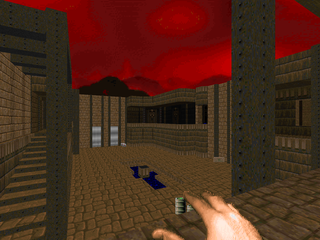 |
| MAP26 | A Beautiful Day in the Neighborhood? |
|---|
| by Grant Monroe, ed. "Printz" |
|---|
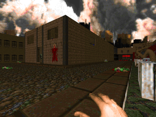 | Starts out kind of looking like a city block infested with the usual Hellspawn. Then the street floods with blood, and as you explore the map, the question mark in the title becomes apparent as the very ground cracks open (in a cool touch, a fissure opens in the central house leading you directly to the red key door). It’s a very tough map due to its open nature. You’ll be running for cover virtually every time you return to the main section due to ritual invasion from cacodemons, demons, and other unsavory things. It’s a very neat experience, and quite deceptive. The way Printz gradually transforms the map from ‘94 to a Stygian pit is remarkable. |
| WetWorkD2 | MAP27 |
|---|
| by Wayne "Zen Psychosis" Conner, ed. "rf`" |
|---|
| This is a massive, gorgeous techbase with a solid heart of Hell. It’s got a lot of grand architecture that catches the eye, like the main slaughter room to the northeast with its giant stairway to nowhere. The map’s turning point arrives upon acquiring the blue key. You’ll encounter a slightly tricky ambush before encountering the red-rock and organic structures of the southern area. Action is excellent with monsters lurking around every corner and a few nasty surprises, which you should only expect after acquiring the BFG. The teleporter room that leads you around to the yellow key wing is another nasty moment if tackled with little planning. The main slaughter fight isn’t quite as imposing as intended; most of its participants can be taken care of with little or no harm to the player, with only a Cyberdemon to mop up. | 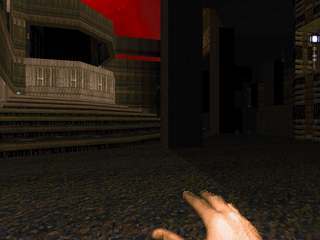 |
| MAP28 | The Nightmare |
|---|
| by "VT Ice", ed. "Masayan" |
|---|
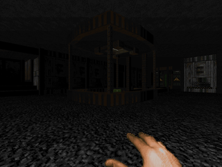 | Truly a nightmare. This is a puzzle map where enemy interactions with weapons are your cipher. If you’ve been carrying over gear and ammo in sequence, you’ll have a ball blasting the hordes of imps and other beasties to pieces with your hard-earned gear. Otherwise, prepare to be conserving ammo via infighting and perfect BFG alignment. You’ll also want to find pretty much every secret you can as well. I foresee two trouble spots in particular. There’s a grey granite room loaded with monsters and revenants in the wings. The only way I could bypass it without suffering arch-vile attrition was to rush the bastard with the BFG and let infighting take the rest out. The other bit, heh, is the finale. Don’t say I didn’t warn you. |
| The Castle Invaded by Hell | MAP29 |
|---|
| by Richard Dignall, ed. Tatsuya "Tatsurd-cacocaco" Ito |
|---|
| It's exactly what it says on the tin, a castle that's been overtaken by demons. You get to the Hell part shortly after acquiring the red key; it makes up the other half of the map. I'm always a fan of Ito's style of detail, which usually involves putting gorgeous architecture beyond the player's reach, like that setup just northeast of the slaughter room or the room where the switch that reveals the blue key is found. Gameplay is great fun, focusing on difficult encounters with tons of demons in the more open rooms. You'll find carefully arranged hordes behind every door, with one of my favorite encounters being the '94 tribute room, where you're introduced to several waves of enemies in a nice, open environment with some nasty overhead. A more ridiculous encounter comes in the final leg, though rounding up a ton of revenant rockets and luring them into a Spiderdemon is strangely edifying. Great stuff! | 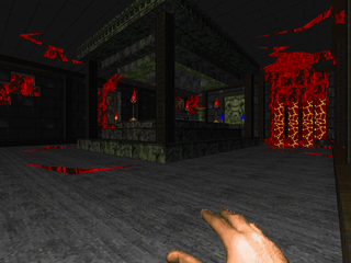 |
| MAP30 | Pure Evil |
|---|
| by Doug Ryerson, ed. Walter "Daimon" Confalonieri and Travers Dunne |
|---|
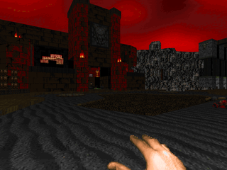 | Welcome to Hell! This map is loaded down with ammo and powerups and health because, well, you will be constantly under siege by demons from a multitude of boss shooters. Confalonieri has rigged up an impressive series of Boom features to keep monsters from perpetually telefragging each other which makes this even more dangerous. You will have to fight your way through constantly regenerating hordes while clearing the map as normal, finding keys through level segments and flipping switches until you arrive at the main showdown, two Cyberdemons at their Hellish thrones. Word to the wise – Romero doesn't appear this map. Blow the terrible two away and the portal to freedom will spring open. Thankfully, a number of tricky shortcuts are available for you to skip past your enemies once you've hit your objectives. Perhaps my favorite bit has you choose between a megasphere, invulnerability artifact, and BFG 9000. Though why settle if you have an arch-vile hanging around... This is simply diabolical. I love it! |
GENTLEMEN, WE CAN REBUILD HIM.
WE HAVE THE TECHNOLOGY.



This is one of those things where my opinion differs from what appears to be the majority. I'd rather see people draw up original maps from scratch that have a classic feel to them rather than try to update old maps I'm already familiar with. But then, what do I know? They say I've never created anything original anyway.
ReplyDeleteI dunno how many people are familiar with the oldstuff retooled here apart from veterans. The only WAD that was even on my radar was Neal Ziring's "Subway" as I had played his "Elements" minisode. Well, that and ORIGWAD. Not to take away from the authors who provided the original plans, who I've listed alongside the project contributors.
ReplyDeleteherculine, stop bitching! your opinion is different than other people so please keep for your own!!! maybe you can't read but that's why the wad is called "1994 Tune-Up" because takes maps from 1994 and "fixes" them so they are not buggy anymore. if this bothers you, play the existing megawads which are unique style.
ReplyDeleteoh regarding this wad, i'm enjoying it. i'm currently at level 6.
Nicely done on the remakes. My level 09 looks sweet and you cant just teleport to the exit now (single player was always an afterthought for me).
ReplyDeleteThe newer ports definitely give more headroom to the use of double sided linedefs then back in the day! By Doom 1.666 you could get some complexity going i guess (see thepit for my attempt at 'realistic' shadows :P) but the before/after comparisons show I lacked the creativity to create cohesive enviroments like these. I was going for the "wow, im outside, this is amazing" look after too long cramped indoors on Wolfenstein :P
Anyways, hats off to you guys for the blast from the past :)
Daniel
I think the review of map 12 is scandalous, as it should at least have been eight sentences longer, maybe with TWO pictures, and it should open with "Major Rawne - the man, the marvel - has done it again. Or would have, if this wasn't his first map."
ReplyDeleteHeh, this project was a pleasure and a pain to work on, especially when I was Losered for backseat modding and lost access to any help. (Bloodshedder, or some secret guardian angel, granted me the permanent ability to view and post in the Losers forum afterwards, but revoked it several years later, probably after some shitposting from me.)
I was a complete noob to mapping and it took something like 2 years to finish Rawnwood, although of course I wasn't working on the map for most of that time! I kind of feel responsible for the megawad winning Mordeth. I'm pretty sure Panophobia, which I've been delaying for ages due to the complexity of the maps versus my limited skill, will win my second consecutive Mordeth.
That said, I'm extremely proud of Rawnwood. The items were supposed to be hidden beneath the barrels so when you blew them up the item was revealed. I appear to have cocked that up something chronic, but it always worked perfectly on my computer before I submitted the map for revision. I loved how the bland original architecture reveals a horrid, Hell-dimension aesthetic. I thought the library, the crusher room, the Hell Knight blood temple and the upstairs corridors with the night sky view were the best areas of the map, even though I lacked the skill to create a convincing exterior view through the corridor windows. Also, the preponderance of candles and burning/glowing objects at the beginning are supposed to be my trademark. You'll see what I mean when Panophobia gets released.
- Major Rawne