DICKIE03
by Richard Wiles
by Richard Wiles
DICKIE03 is – you guessed it - the third map in Richard Wiles's critically-acclaimed DICKIE series, a collection in ten parts. This particular level occupies the MAP03 slot of Doom II, designed for vanilla. The plot of the maps isn't really touched on between the first and last outings. In DICKIE01, you dropped onto a planet apropos of nothing and managed to eliminate the source of a demonic infestation by killing the boss straightaway. The following levels track your journey across (and through) the planet to oust all the insurgents until it is cleansed.
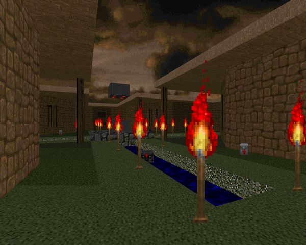
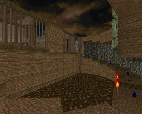
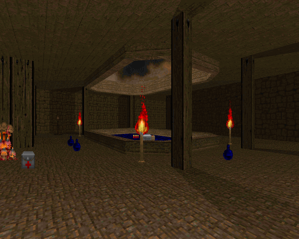
Keeping with Wiles's intent to vary the map themes, DICKIE03 is a classic beige brick and green grass map that reminds me of the iconic Plutonia look. While the layout may look open at first glance, you'll quickly find it fairly linear, with the exception of the blue key doors, which allow you to take the western wing of the map from the direction of your choice. You'll get the red, blue and yellow keys in that order. The architecture is pretty good, with a few subtle texture alignment issues. The use of contrast lighting in the main corridor looks very nice, and I love the construction of the eastern wing.
Combat is a little different for a Wiles map, and not too hard. You start out doing some zerker punching and have to pull the lower guns off of their holders' corpses. I like that adventurous souls can grab the SSG and then run back to efficiently clean out the hell knights. You'll have a few sneaky revenants to contend with and some potentially troubling arch-viles, but the fights are fairly conservative with the exception of the final battle, which puts you in an arachnotron crossfire with a few monsters on the ground to run interference. The most difficult fight for me was the yellow key trap, and that's only because I was attempting to save a nearby secret in case of emergency.
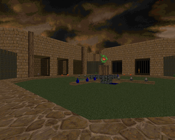
Going back to that final area, it's a good-looking open arena, certainly more navigable than the blue key section. The shadows cast by the columns are a fine example of spartan detailing. On the whole, DICKIE03 is a good play and a great entry in the series, certainly worth the effort if you're looking for more Doom II maps to blast through. With his commitment to vary the look of each map, the aesthetics avoid looking stale, keeping gameplay fresh. Wiles is shaping up to be a fast learner in the realm of map-making and I'm sure that the next seven maps will only showcase his developing talent.

This post is part of a series on
Richard Wiles's DICKIE series
Richard Wiles's DICKIE series
| DICKIE01 | DICKIE02 | DICKIE03 | DICKIE04 |
| DICKIE05 | DICKIE06 | DICKIE07 | DICKIE08 |
| DICKIE09 | DICKIE10 |

No comments:
Post a Comment