STAR TREK: VOYAGER
ANTITHESIS
by Christian Hansen
ANTITHESIS
by Christian Hansen
Chris Hansen is part of a talented stable of authors who got their start in 1998 and kicked around through the early '00s; he continues to walk among us, releasing maps pretty much every year since his debut. This one is, uh, a lot of things. After cranking out a couple of maps using the Plutonia IWAD, Chris decided to employ Evilution and spruce up one of his earlier releases, A Time to Face Your Fears. The result is Antithesis, a MAP13 replacement for TNT: Evilution. The title is apt on a variety of levels; TNT versus Plutonia, long title versus short, old map versus new, and fanfic versus no fic.
Both VOYAGE1 and its predecessor are tributes to Star Trek: Voyager, employing some of its architecture. The first had a little bit of a story to go along with it, but Chris begs off any sort of prose with this one, instead deferring to the talents of the show's actual writers when it comes to establishing the scene. In any case, it's clear that the starship has been invaded by the monsters we love to kill, and the original goal - to escape rather than secure - is in place since you still leave via the teleporter. I will note that Chris starts you off in the security cabinet that used to be a handy secret in the original. Here, it makes for a slightly less linear jumping-off point.
VOYAGER was a relatively static experience. The progression, while not absolutely linear, lacked a sense of exploration, and while the visuals definitely reflected the geometry of the subject, the overall impression was static. VOYAGE1 takes strides toward the former by starting you deeper in the ship, off the med-bay, and giving you an optional goal behind the red key card door, which I assume is Astrometrics. If you can oust the arch-vile that guards it, you'll have a plasma gun to take to the finale. The fights are basically the same as before, featuring copious hitscanners and the occasional pain elemental, but you've got a different direction from which you approach them. There was a revenant in Engineering. It's gone, now. The other new section of the ship is based on Seven-of-Nine's digs, which you'll have to pass through in order to reach the shuttle bay.
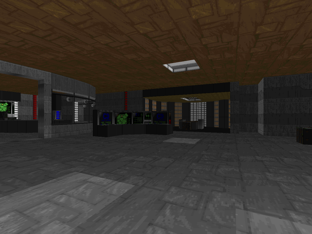
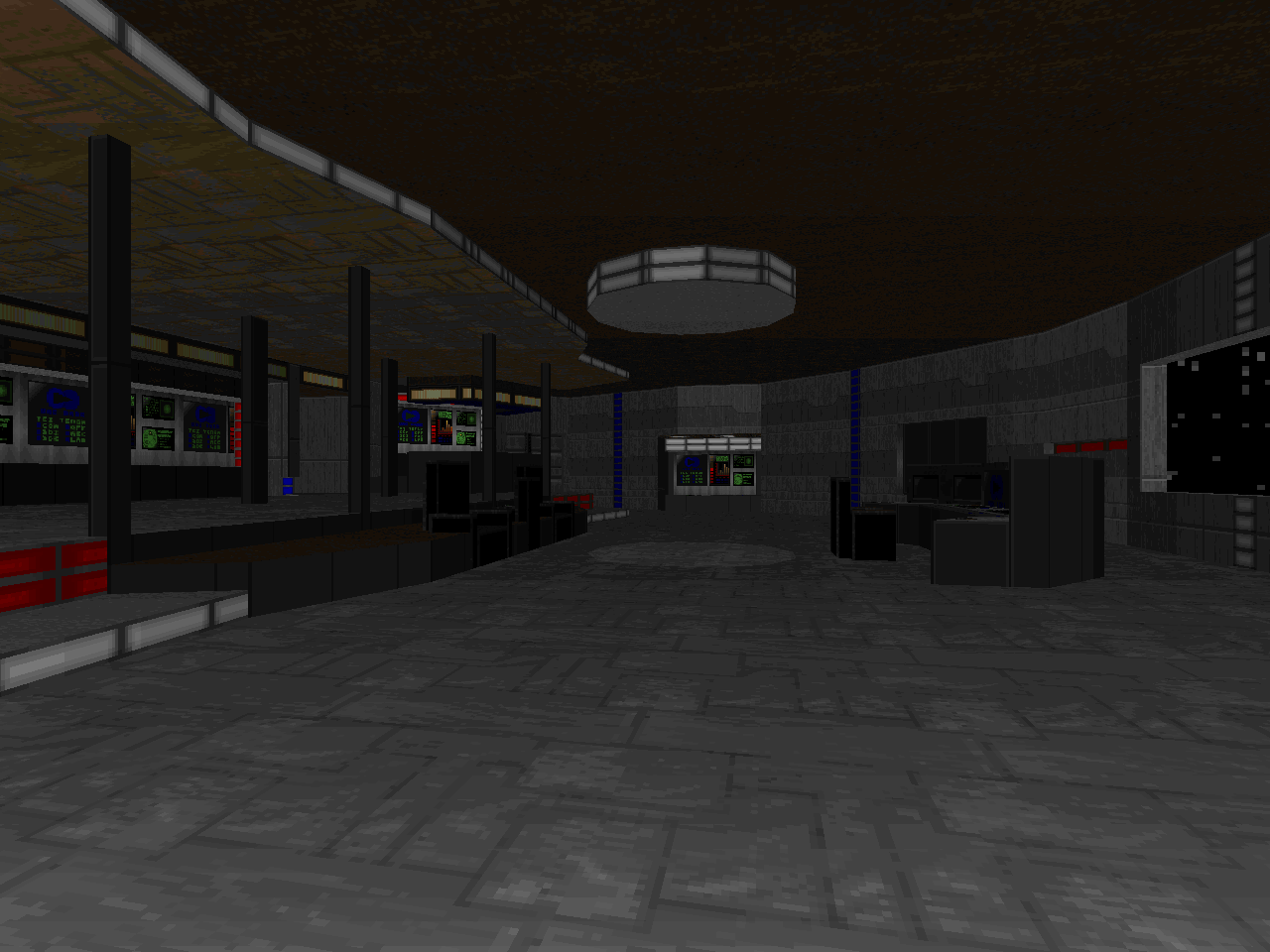
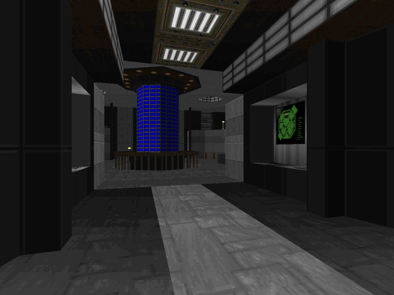
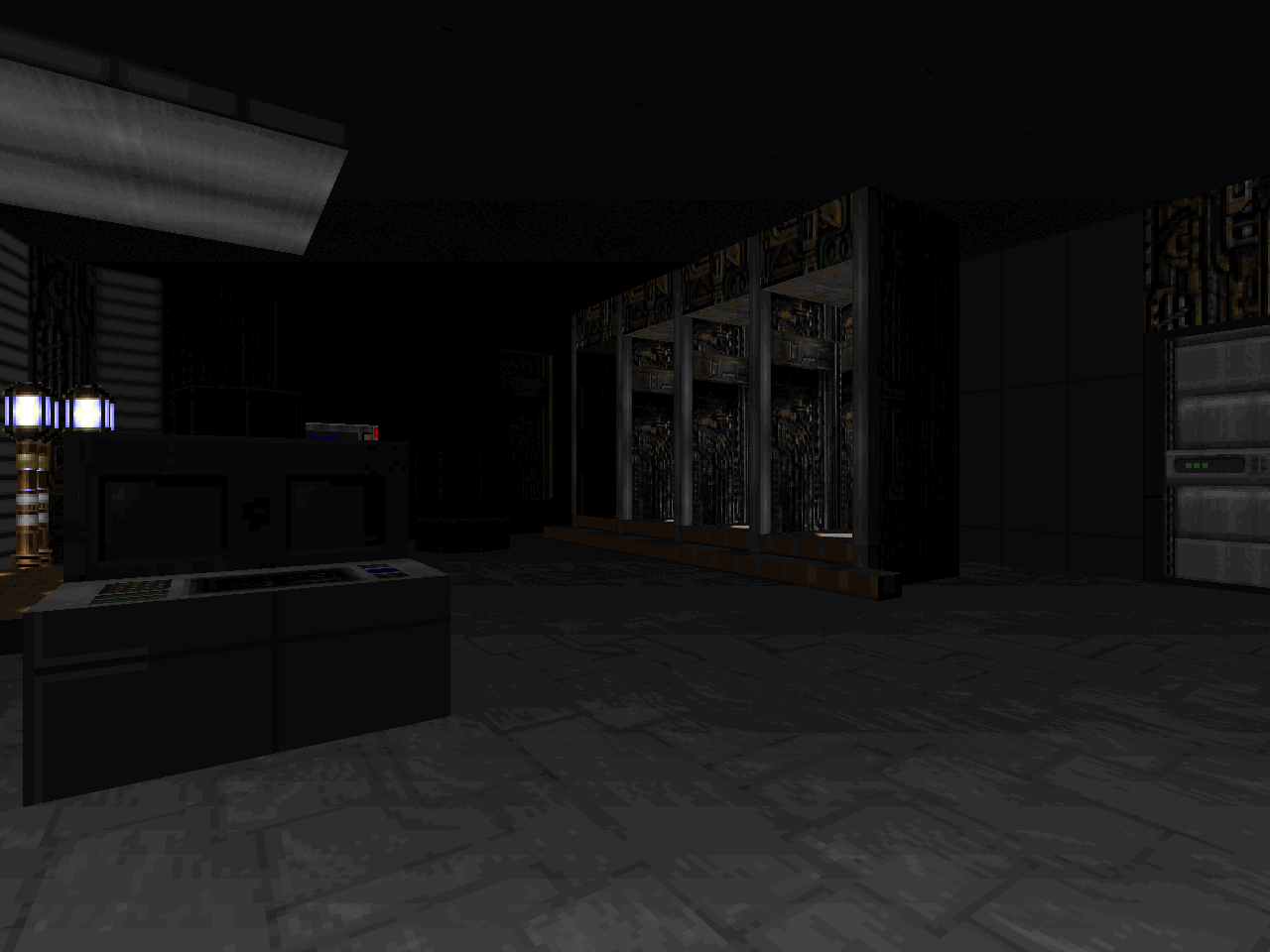
Visuals received a HUGE update with the remake in the most important fashion - dynamic lighting. The atmosphere of the ship is vastly improved over A Time to Face Your Fears, and it's nice to have the UAC window panes from TNT, especially in places like the Sickbay. I really can't stress how important all the dynamic lighting is to setting the scene, elevating the level from a toy set to something more immersive, even if a lot of the lighting is just blinking RED ALERT bullshit. There are a few other subtle touches I appreciate, like the warning light in the shuttle bay, the railing around the warp core, and the Egyptian artifacts in the captain's ready room.
I think that VOYAGER works well enough on its own, but it's really cool to see the souped-up Antithesis to go along with it. It's a powerful before / after effect and, as I mentioned, there are hardly enough starship levels in Doom as it is. Thanks for going back and retooling this one, Chris. I'm looking forward to the next.

TO BOLDLY MAP
WHERE CHRIS HANSEN HAS MAPPED BEFORE
WHERE CHRIS HANSEN HAS MAPPED BEFORE
No comments:
Post a Comment