Obituary is
The Innocent Crew's third and final single-player PWAD bearing their name before they would go on to helm some of the most recognized community megaWADs to this day. It's
Doom II, and 17 levels (MAP01-16 plus MAP31, though there are some deathmatch-only extras). Released in 1995, it's also one of the earliest original megaWADs, certainly of those of any appreciable quality. Thomas and Denis Möller declined to add any semblance of story to this map pack; it's basically random levels for
Doom II, with an added emphasis on co-op play. It would be great to fight that badass cobra-goat-demon thing on the titlepic, but, spoiler: you don't.
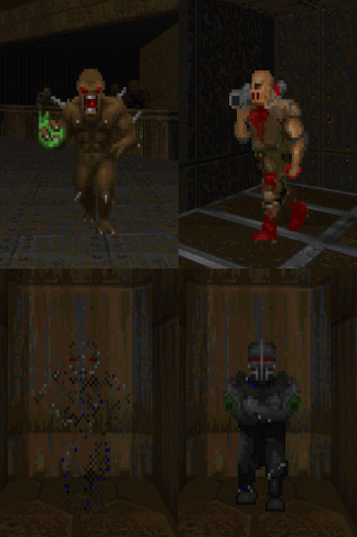
This partial conversion is a pain in the ass to get running on ZDoom and its derivatives unless you do some cleaning. I'm not big on the technical details, but the way they bundled things makes it so that the DeHackEd monster changes never take place, which makes the maps impossible due to some very fundamental gameplay changes. For one thing, they cut out the hell knight, replacing it with the imp. But it's not just any imp; super-imp fires baron plasma, making him significantly more dangerous than the original, if a bit of a glass cannon. If you're wondering what happened to the old imp, he's gone, substituted by the rocket trooper. The trooper has a melee attack, but you'll probably never see it because it fires actual explosives, making it one of the most dangerous enemies, to you and its brethren, as well as itself. The last addition is the rarely seen tech trooper, a unit that zips around semi-invisibly before firing, derived from the SS trooper.
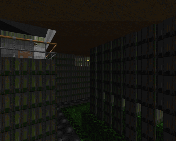
If the DeHackEd changes don't take place, you'll find out early on, because hell knights will be crammed into spaces they can't move in, making the completion of MAP01 improbable, if not impossible. The draconic restrictions of Obituary's distribution - no doubt a response to shovelware CD compilers carelessly scraping PWADs off the internet - forbids any kind of repackaging. It would be great if someone made a DECORATE file for the ZDoom port family that did what the DEH is supposed to do, insofar as replacing the monsters, two of which I think are already sitting on Realm667.
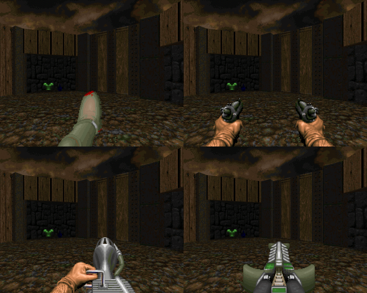
What makes things more complicated is that there are some weapon DeHackEd modifications as well. The Möllers split things up so that you could play with original or modified weapon behavior, having to load them alongside the monster code. Two of the changes, modding the fist into a kick (from their E3 replacement,
The Evil Unleashed) and the pistol into guns akimbo, are purely cosmetic, as far as I can tell. The plasma rifle becomes a flamethrower, which trades sheer power for range, as the projectiles arc and fall to the floor, making hitting monsters on ledges tougher. The BFG / sonic cannon behaves basically the same, but I'm told that the damage of the initial, now invisible projectile is doubled.
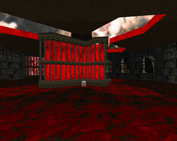
The biggest challenge of this WAD comes from pistol starts, some of which are a royal pain in the ass, but there is some surprising detail to coop play that heralds a trend that carries through to later projects. It uses a lot of their design quirks, like manipulating routes to create better three-dimensional gameplay or just using linedef triggers to create multiple paths using the same hallways, and shares many of their aesthetic principles (like crosses). It's a design style I've come to call Germanic, even if it's only really shared by fellow German Matthias Worch, as far as I can tell. It's a fun WAD, tough at times, but well worth the play. All in all, challenging, interesting, and full of monsters, everything Doom should be.
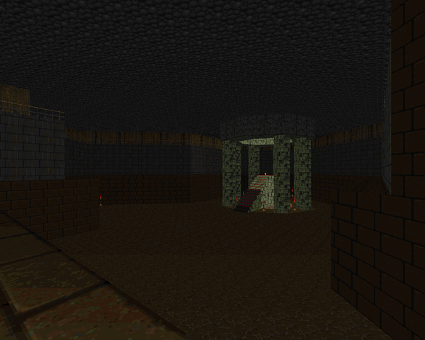
Note: Obituary has an arcane install process and a number of files available to load depending on what you want to run the game with. Andy Olivera's
DSDA site has a cleaned up version with instructions for running it, but it's still impossible to load correctly in some ports like ZDoom. I sincerely recommend one of the other fine source ports, like PrBoom-Plus (which I used), or Eternity. Rule of thumb: If you see Hell knights behind the caged window in the first map, you've loaded it incorrectly.


OBITUARY
by Thomas and Denis Möller
| Entryway | MAP01 |
|---|
| by Denis Möller |
|---|
| Cramped stone and wood layout with some really open areas. I like the cramped-ness of this level. The super-imps are a refreshing change and the rocket troopers haven't really made a menace of themselves yet. Most memorable moment is probably the chaingunner room at the end of the level, right next to that pack of demons by the staircase out of the tunnels, though the way the yellow key sequence unfolds is pretty neat. | 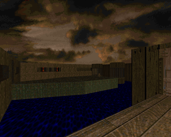 |
| MAP02 | The Cataract |
|---|
| by Thomas Möller |
|---|
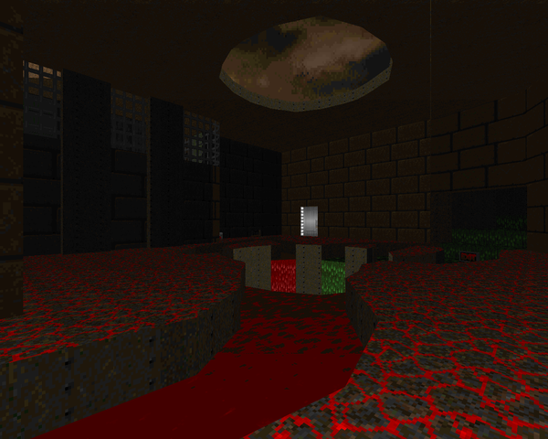 | Another earthy wood/stone level with some nukage and more out-there segments. There's a lot of cool little puzzles here that make an otherwise short level somewhat tricky, like the ride down to the blue key room, which evaded me for a few minutes. The fights aren't very rough, but the architecture is pretty cool, especially the final room with the demon pit. The bunch of secrets around the crate room area were also a positive. |
| Chambers of Confusion | MAP03 |
|---|
| by Thomas Möller |
|---|
| Continuing with earthy stuff and some techbase mixed in. Nice fake-out at the beginning. Some really cool stuff like intimidating demon hordes and the baron cage, plus the room where the monsters rise out of the ground, though a few got stuck on the pillar they rose up on. And a hilarious raised room with a bunch of rocket troopers splashing each other. Good times. I daresay all the Doom II monsters are used quite well here, only once each but they fulfill their function quite nicely. | 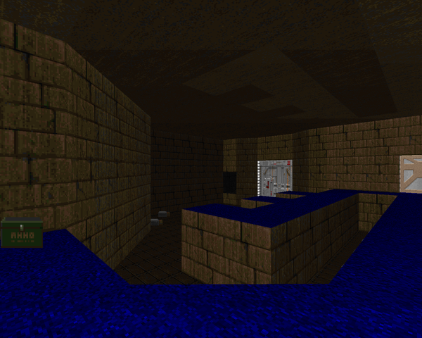 |
| MAP04 | The Church |
|---|
| by Denis Möller |
|---|
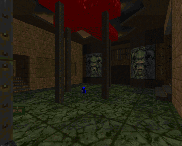 | Continuing the earthy theme with some marble mixed in. This level has an INCREDIBLY brutal pistol start, but it's worth the price of admission. The flow is smart, with a little non-linearity and a lot of close-quarters combat. I would say that every encounter here is memorable, from the opening lost soul clusterfuck to the baron faces spitting lost souls followed up by revenants and, of course, the pack of bruisers behind the exit door. Both mobs of demons stand out as heart-pounding traps, and yeah, my heart skipped a beat when the three rocket troopers popped out, though I certainly saw it coming. Same with the blue key courtyard battle. |
| The Hidden Below | MAP05 |
|---|
| by Thomas Möller |
|---|
| A bit of a different take with a vast underground level. Very strange opening with some cramped fights leading to a lot of wide-open encounters. The canyon sequence surrounding the yellow key dais sticks out in my mind as you're constantly harried by demons below you while alcoves constantly open behind you to reveal more demons at your flanks. I got hopelessly lost paying too much attention to the blue key red herring before picking up the red in what I can only describe is a completely unintuitive puzzle. The architecture leaves a little to be desired; it's a little too bland and the alcoves are very boxy, and it's very brightly lit, except for a few sections which stand out in I assume deliberately stark contrast. | 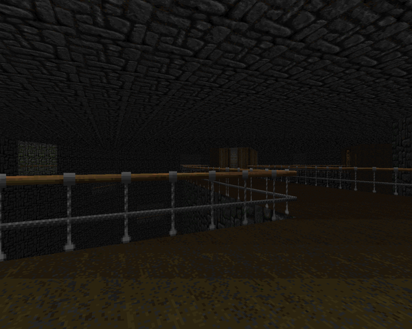 |
| MAP06 | Reactor |
|---|
| by Thomas Möller |
|---|
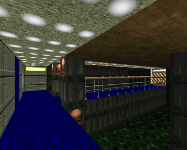 | This level's techbase mixed with sewers. This is a tough cramped little level with no visible reactor. There's a lot of traps that you can handle deftly after you've experienced them. The network of tunnels that comprise the yellow key maze are the standout gameplay wise, though being forced to take down a revenant with a single shotty is fairly memorable regardless. I feel the lift section at the beginning bogs the level down, though the bloodfalls section leading to the yellow key is pretty cool and until you find the rad suit somewhat intense. |
| Slaughter Until Death | MAP07 |
|---|
| by Denis Möller |
|---|
| Compact and violent earthy level that showcases the final new enemy. I was surprised at the easy exit until I realized that it's been optimized for a co-op. If you really feel like it, you can warp back to the other players' starting positions and do the same thing over again, with more ammo. The Predator-type enemies are a real pain here until you get the regular shotgun. The level difficulty then eases considerably. The cross motif returning from SUD is a nice throwback. | 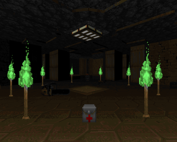 |
| MAP08 | Observation Station |
|---|
| by Denis Möller |
|---|
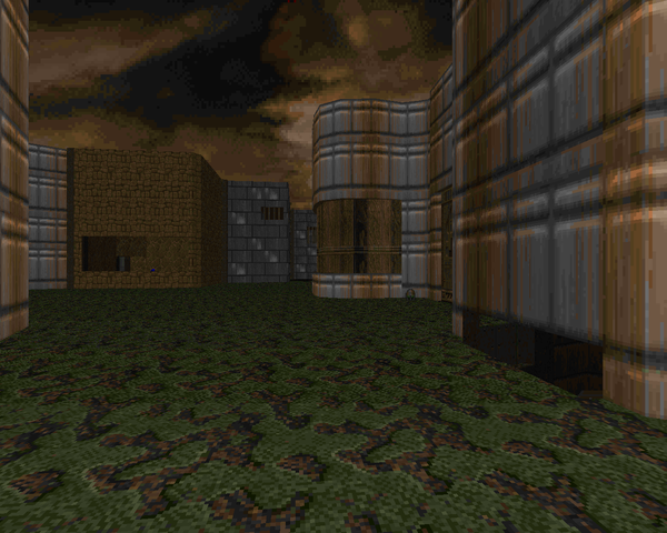 | Large techbase map with a pistol start brutal enough to rival MAP04. The yellow key trap is pretty cute, and I was semi surprised by the arch-vile. The rest of the level is a pretty gruesome slog but again, I like the way TiC plays with lifts and stuff to expand levels beyond the normally accepted architecture. A lot of nasty cramped-in tramps, like that bullet box in the beginning or the blue key or the etc. etc.. All in all, a great romp. |
| Nuclear Research Station | MAP09 |
|---|
| by Thomas Möller |
|---|
| Blue and silver techbase mixed up with some nukage. Refreshingly less difficult. There's all sorts of tiny secrets and a couple of brutal fights. I like the layout of the main room, the one with the reams of demons in it. The arch-vile setup is also pretty cool. I found the backpack and plasma gun long after they would have been useful but the help is still appreciated. I also like how they hid the megasphere. | 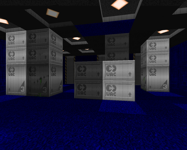 |
| MAP10 | The Stand |
|---|
| by Denis Möller |
|---|
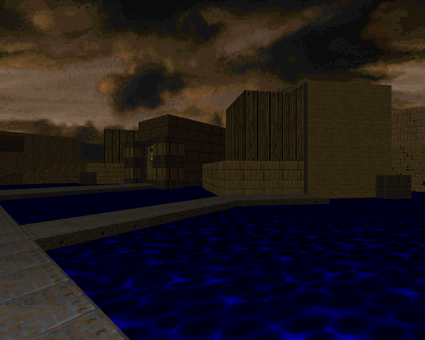 | Back to the organic wood and stone stuff with some metal mixed in. Another brutal pistol start. I tried the infighting route a couple of times before I realized just running through the shit was much safer. Clearing out the first wing is tough but pretty fun except for those chaingun snipers in the Cyberdemon room. Love the little puzzle to escape the red key room. Also love the surprise appearance of the Predator-type enemies. You'll be about as happy as you can be when you find the flamethrower, which sadly shows its vertical limitation in the final wing, but considering how powerful it is I can accept it. Also liked the green armor trap. |
| Incubator of Chaos | MAP11 |
|---|
| by Thomas Möller |
|---|
| Large, earthy techbase map with plenty to love. A pretty fun level. Except for the opening and a particular super-sized monster closet, the fighting here is pretty relaxed with plenty of shotgun ammo. There's some token 3D architecture near the end of the map, and while I appreciate it, I don't think it adds anything to this particular map. I will say the tech troopers after grabbing the blue key were a welcome surprise and functioned ideally. Debut of the BFG, I think, though once you have it you hardly have any need for it. | 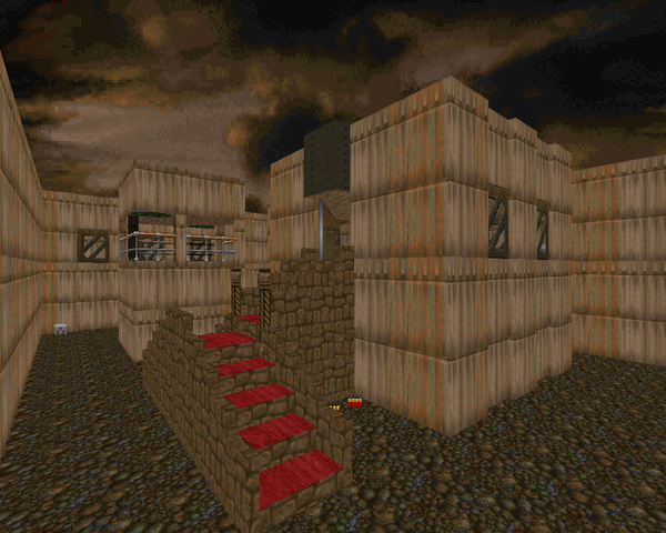 |
| MAP12 | Biochemical Factory |
|---|
| by Thomas Möller |
|---|
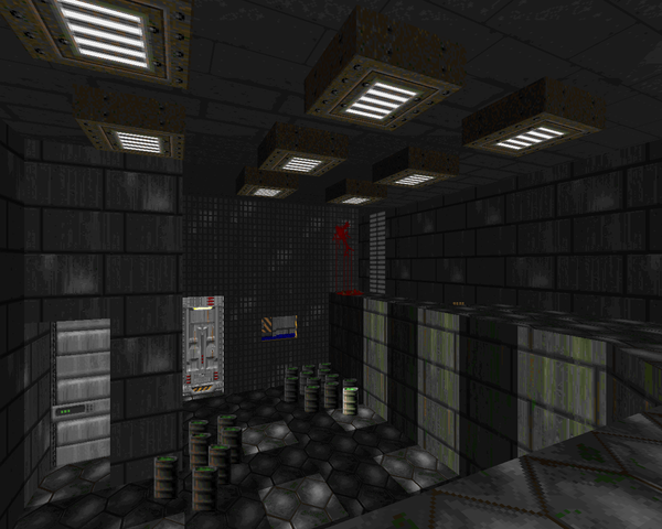 | Very large and fairly tricky techbase map with some neat traps like the spawning vats. I also appreciate the little bloody texture in the red key wing, or that sneaky trap by the plasma rifle secret. It kind of breaks down around halfway; the southeastern portion of the level feels more like Wolfenstein 3D than Doom with the blandly decorated rooms and I'm not even sure what the point of the northeastern section is except to deposit the player once again in rocket crossfire. The end portion is a particularly memorable series of "fuck you" traps that finally got me when I should have had my plasma rifle out. Finally, while I adore their use of 3-dimensional space to create multiple routes through the same area, I feel the use of elevator walkways really bogs down the blue / red / yellow door intersection. |
| Pandemonium II | MAP13 |
|---|
| by Thomas Möller |
|---|
| Taking a turn for a more Hellish style of maps using more abstract layouts and more satanic marble. There's a lot of demon chicanery going around, but more importantly, no blasted rocket troopers! The tower layout is pretty cool, though I wish I'd found the secret at the beginning of the level before I tackled it slowly and painfully with the shotgun. I like a lot of the trap areas as far as being just unusual warps. Also like the return of the cross motif. | 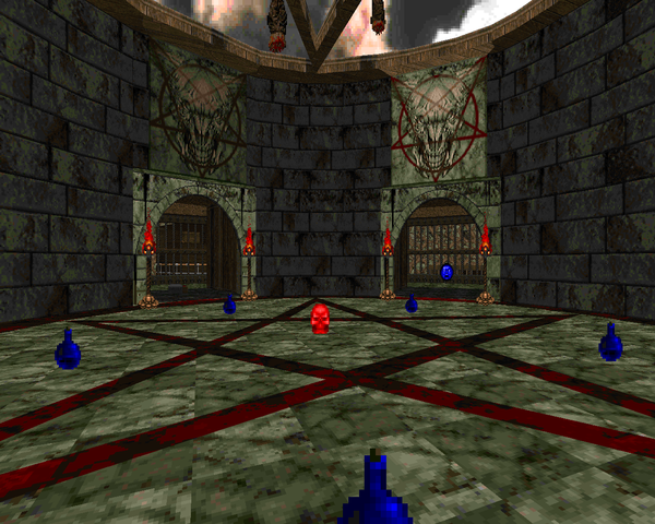 |
| MAP14 | Halls of the Requiem |
|---|
| by Thomas Möller |
|---|
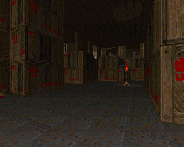 | More marble and wood a la Thy Flesh Consumed and a mother bitch of a pistol start. There's a lot of crazy demon teleporter Hell in a confined space. You can avoid it, but sooner or later you'll have to deal with it, especially if you want to grab the soul sphere secret. Knowing now that there's an SSG pretty close by kind of takes the sting out of the opening but hindsight's 20/20. The blue door room is the trickiest to navigate (sans SSG) but with a little encouragement it all sorts out. Other highlights – the yellow key room, the crate room, and the red checker tile room. |
| Castle of Damnation | MAP15 |
|---|
| by Thomas Möller |
|---|
| Pretty cool level with some nice castle-ish sequences, though except for I think the arachnotron fight around the well and the very opening bullet hell, none of these fights sticks out as particularly memorable. The teleport waves in the final room are a bit too gated, or slow. It took an incredibly long time to get all the monsters in the final teleport chamber out to kill. The glut of secrets in the exit room were appreciated, though. | 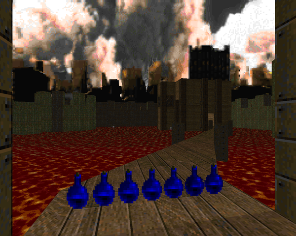 |
| MAP31 | Divine Inferno |
|---|
| by Thomas Möller |
|---|
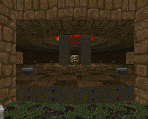 | An impressive gauntlet-style map with an earthy theme. You get one large teleport-rush fight with the SSG, then two takes on "Dead Simple" with different armies of hitscanners plus arch-viles. The sting of the latter is somewhat taken out by impassable lines, but they're still very dangerous. |
| Conclusion | MAP16 |
|---|
| by Denis Möller |
|---|
| Interesting setup compared to your normal Icon of Sin. You start out at the front door of the boss compound under siege from rocket troopers with demons on the ground and from there access the main ring. I thought it was harder than it was initially. The timing for the rockets seems more precise, but the real problem here is all the monsters with upgraded firepower knocking you off the platform before you can even get started. At the very least you should knock out the arachnotron behind your particular elevator so he doesn't buffet you around while you're under the invulnerability effect. The actual level layout feels somewhat bland, but it's a nice fight. |  |
 |
THE TECH TROOPER IS
USUALLY DEAD BEFORE IT
HITS THE GROUND |


This wad looks to run just fine indeed in PRBoom, thanks to Andy Olivera. If only TTP could get this fix treatment, I still can't get that to go perfect in any port (see my post there).
ReplyDeleteI seem to have no problems running this in GZDoom with Olivera's "fixed" version. At least, I can see the new monsters just fine.
ReplyDeleteHa-ha. The new monsters *look* fine in GZDoom, but as you hinted above, the DEH patch doesn't take, so imps are just reskinned HKs, making MAP01 basically impossible. Playing this now in GLBoom+, and it's a lot of fun.
DeleteI just discovered this excellent blog. It's a nice resource for picking Doom WADs worth playing.
ReplyDeleteI played Obituary some months ago using the Doomsday Engine, and this was my impressions of the WAD at the time:
"Currently playing the old (1995) Doom 2 MegaWAD/TC Obituary using Doomsday Engine. Obituary is supposed to be hard to get to work properly on modern source ports, so I was surprised it ran it all on DE. A few platforms in the first map didn't seem to work properly, or else they are one time, timed deals.
After having played all of the 1994 Doom 1 WADs on the Top 100 list Obituary was quite hard, but also more complex than the relatively simple design of the 1994 WADs. Level design is a bit "cramped", with a bit too many buttons and levers to operate for my taste. But it picks up in the middle. The 5th map, The Hidden Below, was epic with good use of the Z axis.
...
Just completed Obituary. Playing the top 100 Doom WADs in chronological order it was easily the best one so far. The new monsters were fun, like the rocket launching imps and the "blue meanies" that reminded me a bit about the Ninjas in Half-Life.
Great stuff!"
It's still formulative, compared to what they would do in Memento Mori and Memento Mori II, but it's great fun and I like the new monsters.
DeleteThe "fixed" version from DSDA seems to run fine under Eternity (this is my favorite source port right now) but for some reason the new status bar doesn't show up. I opened the wad file and it seems that the graphics for new status bar are misplaced and put between S_START and S_END markers, which is why they don't get recognized. I fixed that myself by placing them before the S_START marker and sounds. Hope they will fix that too. :)
ReplyDeletehuh, idk if i knew there was a status bar.
DeleteI have contacted Andy Olivera about the status bar issue and he fixed the wad. You might want to update your review to show the new status bar graphic like in Icarus, Memento Mori 2 and Requiem.
DeleteSo when you update the review with the new status bar?
ReplyDeletei kind of like the screenshots that are currently up but if you have a real hardon for seeing it in here i guess i can remove one of the pics already up, like maybe the rocket trooper mid-attack
DeleteYeah, I'd like to have the rocket trooper image removed (he already appears in that gif picture with all new monsters) and replaced with the new status bar. Also I'd like to have Eternity mentioned when you were recommending other fine source ports.
DeleteOh and yeah I was that anonymous that commented here and on Aliens TC wad but I was writing from phone and didn't bother to log in to google account as I would lose the message. That happened to one of my recent comments, I had to write it twice on my mobile because of some stupid bullshit that erases my message when I choose to reply as google account and asks me to log in, then message gone!
Oh, it happened again right now but thankfully I had message saved in a text file before I clicked "publish". Heh.
Update?
Deletemy blog isn't a full time job, and it isn't my family, so cool your jets
DeleteThanks for update and sorry for being annoying.
Deletehttp://allfearthesentinel.net/download?file=obticfix.wad
ReplyDeleteFor anyone who asked for a ZD-compat version, this version works perfectly fine on both ZDoom and Zandronum. Was a blast to play coop on it! I think these maps have held up well, maybe not quite as much as say, memento mori, and the early maps are a bit underwhelming in terms of looks and gameplay compared to the later ones, but still: definitely one wad worth playing through for anyone who hasn't :)