THE UNHOLY TRINITY
by Steve McCrea, Simon Wall, and Elias Papavassilopoulos
by Steve McCrea, Simon Wall, and Elias Papavassilopoulos
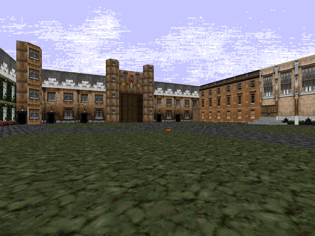
A lot of folks that mapped for Doom in the golden age made imitations of real places, be they their work places, houses, or schools. Occasionally you'd see a few crude graphics that placed the map apart from Doom's aesthetics, but the textures were unmistakable. Steve McCrea took level design to the next level as early as 1994. He ran around his college campus, Trinity College, snapping shots of all the buildings and whatnot, made some new textures, and got together with his friends to make a map out of it. In the end, we get The Unholy Trinity, a decidedly goofy E1M1 replacement that plays pretty well.
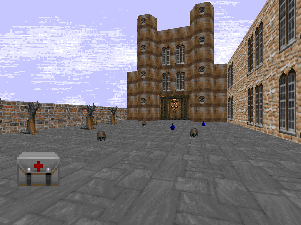
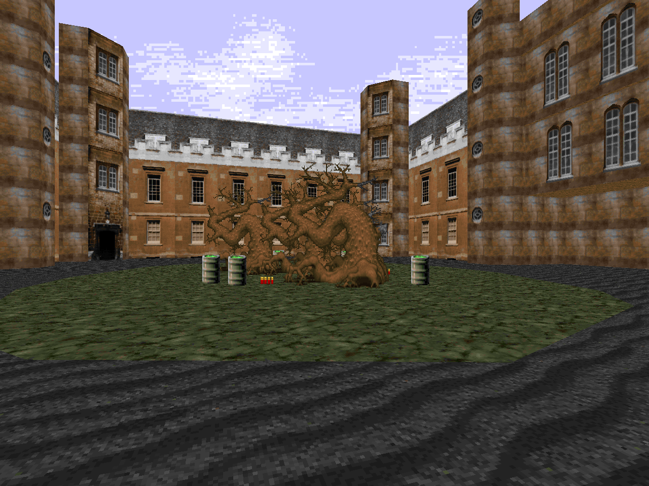
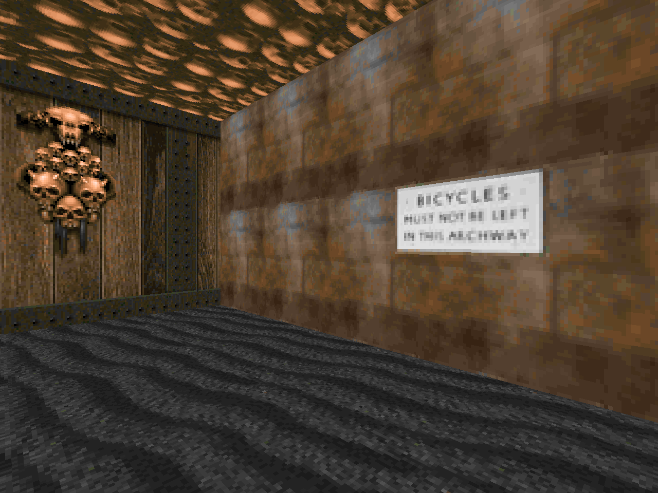
The first thing you'll notice, of course, are the textures. They look very nice in Doom, and while they may not mesh with id's own textures, the whole effect creates a setting distinct from Doom, disregarding the couple forays into Hell. Most of the layout is large courtyards balanced with cramped battles in campus flats. There's enough work put into mixing the textures with the architecture so that they make the facades pop without involving higher-end map design. The lack of more involved structures is felt, though, and the big, flat yards don't help in livening things up.
The fights are okay. There's nothing really to write home about; the more memorable ones are in the courtyards and they can catch you by surprise. On several occasions you return to a previous location and find baddies boiling out of a former trap. Just don't forget about the trap on the opposite end of the square or you'll get donkey punched by a baron or two. The wide, open spaces offer plenty of room for maneuverability, so you're more likely to get attritioned out by hitscanners than suffer any real damage from projectiles.
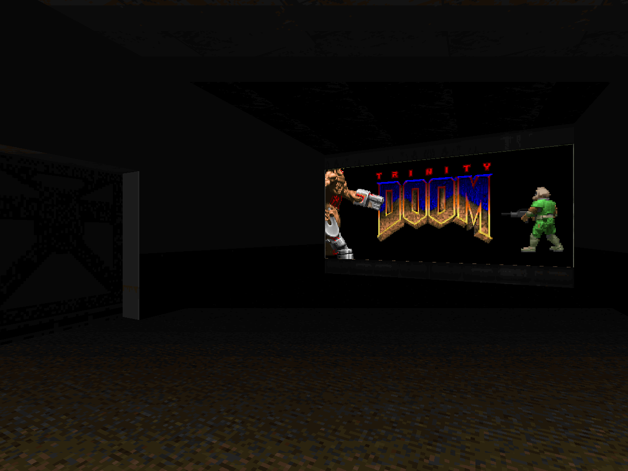
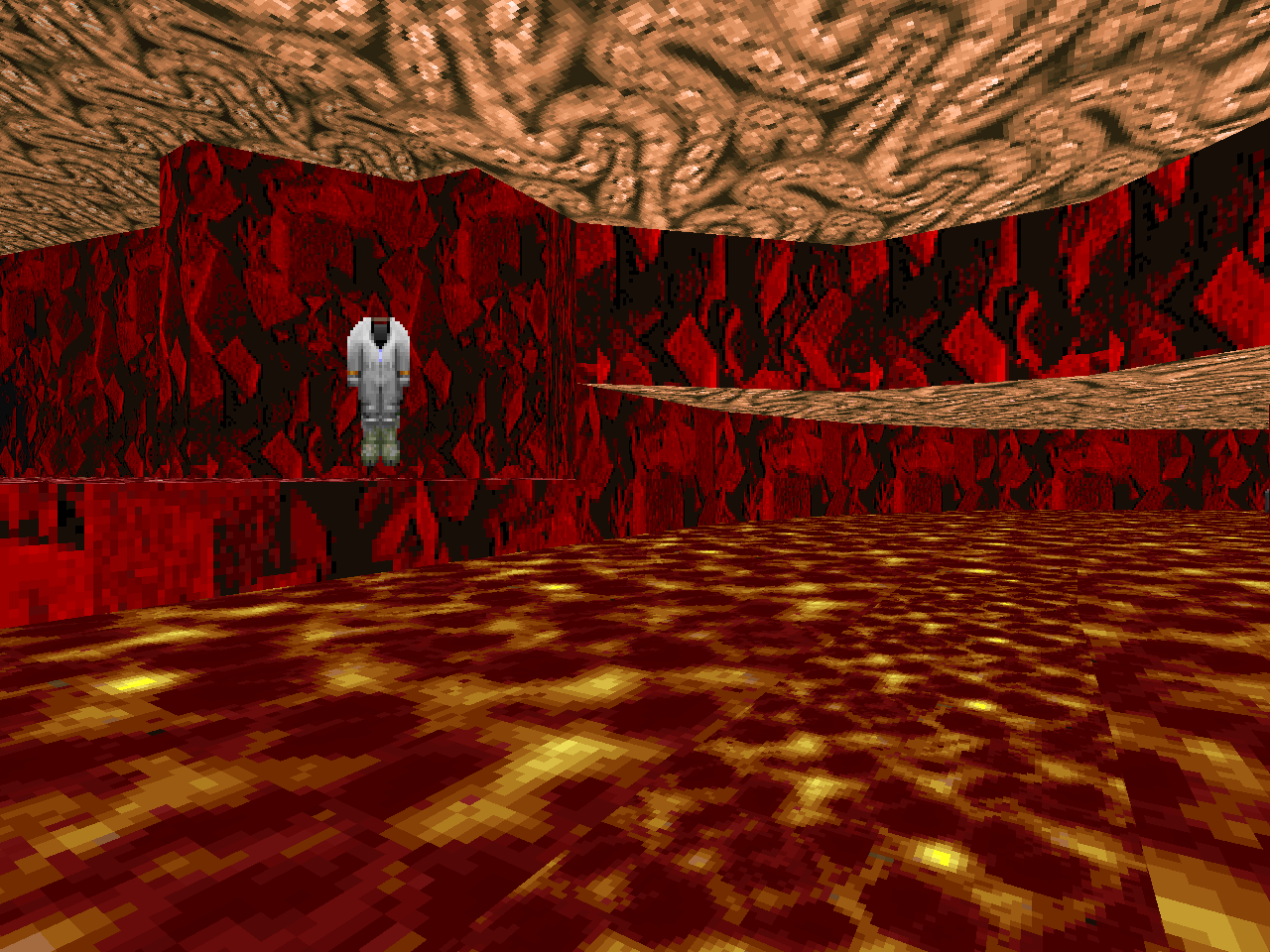
Any distinct features? Well, in the Hell portion of Trinity College, there's a cool faux-deep water effect where you can sneak through the trough to another portion of the underground. Other than that, there's a mess hall that isn't much to look at, several instances of zombimen partying around a barrel (keg stand?) and, well, the movie. It's a short credits bump near the exit. It's DoomCute and has a Cyberdemon splattering a marine.
Gameplay isn't astounding and detailing itself is a bit lacking, but the textures just look really good considering the 1994 release date. So good, in fact, that you should see it for yourself. It's a nice relaxing stroll, so if you want to blow off some steam after failing MAP12 of Vanguard for the fifteenth time, load this up and appreciate some early innovation in Doom's history.


This post is part of a series on
Doomworld's Top 10 WADs of 1994
Doomworld's Top 10 WADs of 1994
| Crossing Acheron | Aliens TC |
| Doomsday of UAC | Galaxia |
| Serenity | Eternity |
| The Unholy Trinity | Return to Phobos |
| Slaughter Until Death | The Evil Unleashed |
I initially wanted to give this one a miss as I wasn't interested in the concept, but the level actually plays out quite well. It's a bit untidy, with some of the interior spaces not looking very polished. The custom textures look fantastic for the time. It's a simple and quick map, and is probably one for people interested more in it for it's historical value in the wadding community.
ReplyDeleteI think that its greatest importance comes from the effort and intent involved in taking photos of Trinity College and then converting them into textures that add a lot of depth to McCrea's otherwise bland architecture.
Delete