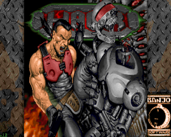
HACX was never destined for greatness. A commercial TC published for Doom II in 1997 and featuring some of the better-known authors of Doom's golden age ('96-'97) (notably superstars Adelusion and Iikka Kernanen), it came out subsequent to the release of the new breed of FPS games, namely Quake and Duke Nukem 3D. It's odd, because HACX feels like a natural bridge between the Doom and BUILD engines. It has themed maps, destroyable objects, and a penchant for goofiness that lies outside the normal bounds of Doom. Unfortunately, it never fulfilled the proposed design documents, topping out at twenty-one out of thirty-two levels replaced, and that's looking at it from a purely numerical standpoint.
HACX has a cyberpunk setting, you playing the hacker, Danny Evanger. You hack into some top-secret database, "Genie", and the government locks you away. To avoid getting pounded in prison, you pump weights like nobody's business, until you're contacted by the government again. This time, they want your help, as things have gone pear-shaped outside the walls. The world's technology is going haywire and to top it off, gangs of cannibal mutants are roaming the streets. You're offered a cyberjack implant that can let you travel through cyberspace across the globe...and a cool 20 million dollars in gold...if you can put an end to the cyber (and not so cyber) terrorism.
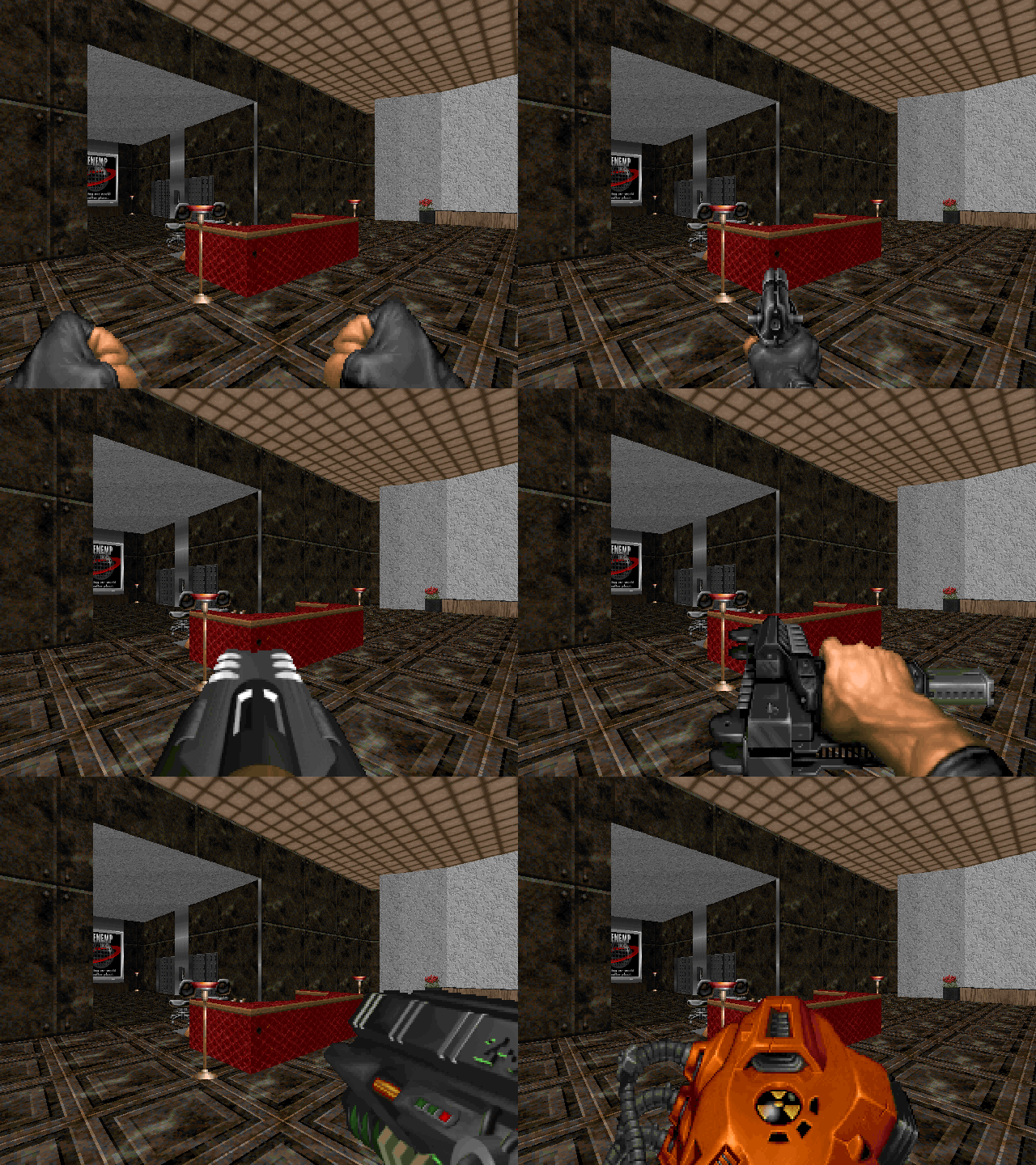
HACX is definitely a TC. It keeps a lot of Doom's gameplay components, but there are enough fresh aspects to keep you intrigued. For starters, a TON of objects are destroyable. Computer monitors, lamps, chairs – you can bust up a lot of stuff. The new weapons fill essentially the same niches. I'm not fond of some of the sprites (they take up way too much screen space), but they're overall pretty decent. My one quibble – the pistol consumes two bullets a shot, and you can only ever hold 200, with the backpack equivalent. It's pretty ridiculous, especially considering the rate at which the uzi (chaingun replacement) eats ammo.
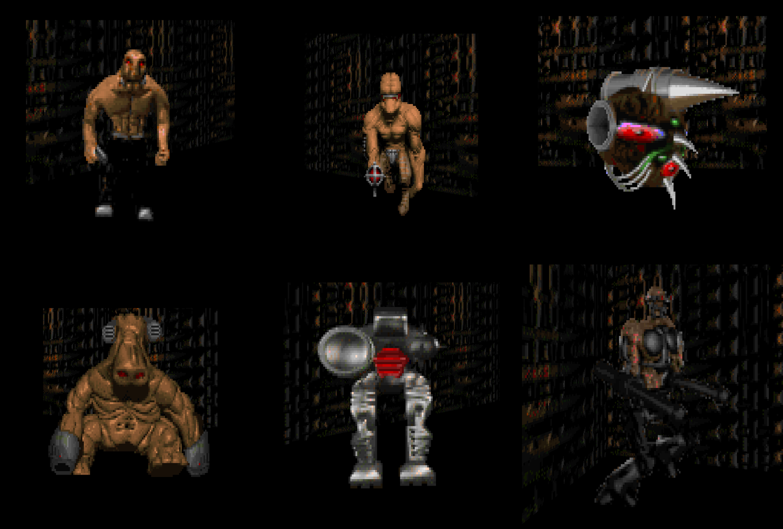
I'm not exactly thrilled with the monster replacements. Or, rather, they're rarely used to their best effectiveness in the TC. HACX's enemies are tougher on average than their Doom II counterparts, but rarely feel that dangerous unless you're being mobbed. The charging monsters are one major exception. The sprites are okay (better than Hell to Pay at least), though the differences between some of the enemies are distracting. The stiffly-moving terminatrix, which fulfills much the same role as the arch-vile, is the worst example. If it weren't for the way she ends up being used in the maps, I'd say something as lithe and fast as ol' archie would be much more intimidating...
The TC starts out great, hits its peak somewhere around the start of the last quarter, and then abruptly runs out of steam with a collection of short, dead simple levels. It's a shame when you get cool maps like Johnston's "Gothik Gauntlet" or Adelusion's "Hidden Fortress". One big aspect that potential players may find off-putting are the usually unusual cyberspace levels. There are a host of cool special effect graphics the authors used to illustrate some of the stranger details of the maps, but the actual wall textures are generally eyesores that leave a lot to be desired for a typical depiction of the digital domain. In spots like these, I'm inclined to point out strange levels like Cyberdreams's MAP29, or Welcome to Hell's MAP06, which pull off some really neat, abstract effects, as opposed to the technicolor yawn that seems to dominate the HACX vision.
HACX isn't Doom. It's kind of close, but the action pace is slower and the level design is uneven (less interesting in some but more interesting in others). Still, much of the work that went into HACX is professional-grade quality, and if you're looking for a new experience in the Doom engine that isn't Doom, HACX is a great choice, certainly closer in feel than others. There are some classic authors here you'd be fain to miss, though beware of some gloriously puzzle-based gameplay. I, for one, look forward to HACX 2.0. Updated assets, modern level design, and even more cool features from the ZDoom and Eternity engines (possibly more!).


HACX
TWITCH'N KILL
by Banjo Software
TWITCH'N KILL
by Banjo Software
| MAP02 | Tunnel Town |
|---|---|
| by Stephen Watson | |
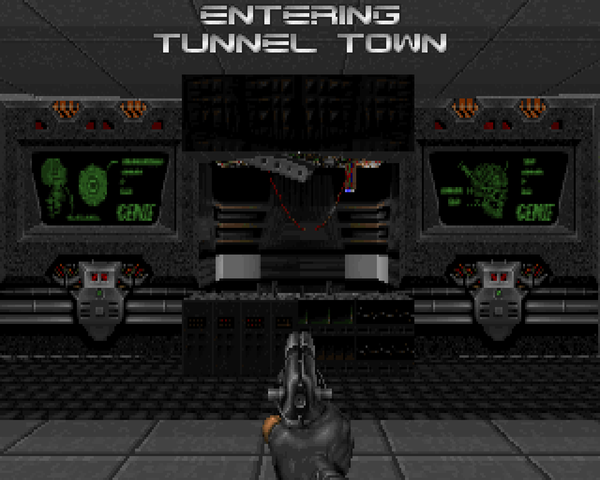
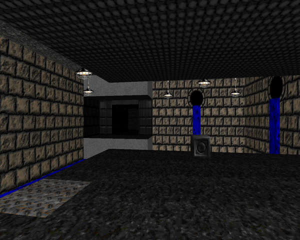 | Mr. Watson of Insertion and Memento Mori II fame sends you on a sewer trip with an opening that borrows the shutter windows from Doom II's "The Focus". There's not much "town" to these tunnels, but there are a ton of mutants and robots to kill. There's enough health that the incidental combat isn't that dangerous, but when a closet opens and a bunch of buzzers pour out like clowns out of a car, you'll start to worry. That's why the rocket – er, torpedo launcher annex to the north is my favorite encounter. The finale, which debuts the monstruct, is a nice surprise, though the new guys didn't give me much trouble. There's also the slightly confusing mess of ducts to the northwest which has a co-op only puzzle for those fortunate enough to have friends that they play HACX with. |
 | |
| Lava Annex | MAP03 |
|---|---|
| by Mark A. Pullen | |
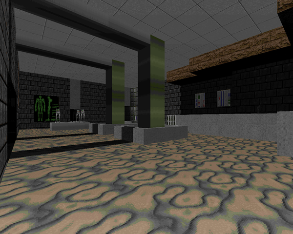
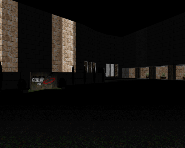
| Thus beings the obligatory underground level, albeit an opening with a cool underwater lagoon. It's wholesale slaughter as you mow through groups of mutants and robots on your way to escape the underground area, with most of the action concentrated in the circular tunnel near the map's center. Granted, it's mostly just room-clearing. There are a ton of enemies in the super-congested finale, what appears to be some kind of geothermal energy plant. Once you wreck up the place, it floods the cavern with lava, a neat effect. | 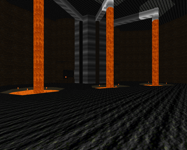 |
| Cyber Circus | MAP05 |
|---|---|
| by John Herndon and Iikka Keranen | |
| Cyber-space is weird. There's just no getting around that. There's extensive use of odd, scrolling textures and strange set pieces like the angry eye discs that you have to remove if you want to ride up to the exit switch. The only combat comes from a few packs of monsters. The ICE aren't very dangerous; I caught a lot more Hell from the D-man that occasionally appeared in the giant, lowering room segment. It's a really weird puzzle where you have to run around the sigma-pillar counter-clockwise to raise the floor to the point where you can grab it. Then, to leave, you have to jump into one of those exploding portal things, which never occurred to me because the others seemed to try to KILL ME DEAD. Strange...but interesting. | 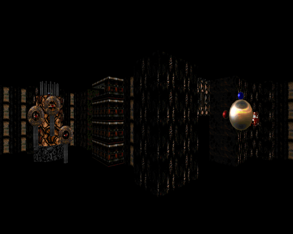 |
| The Great Wall | MAP07 |
|---|---|
| by Adam Williamson | |
| This dense, indoor map presumably takes place within the Great Wall of China. The first half is a sewer crawl, after which you get access to some kind of office complex. It's primarily densely-packed enemies to be mowed down by your advanced weaponry. Actually, the monstructs feel kind of threatening here; I didn't know they fired actual rockets and not just the equivalent of mancubus fireballs. It's still basic room-clearing, though. The foyer of the office is perhaps my standout fight, though you can neuter much of the difficulty by slaying the phages in their little boxes before grabbing the weapon. | 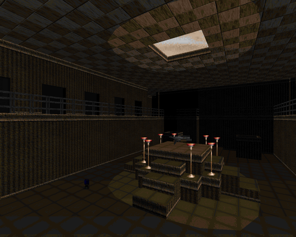 |
| MAP08 | Garden of Delight |
|---|---|
| by Ryan Rapsys and Rich "Nostromo" Johnston | |
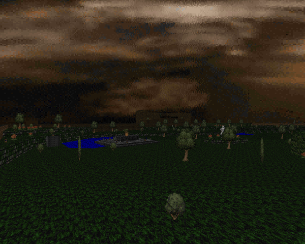
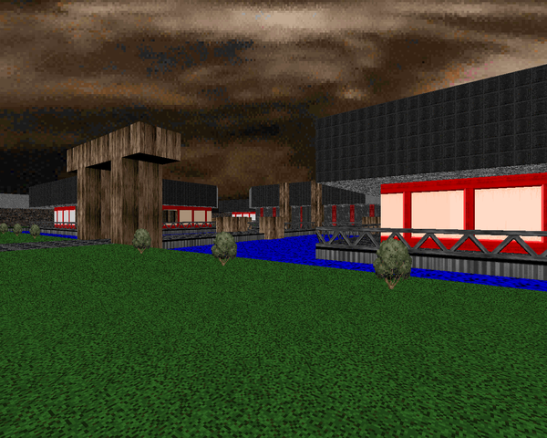
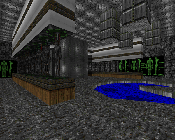
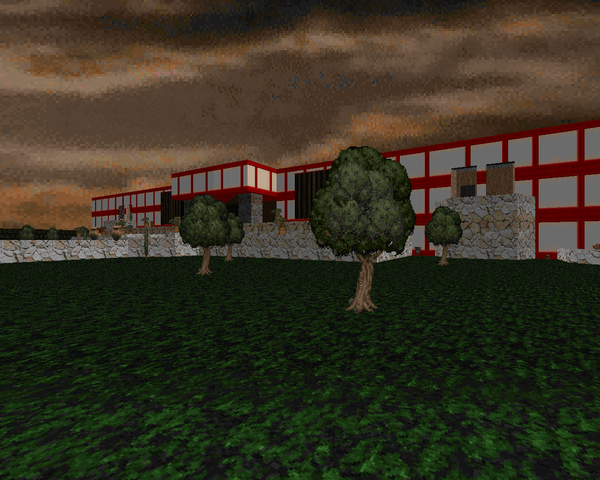 | Continuing on in the oriental theme is this very large level in three parts. The first is a nice palace with some arcane puzzle solving (if you can't figure out what to do, break a nearby pot and stand on it). Afterward you move into the garden proper, a large outdoor area broken up by an underground android factory. There are a couple of excessively stupid lifts in the latter, but once you get to the finale you have a knockdown drag-out slaughter with quite a few of those monstruct – cum – guardian statues. It's a lot of fun to explore and fight in. |
 | |
| Hidden Fortress | MAP09 |
|---|---|
| by Anthony "Adelusion" Czerwonka | |
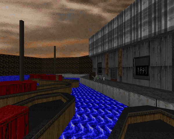
| As always, Adelusion fails to disappoint with this smaller but tightly designed level. You start outside some temple and then fight your way through cavern systems to the docks taking an underwater elevator (genius implementation!) to the eponymous fortress, which is part tech and part cavern. Combat is challenging, perhaps the best level of the set so far, with the advantages of monstructs clearly showing as well as the first appearances of the mechamaniacs, thorn things and terminatrixes. I'm not quite sold on the last one, but looking at the skill set on Doomwiki, I'm sure they just haven't had their time to shine. Very cool level. | 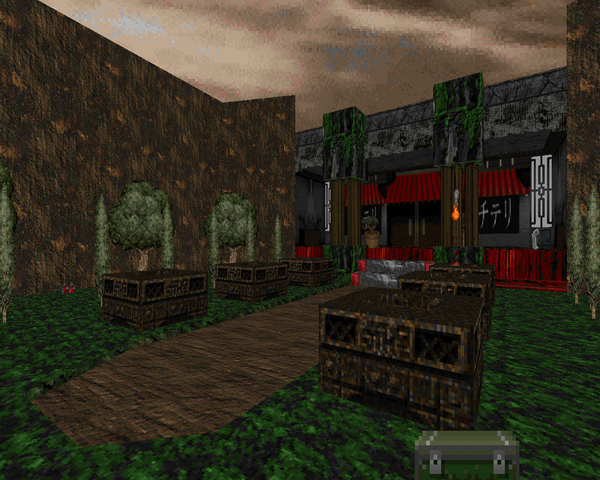 |
 | |
| MAP10 | Anarchist Dream |
|---|---|
| by Ryan Rapsys and Rich "Nostromo" Johnston | |
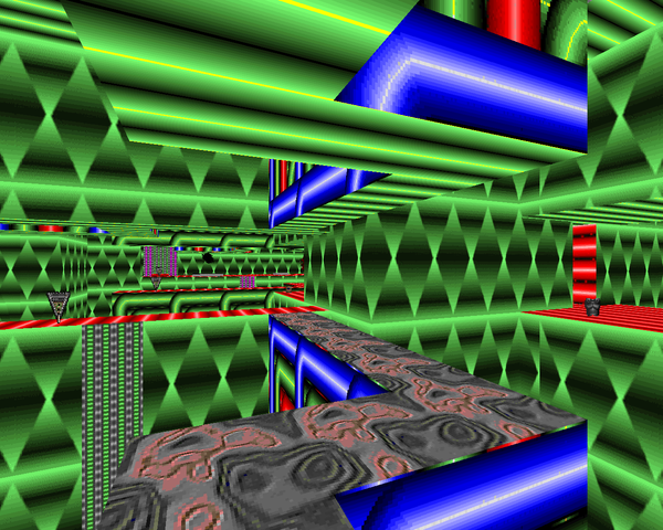 | Cyberspace is weird. This enormous map has some great ideas to it, but it's annoyingly unbalanced. To start out with, you have to navigate some kind of catwalk maze before you hit the switch to open up the other five areas. Good luck getting out if you fall in. Then, amidst all the eyesores of textures you have knocking around, there's the fourth gauntlet, a tunnel of dead space that winds its way through to an ambush, the only action you'll see in that particular leg. Some of the effects look great, but it's far to incoherent compared to John Herndon's simple yet effective "Cyber Circus". I think you can have more fun in cyberspace than a veritable cornucopia of orthogonal platforms and mazes. |
 | |
| Notus Us! | MAP11 |
|---|---|
| by Michael Mesko | |
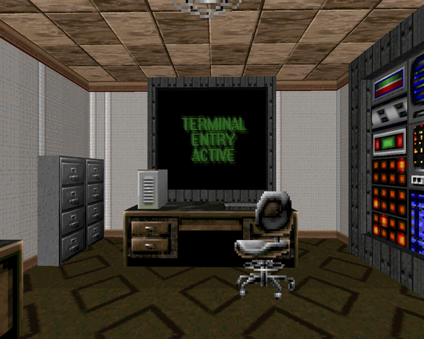
| Something shorter, for a change. This is another office building type level, except the layout resembles much more some non-linear Doom techbase. In fact, next to a couple cubicles, the most realistic feature is the board room, the scene of an all-out brawl once the lights go out. Monster placement is tricky, with some of the mechamaniacs down in a darkened room with columns, and monstructs in some awkward places. The board room battle is definitely the standout fight. Altogether, fun stuff. | 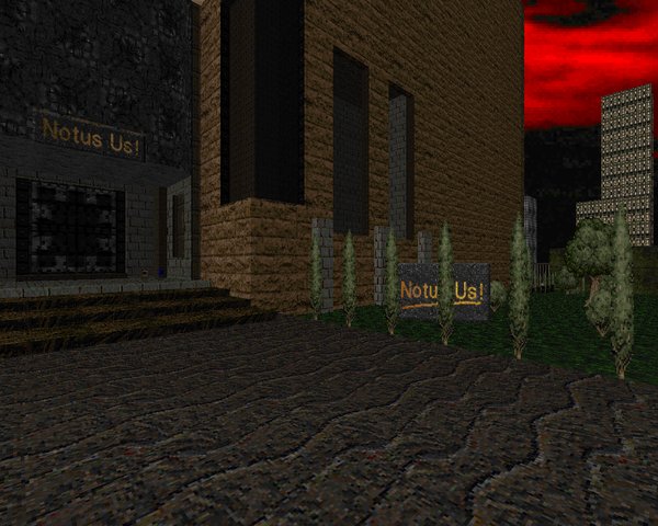 |
| MAP12 | Gothik Gauntlet |
|---|---|
| by Rich "Nostromo" Johnston | |
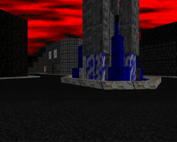
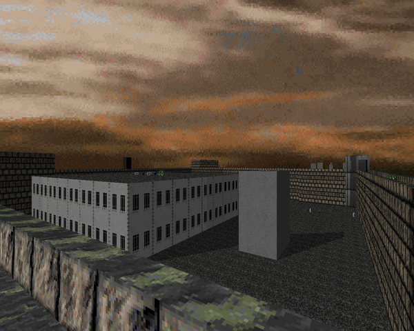
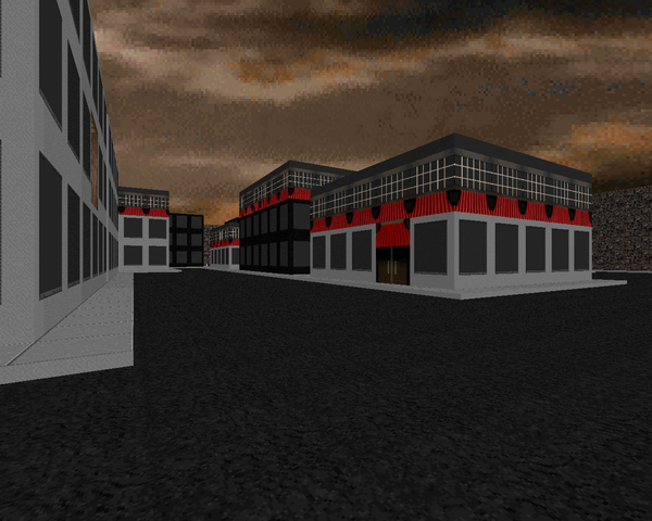
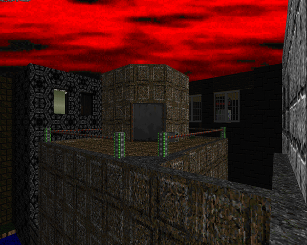 | Not one to be outdone, Nostromo puts out what is probably the largest, most complex level of HACX. It's a huge cityscape that begins and ends on the rooftops, with a lot of street running in between. While Johnston has outdone himself in some aspects (like the cool two-floor elevator trick – great hack), some of the gameplay bits fall flat. Most of the small gaps in between buildings are damage floors, either lethal (inescapable) or not. You'll also be doing a little trial and error jumping between some rooftops; the early portion borders on a three-dimensional maze at times, and finding your way to the street level can be tricky. Certainly, it all looks great and there are plenty of challenging firefights, using HACX's rougher monsters a bit more liberally. You'll want to bring over weapons from the previous level, though. It looks like Johnston forgot to put down any weapon pickups whatsoever. It's still doable as is, though. In spite of my groaning, it's a fun, long level, and the last battle is a good topper (even though you get an invulnerability). |
 | |
| The Sewers | MAP13 |
|---|---|
| by Anthony "Adelusion" Czerwonka | |
| Adelusion drops another cool level. It says it's sewers but it's more a hybrid of flooded underground caverns and a brief, modernized area, both of which look quite gorgeous. It's full of tough, HP enemies in tight spaces (like two pairs of monstructs packed into the first few rooms), so you need to either excel at congested gameplay or getting them to kill themselves / each other. The battle in the blue key room is one of the nastier fights, perhaps the standout encounter. The level layout is pretty intricate, with some neat reusing of three-dimensional space. | 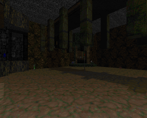 |
| MAP14 | 'Trode Wars |
|---|---|
| by Andrew Gate and Rich "Nostromo" Johnston | |
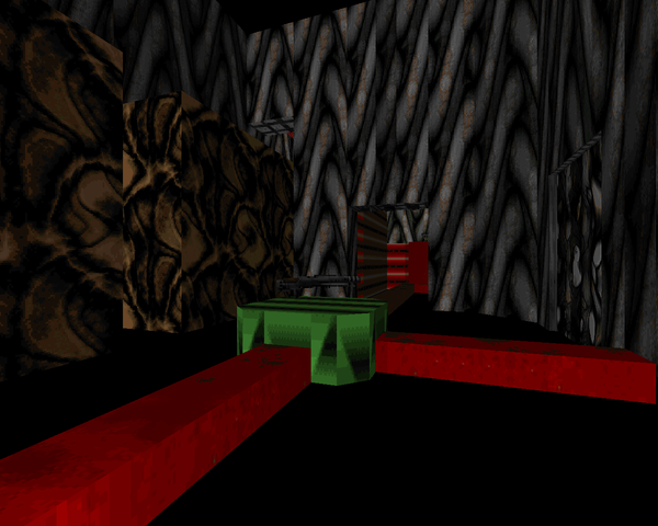 | This cyberspace map almost looks normal. It's pretty short but very tough as you feel the sting of ICE and D-man mercilessly charging through small rooms and leaping off ledges to smite you. It's very straightforward, though, except for the final level of the staircase leading to the exit, which whether it's raised or not is invisible. What it really needs is a ton of health – those charging enemies are killers. |
| Twilight of EnKs | MAP15 |
|---|---|
| by Jeremy Statz and Rich "Nostromo" Johnston | |
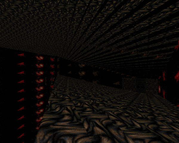
| Statz comes up with an unusual, abstract level opening with a bizarre have-palace half-cyber hallway attached to several instances of ruins. There is one huge stumbling block to the map, located in a separate area reached by teleporter. The room is simple enough but when the lights go out and a bevy of deadly charging enemies are released, you can hardly see anything. The only way I survived was by hunkering down in a corner and spraying my uzi down the corridor. There's a pair of goggles you can grab on exit, but that's not something you'd figure you'd need until after you died. Apart from that, some pretty cool features, like the dangerous ziggurat to the east (a lot of hard-hitters) and the cool switch / lift based puzzle to reach the exit. | 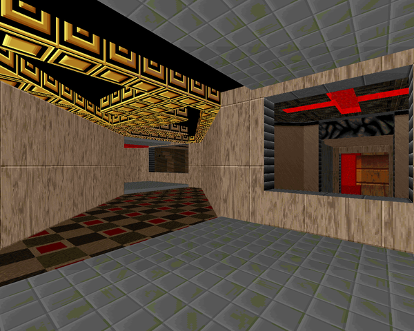 |
 | |
| Protean Cybex | MAP16 |
|---|---|
| by Mark A. Pullen | |
| Well, this is more like a filler map that resembles a tiny, symmetric sewer section. Starts out with some mines, then you take care of some tethered projectile monsters before killing the monstructs in the four corners, which is easier said than done. Not much else to say. I kind of liked the Middle-Eastern backdrop. | 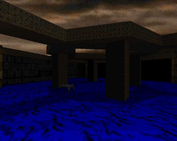 |
| MAP17 | River of Blood |
|---|---|
| by Mark A. Pullen | |
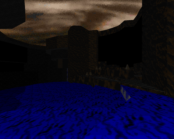 | An underground waterway / slaughtermap from Mr. Pullen. It's mostly hordes of HACX's trash enemies, like androids and thugs, but the two encounters to the southeast are pretty dangerous. One is a line of six monstructs – best dealt with by infighting – and the other a horde of androids that teleport in backed by some thorn things, which can get hairy really fast if you're not careful. It's really short. I do like the look of the caverns, though. Very naturalistic but plays pretty good. The other fights could be a little more compelling. |
| Bizarro | MAP18 |
|---|---|
| by Anthony "Adelusion" Czerwonka | |
| Like MAP16, this is another "Dead Simple"-style short monster arena, except this one is a bit tougher, featuring nothing but the strongest monsters of HACX, in the order of terminatrix (very claustrophobic fight!), monstruct (not much better with those explosive projectiles), and mechamaniac. As can be expected, the level looks nonetheless quite beautiful for a battle platform. | 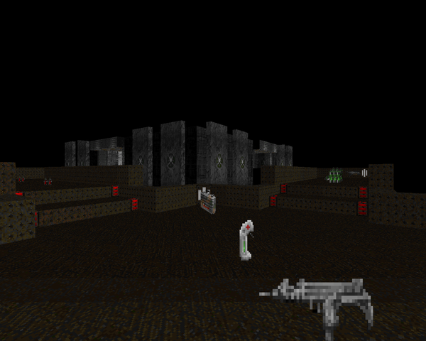 |
| MAP19 | The War Rooms |
|---|---|
| by Adam Williamson | |
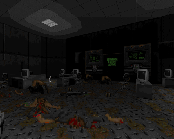 | Some really lazy and bad level design from Adam Williamson. The opening is nice enough with a crowded control-room shootout with thugs and android snipers but you quickly realize that you're on a back and forth switch press that will make practically anyone groan with boredom. About the only real bit of excitement comes from the north and south rooms, filled with a bunch of tough monsters – monstructs in one and Majong 7s in the other. Still, it's hardly inspiring. |
CYBERFUNK
This article is part of a series on id's
| ICONS OF SIN | |||
|---|---|---|---|
| Doom | Heretic | ||
| (Thy Flesh Consumed) | (Shadow of the Serpent Riders) | ||
| Doom II | Hexen: Beyond Heretic | ||
| Master Levels for Doom II | (Deathkings of the Dark Citadel) | ||
| Final Doom | Chex Quest | ||
| TNT: Evilution | The Plutonia Experiment | Strife: Quest for the Sigil | |
| Console Doom | The Wraith Corp MegaWADs | ||
| Doom 64 | Perdition's Gate | Hell to Pay | |
| No Rest For the Living | HACX | ||


I'm hoping Hacx 2.0 shows up again someday. Hacx as it is has a lot of potential but on many occasions it falls short.
ReplyDeleteI've seen the dev alpha and a lot of the work going into it is fantastic. The only problem is finding enough people with the passion, skill, and time to bring it up to par.
DeleteNot a wad licensed by id (just like PG and H2P)
ReplyDeleteThey had to get a license in order to sell it. It's not an official id product. But it was definitely licensed, and not illegal, which is what you are saying
DeleteInteresting. Though I must say that MAP 12 was annoying to me. I don't know if it was because I played the original released version (1.0), but saving liked to crash the game, and after finally completing it and quitting at MAP 13, I had to restart my PC as DOSBox crashed. (I wonder how version 1.1 (is really a beta of sorts, which version 1.2 is based on) performs.) MAP 11 was cool though.
ReplyDelete