Before id contracted
Tim Willits to contribute to the
Master Levels, he and his sister, Theresa Chasar, released the
Raven series for
Doom II. According to an interview conducted for the 5 Years of Doom celebration on Doomworld, the series was originally a collection of maps he’d made for
Doom that he hastily converted to
Doom II upon its release, figuring that the series would get more exposure if it was for
Doom’s sequel (a spot-on assumption, I think).
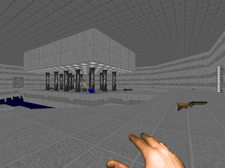
Evidence available somewhat backs this statement up. Four of the
Raven series of maps were previously released by Willits as the
Empire series back in ’94 (E1M1, E1M2, E1M3 and E1M4 as MAP03, MAP06, MAP01 and MAP04 respectively). I’m not sure if the entire
Raven series has this origin given that Willits neglects to mention his sister’s part in the WAD’s creation (responsible for MAP07, 09 and 10). Willits could ultimately be responsible for the entire episode’s thing placement, but an email from Theresa quoted in the unofficial
Master Levels FAQ suggests otherwise (given that she claims unconditional credit on the aforementioned maps while explicitly mentioning she only did the layout for
Thy Flesh Consumed’s E4M5).
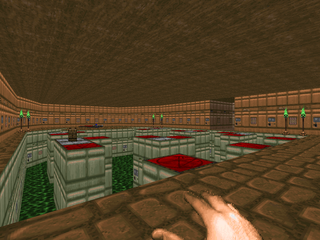
Which is just to say that, well, I just want to give proper credit where credit is due. Theresa’s mapping style is quite distinct from her brother’s. Willits tends toward making levels with multiple avenues of approach into each area whereas Theresa’s are organized into discrete portions that initially appear to have a linear flow but later reveal themselves to be more open. The combat in both tends toward the classic Doom II style, with the monster count hovering around 100 per level and Theresa being I daresay a bit more experimental with the way the maps play out.
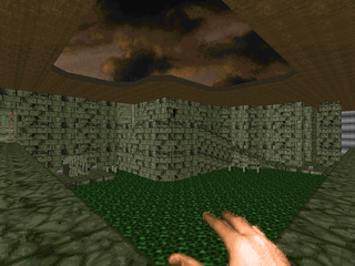
The Raven series mostly fills out its features as stated in the included .TXT. There are some exceptions, of course. Monster placement is fine often leaving the player feeling exposed but the maps could stand to field some more challenging situations. Excepting a surprise appearance from the boss shooter (who is easily silenced), none of Doom’s biggest and baddest demons make an appearance. Texture alignment is mostly bang-on but there are some glaring oversights, most notably some of the marble staircases in MAP05. There’s also a lack of specific detailing, preferring to let the sparing architecture and gameplay speak for itself. When detailing does show up, it’s quite nice and really makes the section shine.
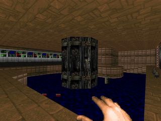
Texturing as far as setting a level theme is a bit of a mixed bag. Up until the final two maps, there’s a wide variety of styles, and while the rooms themselves are internally consistent, switching between green marble and techbase and city style within the levels themselves is pretty jarring and only serves to underscore the thin veil disguising the fact that the aesthetic qualities of the maps are only a skin obscuring the reality of the game itself. MAP10 and 11 are the best the WAD has to offer, following the presented themes from start to end save where deviations make sense, elevating them above the surrounding material.
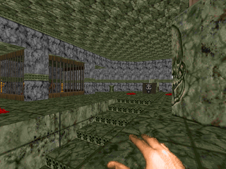
The Raven series isn’t the hardest Doom II levelset you’ll ever play. In fact, it’ll probably rank among the easiest. It’s good stuff, though, and looks nice. The levels are mostly nonlinear, show off most of Doom’s bestiary and weapons, and utilize them in an intelligent manner. Granted, it’s from pretty early on in Doom’s history, and this shows, but there’s quality gameplay to be had here. It’s fast; it’s fun; what more could you want? Besides meticulous detail and lighting, I mean. Anyone concerned by a lack of either should skip straight to MAP10 and 11. The rest should hop in for the full ride.


THE COMPLETE RAVEN SERIES
by Tim Willits and Theresa Chasar
| MAP01 | by Tim Willits |
|---|
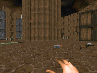 | Very small level built around a central wooden arena. While you’re fairly exposed none of the monsters are that threatening and you’re more than adequately outfitted in weaponry and armor considering the meager forty-some monsters you’ll encounter. The main area with all its nooks around the outer edge and army of elevators is the most interesting section, if only because it throws you against the most demonkin. Simulated lighting is nonexistent, robbing it of another aesthetic quality. |
| by Tim Willits | MAP02 |
|---|
| This is a fun, medium-size techbase featuring some of the design principles found in Willits’s CANYON.WAD (some large outdoor areas, non-linear gameplay with multiple routes into the same area, nice large secrets) but lacking the architecture and detailing that made the Master Level so distinct. Among the more memorable areas are a series of large warehouse rooms culminating in an outdoor battle with an arch-vile, a few raised walkways over some water, and the exit room, which has four switches, three of which reveal monster ambushes to confound the player. | 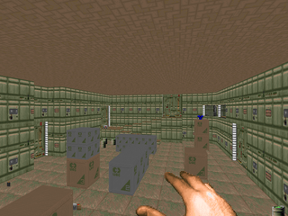 |
| MAP03 | by Tim Willits |
|---|
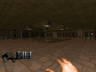 | A labyrinthine assortment of rooms and hallways with a few potentially challenging scenarios, mostly in a wood and marble style. I found myself backed into the library area at the beginning and was rushed along for quite some time. The rest of the fights are pretty banal, but Willits has worked in some cool moments. There’s an ominous pit which you KNOW has something nasty in it, a teleporter maze suspended in lava that’s actually pretty straightforward, some nice marble and blood rooms (including the exit sequence), and a "choose wisely" scenario a la Plutonia’s MAP11, just with less fireworks. |
| by Tim Willits | MAP04 |
|---|
| Another freeform techbase map with some stranger inclusions. It begins with the same gimmick that ends MAP02, except in a much wider area, making the added monsters a bit more dangerous. It’s a bit tougher, due to a greater usage of Doom II’s hardbodies, and some trickier layouts, like the northern marble section where the columns double as another walkway (and could probably be reskinned as computer stacks to give a more consistent theme). The level culminates in a boss shooter that’s pretty easy to take down but visually kind of neat. If I were to denigrate this level for anything, it would be the trio of circular lift rooms in the map’s southern section. |  |
| MAP05 | by Tim Willits |
|---|
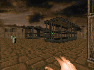 | Another hellish mix of techbase and marble. Willits continues to make the different map areas distinct. The central techbase has a pretty nice layout with snipers all around and some free-roaming revenants to keep you on your toes. There’s an eastern portion with a ton of cages, kind of a demonic zoo, but nothing impressive. The marble portion of the map would look great if the textures on the stairs were better aligned. As it stands, the grand staircases stick out like a sore thumb. Layout is a bit tighter here but you can still go out of your way to skip portions of the map if the need strikes you. Finally, there’s a teleporter hub, but it’s almost entirely incidental to the map’s flow. |
| by Tim Willits | MAP06 |
|---|
| Mostly techbase in the eastern half of the level giving way to marble and wood in the western portions. It’s a bit easier than previous maps, probably in part due to the abundance of ammo and health. The opening wooden hallway is nice, with the windows showcasing Doom II’s burning city. Among the other more memorable features are a gory room staffed with a few revenants, a semi-maze in the northwestern section, and a very obvious teleporter maze near the map’s end that also involves a triggered door on a short timer. More importantly, this features some previously absent bits of atmospheric lighting that help give the level some much-needed character. | 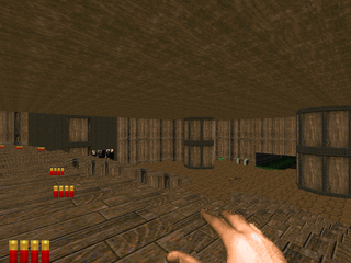 |
| MAP07 | by Theresa Chasar |
|---|
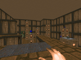 | Theresa’s first outing shows a bit more unrestrained texturing and detailing, a grab bag of themes including some of the Wolf3D textures. It’s a fun level, but kind of scatterbrained. The entire map can be confined to a square shape divided into four rectangular sections. The natural gameplay flow involves moving from one to the next via the key doors but there are a number of secret doors spread throughout the map that facilitate more fluid movement, allowing you to bypass most of the map entirely if you so choose. The opening is a neat moment, placing the player with a limited arsenal among a horde of demons. There are a number of powerups suspended on columns you can lower at your whim, but they’re not all available or immediately apparent, which makes it the trickiest moment of the map. |
| by Tim Willits | MAP08 |
|---|
| Smaller techbase that shows some more improvement in Willits’s style. Atmospheric lighting has been more thoroughly utilized, making some of the sections quite nice (like the darkened eastern hall) and some of the alignment foibles that had earlier plagued the mapset look to have disappeared. Gameplay is less action-packed and some of the fights have been neutered (like the caged arch-vile) but there are some great touches, like the architecturally distinct opening outdoor area that dominates the map or the easily-disarmed trap in the yellow key room, or that neat little room in the southwestern corner with the bloodfalls. | 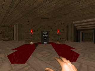 |
| MAP09 | by Theresa Chasar |
|---|
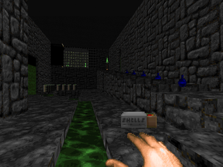 | Starts out like Theresa’s previous map, with two square-shaped areas that must be individually navigated, before giving way to a large "Downtown"-style shootout featuring six buildings (one of them blasted out), an arch-vile that might sneak up on you, and a number of beasties sealed in caged windows. There are several cool moments in this map, like when the center of the first section opens up revealing the blood and marble fight, but my favorite area of the level is the northeastern sewer section. It’s completely extraneous but looks quite nice, showing a bit more care put into it than other portions of this WAD. I also like the blue key bit. |
| by Theresa Chasar | MAP10 |
|---|
| The map may look quite different from Theresa’s other levels, eschewing square layouts, but the core gameplay is unchanged. Rather than entering discrete areas of the map directly, you teleport into each successive zone until at the very end you open up regular modes of access. Aesthetically the map is of an entirely different caliber than the rest of the WAD, using a consistent texturing theme (beige brick, brown and skin textures) while using bloody textures and gibs for detailing. Gameplay starts out pretty wild, putting eager players on the run from an arch-vile (probably my standout moment), but Theresa has seeded it with enough health and ammo that only careless players will suffer on UV. | 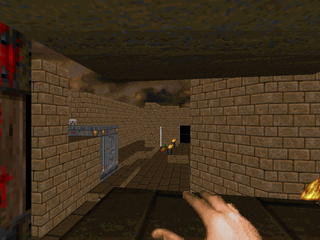 |
| MAP11 | by Tim Willits |
|---|
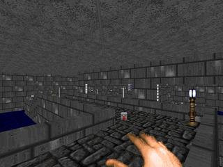
 | A selection of four smaller-sized buildings and one large castle-esque construction that together vaguely suggest some kind of cityscape. The smaller towers are unremarkable, but three of them house the keys necessary to gain access to the final, largest building. It’s got some cool battlements and a neat main hall with a throne that teleports you to the level’s exit, a dark dungeon with flashing lights, spectres, and shooters in the dark. It’s a pleasant romp but the action is pretty light except for the opening where you get your bearings. At the very least, the shooters on the castle walls will make sure you don’t spend too much time out in the open. It looks great, though. |
NEVERMORE




No comments:
Post a Comment