NEBULA 95:
DROWN STONE CASSETTE B
by Chris "lupinx-Kassman" Kassap
DROWN STONE CASSETTE B
by Chris "lupinx-Kassman" Kassap
This ended up being the first of the Nebula 95 levels to appear on the archive, but Drown Stone began life as part of the Doomworld Secret Santa project. There are a few big differences between this edition and the previous, but if you've played the original level, the gameplay is basically identical to my eyes, excepting the Nebula 95 intro map on the saucer. It's got an amusing background story. Since Kassman used a stewboy track for the first version (part of his stewboy imitation), Cassette B is offered as an alternative more in spirit with the gives-no-fucks attitude of Nebula 95. The choice is left to you, as beads of sweat pour down Doomguy's forehead since he can't make the decision himself.
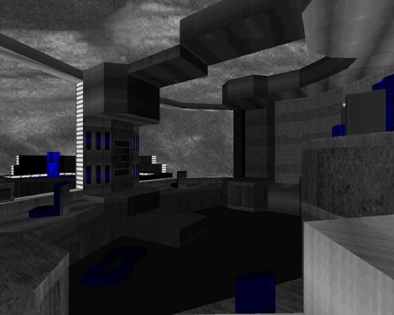
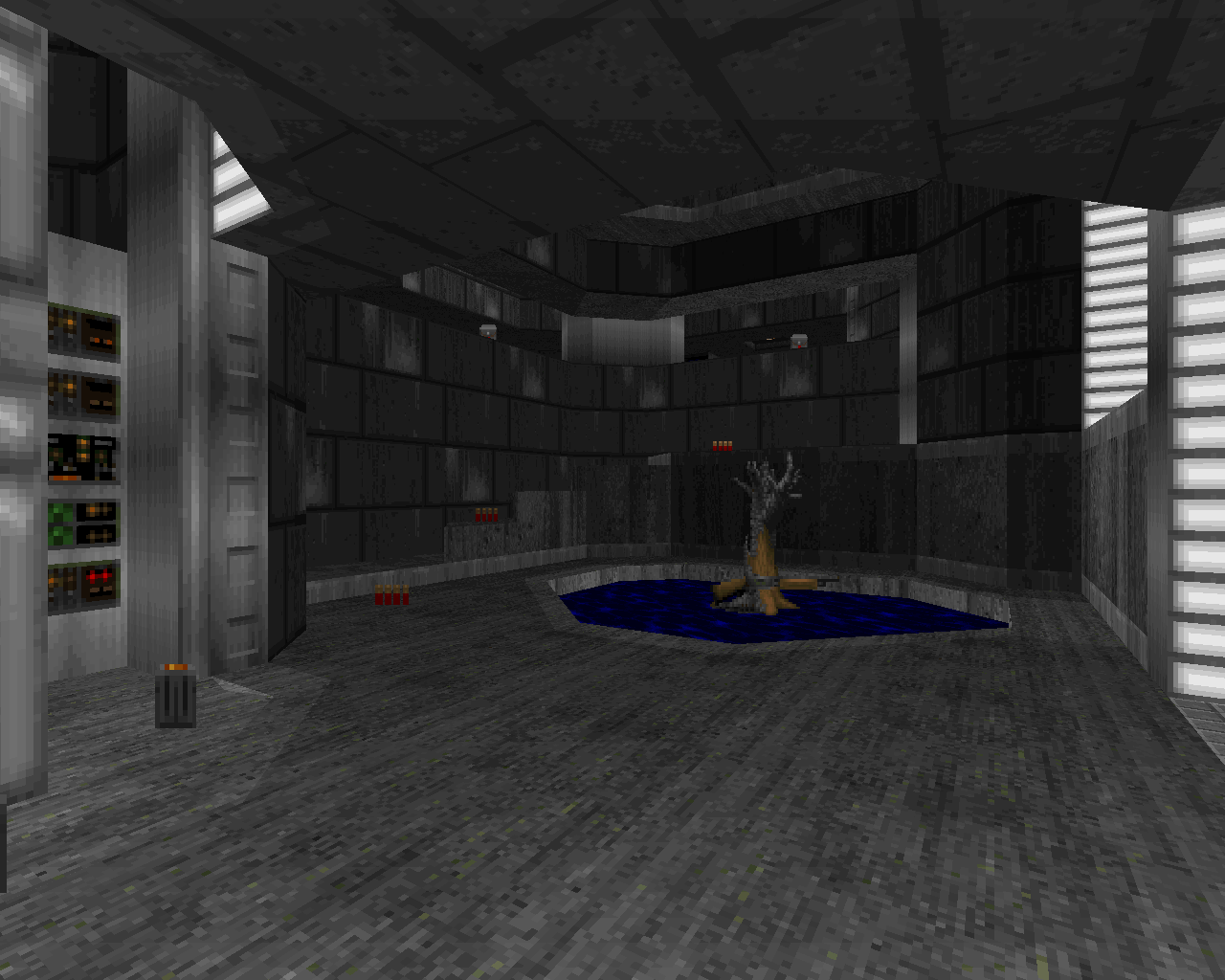
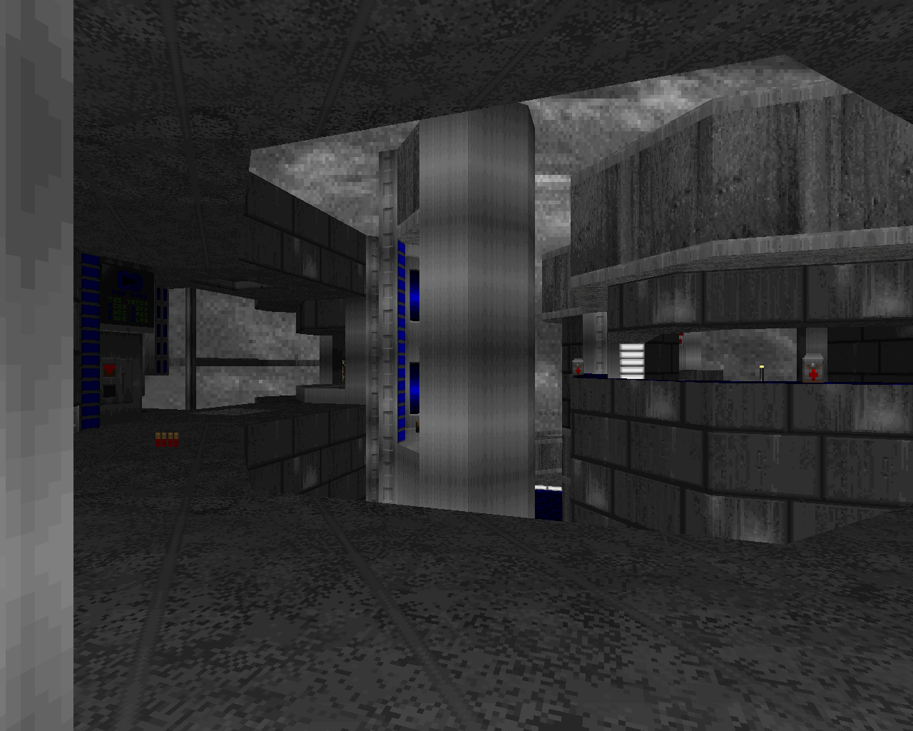
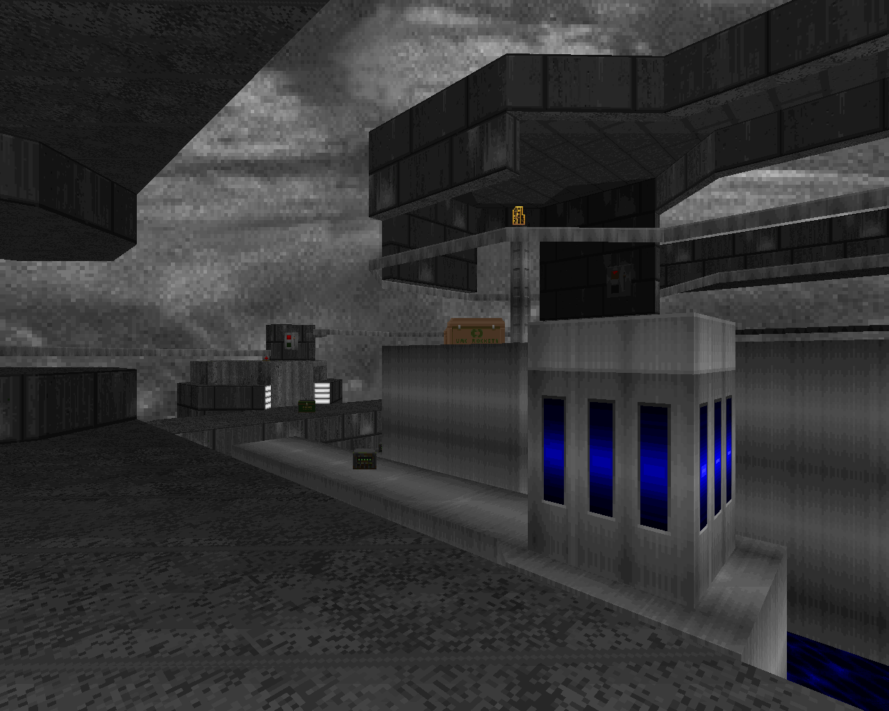
Kassap had some under-the-hood changes to make to vanillafy Drown Stone. It was a Boom level, after all, and had some textures not native to Doom II. The biggest difference for me is the sky, which means a lot for the level's visual flair. Truth be told, the gorgeous blue CC4 sky of the original was a happy accident, as the author meant to use the first episode's cloudy ceiling. Here, it's a sort of muggy overcast gray that leaves the map feeling sort of bland as you're overwhelmed by grays with the occasional pool of water or striping. Not that the architecture / detailing isn't just as great, if slightly toned down for vanilla. It could use some more contrast is all.
As with the original, NEB04 features a lot of vertical action with some timed lifts and platforming as you get around and quickly open the map up. It has a couple of nice pitched fights with one in the catwalk section and the other right by the exit where you get a nice little surge of enemies. It's a pretty short map in keeping with the rest of Nebula 95, so you're never too far from finishing things out. I got a bit reckless since I knew what I was getting into and ate a death or two in the northwestern area but you're not really under any pressure except for maybe a commando surprise around the SSG.
While I preferred the Secret Santa edition, the Nebula 95 version of Drown Stone fits right in with its brethren, compressing a lot of action and maneuvering into a cool, open layout, backed with some lovely jazz / funk / pop MIDIs. The real decision is up to YOU, the PLAYER - Cassette "A" or Cassette "B"?

YOU'VE GOT A HEART OF GLASS OR A HEART OF DROWN STONE
This article is part of a series on
Chris Kassap's Nebula 95 series
Chris Kassap's Nebula 95 series
| Nebula Shrine | Mudman Wonderland |
| Human Earrings | Drown Stone |


Cloudy/rainy days give me a weird sense of comfort, like a white blanket stretched out over the sky. They also make me think of synthpop music (particularly Depeche Mode, New Order, and Pet Shop Boys), hence why I chose the track for the 95' version.
ReplyDeleteYeah the only real architectural differences that aren't purely aesthetic include the setup for the RL (the original walkway ending with the RL on a silver rail was removed, which is why the weird silver pillar was added), and the method for retrieving the YK (before you could just climb the spider posts, in this you need timed lifts to teleport to them). I'm just glad doomer have a version they can enjoy. As always thanks for the review! And I'll try to avoid going monochrome again in the future haha
I wouldn't worry about your choice of sky, I think that contrast is important when it comes to making Doom levels visually striking but whether a level accomplishes this is not to me an arbitrary box to check that differentiates good Doom maps from bad ones, just "striking" from "muted". If I ever sit down to make a Doom map I hope that i would endeavor to make my own level something that was important to me, not to someone else
DeleteAnd that would be an interesting thing to see! I wonder what sources (if some of them happen to be wads) you would draw inspiration from, considering the giant wealth of mods you have played and written detailed pages over.
DeleteI would probably be more irreverent than anyone would expect, at least at first. the allure of making a sloppy but lovable collection of '94 / '95 maps is too strong
Delete