Paul DeBruyne clinched the Best Mapper Cacoward (in addition to two awards for two excellent mapsets) in 2011. He's a much older fixture in the community, however, having released this episode for
Doom II back in 1998, after which he took a long break, returning to author in 2007.
Sector 666 consists of ten limit-removing maps, with an implied story of a marine fighting his way through a conquered Earth Defense Force base to Hell itself. Actually,
666.WAD spans eleven map slots, but MAP06 was intentionally left blank. Did DeBruyne just wanted to get it published? Or did he just want to end the episode with the intermission text?

There is a big disparity between the kind of style and gameplay of DeBruyne's recent material and this comparatively ancient effort. Don't get me wrong; Sector 666 is far from unplayable. It lacks a lot of polish, though. Gradually you'll see improvements in lighting and even architecture, straying away from plain-looking rectangular rooms. One thing that's firmly entrenched in the design philosophy is backtracking, with the author taking few pains to make sure that your trips back through the levels are just as action-packed. Many of the levels are very short, with a few longer adventures, but they're pretty straightforward.
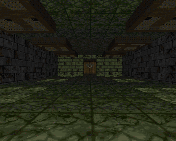
DeBruyne includes a lot of "new" material in the WAD, like a host of
Quake sound effects and textures from a variety of sources.
Duke Nukem 3D,
Hexen,
Icarus... And I'm sure others that escape me. The new stuff helps to freshen up the somewhat lacking level layouts, alongside prototypically inspiring lighting. Some of the sound choices blow, though. The plasma rifle is much more annoying than the original. As far as fights go, the levels range in difficulty with most of the knuckle-biting happening due to scanty ammo stores. The last few levels are actually among the easiest as you're handed a BFG and a ton of cell ammo, Cyberdemons be damned.
I'd recommend
Sector 666 for a playthrough in spite of its quirks and rough edges. Most of the fighting is still loads of fun and the lighting does a good enough job of supplying eye candy. Of course, if you haven't played anything of DeBruyne's yet, you should also shuffle along and dip your toes in
Vanguard and
Lunatic, two fantastic mapsets for Boom. Basically, play it all. Just make sure you put a muffler on that plasma rifle...

SECTOR 666
by Paul "skillsaw" DeBruyne
| Landing Site | MAP01 |
|---|
| Short little techbase with a sewer section and a slow elevator down. It's almost entirely shotgun play, though you get the chaingun at the very end. Some very nice lighting, which helps bring the quality of the base itself up a few notches. No really harrowing fights, but you've got to drag what little health you have until you get past the red door, so be smart about all the hitscanners. I suppose there's a room with a revenant on the ground and a baron on the upper tier, which when coupled with the sergeants can do a good job of chipping your health. | 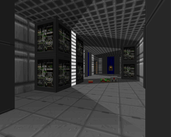 |
| MAP02 | Infested Base |
|---|
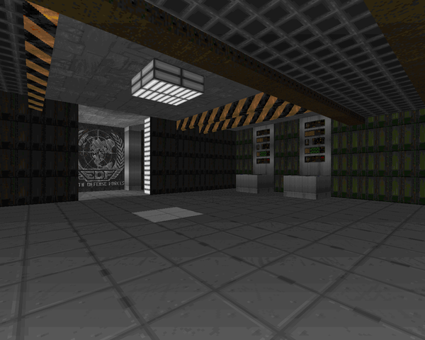 | Starts on a waterfront and quickly advances through an Earth Defense Force base that's been taken over by Hellspawn. Fast access to the chaingun and SSG (and then the rocket launcher!) makes for some great combat options. The megasphere at the beginning is probably overkill, but it's welcome. All the fun action is in the eastern wing of the level, where you tango with two arachnotrons while dodging imp fire and then have to take on an ambush of four cacodemons. Pretty fun. Note the oversized Duke Nukem 3D vending machines. |
| Storage | MAP03 |
|---|
| Ye olde crate level. The room geometry's kind of boring but DeBruyne has put in plenty of ceiling detail so that some of the wide, open spaces aren't so galling, like the Cyberdemon room (which could probably be half as big). The combat is a bit trickier as it's tight with the ammo. I had to let the revenants in the western room take all the imps out on their own if I wanted to have enough scratch to finish of the Cyberdemon, basically. Well, in retrospect, I could probably have used him to knock out all the cacodemons. But what do I know? That first outdoor area looks pretty cool. | 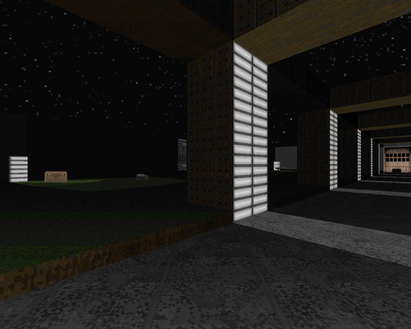 |
| MAP04 | Teleport Base |
|---|
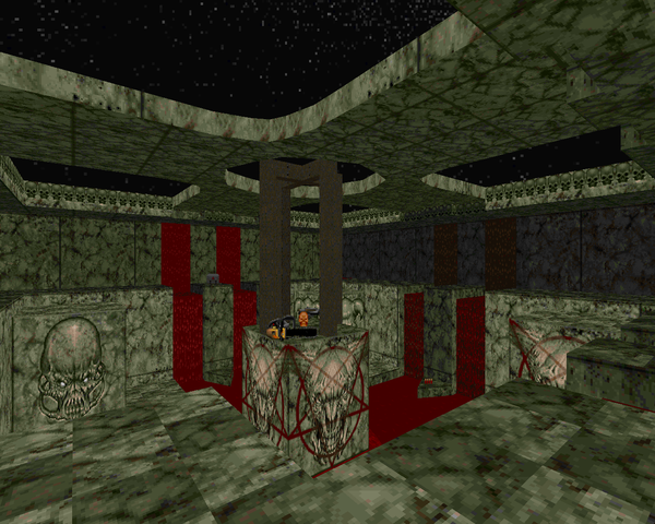 | Pretty simple teleport-hub style map. The hub itself is pretty sparsely decorated except for the teleporters and some flare like ceiling decorations, but your two excursions look pretty cool. Ammo starts out kind of tight but you quickly get the upper edge. The second teleport destination is my favorite fight of the map, clearing an outer ring of monsters while you watch out for the ones on the inside. Also some intelligent use of the pseudo-3D bridge to make the little southeastern annex a bit more interesting. The zombie slaughter at the end (about half of the level's monsters) is not so amusing, but it's fun to blow through it with your remaining rockets. |
| Nothing | MAP05 |
|---|
| Short map with several different square-ish areas connected by very long, narrow hallways. On the upshot, as boring as the architecture sounds, there are a bunch of great fights, like a Spiderdemon, the crossroads-tiered room to the south, and the canyon crawl to the west. It makes up for the dead space you run into while backtracking, with the only influx of new beasties being a cell of commandos in the starting area. There's a decent special effect, another 3D bridge, this one used purely for eye candy. | 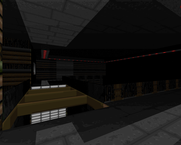 |
| MAP06 | [untitled] |
|---|
 | Placeholder. Nothing to see here... |
| Warzone | MAP07 |
|---|
| A dark, underground techbase. The lighting is the real star of this map, though the firefights lying in wait in the different rooms are appreciated. They're not too memorable with the exception of the penultimate battle, where eight mancubuses emerge from the muck and you have to mow them all down, probably with the plasma rifle. There isn't enough room to circle strafe with impunity, so try not to catch too many fireballs as you hose the fatties. The spectre "maze" at the end isn't the best way to close out the map, though. |  |
| MAP08 | Mansion |
|---|
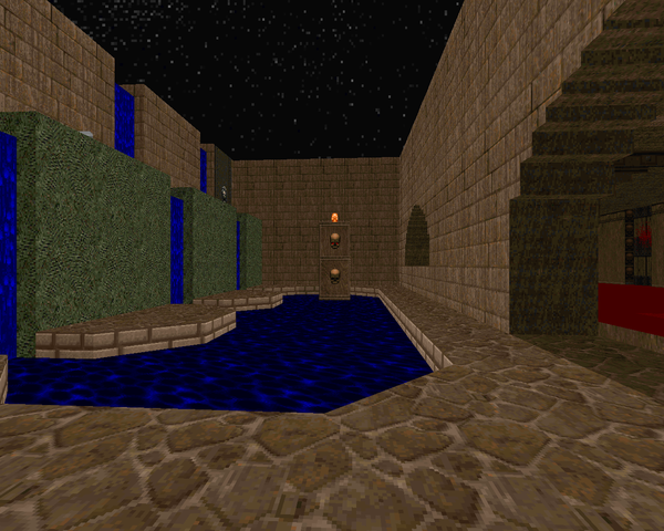
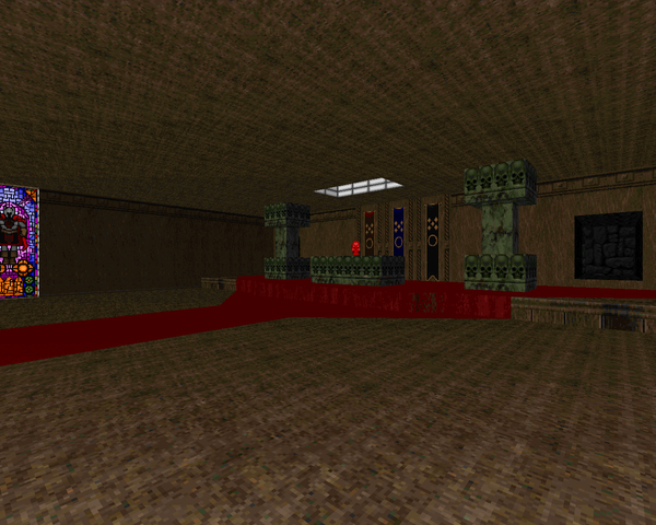 | The largest level of the WAD so far. It's an enormous, mostly beige brick mansion with beds, libraries and gardens. And, err, floating islands, a nice semi-decorative touch. While there's a criminal amount of backtracking with nothing to show for it on the way, there are a few good fights to be had, amplified by more tight ammo control. For instance, anticipating trouble, I used the hell knights on one island to take out the cacodemon pod in between, which saved me considerable ammo. One of my favorite fights is directly after, the northern segment of the mansion, where a handful of cacodemons trickle in through the windows while imps and other beasties sneak around in the hallways to catch you off-guard. |
 |
| Hell | MAP09 |
|---|
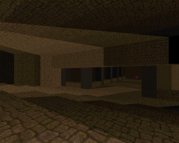
| Another really short, action-packed map. It says it's "Hell", but it might as well be part of the mansion. The opening fight is a little hectic, getting chased around the central pillar by some revenants and their buddies, and the upper tier can get dangerous fast with an arch-vile that completely snuck up on me. After that, things are pretty tame, with tons of plasma ammo to deal with a trio of archies (well, and the invul) and a Spiderdemon you can kill at range, so nothing that challenging. |  |
 |
| MAP10 | More Hell |
|---|
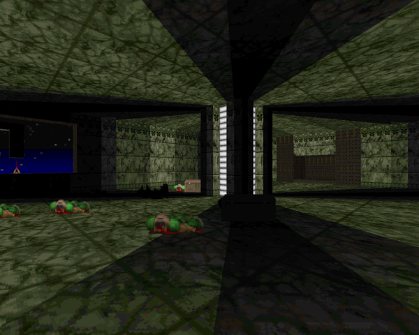 | DeBruyne dumps the beige brick theme for a marble temple of evil. Encounter difficulty is upped, with all kinds of monsters popping up, including a ton of baron ilk in the largest room, which will be awkward to take down even with the BFG so graciously provided near the start. It trivializes a lot of the fights when used properly, especially the end of level teleport rush, though the wrong monster can sideswipe you if you're not alert. The west wing is a pretty cool segment, with nice detailing and a baron and mancubus that appear to be roasting several human corpses. Very good lighting. |
| Demonic | MAP11 |
|---|
| Very short IOS map which can be accomplished quickly (if not necessarily easily) through BFG spam given the amount of ammo afforded to you. After you take out the little resistance in the first room you have to bypass a gauntlet of challenges, including a pair of Spiderdemons sitting in front of the Cyberdemon guarding the switch that reveals the head. After that, you can just return to the central arena, blow a ton of cells, and emerge victorious. The architecture of the main segment gives me Hell Revealed vibes for some reason. | 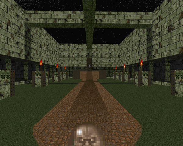 |
GET YOUR KICKS
WITH SECTOR 666





Oh my god. You shouldn't have subjected yourself to this thing, but thanks for the doing so and thanks again for the write up. I thought the book was closed on Sector 666 a decade ago so it's always cool to see someone's comments on it.
ReplyDeleteA few things:
MAP06 was left blank because it was never finished. It was originally intended to be a Metal-themed nuclear reactor map with extreme height variation, lots of narrow catwalks with some custom rail textures that I stole from the "3d Game Alchemy" for Doom CD. I could never get it to turn out well though and eventually I decided to abandon it (After all, I was starting high school, and didn't have the time to mess around with this stuff anymore). I seem to have a history of not finishing things and releasing them anyway.
The sounds/music/textures etc were all ripped. David Shaw and Mark Klem were both easily reached by email at that point in time and I got permision to use their music. For some reason I remember being really proud of that (...I was only 13 or 14 years old). As far as graphics go, I don't think anything was original except for perhaps the sky, and obviously the title pic, but I'm not sure. Most of the textures were from a pack that Nick Baker had been compiling and sending around to various Doom mappers on AOL. I don't know who else was on that list but I'm sure there were some other names that we would recognize today.
One other little known factoid is that I used this wad as an application to join TeamTNT. Surprisingly enough, they accepted the application, but I never participated in any projects (I think the team had already begun to die down). My name is still listed on their website (http://www.teamtnt.com/projname.htm) despite never contributing anything other than a few email messages.
So thanks again. This has a been a fun trip down memory lane for me. I really value what you're doing for the community with this site, so keep it up.
Thanks! Still enjoying myself...mostly. Thanks for the info on MAP06 and all the other background information. I never would have guessed you were 13 or 14 at its inception, but age is hardly an indicator of anything, as we've found out.
Delete